Web
Responsive Web Applications Made Easy (Even Your Grandma Could Do It)
Nov 12, 2025

Application Responsive Design: 3 Flawless Pillars
Why Your Website Needs to Work Everywhere (And What to Do About It)
Application responsive design is the practice of building web applications that automatically adapt their layout and functionality to work seamlessly across all devices, from desktops to smartphones. Instead of creating separate versions for each device, a single, flexible application is built using fluid grids, flexible media, and CSS media queries.
With over 60% of web traffic now coming from mobile devices, a site that isn’t mobile-friendly is losing customers. Google also prioritizes mobile-friendly sites in search results, directly impacting your visibility and revenue. Responsive design ensures a consistent, user-friendly experience on any device, which is what modern users expect.
Key components include:
Fluid Grids: Layouts using percentages to resize proportionally.
Flexible Media: Images and videos that scale within their containers.
Media Queries: CSS rules that apply different styles based on screen size.
Mobile-First Approach: Designing for small screens first, then enhancing for larger ones.
Modern tools like CSS Flexbox and Grid have made implementing responsive design more accessible than ever. It’s about understanding core principles and applying them consistently to create digital experiences that convert visitors into customers.
Explore more about application responsive design:
What is Application Responsive Design and Why Does It Matter?
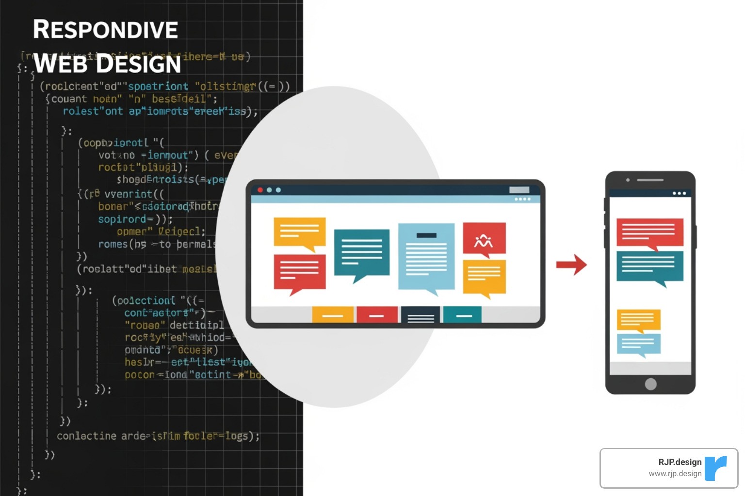
When a website looks great on a desktop but is a disaster on a phone—tiny text, impossible-to-tap buttons, and horizontal scrolling—it creates a frustrating user experience. This is the problem application responsive design solves. First conceptualized by Ethan Marcotte, it’s the practice of building a single, flexible web application that automatically adapts its layout and content to look great on any device.
Why does this matter? The reasons are critical for any modern business:
Mobile Dominance: With over 60% of web traffic coming from mobile devices, a poor mobile experience means turning away more than half of your potential audience.
SEO and Visibility: Google uses mobile-first indexing, meaning it primarily ranks your site based on its mobile version. A responsive site leads to better rankings and more organic traffic.
User Experience and Conversions: A site that is easy to use on any device keeps users engaged. Readable text and tappable buttons lead to higher user retention and better conversion rates.
Future-Proofing: A responsive design adapts to new devices and screen sizes as they emerge, protecting your investment for the long term.
Efficiency: Managing one codebase instead of multiple versions for different devices saves time and money on development and maintenance.
In short, responsive design is no longer optional; it’s the foundation of a successful online presence. Learn more about our Responsive Web Application Development services.
The “Responsive” vs. “Adaptive” Showdown
While often used interchangeably, “responsive” and “adaptive” design are different. Responsive design uses a single fluid layout that continuously adjusts to any screen size. Adaptive design uses several fixed layouts and serves the one that best matches the user’s screen size.
Feature | Responsive Design | Adaptive Design |
|---|---|---|
Layout Approach | Single fluid layout | Multiple fixed layouts |
Content Flow | Uses media queries to reflow content | Detects screen size and loads a specific layout |
Codebase | One codebase | Multiple versions |
Flexibility | Adapts to any screen size | Works at predefined breakpoints |
Best For | Most modern websites and applications | Specific situations requiring precise layout control |
For most projects, responsive design is the better choice. It’s more maintainable, flexible, and provides a smoother user experience. While adaptive design can be useful for legacy systems or when precise control at specific sizes is needed, we find that a responsive approach is more future-friendly and meets the demands of today’s multi-device world.
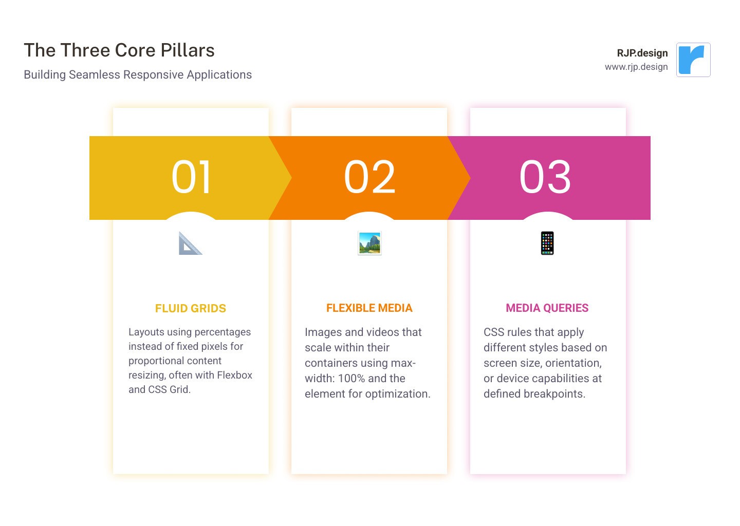
The Three Pillars: Core Principles of Responsive Apps
A seamless user experience is built on the three pillars of application responsive design. These foundational concepts ensure your application is flexible and functions beautifully everywhere. For a deeper technical dive, see our guide on Easy Responsive CSS.
Pillar 1: Fluid Grids and Flexible Layouts
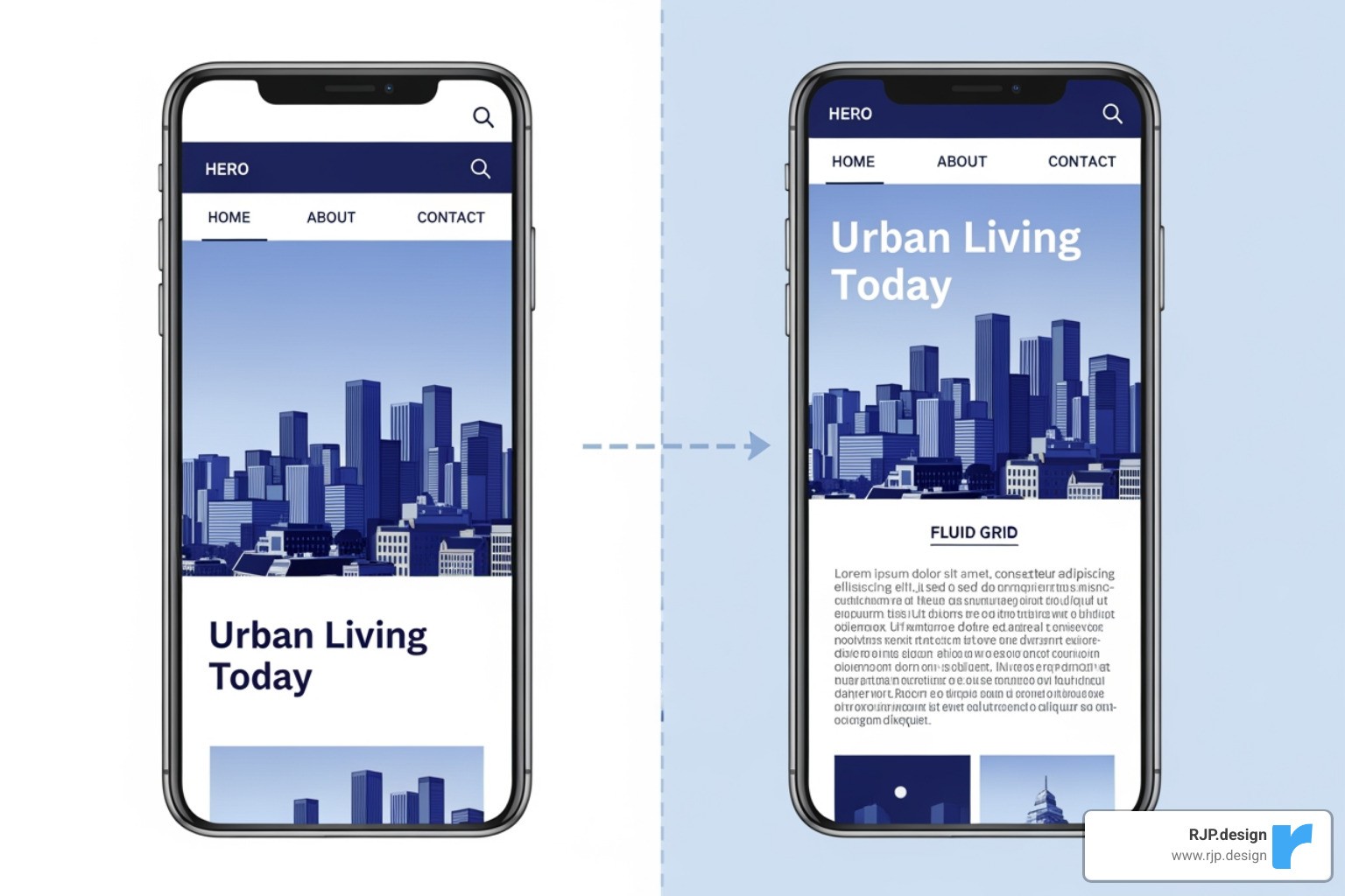
Old websites used fixed-pixel widths, which broke on different screen sizes. The modern solution is fluid grids, which use relative units like percentages instead of rigid pixels. This allows layouts to adapt gracefully. For example, a sidebar can be set to take up 30% of the screen width, not a fixed 300 pixels.
Modern CSS provides powerful tools for this:
CSS Flexbox: Ideal for one-dimensional layouts (rows or columns), allowing items to align and distribute space automatically.
CSS Grid: Perfect for complex two-dimensional layouts. It allows for the creation of a complete grid structure where elements can be placed precisely. The
frunit (fraction) is especially useful for dividing available space proportionally.
Pillar 2: Flexible Images and Media
A fluid layout is incomplete if media elements like images and videos are not also flexible. The key is to ensure they scale correctly within their containers.
max-width: 100%: Applying this simple CSS rule to images (along withheight: auto) ensures they never overflow their container and scale down smoothly while maintaining their aspect ratio.The
<picture>element: This HTML element allows you to serve different image files based on screen size, improving performance by sending smaller, optimized images to mobile devices.SVG (Scalable Vector Graphics): For logos and icons, SVGs are ideal. They are vector-based, meaning they scale to any size without losing quality, ensuring they look sharp on all displays.
Pillar 3: Core tenets of application responsive design
This pillar is about thinking in relative terms instead of absolute ones. Using relative units makes your entire design scalable and adaptable.
emandrem: These units are used for typography and spacing.emis relative to the parent element’s font size, whileremis relative to the root HTML font size. This allows for consistent, scalable typography.Percentages (
%): Used for layout dimensions, percentages define an element’s size relative to its parent container, creating fluid behavior.Viewport Units (
vw,vh): These units are relative to the viewport’s width and height (1vw = 1% of viewport width). They are excellent for elements that need to scale directly with the screen, like full-screen hero sections.
By building with relative units, you create an application responsive design that is not only visually adaptable but also respects user preferences and accessibility needs.
Key Techniques for Flawless Responsiveness
Putting the principles of application responsive design into practice involves changing static layouts into dynamic interfaces that adapt to how they present information.
Using Media Queries and Breakpoints Effectively
Media queries are CSS rules that apply styles based on device characteristics. The CSS @media rule allows your application to adapt to different screen sizes.
Media queries can also detect orientation (portrait/landscape), hover capabilities, and screen resolution. The key is choosing the right breakpoints—the points at which the layout changes. Instead of using fixed device sizes (e.g., “iPhone width”), the best practice is to use content-driven breakpoints. Let the content itself determine when a layout change is needed—for instance, when a line of text becomes too long or elements feel cramped. This creates a more robust and future-proof design, a core concept in our approach to Breakpoints in Responsive Web Design.
The Power of a Mobile-First Approach
Designing mobile-first is a cornerstone of modern responsive design. Instead of designing for a large desktop screen and then trying to shrink it, you start with the smallest screen. This approach, pioneered by thinkers like Luke Wroblewski, offers several key advantages:
Content Prioritization: Limited screen space forces you to focus on what’s most important to the user, leading to a cleaner, more focused experience on all devices.
Improved Performance: By loading only essential assets for mobile users, you create a leaner, faster application. This is crucial for users on slower mobile networks.
Better UX for Everyone: A simplified, focused mobile design often translates into a better desktop experience. Clear navigation and large touch targets benefit all users.
SEO Benefits: Google’s mobile-first indexing prioritizes the mobile version of your site for search rankings. A mobile-first approach is therefore good for both UX and SEO.
At RJP.design, mobile-first is a foundational part of our application responsive design process. We start small and progressively improve the experience for larger screens, ensuring a great result for every user. Learn more about our Responsive Web Application Development approach.
Tools and Testing for a Perfect User Experience
Executing an application responsive design efficiently requires the right tools and a thorough testing strategy. This ensures consistency, efficiency, and a flawless experience on every platform, which is central to our Responsive Web Application Development process.
Tools and Techniques That Simplify Development
Modern web development offers powerful tools that make building responsive applications faster and more reliable. Native browser features like CSS Flexbox (for one-dimensional layouts) and CSS Grid (for two-dimensional layouts) allow us to create adaptable designs without complex workarounds. We also use established CSS methodologies and custom utility classes to keep code organized, maintainable, and easy to update. This structured approach, refined through years of experience, leads to cleaner code and faster development cycles.
How to Test Your Application Responsive Design
Building is only half the battle; rigorous testing is essential to guarantee a flawless experience. Our testing process is integrated from the start and includes several key methods.
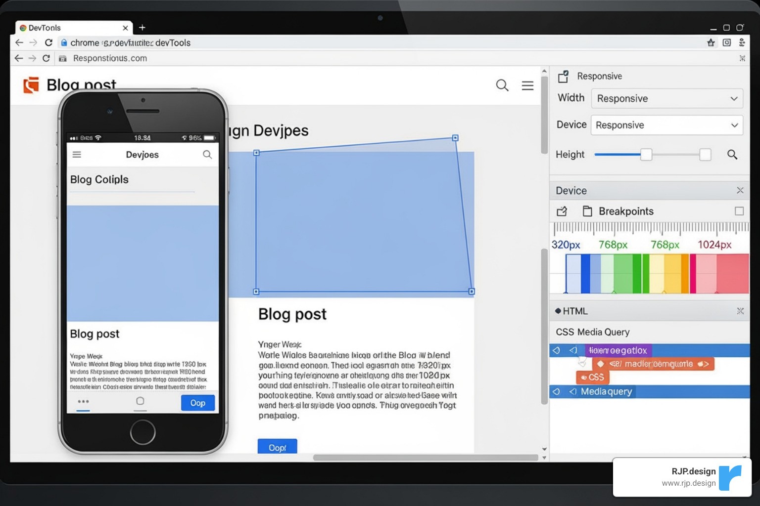
Browser Developer Tools: Tools in Chrome, Firefox, and Safari allow for quick simulation of different screen sizes, helping us catch layout issues early.
Real Device Testing: While simulators are useful, nothing beats testing on actual hardware. We test on a range of iPhones, Android devices, and tablets to check for real-world performance, touch interactions, and visual consistency.
Performance and Usability Testing: We test loading times on various network conditions and gather feedback from real users to identify any points of friction or frustration.
Accessibility and Visual Regression Testing: We ensure the application is usable by everyone by testing with screen readers and checking color contrast. Automated visual regression tests help us catch unintended layout changes after updates.
This comprehensive testing ensures your application responsive design delivers a seamless experience for every user.
Frequently Asked Questions about Responsive App Design
Here are answers to some common questions about application responsive design.
What’s the difference between responsive design for a web app versus a native mobile app?
The goal is the same—adapting to different screen sizes—but the technologies differ.
Web applications, accessed via a browser, use web technologies like HTML, CSS (with media queries, Flexbox, and Grid), and JavaScript to create a single, adaptable codebase.
Native mobile apps, downloaded from an app store, use platform-specific tools. iOS apps use Auto Layout and Size Classes, while Android apps use ConstraintLayout to build adaptive interfaces within their respective operating systems.
How does responsive design impact website loading speed?
It depends on the implementation. When done correctly, application responsive design improves loading speed, especially for mobile users. A mobile-first approach prioritizes loading essential, optimized assets. Techniques like serving smaller images to smaller devices (using the <picture> element) and lazy loading content significantly reduce initial load times.
However, a poorly implemented responsive site that loads all high-resolution images and desktop-only features on every device will be slow and bloated on mobile. The key is to deliver only what’s necessary for the specific device.
Is it better to hide content on mobile or reflow it?
The best practice is to reflow and re-prioritize content, not hide it. Hiding content assumes mobile users want fewer features or less information, which is often incorrect and leads to frustration. It can also create accessibility issues for screen reader users and may negatively impact SEO.
Instead of hiding content, a good responsive design changes its presentation. For example, a multi-column layout might stack into a single column, or complex navigation might be collapsed into a hamburger menu. The content remains accessible, but its hierarchy and layout are optimized for the smaller screen. The only exceptions are purely decorative elements that can be removed to improve performance without affecting functionality.
Conclusion
Effective application responsive design is about creating digital experiences that work for real people on any device. By using core principles like fluid grids, flexible media, and a mobile-first approach, you can build a website that is both user-friendly and adaptable.
The digital landscape is always evolving with new devices and screen sizes. A responsive design doesn’t just meet today’s needs; it future-proofs your website, ensuring it remains functional and accessible for years to come. This approach shows respect for your users’ time by providing a seamless experience, whether they are on a phone, tablet, or desktop.
A well-executed responsive design is the result of thoughtful strategy and solid technical implementation. It’s an essential investment for any business looking to succeed online.
If you’re ready to create a digital presence that works for everyone, everywhere, we can help. Take the first step towards a flawless user experience with our Web Design Development services.

