Web
Responsive UI UX: Because Your Users Deserve Better Than Pinch-and-Zoom
Aug 8, 2025

Responsive UI UX: 3 Core Pillars for Better UX
Why Your Website’s Mobile Experience is Costing You Customers
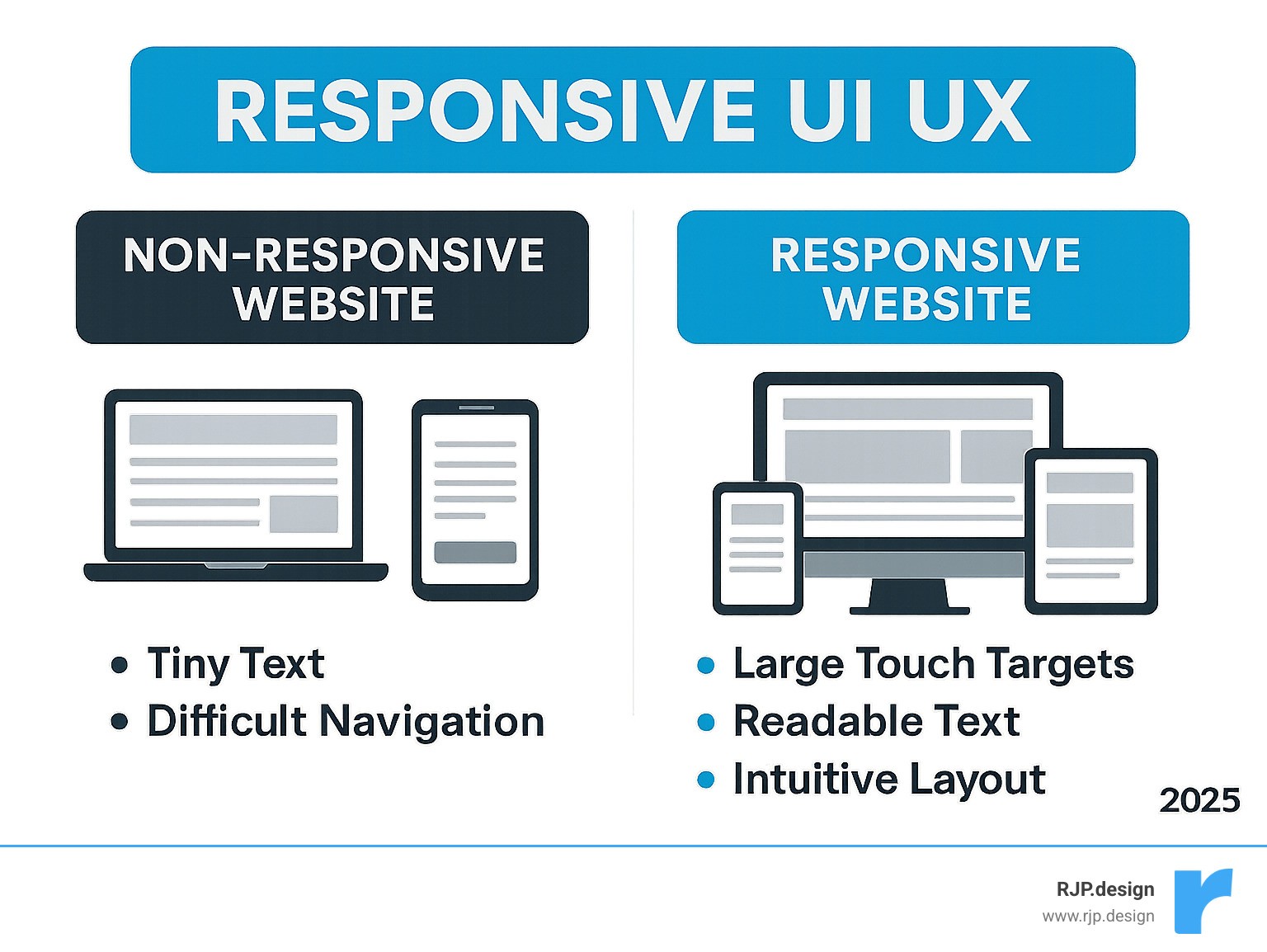
Responsive ui ux is a web design approach that ensures your website adapts seamlessly to any screen size, from desktops to smartphones. Instead of forcing users to pinch and zoom, responsive design creates a fluid experience that works perfectly on every device.
Key Elements of Responsive UI UX:
Fluid grids that resize based on screen width
Flexible images that scale without breaking layouts
Media queries that apply different styles for different devices
Touch-friendly interfaces with large, tappable buttons
Optimized content that prioritizes what matters on smaller screens
Imagine a potential customer finding you on their phone. They tap your link, but instead of a smooth experience, they find tiny text and buttons they can’t tap. Frustrated, they leave for a competitor.
This happens constantly. With mobile devices accounting for 54.2% of global web traffic in 2022, a poor mobile experience isn’t just an annoyance—it’s a business risk.
The solution is responsive design that puts your users first, no matter how they access your site.
I’m Ross Plumer. I’ve helped businesses with over $20 million in revenue transform their digital presence with strategic responsive ui ux. My work integrates psychology and user behavior research, teaching me that great responsive design isn’t just about fitting content on a screen—it’s about creating experiences that feel natural on every device.
Quick look at responsive ui ux:
What is Responsive Web Design and Why is it Crucial?
In the early days of the web, websites were built for one screen size. When smartphones arrived, those fixed-width layouts became a nightmare on mobile, forcing users to pinch, zoom, and scroll endlessly. It was like trying to read a newspaper through a microscope.
In 2010, Ethan Marcotte coined the term “responsive web design”, a game-changing approach. Instead of building separate sites for every device, we could create one website that gracefully adapts to any screen, from massive desktop monitors to tiny smartwatch displays.
Why does this matter so much for your business? It comes down to user experience and search engine visibility.
From a user experience perspective, responsive ui ux ensures every visitor has an enjoyable experience. A microscopic “Add to Cart” button or buried information on a cluttered mobile layout sends users straight to your competitors. Interestingly, 94% of smartphone users search for local information on their phones, and 77% of those searches happen at home or work—places where they could use a desktop. People choose mobile and expect it to work perfectly.
The SEO benefits are equally critical. Google’s mobile-first indexing means the search engine primarily uses the mobile version of your site for ranking. If your site isn’t mobile-friendly, you’re hurting your search visibility. A well-designed responsive ui ux leads to higher engagement, lower bounce rates, and better search rankings.
At RJP.design, we believe great web design should feel effortless for our clients, and that starts with a rock-solid responsive foundation. Learn how our approach makes web design and digital marketing effortless for your business.
The Mobile-First Approach
The “mobile-first” approach flips traditional design on its head. Instead of designing for large screens and shrinking down, we start with mobile and expand.
This is a strategic move. We identify the absolute essentials for a mobile user first, creating a focused, streamlined experience. Then, using media queries, we progressively improve the layout for larger screens, adding features and content as space allows.
This approach delivers serious benefits. Performance improves because we prioritize essential content and eliminate bloat. User focus sharpens because we strip away distractions to highlight what truly matters. SEO gets better because Google loves mobile-friendly sites.
By designing for constraints first, your site will look fantastic on a smartphone and scale beautifully to tablets and desktops. For deeper insights, check out our guide on good mobile website design.
Responsive vs. Adaptive Design
It’s common to confuse “responsive” and “adaptive” design, but they are different approaches to the multi-device challenge.
Responsive design uses a single, fluid layout that continuously adapts to any screen size. It uses fluid grids and flexible images to reshape itself to fit any container.
Adaptive design uses multiple, distinct layouts for specific screen sizes, serving the version that best matches the user’s device.
Here’s how they stack up:
Feature | Responsive Design | Adaptive Design |
|---|---|---|
Layout Approach | Single fluid layout that scales continuously | Multiple fixed layouts for specific breakpoints |
Development Effort | More complex initially, but one codebase | More labor-intensive (multiple designs needed) |
Maintenance | Easier – update once, works everywhere | Complex – changes needed across all versions |
User Experience | Consistent feel across all devices | Highly customized for specific devices |
Performance | May load extra content on smaller screens | Can be optimized perfectly for each device |
Future-Proofing | Automatically works on new screen sizes | Requires updates for new device categories |
While adaptive design can be highly optimized, it requires maintaining several versions of a site. For most businesses, responsive design is more practical, flexible, and future-proof. That’s why we at RJP.design focus on responsive methodologies—they give our clients the best value while keeping their online presence robust and ready for the future.
The Core Pillars of Responsive UI UX
Mastering responsive ui ux relies on a few fundamental building blocks that enable a seamless experience across any screen. These are the concepts that make your website work perfectly on any device.
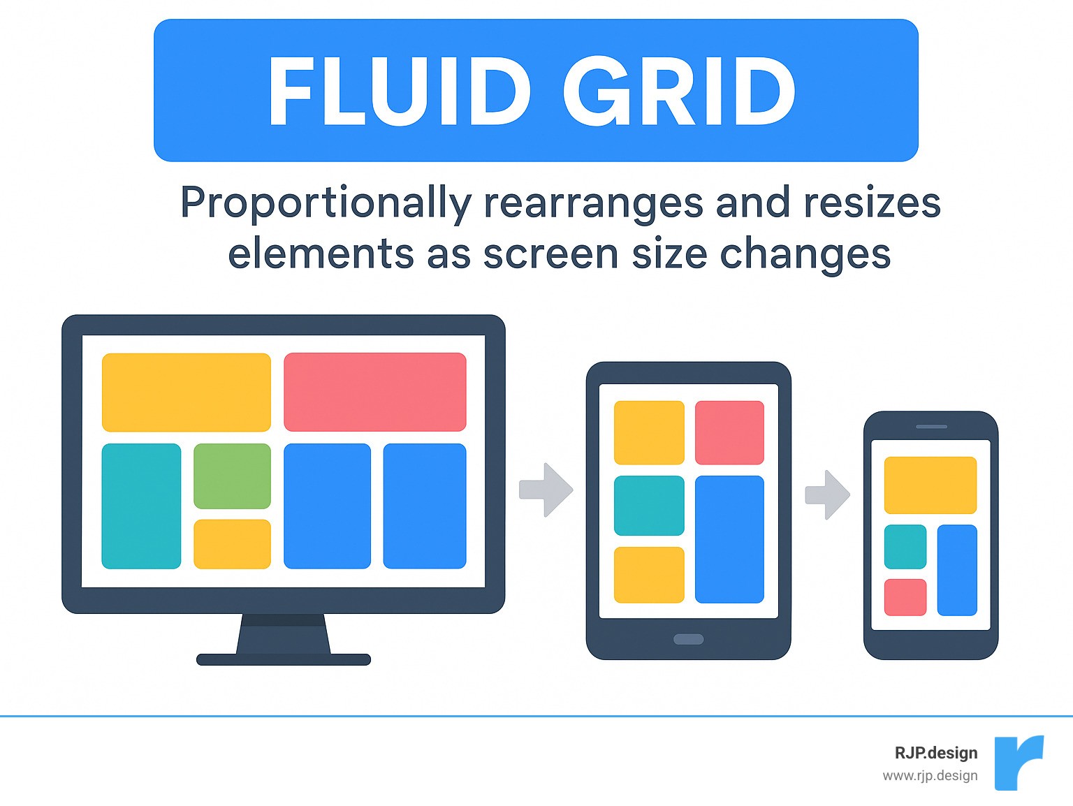
Fluid Grids
Instead of fixed pixel widths, fluid grids use relative units like percentages (%), ems (em), and rems (rem). This means website elements—columns, images, buttons—take up a proportional amount of the available space. As a user switches from a desktop to a smartphone, these elements scale proportionally. This keeps your layout tidy and organized, no matter the screen size, preventing awkward gaps or overflows.
Flexible Images & Media
Images and videos can break responsive layouts if not handled correctly. A large image designed for a desktop screen would load slowly and look wrong on a phone. The solution is flexible media. The simplest rule is to add max-width: 100%; to images. This code ensures an image will never be wider than its container, allowing it to shrink gracefully. For even better performance, we use HTML’s srcset attribute and the <picture> element, which allow the browser to load the most appropriately sized image for the user’s screen, improving load times.
Viewport Meta Tag
Without the tiny line of code <meta name="viewport" content="width=device-width, initial-scale=1.0">, mobile browsers often show a zoomed-out desktop version of a site, making everything unreadable. This tag tells the mobile browser to set the page width to the device’s width and use a 1:1 scale. This ensures your responsive design appears as intended and saves users from pinch-and-zoom frustration.
Media Queries and Breakpoints: The Brains of Responsive UI UX
If fluid grids and flexible images are the body of responsive ui ux, then media queries and breakpoints are the brains. These tools allow a website to adapt its layout based on the device viewing it.
Media Queries are CSS rules that apply styles based on device characteristics like screen width or orientation. For example, a rule might state: “If the screen is smaller than 768 pixels, change the navigation to a hamburger icon and stack content vertically.”
Breakpoints are the specific screen widths where the layout changes. The best practice is to use content-driven breakpoints: we set a breakpoint at the exact point where the content starts to look awkward or crowded as the screen shrinks. This ensures the design is optimized for the content, not arbitrary device sizes. For example, a three-column layout might switch to two columns, and then to a single column on the smallest screens. These transition points are your breakpoints. To learn more, check out our insights on Breakpoints in Responsive Web Design.
Making Typography and Images Truly Responsive
Excellent responsive ui ux also requires adapting text and images for readability and visual appeal on any screen.
Responsive Typography ensures text is easy to read, no matter the screen size. We use media queries to adjust font sizes at different breakpoints. While viewport units (vw) can make text scale smoothly, they can cause accessibility issues. A better approach combines rem units with vw using the CSS calc() function. This creates text that scales fluidly but maintains a minimum readable size and allows user zooming.
Image Optimization goes beyond max-width: 100%. To prevent mobile users from downloading large desktop-sized images, we use HTML’s srcset attribute and the <picture> element. These let the browser load the most appropriately sized image, saving data and speeding up the site. For logos and icons, we use Scalable Vector Graphics (SVGs), which are sharp at any size and have small file sizes. Finally, all images should be compressed and served in the right format to ensure fast load times. Mozilla has a fantastic guide on responsive images if you want to dive deeper.
Modern Layouts and Best Practices
Modern CSS has made building flexible, adaptive websites far more efficient than in the past. Today, we use powerful tools built for responsiveness from the ground up: Flexbox and CSS Grid.
Modern CSS Layouts
Flexbox is ideal for arranging items in a single direction, like a row or column. We use it for components like navigation bars or card layouts, as it allows elements to grow or shrink to fit the available space, making them highly adaptable.
CSS Grid Layout is a powerhouse for designing the entire page structure in two dimensions (rows and columns). We can define areas for the header, sidebar, and content, then easily rearrange them with media queries for different screens. Using fractional (fr) units allows columns to take up a proportional slice of space, creating flexible layouts.
These modern techniques simplify building complex responsive ui ux designs, helping us create robust and easy-to-maintain websites. Want to see how we make responsive design simple? Explore our insights on Easy Responsive Design.
Performance Optimization
A beautiful, adaptive website is useless if it’s slow to load. Speed is critical, especially for mobile users. Performance optimization is a key part of a great responsive ui ux.
Key techniques include Image Compression to reduce file sizes, and Lazy Loading, which defers loading off-screen images and videos until the user scrolls to them. We also Minimize HTTP Requests by combining files and use Caching and CDNs (Content Delivery Networks) to store site data closer to the user, ensuring lightning-fast load times.
By focusing on these performance tricks, we make sure your responsive ui ux is not just beautiful and adaptable, but also lightning-fast.
Key Best Practices for a Great Responsive UI UX
Building an effective responsive ui ux requires user-centric design choices. Here are some of our top best practices:

First is Content Prioritization. On small screens, we identify the most critical information for a mobile user. Less critical content can be hidden, rearranged lower on the page, or tucked into a Navigational drawer (the “hamburger menu”) to save space.
Next, Touch-Friendly Interactions. Since fingers are less precise than a mouse, interactive elements like buttons and links must be large enough to tap easily—typically at least 48×48 pixels—with ample spacing to prevent “fat-finger” errors.
Then there’s Cross-Device Testing. This is essential to ensure a site works perfectly on the vast array of devices, browsers, and operating systems. We test on actual hardware (smartphones, tablets, desktops) across different platforms and browsers. While tools like Google’s Mobile-Friendly Test are useful, nothing replaces testing on real devices.
Finally, we believe in Continuous Iteration. The digital landscape is always evolving. We refine designs by gathering user feedback, analyzing data, and A/B testing elements to ensure your website remains effective and engaging over time.
Frequently Asked Questions about Responsive Design
How do I choose the right breakpoints for my design?
Many people mistakenly choose breakpoints based on standard device sizes, but these sizes are always changing. Instead, we use content-driven breakpoints. As you view a site on a smaller screen, you identify the exact point where the layout starts to look awkward or text becomes unreadable. That’s where you set a breakpoint to trigger a layout change.
For example, if three columns of text look great on a wide screen but become unreadable on a medium-sized screen, that’s where you’d switch to two columns, and then to one on even smaller screens. This way, your design is always optimized for your content, not an arbitrary device size.
What is the role of the viewport meta tag in responsive design?
The viewport meta tag is crucial for how your site appears on mobile devices. Without it, mobile browsers often display a shrunken-down desktop version, forcing users to pinch and zoom.
The viewport meta tag, specifically <meta name="viewport" content="width=device-width, initial-scale=1.0">, tells the mobile browser two key things:
width=device-width: “Make the width of this page match the actual width of the device.”initial-scale=1.0: “Don’t zoom in or out when the page first loads.”
This small piece of code is what allows your responsive design to adapt correctly on mobile, preventing user frustration and ensuring a great responsive ui ux.
How does performance optimization impact responsive user experience?
Think of your website like a car. It can be beautifully designed, but if the engine is slow, the experience is poor. The same is true for your website. A responsive design is great, but if it loads slowly, it will frustrate visitors and send them to competitors.
This is especially true for mobile users, who may be on slower connections and expect instant loading. A slow website leads to a poor user experience, no matter how good the design is.
Performance optimization techniques—like compressing images, lazy loading off-screen content, and minimizing code—are essential to make your site load quickly.
Faster loading means happier users, longer engagement, and a better chance of converting a visitor into a customer. It’s a crucial component of a successful responsive ui ux.
Conclusion: Build for Every User, on Every Device
We’ve explored why responsive ui ux is a game-changer for any online business. When users hop between devices, a website that works everywhere is no longer optional—it’s a must.
We’ve covered the core principles: fluid grids and flexible images that allow content to adapt, media queries that reshape layouts for any screen, and the strategic mobile-first approach that prioritizes the on-the-go user.
It’s all about creating a natural, easy experience for everyone. This means prioritizing content so the most important information is front and center, ensuring touch-friendly buttons are easy to tap, and always testing across different devices. Through continuous iteration, your site stays fresh and effective.
At RJP.design, we truly believe in this user-centric approach. We specialize in building websites that not only look fantastic but are also super easy for your customers to find and use online. Our team loves making the complex world of web design simple for you, and we’re committed to your satisfaction every step of the way.
Don’t let a clumsy mobile experience send your potential customers running to a competitor. Invest in a responsive ui ux that makes every visit a breeze, no matter the device.
Ready to make your website work perfectly for every user, everywhere? Explore our Web Design & Development services and let’s build something amazing together!

