Web
The Top 20 Award-Winning Responsive Websites You Need to See
Sep 19, 2025

Award Winning Responsive Websites: Top 20 Stunning!
Why Award-Winning Responsive Websites Matter for Your Business
Award winning responsive websites represent the gold standard of modern web design, seamlessly adapting to any screen size while delivering exceptional user experiences. These sites don’t just look good—they drive real business results through superior functionality and design excellence.
Key characteristics of award-winning responsive websites:
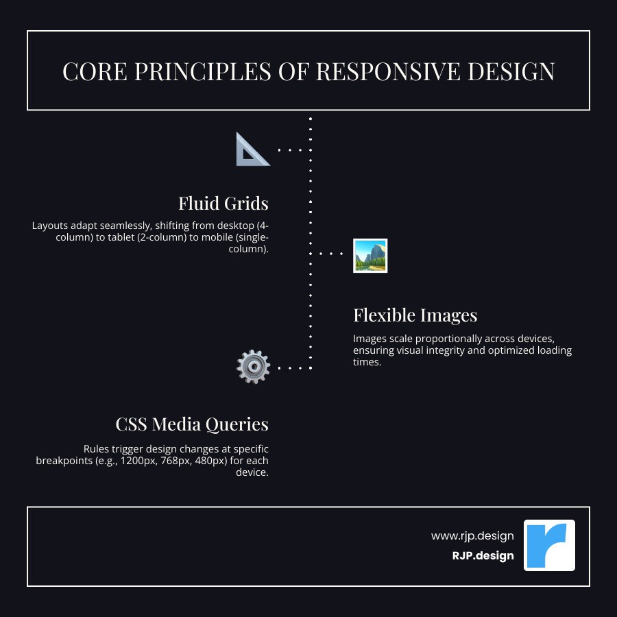
Fluid grids that automatically adjust to any screen size
Flexible images that scale without losing quality
CSS media queries that optimize layouts for different devices
Mobile-first design that prioritizes the majority of users
Intuitive navigation that works perfectly on touch screens
The stakes couldn’t be higher for your business. Over 60% of website visits now happen on mobile devices, and Google’s mobile-first indexing means your site’s mobile version directly impacts your search rankings. Award-winning responsive sites solve this challenge by creating a single, adaptable website that delivers consistent excellence across all devices.
As Ross Plumer, I’ve helped businesses market over $20 million in revenue by creating award winning responsive websites that blend psychology-driven design with technical excellence. My experience working with high-revenue companies has shown me exactly what separates good responsive sites from award-worthy ones that drive real results.
Simple guide to award winning responsive websites terms:
What is Responsive Web Design and Why is it Crucial?
Picture this: you’re browsing a website on your phone, and everything looks perfect. The text is readable, buttons are easy to tap, and you don’t need to pinch and zoom to see anything. Then you open the same site on your laptop, and it still looks amazing—just arranged differently to fit the bigger screen. That’s the magic of responsive web design in action.
Responsive web design is essentially creating one website that automatically adjusts to look great on any device. It’s like having a smart outfit that perfectly fits whether you’re tall or short, without needing separate clothing for each size. This brilliant concept was introduced by Ethan Marcotte, and it’s revolutionized how we think about web design.
The secret sauce behind responsive design lies in three core principles working together seamlessly. Fluid grids replace fixed pixel measurements with flexible percentages, so your website’s layout stretches and shrinks naturally with the screen size. Flexible images scale up or down proportionally, preventing those awkward moments where photos get cut off or look blurry. And CSS media queries act like the brain of the operation, telling different parts of your website exactly how to behave on different devices.
Think of media queries as smart instructions. They might tell your navigation menu to transform into a compact hamburger icon on mobile phones, or reorganize your content from multiple columns on desktop to a single, easy-to-scroll column on tablets.
Key Characteristics of Award-Winning Responsive Websites
What transforms a basic responsive site into an award winning responsive website? It’s all about creating an experience so smooth that users never have to think about what device they’re using.
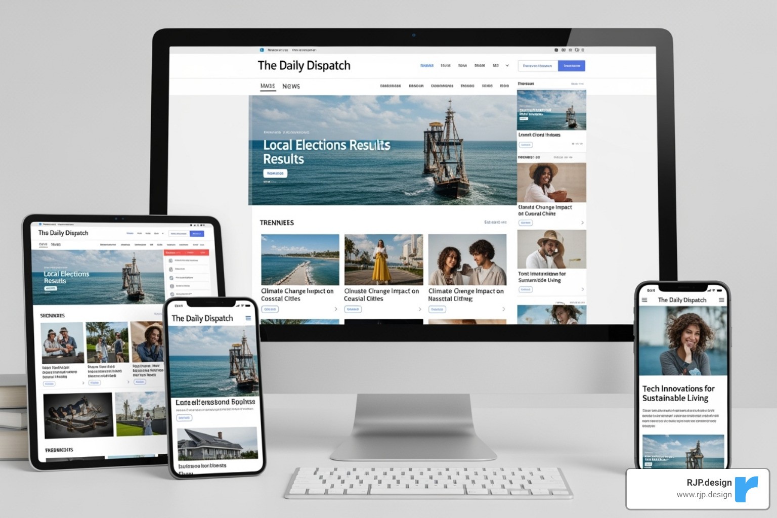
The best responsive sites achieve seamless adaptation—everything flows naturally from desktop to tablet to phone without any jarring jumps or broken layouts. When you’re scrolling through content, the transition feels effortless and intuitive.
Improved SEO is another hallmark of excellence. Google’s mobile-first indexing means they look at your mobile site first when deciding how to rank you in search results. Since mobile traffic now accounts for over 60% of all website visits, having a responsive design isn’t just nice to have—it’s essential for being found online.
User experience prioritization sets award-winning sites apart from the rest. These sites follow a mobile-first approach, making sure the most important information and actions are front and center on smaller screens. Buttons are thumb-friendly, text is readable without squinting, and navigation makes sense whether you’re tapping or clicking.
Here’s how responsive design compares to simply being mobile-friendly:
Feature | Mobile-Friendly Design | Responsive Web Design |
|---|---|---|
Layout Adaptation | Same version, just scaled down; often requires zooming. | Dynamic layouts, optimized for specific screen sizes. |
User Experience | Can be clunky, hard to read/steer on mobile. | Seamless, intuitive, and consistent across all devices. |
Technical Approach | Often a separate mobile site or simple scaling. | Uses fluid grids, flexible images, media queries. |
Maintenance | Potentially two separate sites to manage. | Single codebase, easier to update and maintain. |
SEO Impact | May have duplicate content issues; less favored by Google. | Google-preferred; single URL, improved crawlability. |
Want to dive deeper into the technical aspects? Check out our detailed guide on responsive web design for more insights.
The Business Benefits of a Flawless Responsive Site
Let’s talk about what really matters—how an award winning responsive website impacts your business success. The benefits aren’t just theoretical; they show up directly in your analytics and your bank account.
Increased mobile traffic is perhaps the most obvious advantage. With mobile device usage continuing to climb and representing the majority of web browsing, a responsive site ensures you’re not missing out on potential customers who might bounce from a poorly designed mobile experience.
Lower bounce rates happen naturally when visitors can easily read and steer your site regardless of their device. When someone lands on your page and everything works perfectly, they’re much more likely to stick around and explore what you have to offer.
Higher conversion rates follow naturally from better user experiences. Whether someone is trying to make a purchase, fill out a contact form, or sign up for your newsletter, a smooth, responsive design removes friction from the process. Users are significantly more likely to complete their intended action when the process is intuitive and enjoyable.
Improved brand perception might be less measurable, but it’s incredibly valuable. A modern, well-functioning website signals professionalism and attention to detail. It shows visitors that you care about their experience and stay current with technology trends.
Google’s mobile-first indexing makes responsive design crucial for search visibility. Google primarily uses your mobile site’s content and structure for ranking decisions. This also connects to Core Web Vitals—Google’s measurements of user experience factors like loading speed, interactivity, and visual stability.
The statistics speak for themselves: mobile traffic statistics show that over 60% of website visits now happen on mobile devices. Ignoring responsive design means potentially losing more than half your audience before they even see what you offer.
A responsive website isn’t just about keeping up with trends—it’s about creating a foundation for business growth. When your site works beautifully for everyone, regardless of how they access it, you’re setting yourself up for success.
Learn how responsive design can improve your local marketing efforts: Mastering Local SEO Using Video to Dominate Local Search.
A Showcase of Award-Winning Responsive Websites
Ready to see what makes a website truly exceptional? Let’s explore some real-world examples of award winning responsive websites that don’t just look stunning—they actually work brilliantly for their users and businesses.
These sites prove that great responsive design isn’t about fancy tricks or complex code. It’s about understanding your users and creating experiences that feel natural, whether someone’s browsing on their morning commute or relaxing with their laptop at home.
E-commerce & Retail Excellence
The most successful e-commerce sites understand one crucial truth: mobile shoppers want to find what they need quickly and buy it easily. These award winning responsive websites master the art of content prioritization and user intent.
Take modern e-commerce stores that use flexible visuals to showcase products beautifully on any screen size. They understand that a stunning product photo on desktop needs to remain compelling when viewed on a smartphone during a quick lunch break.
Handcrafted goods marketplaces excel by using fluid grid layouts that transform multiple product columns on desktop into a single, scrollable column on mobile. The magic happens in how they handle navigation—what starts as a full menu bar gracefully becomes a scaled-down navigation system, often prioritizing search functionality because mobile users typically know what they’re looking for.
Specialty coffee retailers showcase how clean layouts can work across devices. They often use the hamburger menu approach on mobile, but they do it thoughtfully. Instead of hiding everything, they keep the most important elements—like “Order Now” or “Find Locations”—easily accessible.
Even boutique resort websites with their intricate design patterns prove that complex doesn’t have to mean complicated. They use mobile-first video adaptation, replacing heavy desktop videos with optimized versions or static images that still capture the luxury experience without killing mobile performance.
Media & Information Hubs
Content-heavy sites face a unique challenge: how do you present tons of information without overwhelming users on smaller screens? The best examples show us exactly how it’s done.
Global news platforms demonstrate masterful newspaper layout adaptation. They understand content hierarchy like no one else—breaking news stays prominent, while secondary stories scale appropriately. Their mobile versions often feature a clear subscription CTA that doesn’t feel pushy, just naturally integrated into the reading experience.
Tech magazines tackle the complex challenge of multi-column layouts on desktop that need to work on narrow mobile screens. Their ad display strategy is particularly clever—instead of cramming desktop ads into mobile spaces, they redesign ad placements to feel natural and unobtrusive.
Design resource hubs prove that even content-rich designs can maintain excellent readability across all devices. They use generous white space and thoughtful typography that makes long articles feel approachable, whether you’re reading on a 27-inch monitor or a 5-inch phone screen.
For more insights into our capabilities and successful projects, explore More info about our work and results.
Inspiring Agency & Portfolio Sites

Creative agencies and portfolio sites have the most fun with responsive design—and often create the most memorable experiences. These award winning responsive websites show personality while maintaining perfect functionality.
Award-winning design studios often feature impressive hero videos on desktop that could easily overwhelm mobile users. Instead, they implement smart vertical navigation systems and replace heavy videos with compelling static visuals that load instantly on mobile devices.
Visual media studios face the challenge of showcasing dynamic visuals across different screen sizes. Their portfolio grids adapt beautifully—what might be a 4-column gallery on desktop becomes a single-column showcase on mobile, ensuring each project gets the attention it deserves.
Interactive experience agencies create what feels like a cloned experience across devices, but it’s actually carefully crafted responsive design. They ensure the seamless transition between desktop and mobile feels natural, not jarring.
Innovative digital studios push the boundaries with interactive design while maintaining user-friendly navigation. They prove that creative doesn’t have to mean confusing—even the most artistic sites can be intuitive to use.
At RJP.design, we pride ourselves on creating compelling and effective online presences for businesses. Our approach to design ensures your brand stands out: RJP.design Creative Web Design Agency.
How to Create an Award-Worthy Responsive Website
Building an award winning responsive website isn’t just about technical know-how; it’s about understanding your users and creating something that truly serves them. After working with countless businesses to improve their online presence, I’ve learned that the best responsive sites combine strategic thinking with genuine care for the user experience.
Best Practices for Effective Responsive Design
Creating exceptional responsive websites starts with shifting your mindset. Instead of thinking “desktop first,” we need to accept a mobile-first approach. This means designing for the smallest screen first, which naturally forces you to focus on what really matters to your users.
When you start with mobile, something magical happens. You can’t rely on endless sidebar content or sprawling navigation menus. You have to prioritize content ruthlessly, keeping only what your visitors truly need. This constraint actually makes your site better for everyone, including desktop users who appreciate clean, focused experiences.
Performance optimization becomes critical when you’re serving users on mobile networks. Every image needs to earn its place, and every line of code should serve a purpose. We use techniques like responsive images with srcset and the <picture> element to serve the right image size for each device, ensuring fast loading without sacrificing visual quality.
Touch-friendly design might seem obvious, but it’s amazing how many sites still feature tiny buttons that require surgical precision to tap. We design all interactive elements to be at least 44×44 pixels—comfortable for thumbs of all sizes. We also consider the natural “thumb zone” on larger phones, placing important actions where they’re easily reachable.
Clear navigation becomes an art form on mobile devices. While hamburger menus are common, they’re not always the best solution. Sometimes a prominent search bar serves mobile users better than hiding navigation behind an icon. The key is understanding how your specific audience uses your site on different devices.
Strategic breakpoints help us optimize the experience at common screen sizes. We typically focus on three main breakpoints, using CSS media queries to adapt layouts for phones, tablets, and desktops. But remember—these breakpoints should serve your content, not dictate it.
Key principles that guide our responsive design process include using relative units for fluid layouts, implementing proper max-width for images, designing appropriately sized touch targets, prioritizing content based on user intent, optimizing all media for fast loading, testing thoroughly across devices, simplifying forms for mobile usability, and considering how user behavior changes across different screen sizes.
For deeper insights into creating effective websites, explore our guide on Effective Web Design. And if you want to master the technical side of screen size optimization, check out our detailed article on Breakpoints in Responsive Web Design.
Common Challenges in Building Award-Winning Responsive Websites
Even with the best intentions, creating an award winning responsive website presents real challenges. The good news? We’ve steerd these waters many times and can help you avoid the common pitfalls.
Navigation complexity often becomes the biggest headache. You might have a beautiful multi-level menu on desktop, but how do you make that work on a 5-inch screen? Sometimes the hamburger menu works perfectly. Other times, we find that restructuring the entire navigation approach—maybe emphasizing search or creating category-based entry points—serves users better.
Performance bottlenecks can sneak up on you. That stunning hero video might look amazing on desktop, but it could kill the mobile experience. We carefully balance visual impact with loading speed, often creating different experiences for different devices while maintaining the same brand feel.
Image optimization requires both technical skill and artistic judgment. Serving a massive desktop image to a mobile device wastes bandwidth and frustrates users. But serving a tiny image to a high-resolution desktop monitor looks unprofessional. We use modern responsive image techniques to deliver the perfect image for every situation.
Testing across devices feels overwhelming when you consider the hundreds of device and browser combinations out there. We focus on the most common devices your audience actually uses, supplemented by thorough testing tools that simulate various screen sizes and capabilities.
Maintaining a consistent brand experience while adapting layouts can feel like walking a tightrope. Your brand needs to feel cohesive whether someone visits on their phone during their commute or on their desktop at work. This requires careful planning of visual elements, messaging hierarchy, and interaction patterns.
These challenges are real, but they’re absolutely solvable with the right approach and experience. If you’re working with budget constraints, our practical guide on Revamp Your Mobile Site on a Budget: Affordable Redesign Tips offers actionable strategies for improving your mobile experience without breaking the bank.
The key to overcoming these challenges is remembering that responsive design is ultimately about people, not just pixels. When you focus on creating genuinely helpful experiences for your users, the technical solutions tend to follow naturally.
Frequently Asked Questions about Responsive Websites
Let’s address the most common questions we hear from business owners about award winning responsive websites. These are the real concerns that keep entrepreneurs up at night when they’re thinking about their online presence.
How does responsive design impact SEO?
Here’s the truth: responsive design can make or break your search rankings. Google has made it crystal clear that they prefer responsive websites, and there are solid reasons why.
Mobile-first indexing means Google looks at your mobile site first when deciding where to rank you. If your mobile experience is clunky or hard to use, your rankings suffer across all devices. It’s like having a job interview where they judge you based on your worst day rather than your best.
The beauty of responsive design lies in its single URL approach. Instead of juggling separate mobile and desktop sites (which can confuse search engines), you have one clean, consistent web address. This eliminates duplicate content issues and makes it much easier for Google to understand and rank your site.
User experience signals are where responsive design really shines. When visitors land on a site that works perfectly on their device, they stick around longer and explore more pages. Google notices these positive behaviors – lower bounce rates, longer session times, and higher engagement all boost your search rankings.
Core Web Vitals measure how fast your site loads, how quickly users can interact with it, and how stable the layout is. Well-built responsive sites naturally perform better on these metrics because they’re designed from the ground up to work smoothly on every device.
What is the difference between responsive and adaptive design?
Think of responsive design as water and adaptive design as ice cubes. Water (responsive) flows smoothly into any container, adapting continuously to fit perfectly. Ice cubes (adaptive) come in fixed shapes that work well in specific situations.
Responsive design uses fluid grids that stretch and compress smoothly as screen sizes change. Your content flows naturally from a four-column desktop layout to a single-column mobile view, adjusting at every point in between.
Adaptive design works with breakpoints – it detects your device size and serves up one of several pre-built layouts designed for that specific screen. You might have distinct layouts for desktop, tablet, and phone, but nothing in between.
Client-side adaptation happens in responsive design – your browser does the work of adjusting the layout. With adaptive design, server-side detection often determines which layout to serve before it even reaches your device.
For most businesses, responsive design offers better user experience because it handles the endless variety of device sizes we see today. There are tablets that are almost laptop-sized, phones that are nearly tablet-sized, and everything in between.
How do you prioritize content for a mobile-first experience?
Creating a mobile-first experience means getting inside your users’ heads. Mobile visitors are often on the go, looking for specific information quickly, or multitasking while browsing your site.
Identify user goals by asking what someone really needs when they visit your page on their phone. A restaurant’s mobile visitors want to see the menu, hours, and location immediately – not your company history or awards. Put yourself in their shoes and prioritize ruthlessly.
Key information first is non-negotiable. Your most important content and primary call-to-action should be visible without scrolling. If someone has to hunt for your phone number or main service offering, you’ve already lost them.
Simplify navigation by focusing on the essential paths through your site. That comprehensive menu that works great on desktop might need to become a streamlined hamburger menu or even a prominent search bar on mobile. Sometimes the best navigation is the one that gets out of the user’s way.
Reduce clutter means every element on your mobile page needs to earn its place. That decorative image might look nice on desktop, but if it pushes your main content below the fold on mobile, it’s got to go. Focus on primary CTAs by making your most important buttons large, clear, and impossible to miss.
The goal isn’t just to make everything smaller – it’s to make everything better for the way people actually use their mobile devices.
Your Partner in Professional Web Design
Creating an award winning responsive website goes far beyond just making sure your site works on phones and tablets. It’s about building the very foundation of how your business connects with customers online. The examples we’ve explored throughout this guide represent the perfect marriage of beautiful design and rock-solid functionality—websites that don’t just look amazing but actually help businesses grow.
When you see these exceptional sites adapting seamlessly from desktop to mobile, what you’re really witnessing is thoughtful planning and expert execution. Every fluid grid adjustment, every perfectly scaled image, and every intuitive navigation change represents countless hours of strategic thinking and technical craftsmanship.
The reality is simple: your website is often the first impression potential customers have of your business. If they can’t easily steer your site on their phone during their morning commute, or if your beautiful desktop design turns into a confusing mess on their tablet, you’ve likely lost them forever. That’s why responsive design isn’t optional anymore—it’s absolutely essential.
At RJP.design, we understand that behind every great website is a business owner who wants to connect with their customers and grow their company. That’s exactly why our down-to-earth team focuses on creating professional web designs that work beautifully on every device while driving real results for your business.
We don’t just build websites that look pretty. We create award winning responsive websites that help you capture more leads, increase sales, and build stronger relationships with your customers. Because at the end of the day, that’s what really matters for your business success.

