Web
The Ultimate Guide to Breakpoints in Responsive Web Design
Jun 9, 2025

Breakpoints in Responsive Web Design: 5 Essential Success Tips 2025
Understanding the Backbone of Adaptive Websites
Breakpoints in responsive web design are specific screen widths where your website’s layout changes to provide optimal viewing experience across devices. They’re the foundation of modern web design, ensuring your site looks great whether viewed on a smartphone, tablet, or desktop.
Quick Answer: What are breakpoints in responsive web design?
What | Definition |
|---|---|
Breakpoints | Specific pixel values (e.g., 768px, 992px) in CSS media queries where layouts adapt to different screen sizes |
Common Ranges | Mobile (320-480px), Tablet (481-768px), Desktop (769-1024px), Large (1025px+) |
Implementation | Using CSS media queries like |
Best Practice | Mobile-first approach, content-driven breakpoints rather than device-specific |
In today’s digital landscape, over 70% of global internet traffic comes from mobile devices. This makes breakpoints in responsive web design absolutely essential for delivering a seamless user experience. Without proper breakpoints, your website might appear broken or difficult to steer on certain devices, leading to frustrated users and lost business opportunities.
The concept is simple: as screen sizes change, your layout needs to adapt. But implementing this effectively requires strategic thinking about content priorities, user behavior, and visual hierarchy.
I’m Ross Plumer, a digital marketing expert with extensive experience implementing breakpoints in responsive web design for businesses that have marketed over $20 million in revenue. My approach combines technical expertise with business strategy to ensure your website performs flawlessly across all devices.
Essential breakpoints in responsive web design terms:
– easy responsive css
– good mobile website design
– responsive website tailwind
Why This Guide Matters
With smartphone traffic now accounting for over 70% of global internet usage, having a responsive website isn’t just nice to have—it’s essential. Google’s mobile-first indexing means your site’s mobile experience directly impacts your search rankings. Plus, users simply expect websites to work seamlessly across all their devices.
At RJP.design, we’ve seen businesses transform their online presence by implementing proper responsive design strategies. Our down-to-earth approach focuses on practical solutions that deliver real results for our clients.
Breakpoints in Responsive Web Design 101
Think of breakpoints in responsive web design as the magic moments when your website transforms itself to look perfect on different screens. These aren’t just technical details – they’re the secret sauce that makes websites feel natural whether you’re browsing on your phone during your morning commute or at your desk on a giant monitor.
When we build responsive websites at RJP.design, we’re not just making things look pretty. We’re creating experiences that actually work for real people on real devices. That means considering everything from how easy it is to tap buttons on a tiny screen to how text flows across a widescreen display.
What Are Breakpoints in Responsive Web Design?
Breakpoints in responsive web design are simply the specific screen widths where your website’s layout changes to fit the viewing environment. It’s like having a wardrobe that automatically adjusts to fit perfectly whether you’ve gained or lost weight!
We implement these magical transitions using CSS media queries – little snippets of code that say “when the screen is this wide, do this instead.” Here’s what that looks like in action:
“`css
/ Base styles for mobile first approach /
.container {
width: 100%;
padding: 15px;
}
/ Styles for screens 768px and wider /
@media (min-width: 768px) {
.container {
width: 750px;
padding: 0;
}
}
“`
In plain English, this tells your website: “Start with a full-width layout that works on phones, then when there’s at least 768 pixels of screen space available, switch to a different arrangement.” That 768px point is our breakpoint – the moment of change.
Most modern designers use a min-width approach (starting with mobile and scaling up) rather than max-width (starting with desktop and scaling down). This “mobile-first” mindset ensures the core experience works on the smallest screens, where most of your visitors are likely browsing.
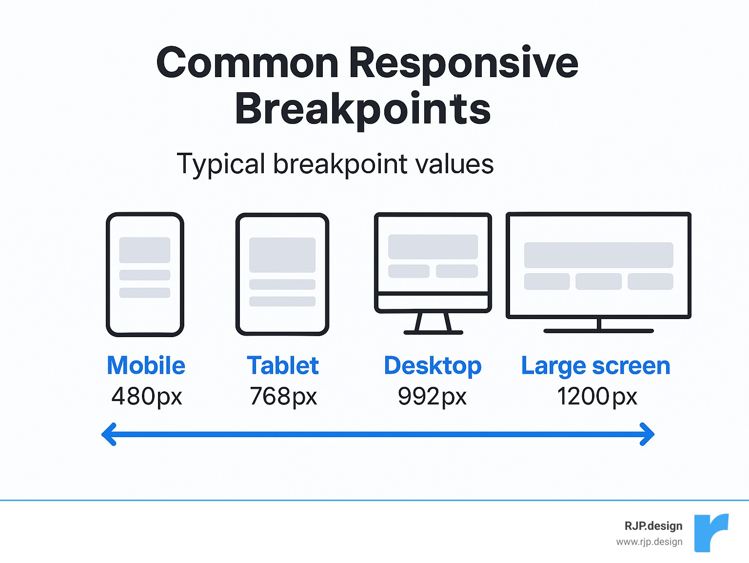
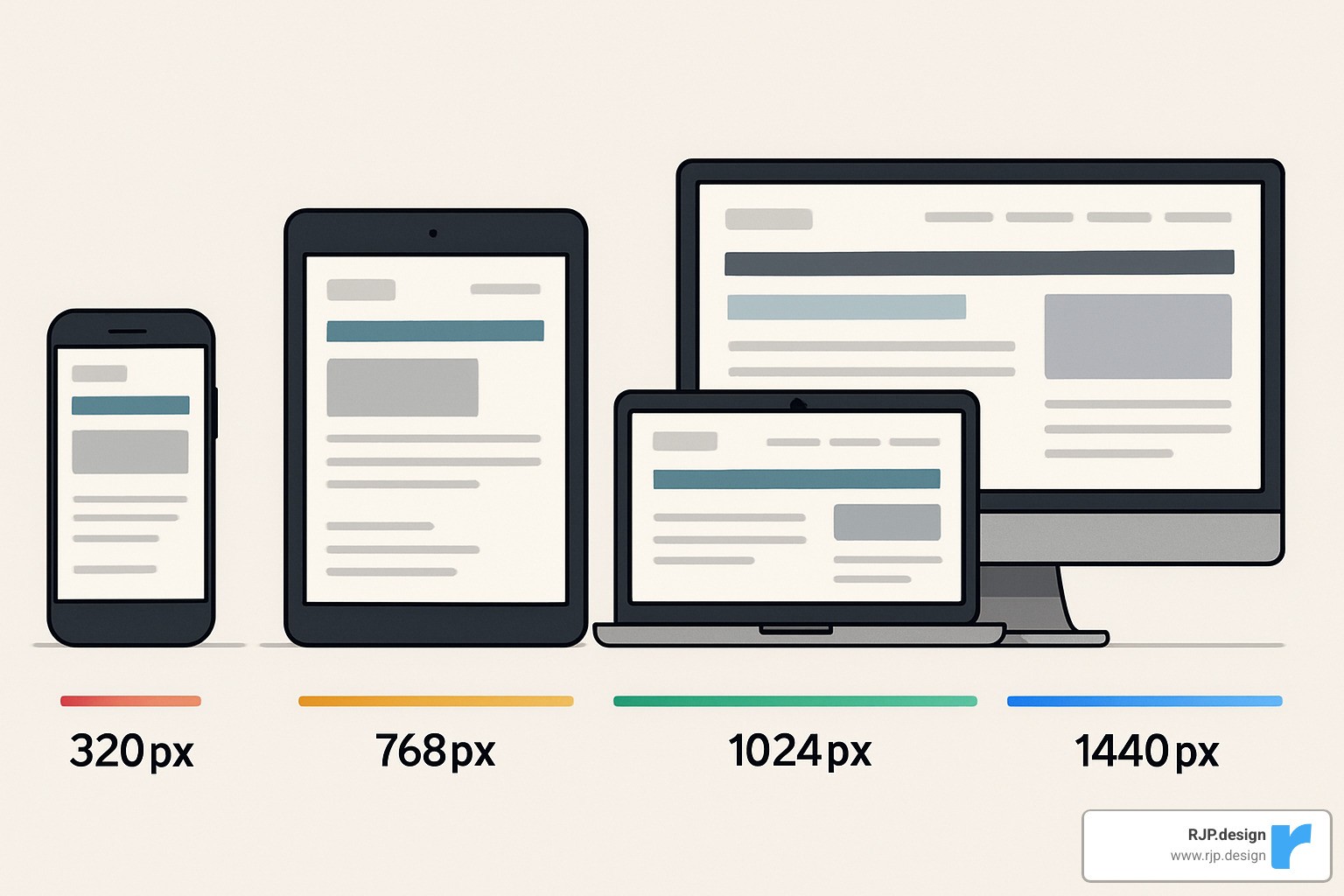
Four Common Ranges (Mobile-Tablet-Desktop-Large)
While every website is unique, most responsive designs follow a pattern of four main screen size ranges:
Extra Small/Mobile: 320px-480px
Perfect for smartphones held vertically. Here we focus on the essentials – simple layouts, larger touch targets, and only the most critical content.Small/Tablet: 481px-768px
As screens get a bit roomier, we can start introducing two-column layouts and showing a bit more content without overwhelming the user.Medium/Desktop: 769px-1024px
Now we’re in tablet landscape and small desktop territory. Multi-column layouts shine here, and we can introduce more sophisticated navigation options.Large/Extra Large: 1025px-1440px and beyond
With all this screen real estate, we can really spread out! Wide layouts, advanced features, and thoughtful use of white space make for a premium experience.
The beauty of these ranges is that they give you a starting point, but they’re not set in stone. Devices are constantly evolving – remember when a 4-inch phone seemed huge? Now it’s tiny! That’s why it’s worth checking out the Mozilla Developer Network’s excellent documentation for the latest best practices.
At RJP.design, we’ve found that these common breakpoints work wonderfully as a foundation, but the real magic happens when we fine-tune them based on your specific content and audience. After all, responsive design isn’t about devices – it’s about people.
Choosing & Implementing the Right Breakpoints
Picking the perfect breakpoints for your website isn’t an exact science—it’s more like cooking a favorite recipe where you adjust ingredients to taste. While those common ranges we discussed earlier give you a solid starting point, your specific project might need some tweaking based on who’s visiting your site, what content you’re sharing, and your overall design vision.
Device-Based vs Content-Based Breakpoints in Responsive Web Design
When deciding where your layout should shift, you’ve got two main paths to consider:
The traditional device-based approach targets common screen sizes that most people use. It’s straightforward—you plan around standard dimensions like 320px, 768px, and 1024px. This method makes it easier to explain your design choices to clients and team members, plus it aligns nicely with industry standards most developers understand.
The more modern content-based approach, however, focuses on your actual website content. Instead of arbitrary device widths, you add breakpoints in responsive web design wherever your layout starts to look awkward or “breaks.” This creates a more custom experience that responds to what your users actually need to see.
In the real world, most successful websites use a bit of both approaches. We typically start with common device breakpoints as a foundation, then fine-tune with custom breakpoints where the content demands it.
You might want to add a new breakpoint when:
– Your text lines become too long (harder to read) or too short (choppy)
– Navigation menus start feeling cramped or too spread out
– Images lose impact or overwhelm other content
– Important buttons or calls-to-action become hard to spot
– The balance of white space feels off
At RJP.design, we always check your audience analytics before making recommendations. If we see that 40% of your visitors are using tablets, you better believe we’ll spend extra time perfecting how your site looks on those mid-sized screens!
Framework Defaults & Custom Sass Maps
Most popular CSS frameworks come with their own set of breakpoints built in. These can save you tons of time and brain power:
Framework | Extra Small | Small | Medium | Large | Extra Large | XXL |
|---|---|---|---|---|---|---|
Bootstrap 5 | < 576px | ≥ 576px | ≥ 768px | ≥ 992px | ≥ 1200px | ≥ 1400px |
Tailwind CSS | Default | ≥ 640px | ≥ 768px | ≥ 1024px | ≥ 1280px | ≥ 1536px |
Foundation 6 | Default | ≥ 640px | ≥ 1024px | ≥ 1200px | ≥ 1440px | – |
If you’re using Sass with Bootstrap (something we love for bigger projects), you can customize these breakpoints to fit your specific needs:
scss
$grid-breakpoints: (
xs: 0,
sm: 576px,
md: 768px,
lg: 992px,
xl: 1200px,
xxl: 1400px
);
This neat trick lets you keep consistent naming (sm, md, lg) while tweaking the actual pixel values to match what your project needs.
Practical CSS Media Query Patterns
Let’s look at some everyday patterns for implementing breakpoints in responsive web design that we use regularly at RJP.design:
When we build sites, we almost always take a mobile-first approach. This means starting with styles for the smallest screens, then gradually adding complexity as screens get larger:
“`css
/ Base styles for all devices /
.element {
font-size: 16px;
padding: 10px;
}
/ Tablet and up /
@media (min-width: 768px) {
.element {
font-size: 18px;
padding: 15px;
}
}
/ Desktop and up /
@media (min-width: 1024px) {
.element {
font-size: 20px;
padding: 20px;
}
}
“`
Sometimes you need to target just a specific range of devices. For this, we use both min-width and max-width together:
css
/* Only apply to tablets */
@media (min-width: 768px) and (max-width: 1023px) {
.element {
background-color: lightblue;
}
}
Modern browsers now support a more readable range syntax that feels more like natural language:
css
/* Only apply to tablets */
@media (768px <= width <= 1023px) {
.element {
background-color: lightblue;
}
}
One of our favorite tricks is using relative units like ’em’ for breakpoints. This makes your site more accessible because it respects users’ font size preferences:
“`css
/ Base styles /
.container {
padding: 1rem;
}
/ Roughly 768px at default browser font size /
@media (min-width: 48em) {
.container {
padding: 2rem;
}
}
“`
We’ve found these approaches work wonderfully for our clients’ websites, creating smooth experiences across all devices. If you’re hungry for more responsive techniques, take a peek at our guide to easy responsive CSS.
Advanced Responsive Techniques Beyond Breakpoints
Traditional breakpoints are just the beginning of responsive design. Today’s CSS gives us even more powerful tools that can work alongside your breakpoints—or sometimes even reduce how many you need!
When to Move Past Traditional Breakpoints
While breakpoints work wonderfully for overall page layouts, sometimes your individual components need their own responsive behavior. This is where newer techniques really shine.
Container queries have been a designer’s dream for years, and they’re finally here! Unlike media queries that respond to the entire viewport, container queries adapt based on their parent element’s size:
“`css
/ Only supported in modern browsers /
.card-container {
container-type: inline-size;
}
@container (min-width: 400px) {
.card {
display: flex;
}
}
“`
This is perfect for those reusable components that might appear in different contexts—like a card that shows up in both your main content area and a narrow sidebar. The card can adapt based on its available space, not just the overall screen size.
Typography can also become more fluid with modern CSS. Instead of changing font sizes at specific breakpoints in responsive web design, you can create text that scales smoothly:
css
h1 {
/* Min size: 2rem, preferred: 5vw, max: 4rem */
font-size: clamp(2rem, 5vw, 4rem);
}
This creates headings that grow and shrink naturally with the viewport, but never get too tiny or too enormous. It’s like having infinite breakpoints just for your text!
CSS Grid and Flexbox are also game-changers for responsive layouts. Look at this simple grid that automatically adjusts without any media queries:
css
/* Auto-adjusting grid with minimum column width */
.grid {
display: grid;
grid-template-columns: repeat(auto-fill, minmax(250px, 1fr));
gap: 20px;
}
This creates as many 250px columns as will fit in the container, automatically adapting from one column on mobile to multiple columns on larger screens. No breakpoints needed!
For even more techniques like these, check out our guide to easy responsive design.
Performance & Accessibility Considerations
A truly responsive site isn’t just about looking good—it needs to perform well and work for everyone.
For performance, consider using responsive images with the srcset attribute so mobile users aren’t downloading desktop-sized images. Modern formats like WebP can also dramatically reduce file sizes. And remember that each CSS override at your breakpoints in responsive web design adds to your stylesheet size, so keep them lean and purposeful.
Accessibility is equally important across all screen sizes. Make sure touch targets (like buttons) are at least 44×44px on mobile—nobody wants to play “tap the tiny button”! Test your color contrast at all sizes, since smaller text needs higher contrast to remain readable. And always maintain a logical focus order for keyboard users as your layout shifts between breakpoints.
At RJP.design, we believe a website isn’t truly responsive unless it works for everyone. Our down-to-earth approach ensures your site performs beautifully and remains accessible to all users, regardless of their device or abilities. We consider the whole picture—not just how it looks, but how it works in the real world.
Testing, Analytics & Optimization
Let’s face it – your website might look perfect on your laptop, but how does it perform on your mom’s old iPad or your friend’s brand-new phone? Testing across devices isn’t just a nice-to-have; it’s essential for making sure your breakpoints in responsive web design actually work in the real world.

At RJP.design, we’ve seen countless “responsive” websites that fall apart on certain devices. That’s why we’re passionate about thorough testing – because your users don’t care about your code; they care about whether they can read your content and click your buttons!
Validating Breakpoints Across Devices
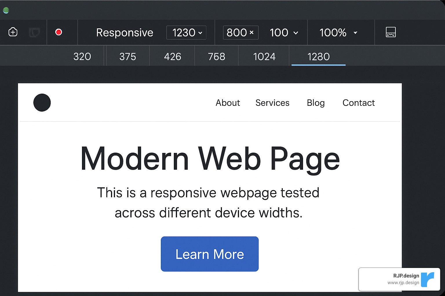
Browser developer tools are fantastic for initial testing – both Chrome and Firefox offer excellent responsive design modes that let you quickly check how your site behaves at different sizes. But they’re just the starting point.
Nothing beats testing on actual devices. We keep a drawer full of phones and tablets at the office (some team members call it my “device graveyard”) specifically for testing. Those older Android tablets and iPhones from three generations ago? Your customers are still using them!
When we can’t physically test on every device, services like BrowserStack become our best friends. They let us check hundreds of real device configurations without having to buy them all. This is particularly valuable for catching those quirky rendering issues that only happen on specific browser/device combinations.
One of our favorite testing techniques is the “slow resize” – simply grabbing the corner of your browser window and gradually making it smaller or larger. This reveals those awkward in-between states where content might jump, overlap, or become unreadable. It’s surprisingly effective at catching responsive design flaws!
Don’t forget to test with network throttling turned on. Many users will access your site on spotty connections, and responsive images or layout shifts can behave differently when bandwidth is limited.
For more comprehensive guidance, check out our responsive web design services page.
Using Analytics to Refine Breakpoint Strategy
Your website analytics aren’t just numbers – they’re the voice of your users telling you exactly how they experience your site.
Start by digging into your device statistics. What screen resolutions are most common among your visitors? We recently helped a client find that over 30% of their traffic came from a specific tablet model we hadn’t optimized for. By adding a custom breakpoint, their conversion rate jumped almost immediately.
User behavior patterns by device can reveal hidden problems. If your bounce rate is significantly higher on mobile than desktop, that’s a red flag that your responsive design might not be serving those users well. Similarly, if certain pages have unusually high exit rates on specific devices, that’s where you should focus your optimization efforts.
Heatmap tools add another layer of insight by showing exactly how users interact with your site at different screen sizes. We’ve seen cases where buttons that looked perfectly clickable on mobile were being consistently missed by actual users – something we would never have finded without heatmap data.
Don’t be afraid to A/B test different responsive approaches. For one e-commerce client, we tested two different mobile navigation patterns and found that one outperformed the other by 23% in terms of product page views. That kind of improvement would have been impossible to predict without testing.
At RJP.design, we don’t just set up your responsive breakpoints and call it a day. We help you establish an ongoing process of measurement and refinement, ensuring your site continues to perform brilliantly as device trends evolve and your business grows.
★+1 ★+1Track your progress – it’s free!
Frequently Asked Questions about Breakpoints in Responsive Web Design
How many breakpoints should I use?
One of the most common questions I hear from clients is about the “right” number of breakpoints to use. The truth is, there’s no magic number that works for everyone.
For most websites, simplicity wins. 2-3 breakpoints will serve you well for straightforward sites with clean layouts. More complex projects with intricate designs might need 3-5 breakpoints to properly adapt across device sizes.
Think of breakpoints like spices in cooking—you want just enough to improve the experience, but not so many that they overwhelm. Each additional breakpoint adds to your development time, testing requirements, and potential maintenance headaches down the road.
At RJP.design, we typically start with the essentials (mobile, tablet, desktop) and only add custom breakpoints when we see specific layout issues that need fixing. The goal isn’t pixel-perfect design at every possible screen width—it’s creating a fluid, enjoyable experience that works well across the device spectrum.
Do breakpoints impact SEO?
Absolutely! Breakpoints in responsive web design have a significant impact on your search rankings, though you might not immediately connect the two.
Google now uses mobile-first indexing, which means they primarily look at how your site performs on mobile devices when determining rankings. Well-implemented breakpoints ensure your content shines on smaller screens, directly affecting how Google perceives your site.
Poor breakpoint implementation often leads to layout shifts as pages load—what Google calls Cumulative Layout Shift (CLS). This frustrates users and hurts your Core Web Vitals scores, which are now official ranking factors.
There’s also the speed factor. A thoughtfully designed responsive site typically loads faster than one with clunky breakpoints and unnecessary code. Since page speed is a ranking factor, your breakpoint strategy directly impacts your SEO performance.
Perhaps most importantly, proper breakpoints in responsive web design create better user experiences. When visitors can easily steer and engage with your content regardless of device, they stay longer and bounce less—sending positive signals to Google that your site is valuable.
What’s the difference between media and container queries?
Think of media queries as the city planners of your website, while container queries are more like interior designers. They serve different purposes but work together to create a cohesive experience.
Media queries look at the big picture—the entire viewport. They’re perfect for major structural changes like rearranging your site’s main sections when someone switches from a phone to a tablet. They’ve been around for years and enjoy universal browser support. A typical media query looks like: @media (min-width: 768px) { ... }.
Container queries, the newer kid on the block, focus on specific components. They allow elements to adapt based on their parent container’s size rather than the overall screen size. This is incredibly useful for reusable components that might appear in different contexts throughout your site. They look something like: @container (min-width: 400px) { ... }.
The real magic happens when you use both: media queries to handle your overall page layout and container queries to fine-tune how individual components behave in their specific contexts. While container queries aren’t supported in every browser yet, their adoption is growing rapidly.
At RJP.design, we’re excited about how these complementary approaches are creating more fluid, adaptable websites that truly respond to users’ needs—no matter what device they’re using.
Conclusion
The journey through breakpoints in responsive web design reveals they truly are the backbone of modern websites. While we still rely on those trusty media queries to adapt layouts at different screen widths, the landscape continues to evolve alongside new CSS capabilities and the ever-changing device ecosystem.
Creating truly responsive experiences isn’t about following a rigid formula—it’s about thoughtfully combining several key elements. Start with strategic breakpoints that consider both standard device dimensions and your unique content needs. Then, leverage modern CSS techniques like Grid, Flexbox, and container queries to create fluid, adaptable layouts that respond beautifully across devices.
Don’t forget that great responsive design goes beyond just looking good. Pay attention to performance optimization to ensure your site loads quickly everywhere—mobile users especially will thank you! Equally important are accessibility considerations that make your content available to everyone, regardless of how they browse the web.
Perhaps most importantly, view responsive design as an ongoing relationship rather than a one-time project. Continuous testing and refinement based on analytics and real user feedback will keep your site feeling fresh and functional as new devices enter the market and user expectations evolve.
Here at RJP.design, we take a down-to-earth approach to responsive design. Our team brings both technical expertise and genuine care to every project, ensuring your website not only looks fantastic but performs exceptionally well for every visitor. We believe your online presence should truly represent your business, regardless of whether someone’s viewing it on a phone during their commute or on a desktop in their office.
Responsive design isn’t something you “finish”—it’s an ongoing commitment to providing the best possible user experience. As new devices emerge and browsing habits change, your responsive strategy should grow and adapt alongside them.
Ready to make sure your website delivers a seamless experience across all devices? Learn more about our web design and development services or reach out for a friendly chat about how we can help your business shine online. We promise no tech jargon—just honest advice and solutions that work.

