Web
Designing for the Small Screen: Top Mobile Website Examples
May 7, 2025

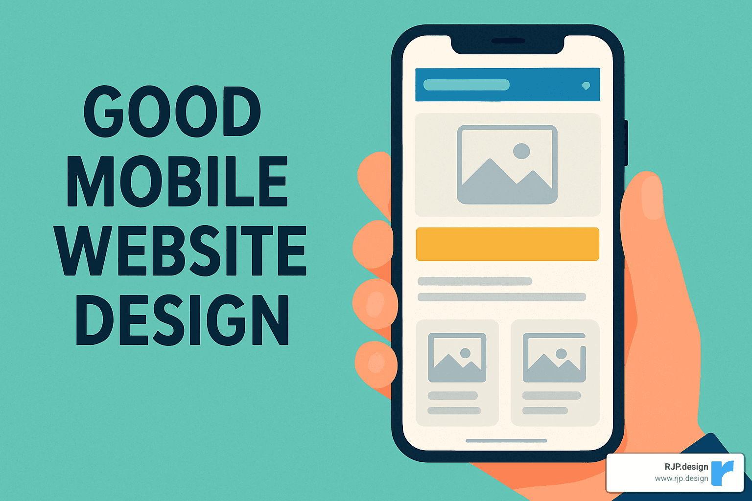
Good mobile website design: 3 Powerful Top Examples 2025
Mobile-First: Why Good Mobile Website Design Matters
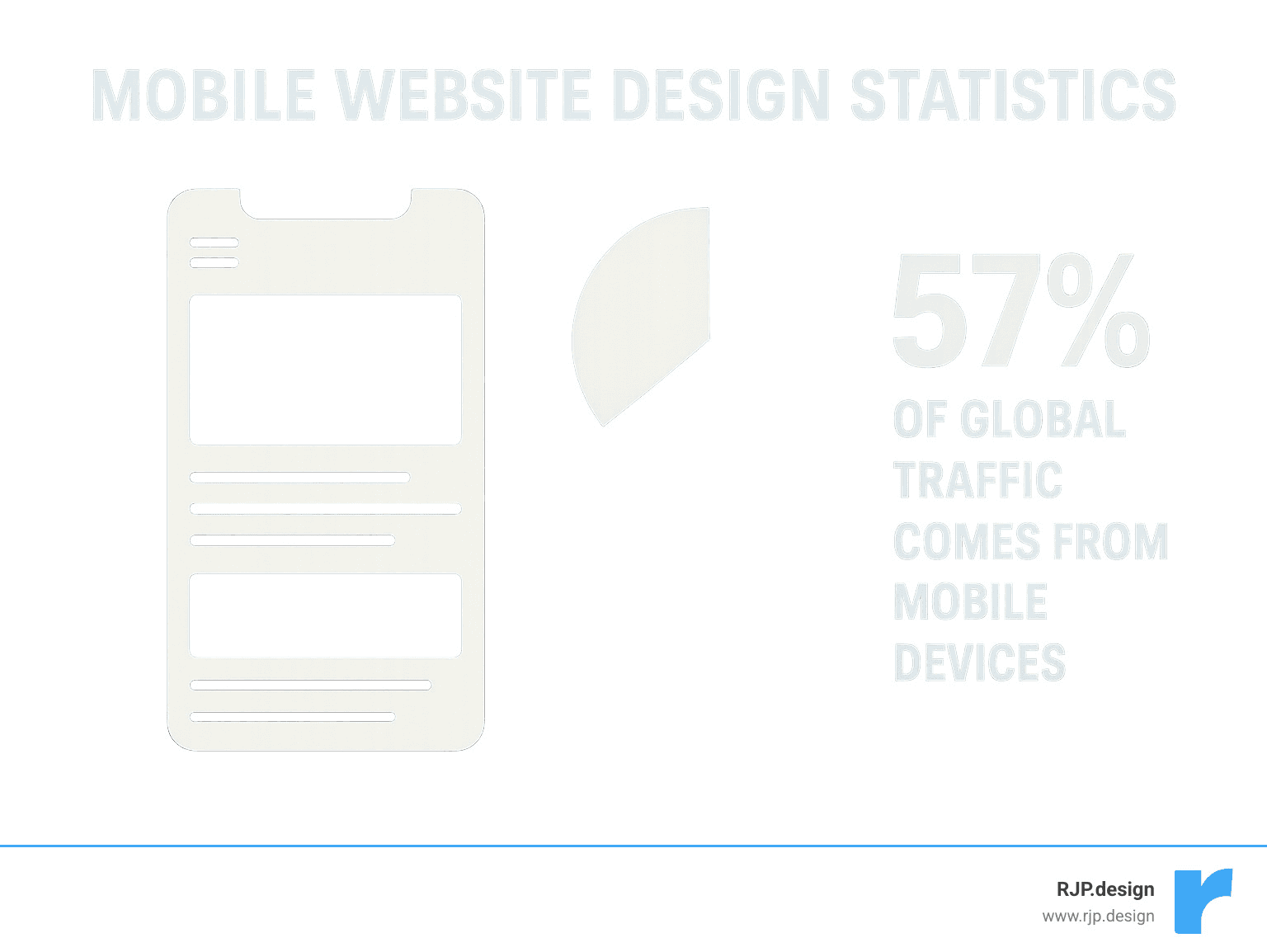
Good mobile website design is no longer optional for businesses today. With nearly 60% of global web traffic now coming from mobile devices, your site’s mobile experience directly impacts your online success.
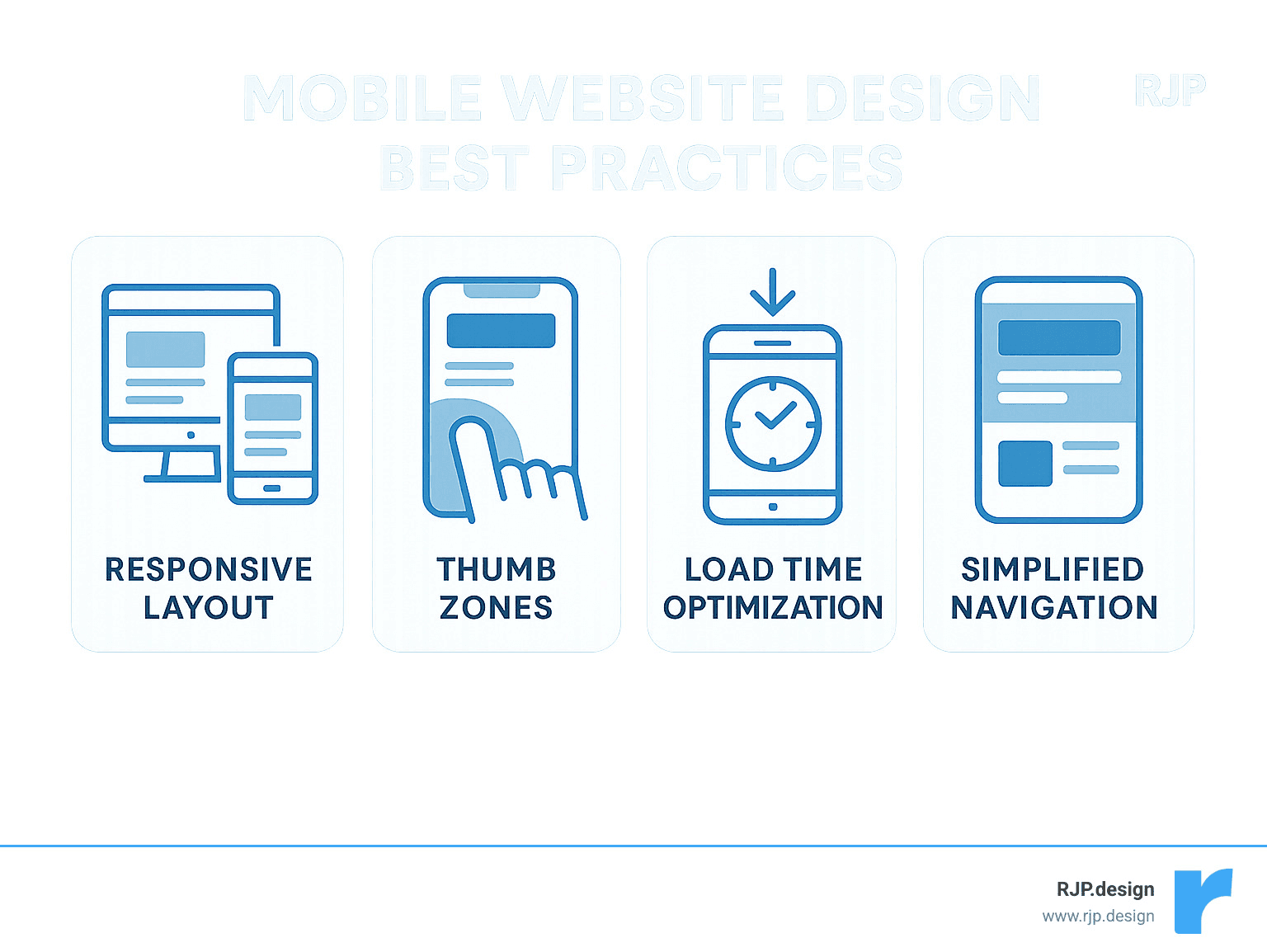
What Makes a Good Mobile Website Design:
Responsive layout that adapts to all screen sizes
Fast loading times (under 3 seconds)
Thumb-friendly navigation with appropriately sized buttons
Simplified menus (often using hamburger icons)
Optimized images and media for quick loading
Clear, concise content with scannable text
Prominent CTAs within easy reach
Consistent branding across all devices
Mobile users browse differently than desktop users—they’re often on the go, using a single thumb, and have less patience for slow-loading pages. A well-designed mobile site acknowledges these behaviors and creates an experience that feels natural on a small touchscreen.
When your mobile site works well, users stay longer, engage more, and convert better. Plus, Google has implemented mobile-first indexing, meaning it primarily uses the mobile version of your site for ranking and indexing.
I’m Ross Plumer, and I’ve helped businesses optimize their good mobile website design to increase conversions and improve user experience across more than 100 client projects. My approach combines technical performance optimization with intuitive user-centered design principles.
Easy good mobile website design word list:
– creative web design agency
– custom website solutions
– easy responsive css
Introduction to Good Mobile Website Design
Remember when we all used to huddle around desktop computers to browse the internet? Those days feel like ancient history now. Today, good mobile website design isn’t just a nice-to-have feature—it’s absolutely essential for any business that wants to succeed online.
Did you know that 91% of mobile users keep their devices within arm’s reach 24/7? That’s right—people are scrolling through websites while lying in bed, riding the bus, waiting for coffee, or even (let’s be honest) sitting on the toilet. Our phones have become extensions of ourselves.
Here at RJP.design, we’ve seen the impact of this shift firsthand. Our clients who accept mobile-first design consistently outperform those who treat mobile as an afterthought. The numbers don’t lie—better engagement, longer visits, and more conversions happen when mobile users feel at home on your site.
Why good mobile website design matters for SEO
When Google announced its shift to mobile-first indexing in 2019, it was like the digital equivalent of saying, “Show me your phone-friendly site or prepare to disappear.” This wasn’t just a minor algorithm update—it fundamentally changed how websites get ranked.
As our lead SEO specialist often tells clients (usually with a coffee in hand): “Google now looks at your mobile site first when deciding where you’ll appear in search results. Your desktop site could be gorgeous, but if your mobile experience is a mess, you might as well be invisible.”
What does Google care about when it comes to mobile? Several things: your page load speed (anything over 3 seconds and visitors start abandoning ship), your Core Web Vitals (those technical-sounding metrics that actually measure real user experience), mobile usability (can people actually use your site without zooming or squinting?), content parity (making sure mobile users see all your important stuff), and properly implemented structured data.
When you nail these elements, you’re not just making Google happy—you’re creating a better experience for actual humans using your site. And isn’t that the whole point?
Essential elements of good mobile website design
Creating a mobile site that people actually enjoy using requires understanding how we interact with those little screens in our hands. Let’s talk about what really matters:
Finger-friendly CTAs make all the difference. We’re not using precise mouse pointers on mobile—we’re using our comparatively clumsy fingers. Touch targets should be at least 44×44 pixels with plenty of breathing room between them. One of our e-commerce clients saw their conversion rate jump 28% after we simply made their buttons more tappable. Sometimes the smallest changes make the biggest impact!
Compressed media is non-negotiable if you want people to stick around. Nothing drives visitors away faster than watching an image slowly appear line by line like it’s 1998. We compress images, use modern formats like WebP, and implement lazy loading so content appears right when it’s needed—not a moment before.
Concise copy respects the mobile context. Reading War and Peace on a 5-inch screen isn’t anyone’s idea of fun. We break text into scannable chunks, use subheadings generously, and put the most important information first. Your mobile visitors will thank you.
Intuitive navigation helps people find what they need without frustration. The humble hamburger menu has become the universal symbol for “menu lives here,” but it’s not your only option.
Bottom navigation bars, tab systems, and thoughtfully designed gesture controls can all make your mobile site feel more intuitive and app-like. The key is consistency and clarity—don’t make users think about how to get around.
Now, let’s look at some real-world examples of good mobile website design that put these principles into action. These sites don’t just work on mobile—they shine there.
Shutterfly: Visual Storytelling in the Palm of Your Hand
Shutterfly’s mobile website exemplifies how e-commerce can thrive on small screens. As a photo printing and personalized gifts service, their business depends on showcasing products beautifully while making the purchasing process seamless.
What makes Shutterfly’s mobile design exceptional:
Prominent, oversized menu buttons make navigation intuitive
Swipe galleries allow users to browse product options without loading new pages
Streamlined checkout process with minimal form fields
Emotionally resonant imagery that connects with users
A representative from Shutterfly once shared that their mobile traffic accounts for over 60% of their overall site visits, which aligns with broader industry trends showing that 57% of global internet traffic now comes from mobile devices.
The site’s design acknowledges that mobile shoppers often have different intentions than desktop users. While desktop visitors might spend time exploring and customizing in detail, mobile users frequently want quick access to recent orders, promotions, or specific product categories.
“We designed our mobile experience to prioritize the most common user journeys,” explains a Shutterfly designer. “By analyzing how people actually use our site on phones, we were able to create shortcuts to the features they need most.”
At RJP.design, we’ve applied similar principles for our e-commerce clients, focusing on creating emotional connections through imagery while maintaining fast load times and intuitive navigation.
Google Maps: App-Like Performance on the Web
Google Maps’ mobile website is a masterclass in creating web experiences that rival native applications. When I first experienced it, I was genuinely surprised it wasn’t an app—it’s that good. Despite the complexity of mapping functionality, Google has created a mobile web version that feels just as responsive and intuitive as their popular app.
What makes Google Maps’ mobile website so impressive isn’t just what it does, but how effortlessly it does it. The site functions as a progressive web app, which means it loads instantly and works even when your connection gets spotty. I’ve personally used it in rural areas where my signal was weak, and the offline caching saved my journey more than once.
The geolocation integration feels completely natural on mobile devices. Rather than clunky permission requests, the site smoothly asks for your location and immediately puts you on the map. When you need to explore, the intuitive pinch-to-zoom and drag navigation responds to your fingers exactly as you’d expect—no lag, no frustration.
One of my favorite features is how the smart search predictions kick in after typing just a few letters. This minimizes the need for typing on small screens (which we all know can be annoying). For those times when you’re driving or have your hands full, the voice input support works remarkably well for hands-free operation.
Google Maps perfectly demonstrates what we at RJP.design always tell our clients: complex functionality doesn’t have to be sacrificed for mobile users. By embracing modern web technologies and obsessing over performance optimization, you can create web experiences that users can’t distinguish from native apps.
This approach aligns perfectly with Google’s mobile-first indexing best practices, which emphasize maintaining feature parity between mobile and desktop versions of a site. When we build location-based services for our clients, we’re inspired by this example. We’ve found that investing in progressive web app technology delivers app-like experiences without requiring users to download anything—removing a significant barrier to engagement.
The good mobile website design of Google Maps proves that with the right approach, websites can feel just as powerful and responsive as any app in the app store. And isn’t that what users really want? A great experience, regardless of how they access it.
Typeform: Minimalist Forms That Convert
Forms are notoriously difficult to get right on mobile devices. They often involve multiple fields, complex validation, and precise input—all challenging on a small touchscreen. Typeform has revolutionized mobile form completion by rethinking the entire experience from the ground up.
What makes Typeform’s mobile design exceptional? It starts with their conversational UX approach. Instead of overwhelming users with a wall of fields, Typeform presents just one question at a time, making the experience feel more like a natural dialogue than a tedious form.
The generous use of whitespace throughout their design gives mobile users room to breathe. This isn’t just about looking pretty—it reduces cognitive load, helping users focus on one task at a time without distraction. When I showed a Typeform design to a client who had been using traditional forms, they immediately noticed how much cleaner and less intimidating it felt.
The smooth, subtle animations that guide users from question to question aren’t just eye candy. They provide visual feedback that something has happened and gently lead users through the experience. These transitions feel particularly natural on touchscreens, where swiping and tapping motions connect with the flowing interface.
“We’ve seen completion rates increase by up to 35% when clients switch from traditional forms to Typeform’s mobile-optimized approach,” notes our UX director at RJP.design. “The conversational format feels more natural on a phone, and breaking complex forms into bite-sized steps dramatically reduces abandonment.”
Another standout feature is their large, clearly labeled input fields that are perfectly sized for thumbs of all dimensions. No more zooming in to tap a tiny checkbox or struggling to hit a small radio button. Everything is designed with real human fingers in mind.
The inclusion of progress indicators throughout the form experience is a small touch that makes a big difference. Users always know how far they’ve come and how much is left, which significantly reduces form abandonment. It’s like seeing the light at the end of the tunnel—even if you’ve got several questions to go, knowing exactly where you stand helps motivation.
This example reminds us that sometimes the best mobile experience isn’t just a shrunken version of the desktop experience—it’s a fundamentally reimagined approach that plays to the strengths of the medium. When creating good mobile website design, we often need to let go of desktop conventions and rethink interactions from first principles.
At RJP.design, we’ve applied these lessons to numerous client projects, finding that forms which accept mobile constraints rather than fighting against them consistently perform better. The fast load times and minimalist aesthetic of Typeform’s approach proves that sometimes less truly is more when it comes to mobile conversion.
Etsy: Thumb-Friendly E-commerce That Delights
Etsy’s mobile website demonstrates how a marketplace with millions of products can create a browsing experience that feels manageable and enjoyable on small screens.
What makes Etsy’s mobile design exceptional:
Search-first approach with prominent search bar at the top
Visual browsing with clean product thumbnails in a responsive grid
Trending items featured on the homepage to inspire findy
Thumb-friendly filter menus that slide in from the bottom
Persistent shopping cart accessible with one tap
Etsy understands that mobile shoppers often browse in short bursts—perhaps while waiting for coffee or during a commute. Their mobile design accommodates this behavior by making it easy to pick up where you left off and find new items quickly.
The site also demonstrates excellent use of “thumb zones”—placing the most common actions within easy reach of the thumb for one-handed use. This ergonomic approach to mobile design acknowledges how people physically hold and interact with their devices.
“Designing for thumb reach zones is one of the most overlooked aspects of good mobile website design,” explains our mobile UX specialist. “At RJP.design, we create heat maps of interactive elements to ensure the most common actions fall within easy reach, reducing user fatigue during longer browsing sessions.”
BuzzFeed: Content Consumption Optimized for Mobile
BuzzFeed has truly mastered the art of mobile content consumption. When I first started analyzing their approach at RJP.design, I was impressed by how seamlessly they’ve created a website that keeps thumbs scrolling and minds engaged through multiple articles in a single session.
What makes BuzzFeed’s mobile design exceptional isn’t just one thing – it’s the thoughtful combination of several elements working together. Their scannable headlines jump off the screen, making it incredibly easy for readers to decide what’s worth their time. They’ve acceptd visual storytelling with vibrant, attention-grabbing images for each article that communicate the content’s essence before you read a single word.

One of BuzzFeed’s smartest design choices is their implementation of infinite scroll. As you reach the bottom of one article, new content automatically loads, creating that “just one more” feeling that keeps users engaged. Their sticky sharing buttons follow you down the page, making it effortless to share that hilarious list or heartwarming story with friends – a brilliant way to extend their reach organically.
Perhaps most importantly, BuzzFeed understands that mobile reading happens in snippets of time. Their bite-sized content chunks are perfectly portioned for on-the-go consumption – whether you’re waiting for coffee or riding the bus.
I remember chatting with a BuzzFeed reader during one of our user studies who perfectly captured what makes their mobile experience work: “I always check BuzzFeed on my commute. The articles are perfectly sized for reading between subway stops, and I can easily share anything interesting with friends.”
This example demonstrates why understanding context is so crucial in good mobile website design. BuzzFeed knows their mobile users aren’t settling in for long reading sessions – they’re looking for quick entertainment during brief moments throughout the day. Every aspect of their experience is optimized for this reality.
At RJP.design, we apply these same principles when designing content-heavy sites for our clients. We focus on creating scannable layouts that make information easy to digest, strategically placing images that improve rather than distract, and implementing sharing mechanisms that align with how people naturally use their mobile devices. It’s not about shrinking desktop content – it’s about reimagining it for the mobile mindset.
Linear: Proof That Simplicity Wins on Mobile
When it comes to good mobile website design, Linear shows us that enterprise software doesn’t need complicated interfaces to be powerful. Their project management tool takes a refreshingly minimalist approach that feels like a breath of fresh air on a small screen.
The first thing you’ll notice about Linear’s mobile site is its striking black and white color scheme. This isn’t just a style choice—it’s a deliberate decision to eliminate distractions and help users focus on what matters. In a world of colorful, notification-filled apps competing for attention, Linear’s restrained palette feels almost revolutionary.
“I was worried about losing functionality on mobile, but this actually helps me focus on what matters when I’m away from my desk,” one of our clients told us after we applied similar principles to their dashboard redesign.
What makes Linear’s approach so effective is their ruthless prioritization. Instead of cramming every feature from their desktop version onto a small screen, they’ve carefully considered what mobile users truly need in the moment. Their typography-focused interface creates a clear visual hierarchy that guides your eye exactly where it needs to go.
Perhaps most impressive is Linear’s lightning-fast performance. Their team has optimized every line of code, resulting in a mobile experience that feels instantaneous—no small feat for a complex project management tool. This speed isn’t just technically impressive; it fundamentally changes how people use the product on mobile devices.
Linear also accepts gesture-based interactions that feel natural on touchscreens. Swiping, pinching, and tapping replace the more complicated hover states and right-clicks of desktop interfaces. These gestures become second nature quickly, making the entire experience feel more intuitive.
For more complex features, Linear employs progressive disclosure—revealing additional options only when needed. This keeps the interface clean while still providing access to powerful functionality when users want it.
At RJP.design, we’ve found that this “less is more” philosophy resonates deeply with our clients. When we strip away unnecessary elements and focus on core functionality, mobile users engage more deeply with the content that matters. The challenge isn’t fitting everything on a small screen—it’s making smart decisions about what truly belongs there.
Linear’s approach reminds us that good mobile website design isn’t about compromise. It’s about clarity of purpose and understanding that mobile users have different needs and contexts than desktop users. Sometimes the most sophisticated design solution is also the simplest one.
Frequently Asked Questions about Good Mobile Website Design
What is the difference between responsive and dedicated mobile sites?
I remember when clients would ask me this question with furrowed brows, clearly confused by the technical jargon they’d heard thrown around. Let me break it down in plain English.
Think of responsive design as a chameleon—it’s a single website that cleverly adapts to whatever screen it’s viewed on. The same content reshuffles and resizes itself using CSS magic (media queries, if you’re curious) to look great whether you’re on a tiny phone or a massive desktop monitor.
Dedicated mobile sites (sometimes called “m-dot” sites because they often use URLs like m.example.com) are more like having two separate houses—one for desktop visitors and another for mobile folks. They’re completely different websites with their own code and content.
There’s also adaptive design, which sits somewhere in between. It’s like having one house with different room arrangements that get switched around depending on who’s visiting.
At RJP.design, we almost always recommend responsive design to our clients. Why? It’s simply more practical—you only need to update content in one place, Google prefers it for SEO purposes, and your users get a consistent experience no matter what device they’re using.
“I was convinced I needed a separate mobile site until Ross explained how much extra work that would create,” one of our small business clients told me recently. “Going responsive saved me countless hours of duplicate content management.”
That said, there are rare cases where a dedicated mobile site makes sense, particularly for legacy systems or when your mobile users have radically different needs than desktop users.
How can I test and improve my mobile site’s speed?
Here’s a sobering stat that changed how I approach every project: 53% of mobile visitors will abandon your site if it takes more than 3 seconds to load. Three seconds! That’s barely enough time to take a sip of coffee.
Testing your mobile speed is actually quite straightforward with these trusted tools:
Google PageSpeed Insights gives you actionable recommendations
Lighthouse (built right into Chrome DevTools) provides detailed performance reports
WebPageTest.org lets you test from different locations and devices
GTmetrix offers in-depth analysis with grades for each aspect of performance
But identifying problems is just the first step. Here’s what actually moves the needle when it comes to speed:
Compress those images! I’ve seen sites shed 70% of their page weight just by properly optimizing images. Lazy loading is another game-changer—why load content that’s off-screen until the visitor scrolls to it?
Minifying your code (removing unnecessary characters from your HTML, CSS, and JavaScript) might seem like small potatoes, but those savings add up. And don’t forget about browser caching, which lets returning visitors load your site much faster.
For clients with global audiences, we always recommend using a Content Delivery Network (CDN). It’s like having copies of your website stored in cities all around the world, so visitors get served from the location closest to them.
“We shaved 4.2 seconds off our mobile load time,” a recent e-commerce client told me after implementing our recommendations. “Our mobile conversion rate jumped 26% the following month.”
Which tools help create good mobile website design quickly?
Creating good mobile website design doesn’t require a computer science degree anymore. The right tools make all the difference, and I’m happy to share what works well for our team at RJP.design.
For design and prototyping, we’re big fans of Figma. It’s collaborative, works in the browser, and makes it easy to see how designs will look across different device sizes. Other solid options include Adobe XD, Sketch, and InVision.
When it comes to actually building sites, frameworks like Bootstrap and Tailwind CSS give you a head start with mobile-friendly components. They handle a lot of the responsive heavy lifting so you can focus on making your site unique.
Many of our small business clients prefer working with content management systems that have mobile-friendly themes built in. WordPress offers thousands of responsive themes, Shopify is excellent for mobile e-commerce, and Webflow gives you incredible design control without coding.
Once your site is built, testing tools become invaluable. BrowserStack lets you see how your site looks on different devices without actually owning them all. Hotjar shows you heatmaps of where mobile users are tapping, and Google Optimize makes A/B testing different mobile layouts straightforward.
A client once told me, “I spent months trying to make my site mobile-friendly until I finded these tools existed. What took me forever now takes days.”
Remember though—tools are just tools. As our creative director likes to say, “Even the fanciest hammer won’t build a house by itself.” The real magic happens when you combine these tools with a deep understanding of how people actually use mobile devices in real life.
At RJP.design, we believe the best technology is the kind you barely notice because the experience feels so natural. That’s the true mark of good mobile website design—when the technology gets out of the way and lets people accomplish what they came to do.
Frans Hals Museum: Cultural Content That Feels Fresh
When most people think of museum websites, they might imagine something stuffy, academic, or downright boring. The Frans Hals Museum completely breaks this stereotype with a mobile experience that feels as vibrant and contemporary as the artwork it showcases.
Walking through the digital halls of the Frans Hals Museum’s mobile site feels refreshingly modern. Their sticky navigation follows you as you scroll, keeping important sections like “Visit,” “Exhibitions,” and “Collection” always within thumb’s reach – a small touch that makes a huge difference when you’re trying to plan a visit on the go.
The typography choices are particularly thoughtful. Large, crisp text makes exhibition information easily readable even on the smallest screens, eliminating that frustrating “pinch-to-zoom” dance that plagues so many cultural websites. It’s these kinds of considerations that make good mobile website design stand out.
“We wanted our mobile site to feel as hip and fresh as the physical museum experience,” the museum’s digital director shared with us. “Many cultural institutions create mobile sites that feel stuffy or academic, but we aimed for something that would appeal to younger audiences while still respecting our collection.”
What really captivates visitors is how the museum uses full-screen imagery that showcases artwork in stunning detail. Rather than tiny thumbnails, paintings expand to fill your screen, allowing you to appreciate brushstrokes and colors in a way that actually entices you to see the real thing.
Perhaps most importantly, the site prioritizes practical information that mobile users need most – clear event listings, ticket purchasing options, and opening hours – all organized within a balanced information architecture that never feels overwhelming.
This thoughtful approach to mobile design has delivered measurable results. The museum reports that over 60% of their online ticket purchases now come through mobile devices, a dramatic increase since their redesign.
At RJP.design, we’ve had similar successes when working with our cultural clients. We’ve found that striking the right balance between scholarly information and accessible, engaging mobile experiences doesn’t just improve the website experience – it drives real-world visits and deeper engagement with the institution itself.
The Frans Hals Museum demonstrates that cultural content doesn’t have to feel like homework on mobile. With the right approach to good mobile website design, even centuries-old artwork can feel fresh, relevant, and just a tap away.
Crumbl Cookies: Mouth-Watering Mobile E-commerce
Crumbl Cookies demonstrates how food businesses can create crave-worthy mobile experiences that drive both online orders and in-store visits.
What makes Crumbl’s mobile design exceptional:
Hero video showing fresh cookies creates immediate desire
Persistent order/store-locator bar at the bottom of the screen
Weekly rotating menu highlighted prominently
One-tap ordering process for returning customers
Social sharing integration that encourages viral spread
The company’s approach to mobile design has been a key factor in their rapid growth. By creating a mobile experience that’s as delightful as their products, they’ve built a loyal following that eagerly checks the app each week for new flavors.
“Food is inherently visual and emotional,” notes our food and beverage specialist at RJP.design. “The best mobile sites for restaurants and food brands tap into this by leading with mouth-watering imagery and streamlining the path to purchase or reservation.”
Conclusion
As we’ve explored these amazing examples of good mobile website design, I can’t help but notice how far we’ve come since the early days of the mobile web. Remember those clunky, barely functional mobile sites from just a decade ago? Today’s mobile experiences are not just functional—they’re often delightful!
Several key themes have emerged throughout our journey:
Performance is non-negotiable. Even the most stunning design fails if users are tapping their fingers waiting for it to load. Those three seconds of load time might as well be three hours in mobile user patience!
Context matters deeply. Understanding how, when, and why people use your mobile site should inform every design decision. Someone browsing on their phone while commuting has very different needs than someone leisurely exploring on a tablet at home.
Simplicity always wins. The constraints of mobile force us to prioritize what truly matters, often resulting in cleaner, more focused experiences. As one of our clients put it: “My mobile site is actually better than my desktop site now because you made me choose what really matters.”
Touch-first thinking creates interfaces that feel natural on smartphones. When buttons are perfectly sized for human thumbs and gestures feel intuitive, users barely notice the interface at all—they’re just accomplishing their goals.
Visual storytelling becomes even more critical on smaller screens where text can feel overwhelming. A picture truly is worth a thousand words, especially when you’ve got limited screen real estate!

At RJP.design, we believe the future of mobile web design will continue to blur the lines between websites and applications. Progressive Web Apps, gesture-based interactions, and context-aware experiences aren’t just fancy buzzwords—they’re becoming essential tools in creating seamless mobile experiences that truly connect with users.
The mobile web is no longer the awkward younger sibling of the desktop experience—it’s often the primary way people interact with your brand online. I’ve seen businesses completely transform their results by embracing mobile-first thinking, with one client seeing a 43% increase in conversions after we rebuilt their site with a truly mobile-optimized approach.
Our down-to-earth team at RJP.design genuinely loves creating mobile websites that not only look great but perform beautifully and drive real business results. We’re not interested in flashy gimmicks that look cool in a portfolio but don’t actually help your customers. Instead, we focus on thoughtful design that meets real human needs on small screens.
Whether you’re starting from scratch or optimizing an existing site, we bring both technical expertise and creative vision to every project—along with a refreshing lack of tech jargon and design-speak.
Ready to make your mobile presence shine? Learn more about our web design & development services and find how we can help your business thrive in an increasingly mobile-first world.