Landing page
High-Converting Landing Pages: Traits That Turn Visitors into Customers
Apr 29, 2025

The Science of Conversion: What Makes Landing Pages Perform
Ever wondered why some landing pages seem to magically turn visitors into customers while others just… don’t? The difference is actually less magic and more science.
High-converting landing pages aren’t just pretty web pages—they’re carefully crafted conversion machines designed with one purpose: turning visitors into leads or customers. When done right, they can achieve conversion rates of 10% or higher, which absolutely crushes the average 2.35% most standard web pages see.
I’m Ross Plumer, and over the years, I’ve helped businesses generate more than $20 million in revenue through landing pages that convert. The secret? It’s not flashy design tricks—it’s understanding psychology, maintaining laser-like clarity, and keeping visitors focused on a single path forward.
When someone lands on your page, you’ve got about 7 seconds (yes, just 7!) to communicate value and guide them toward taking action. That’s not much time to make an impression that counts.
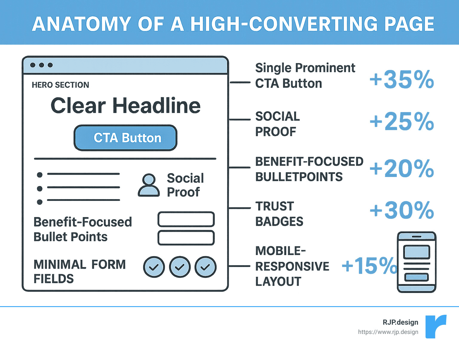
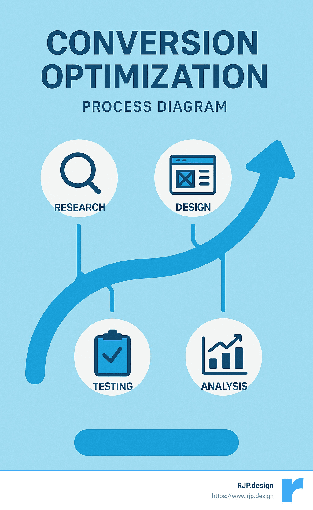
What separates the high performers from the rest comes down to six essential traits:
Clear value proposition that visitors can grasp almost instantly. Your offering should be crystal clear within those crucial first 7 seconds.
Single, focused call-to-action without distracting navigation options. When you give people too many choices, they often make none at all.
Compelling visuals paired with benefit-focused copy that speaks directly to what your visitors actually care about.
Trust elements like testimonials, security badges, and guarantees that remove doubt from the equation.
Mobile-optimized design with lightning-fast load times because more than half of your traffic is probably coming from phones.
Continuous testing and measurement to refine and improve your page’s performance over time.
If you’re new to landing pages, here are some related terms you might find helpful:
What You’ll Learn
Throughout this guide, we’ll walk together through each of these six essential traits that transform ordinary landing pages into conversion powerhouses. No jargon, no fluff—just practical advice you can actually use.
You’ll find:
How to craft value propositions that grab attention in those critical first 7 seconds (and why this matters so much)
The psychology behind why a single, focused CTA dramatically outperforms pages with multiple options
Techniques for creating visuals and copy that don’t just look pretty but actually drive people to take action
The specific trust elements that remove hesitation and make visitors feel confident in their decision
Mobile optimization approaches that recognize how people actually use their devices today
Testing strategies that help you continuously improve your results (because even good pages can become great)
By the time you finish reading, you’ll have a clear roadmap for creating landing pages that consistently turn curious visitors into delighted customers. No smoke and mirrors—just proven approaches that work.
Trait 1: Clear Value Proposition Within 7 Seconds
Ever clicked on a link and then immediately thought, “What is this page even about?” We’ve all been there. The truth is, when someone lands on your page, you have just 7 seconds to convince them to stay. Those first moments are make-or-break time for your conversion journey.
“You never get a second chance to make a first impression,” isn’t just a clever saying—it’s the reality of online marketing, especially for landing pages.
A great value proposition isn’t complicated. It simply answers three questions visitors have when they arrive:
What are you offering me?
How will this solve my problem?
Why should I choose you instead of someone else?
How High-Converting Landing Pages Nail the First Impression
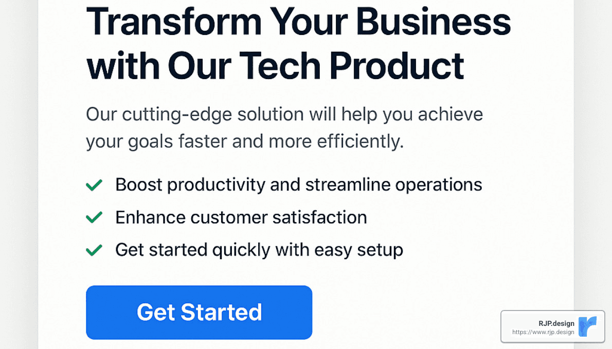
High-converting landing pages don’t waste those precious seconds. They deliver clear, compelling value through powerful headlines that grab attention immediately.
Take Unbounce’s example that achieved an impressive 52.68% conversion rate. As Josh Grossman from edX explains, “Rather than get bogged down in the details of the course, we made it easy for people to understand what they’ll learn using just a few bullet points.”
The most effective headlines follow patterns that connect instantly with visitors. They might highlight a problem and solution: “Stop Wasting Time on Spreadsheets. Automate Your Reporting in 3 Clicks.” Or they promise a specific outcome in a timeframe: “Launch Your Online Store in Under 24 Hours.” Some focus on a benefit with a differentiator: “Enterprise-Level Security Made Simple for Small Businesses.”
Conversion expert Peep Laja recommends focusing on what he calls “very important attributes” (VIAs)—just 2-5 key benefits that truly matter to your audience. This beats overwhelming visitors with a laundry list of features that dilute your message.
Test Your Message
Here at RJP.design, we’ve seen that testing different headline variations often provides the biggest bang for your optimization buck. Let me share a real example:
We had a client using the headline “AI-Powered Analytics Platform.” Pretty standard, right? We tested it against “Get Actionable Insights From Your Data in Minutes, Not Days.” The result? A 34% lift in conversions.
Why such a dramatic difference? The winning headline focused on the actual benefit (saving time) rather than just describing the technology. People don’t buy AI—they buy what AI does for them.
Testing your own headlines doesn’t have to be complicated. Create 2-3 variations that emphasize different benefits, split your traffic evenly between them, and measure which one drives more complete conversions (not just clicks). Then implement the winner and test again with a new challenger.
As successful e-commerce marketer Meg Hellerstedt puts it, “compelling headlines that start with a strong value proposition” are often the difference between landing pages that convert and those that don’t. When your value proposition connects in those crucial 7 seconds, you’ve cleared the most important hurdle to conversion.
Trait 2: Single, Focused Call-to-Action
Ever stood in front of an ice cream shop with 50 flavors and felt completely stuck? That same feeling happens to your website visitors when they face too many choices. High-converting landing pages understand this psychological principle and do something brilliantly simple: they give visitors just one clear path forward.
As one straight-talking landing page expert puts it: “Options kill conversion.” This concept is supported by Hick’s Law, a psychological principle stating that decision time increases with the number of options.
Why High-Converting Landing Pages Avoid Distractions
Think of your landing page as a guided tour, not a maze. When visitors have multiple exits, they tend to use them—often before converting. The most successful landing pages I’ve created for clients intentionally:
Remove the tempting escape hatch of site navigation
Strip away those seemingly harmless footer links
Say “not now” to social media buttons
Laser-focus on a single conversion goal
I was particularly impressed by Simply Business’s approach. According to Unbounce, they achieved an incredible 62.26% conversion rate by taking something as complicated as insurance and presenting it with refreshing simplicity—creating just one clear path for visitors to follow.
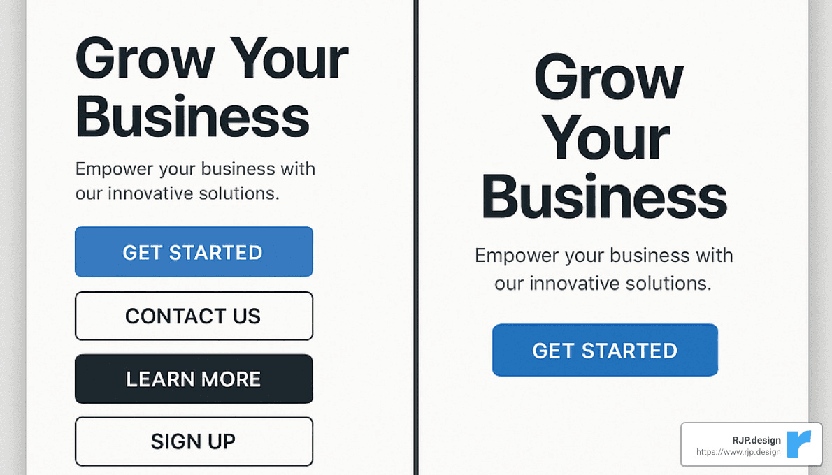
The numbers tell a compelling story:
Landing Page Type | Average Conversion Rate | Key Characteristic |
|---|---|---|
Single CTA | 13.5% | Clear path to action |
Multiple CTAs | 7.6% | Decision fatigue |
Navigation Links | 4.3% | Escape routes |
Optimize the CTA
Having one CTA is just the starting point. The magic happens when you optimize that button to practically beg for clicks:
Action-Oriented Verbs make a huge difference. “Get Started” feels like the beginning of something exciting, while “Submit” sounds like homework. That simple change can boost clicks by 25% according to multiple studies I’ve reviewed.
Benefit-Focused Language reminds visitors what they’re getting. Compare the bland “Sign Up” to the more compelling “Start Saving Time Now.” Which would you click?
High-Contrast Colors matter more than you might think. A button that visually pops from the page can increase clicks by up to 20%. I always tell my clients: “If your button doesn’t demand attention, it’s not doing its job.”
Smart Microcopy – that little text beneath your button – can address the hesitation that stops people from clicking. Something as simple as “No credit card required” or “Takes just 2 minutes” can dissolve objections before they form.
Aditya Bagri from WITHIN shared something that resonates with our approach at RJP.design: “Our landing page creation strategy is mobile-first, and optimizing for mobile helps us get first-time viewers down the funnel.”
One technique I’ve found particularly effective is using what conversion experts call “directional cues” – those subtle design elements that naturally guide the eye toward your CTA. These can be literal arrows pointing to the button, images of people looking toward the CTA, or simply smart use of white space that frames the action area.
And remember: when it comes to forms, less is absolutely more. The Listings Lab’s high-performing real estate landing page uses a clean, straightforward design with minimal fields, focusing entirely on getting visitors to take that one desired action.
Trait 3: Magnetic Visuals & Benefit-First Copy
Did you know our brains process images 60,000 times faster than text? It’s true! This phenomenon, called the picture superiority effect, is why high-converting landing pages always feature compelling visuals that instantly communicate value.
As Yael Miriam Klass from Promo puts it: “Using video on your landing page is a great way to boost engagement and crank up your conversion rate.” The numbers back this up too—including video can boost conversions by up to 80% according to Unbounce’s research.
When we create landing pages at RJP.design, we’ve found that certain types of visuals consistently perform better than others. Contextual hero shots showing your product in action create immediate understanding. Explainer videos (kept between 30-90 seconds) demonstrate benefits quickly. Process infographics help visitors understand how your solution works without reading paragraphs of text. And nothing beats before/after comparisons for showing change—they’re like visual proof that your solution works.
Crafting Copy That Converts
While eye-catching visuals grab attention, it’s your words that ultimately persuade visitors to take action. The best high-converting landing pages don’t just look good—they speak directly to visitors’ needs.
Think about it this way: nobody cares about your “automated reporting feature,” but they absolutely care about “saving 5 hours every week.” That’s the difference between talking about features versus benefits. Good landing page copy always focuses on what your visitor gets, not what your product does.
We’ve found that keeping things scannable makes a huge difference too. Most visitors skim rather than read word-for-word, so we use bullet points sparingly, keep paragraphs short, and include plenty of subheadings to guide the eye.
The tone matters just as much as structure. High-converting landing pages sound like a helpful friend, not a corporate brochure. As Neil Patel wisely points out: “It’s impossible to write copy as good as your customer. Why? Because good copy depends on the source, not just the style and substance.” That’s why we often incorporate actual customer language from surveys and interviews into our landing pages.
When structuring your copy, think of it as a conversation that flows naturally:
Start with a headline that makes a big promise or addresses a specific problem
Follow with a subheadline that explains a bit more
Highlight 3-5 key benefits (not features!)
Include a quick testimonial or customer count for credibility
End with a clear call-to-action that reinforces the benefit
Visual Consistency
Have you ever clicked on an ad that promised one thing but landed on a page that looked completely different? That disconnect creates what we call “cognitive friction”—and it kills conversions.
The concept of “conversion scent” is crucial here—the visual and messaging consistency between your ads, emails, and landing page. Chin Tan, Communication Design Lead at Later, credits their impressive 57.92% conversion rate to maintaining “conversion scent throughout the campaign.”
At RJP.design, we’re sticklers for visual consistency. We make sure the same key imagery appears in both ads and landing pages. We maintain consistent color schemes and typography across all touchpoints. We repeat headline messaging from ads to landing pages. And most importantly, we ensure the promised offer is immediately visible when visitors arrive.
This consistency isn’t just about looking professional—it creates trust. When everything matches, visitors feel confident they’re in the right place and that you’ll deliver what was promised.
More info about Creative Website Solutions
Trait 4: Trust Builders That Remove Doubt
Ever notice how we hesitate before clicking that “Buy Now” button? That moment of doubt is the conversion killer that high-converting landing pages work hard to eliminate.
Kate Strollo, Director of Digital Marketing, shares a remarkable insight from her experience: “We saw our conversion rate double when we directed them to this explainer page first.” This perfectly illustrates how addressing concerns upfront can transform your results.
How High-Converting Landing Pages Use Social Proof
We humans are social creatures at heart. When we see others taking the plunge before us, we feel much more comfortable following suit. That’s why social proof is like conversion gold on landing pages.
High-converting landing pages typically showcase several trust elements that work together:
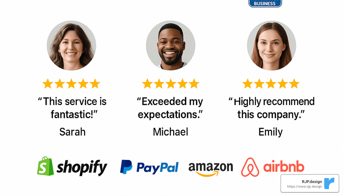
Real customer testimonials work wonders, especially when they include a photo and full name. They feel authentic rather than manufactured. Short but impactful case studies showing actual results help visitors envision their own success. Those little star ratings and review snippets we’ve all come to trust? They’re conversion powerhouses.
When visitors see recognizable client logos, it creates an immediate “if they trust this company, I can too” reaction. And don’t underestimate the power of simple usage stats like “Trusted by 10,000+ customers” – they provide instant credibility.
Mark Samuel, Founder & CEO at IWON Organics, doesn’t hold back when describing his experience: “Juan knows how to write FB/Instagram ads and landing pages that make people take action on the first touchpoint.” Testimonials like this that speak directly to effectiveness are worth their weight in gold.
Build Authority Fast
Beyond showing that others trust you, high-converting landing pages build authority through several strategic elements.
Security badges near your form fields or checkout buttons instantly reduce anxiety. We’ve all become trained to look for that little padlock icon or trusted payment processor logos before entering our credit card details.
Clear guarantee statements like “30-day money-back guarantee” or “Free 14-day trial, no credit card required” remove the risk that prevents many visitors from converting.
Industry certifications and partnerships position you as a legitimate player in your field. Media mentions (even small ones) add third-party validation that’s hard to match. And specific, impressive statistics about your business build credibility in a way that vague claims never could.
Kara Landau, Founder & CEO at Uplift Food, shares an experience that many business owners dream of: “The conversion rate Juan got for us was insane. We didn’t even know hitting a conversion rate of more than 10% was possible with cold traffic.”
The placement of these trust elements matters tremendously. Security badges work best near form fields where visitors are about to share personal information. Testimonials should sit close to your biggest claims or benefits, essentially backing up what you’re promising. And guarantees placed near your primary CTA can give that final reassurance needed to click.
At RJP.design, we’ve found that strategically incorporated trust elements don’t just improve conversion rates – they also lead to higher customer satisfaction after purchase because expectations have been properly set from the beginning.
Trait 5: Frictionless User Experience (UX) on Any Device
Remember when you had to pinch and zoom to read a website on your phone? Those days are long gone—and thank goodness for that! Since 2016, mobile traffic has actually surpassed desktop browsing. This shift means that high-converting landing pages now put mobile experience front and center, not as an afterthought.
When someone visits your landing page on their phone while waiting for coffee, sitting on the bus, or relaxing on their couch, they expect it to work flawlessly. According to Pew Internet research, most of us now shop primarily using our mobile devices—making mobile optimization non-negotiable.
Speed matters tremendously here. When a page takes too long to load, people simply leave. Even a one-second delay can reduce conversions by up to 7%! The best high-converting landing pages load in under 3 seconds, even on average mobile connections.
High-Converting Landing Pages & Mobile UX
Mobile optimization goes well beyond just making your site “responsive.” It’s about creating an experience that feels natural on a smaller screen—a truly user-friendly user experience (UX):
Thumb-Friendly Navigation makes all the difference. Ever tried tapping a tiny button with your thumb and hit something else instead? Frustrating, right? Smart designers place important elements within the natural arc of your thumb’s reach.
Buttons need to be substantial—at least 44×44 pixels—giving visitors’ fingers a comfortable target to tap. Content should be streamlined for mobile, focusing on what really matters rather than cramming everything from the desktop version onto a smaller screen.
Kurt Oriol, Founder at Campo Grande, shares a real success story: “Juan’s landing pages convert up to 5% of first-time visitors which is huge considering our first order value is about $220.” That impressive conversion rate comes from thoughtful attention to how people actually use their mobile devices.
Progressive loading is another clever technique where the most important content appears first while background elements continue loading. This gives visitors something to engage with immediately, rather than staring at a blank screen.
Reduce Form Friction
Let’s be honest—nobody enjoys filling out forms, especially on mobile devices. Yet forms are often the final hurdle before conversion happens. That’s why high-converting landing pages make completing forms as painless as possible.
The first rule? Ask for less. Every additional field reduces your conversion rate, so request only what’s absolutely necessary. If you don’t immediately need someone’s phone number or company size, don’t ask for it.
Inline validation works wonders by providing immediate feedback as people complete each field. That little green checkmark that appears when you’ve entered a valid email address? It’s reassuring and prevents the frustration of submitting a form only to find out you made a mistake somewhere.
Smart defaults and logical field grouping make the process feel more intuitive. For longer forms, progress indicators help people understand how much more they need to complete—reducing abandonment.
One particularly effective approach we’ve implemented at RJP.design is progressive profiling—collecting minimal information initially, then gathering additional data in later interactions. This approach can boost initial conversion rates by up to 50% by removing that initial friction.
Farhan Siraj puts it perfectly: “This landing page has a high conversion rate because it clearly mentions the discount we provide on multiple enrollments in our eLearning platform.” Clarity and simplicity win every time.
For service businesses, adding conversational interfaces like chatbots can make the whole experience feel more human and less transactional. This approach has been shown to reduce cost-per-lead by 48% while potentially doubling conversion rates.
The best mobile experiences don’t feel like you’re using a smaller version of a desktop site—they feel natural, intuitive, and designed specifically for the device in your hand.
More info about Google Search Optimization
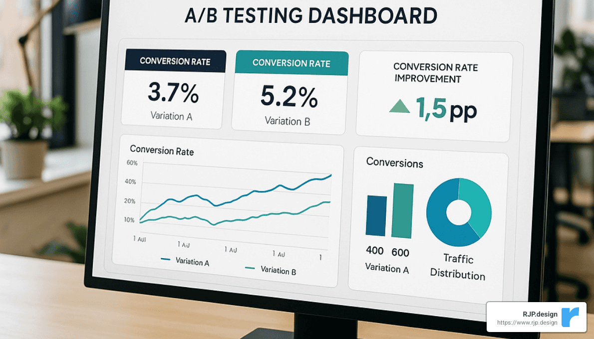
Trait 6: Continuous Optimization & Measurement
High-converting landing pages don’t magically achieve their impressive results. They get there through careful testing, measurement, and ongoing refinement. As many conversion experts like to say: “A/B testing can double or even triple your conversions—don’t skip it!”
Keeping High-Converting Landing Pages at Peak Performance
Think of your landing page as a living thing that needs regular check-ups. The first step is knowing what vital signs to monitor. We track two types of metrics for our clients at RJP.design:
Your primary metrics tell you if the page is actually doing its job: conversion rate (both overall and by traffic source), cost per acquisition, value per visitor, and return on ad spend. These are the numbers that directly impact your bottom line.
Meanwhile, your secondary metrics help explain why things are working (or not): bounce rate, time on page, scroll depth, and how people interact with different elements. These give you clues about what to fix.
Adam White, who’s seen remarkable success with landing page optimization, shares this insight: “We do a ton of above-the-fold content A/B testing on our homepage. The current iteration continues to beat out other more benefit-driven headlines.” His experience shows that even when you think you’ve nailed it, there’s often room for improvement.
At RJP.design, we build custom Google Analytics 4 (GA4) dashboards that make tracking these metrics painless. You can see your conversion funnel in real-time, compare how different traffic sources perform, check device-specific conversion rates, and monitor A/B test results—all in one place. This visibility helps you spot opportunities and fix issues quickly, before they cost you customers.
Growth Through Experimentation
The most successful optimization isn’t random—it follows a rhythm. First, we analyze current performance to identify where people drop off. Then, we form hypotheses about what might improve things. Not all changes are created equal, so we prioritize tests with the highest potential impact.
Next comes the fun part: creating alternative versions based on our theories. We make sure to gather enough data for statistically significant results (no jumping to conclusions based on a handful of visitors). When we find a winner, we implement it and start the cycle again with fresh ideas.
Michael Maximoff offers this practical advice: “Landing pages offering simple tools that help your leads get accustomed to your offer convert like crazy, and I’d highly suggest creating one if you have a cool idea and the resources to do so.” It’s a reminder that sometimes the best optimization isn’t changing button colors—it’s adding genuine value.
When it comes to what to test, some elements consistently deliver bigger wins: headline variations can dramatically change how people understand your offer; call-to-action (CTA) button text, color, and placement directly impact click rates; form length influences completion rates; social proof placement affects trust; and visual hierarchy guides attention where you want it.
One approach that’s been game-changing for our clients is personalization—showing different content to different visitor segments based on where they came from, how they’ve behaved, or who they are. This custom approach typically increases conversion rates by 20% or more compared to one-size-fits-all pages.
Jeremy Blossom, Co-Founder and CEO of Strikepoint Media, shares a valuable lesson about timing: “This page had the most success when Bitcoin was hot, so it was the right offer and the right time.” His experience reminds us that optimization isn’t just about the page itself—it’s about aligning with what’s happening in your market right now.
The beauty of continuous optimization is that it compounds over time. Small improvements add up to significant results, and each test teaches you something valuable about your audience. That’s why the highest-converting pages are never truly “finished”—they’re always evolving.
More info about Website Marketing Solutions
Frequently Asked Questions about High-Converting Landing Pages
What is a “good” conversion rate?
Wondering what conversion rate you should aim for? While 10% is often cited as the benchmark for high-converting landing pages, real-world numbers tell a more nuanced story.
The truth is, conversion rates vary widely across industries. Ecommerce pages typically convert around 12.9%, while SaaS companies see about 7.38% on average. Financial services tend to hover around 5.01%. Some education landing pages can achieve remarkable results—the College Board example we mentioned earlier hit an impressive 77.38%!
If you’re looking for a solid reference point, the top quarter of landing pages across all industries convert at 5.31% or higher. But here’s the thing—instead of obsessing over industry averages, you’ll get better results by focusing on beating your own personal best. What matters most is continuous improvement from your current baseline.
How many landing pages should my business have?
“Should I create one amazing landing page or several different ones?” It’s a question I hear often, and the answer is clear from the data: more targeted pages beat fewer generic ones every time.
Think about it this way: each distinct audience segment, campaign, or offer deserves its own dedicated landing page. This approach creates relevance that generic pages simply can’t match.
Let’s say you run Google Ads promoting three different services to four different types of customers. Ideally, you’d create 12 different landing pages (3 services × 4 audiences) to ensure maximum relevance for each visitor.
This isn’t just theory—HubSpot research shows businesses with 10-15 landing pages generate 55% more leads than those with fewer than 10 pages. Each targeted page gives you another opportunity to connect with a specific audience segment in exactly the right way.
Do videos always boost conversions?
Videos can be conversion gold—increasing rates by up to 80% in some cases—but they’re not a guaranteed win for every landing page. Their effectiveness depends on several factors that are worth considering before you hit the record button.
Complex products or services tend to benefit most from video explanations, while simpler offerings might do just fine with text and images. The quality matters tremendously too—a poorly produced video can actually hurt your conversion rates rather than help them.
Timing is everything when it comes to video engagement. Desktop visitors typically stick with videos for 30-90 seconds, so keep yours concise and compelling. And please, be thoughtful about autoplay settings—videos that start blasting sound can send mobile visitors running for the “back” button.
Finally, consider the technical impact. Videos that slow your page loading can torpedo your conversion rates, no matter how brilliant the content. For best results, keep videos under 60 seconds, include captions, avoid autoplay with sound, and optimize them for fast loading.
When done right, video can create an immediate connection that text alone can’t match—just make sure you’re implementing it thoughtfully for your specific audience and offering.
More info about Website Marketing Solutions
Conclusion
Creating high-converting landing pages isn’t about chasing the latest design trends or mimicking what your competitors are doing. It’s about understanding the psychology behind why people take action online and then applying that knowledge in a systematic, data-driven way.
Let’s take a moment to revisit those six essential traits that transform ordinary landing pages into customer-generating machines:
Clear value proposition within 7 seconds that immediately answers “what’s in it for me?”
Single, focused call-to-action that guides visitors down one clear path without confusion
Magnetic visuals and benefit-first copy that capture attention and speak directly to needs
Trust builders that remove doubt through authentic testimonials and credibility signals
Frictionless user experience on any device because frustrated visitors don’t convert
Continuous optimization and measurement because even great pages can get better
At RJP.design, we’ve seen these principles work their magic time and again. When properly implemented, our clients typically enjoy conversion rate improvements of 30-50% – turning what were once digital billboards into hardworking sales tools.
I’ve found that the most successful landing pages are those built on genuine understanding. They speak directly to real people with real problems looking for real solutions. This means starting with thorough customer research before you design a single pixel or write a single word.
The beauty of this approach is that it works whether you’re selling enterprise software or handmade soap. The principles remain constant even as the execution varies to match your specific audience and offering.
A landing page isn’t a static brochure – it’s a living, evolving asset that should get better over time. Commit to regular testing and refinement, and you’ll see your conversion rates climb steadily upward.
Ready to transform your landing pages from underperformers into conversion powerhouses? Let’s talk about how our team at RJP.design can help you create pages that not only look fantastic but consistently turn those valuable clicks into loyal customers.

