Web
The Easiest Way to Make Your Website Responsive on All Screens
Sep 24, 2025

How to implement responsive web design: #1 Easy Guide
Why Every Website Needs to Be Responsive Today
Learning how to implement responsive web design is essential for any business that needs its website to work properly on all devices. Here’s a quick overview:
Core Steps to Implement Responsive Web Design:
Set the viewport meta tag: Add
<meta name="viewport" content="width=device-width, initial-scale=1.0">to your HTML head.Use CSS media queries: Apply different styles for different screen sizes using
@mediarules.Create flexible layouts: Use percentage widths, Flexbox, or CSS Grid instead of fixed pixel widths.
Make images responsive: Set
max-width: 100%andheight: autoon images.Test across devices: Use browser developer tools and real devices to verify everything works.
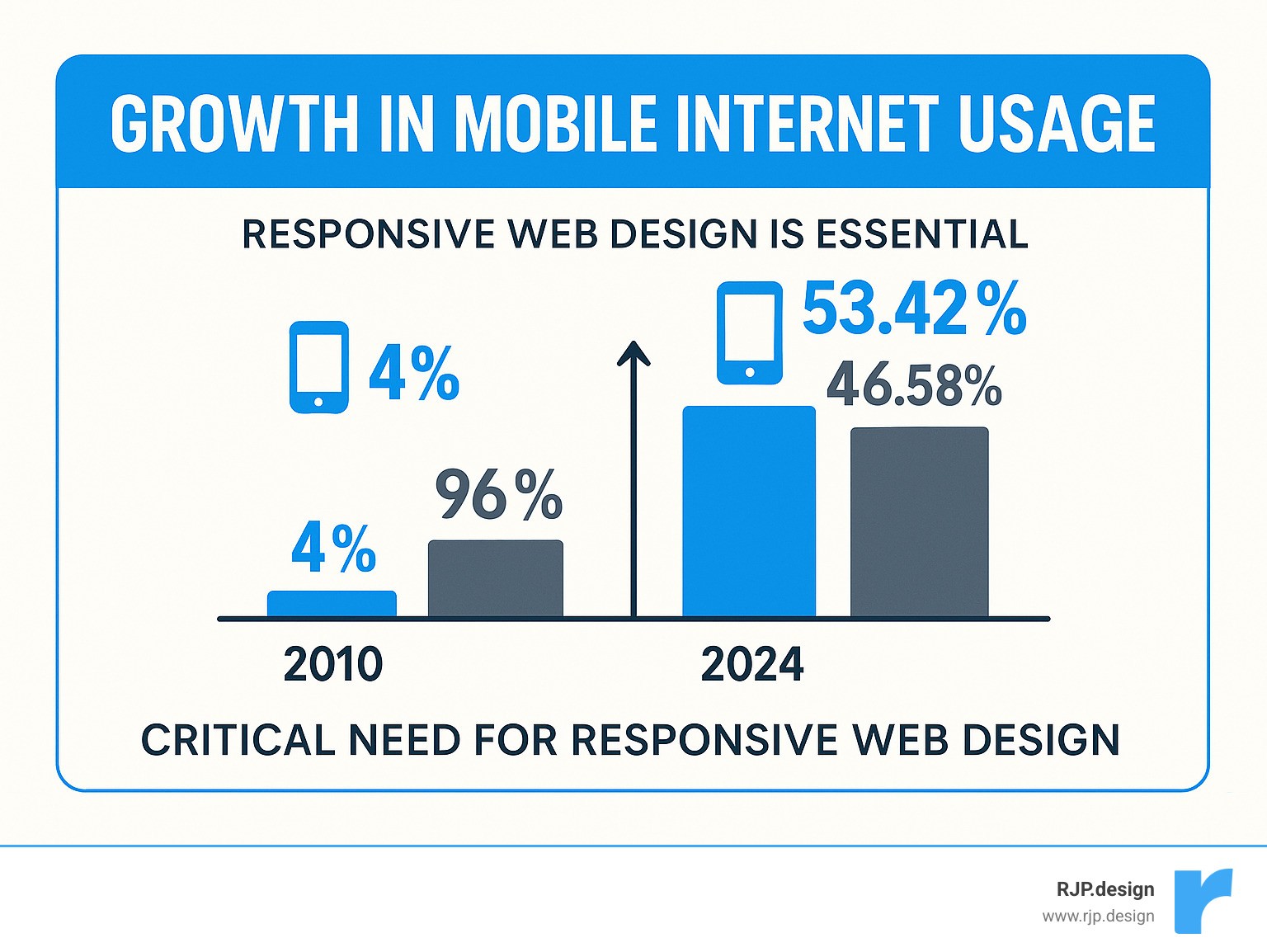
The numbers are clear: Mobile devices now generate 53.42% of all website traffic, and 57% of users won’t recommend a business with a poorly designed mobile site. Furthermore, Google’s mobile-first indexing means your site’s mobile version directly impacts your search rankings.
I’m Ross Plumer, and I’ve helped businesses generate over $20 million in revenue with websites that work seamlessly on all devices. My experience shows that knowing how to implement responsive web design is the difference between a site that drives sales and one that drives customers away.
Simple guide to how to implement responsive web design terms:
The Core Principles of Modern Responsive Design
Responsive design ensures a user has a smooth, consistent experience whether they visit your site on their phone or laptop. That’s the goal when learning how to implement responsive web design. The concept, coined by Ethan Marcotte in 2010, is about creating one flexible site that adapts to any screen size, from a small smartphone to a large desktop monitor.
At RJP.design, we build every website using these core principles:
Fluid grids are the backbone of responsive design. They use percentages and flexible units instead of fixed pixels, allowing content to stretch and shrink naturally to fit any screen.
Flexible layouts apply this concept to all page elements—images, text, and buttons—so they can resize, move, or hide as space changes.
The mobile-first approach means designing for the smallest screens first, then scaling up. This forces a focus on essential content and improves the user experience on all devices.
Progressive improvement involves building a solid foundation that works everywhere, then adding advanced features for devices that can support them.
User-centric design keeps real people at the center of the process, creating experiences that are intuitive and easy to use on any device.
This approach is what creates truly good mobile website design, ensuring your visitors can use your website effectively, no matter how they access it.
Responsive vs. Adaptive Design: What’s the Difference?
Understanding this distinction helps you make better decisions about how to implement responsive web design.
Responsive design is fluid, using one layout that continuously adjusts to any screen size. Adaptive design is more rigid, using a set of pre-built layouts for specific screen sizes, detected on the server.
Feature | Responsive Design | Adaptive Design |
|---|---|---|
Layout Structure | Single fluid layout that adapts continuously | Multiple fixed layouts for specific screen sizes |
How It Works | CSS media queries and flexible units | Server-side detection with pre-defined templates |
Flexibility | Adapts to any screen size automatically | Works for predetermined screen sizes only |
Maintenance | Easier—one codebase to manage | More complex—multiple versions to maintain |
New Devices | Automatically works on new screen sizes | May need new templates for new devices |
For most businesses, responsive design is the better choice. It’s more flexible, easier to maintain, and future-proof. Google also prefers it, as a single URL per page simplifies crawling and indexing.
Why a Mobile-First Approach is Crucial
Designing mobile-first improves your entire website, not just the mobile version. It forces you to prioritize and leads to better outcomes.
Designing for constraints forces you to focus on essential content and features, leading to a cleaner, more focused user experience.
Better performance is a natural result. Optimizing for slower mobile connections with smaller images and cleaner code benefits all users, making the experience faster for everyone.
Improved user experience on mobile is critical, as mobile traffic accounts for over half of all web visits. A poor mobile experience can turn away a significant portion of your potential customers.
Scalability is a major long-term benefit. A mobile-first foundation is more adaptable to new devices and screen sizes, so your site is better prepared for the future.
Adopting a mobile-first mindset makes you a better designer by teaching you to prioritize user needs. If you want to revamp your mobile site on a budget, starting with these principles is the smartest investment you can make.
How to Implement Responsive Web Design: A Step-by-Step Guide
Now let’s dive into the “how.” Implementing responsive design is more straightforward than you might think. It combines the structure of HTML5 with the flexibility of CSS3 to build websites that adapt to any screen.

This guide focuses on the essential techniques. For more advanced help, our team at RJP.design offers Easy Responsive CSS solutions custom to your project.
Step 1: Set the Viewport Meta Tag
The most crucial first step in responsive design is a single line of HTML. Without the viewport meta tag, mobile browsers assume a desktop site and shrink the page, making it unreadable. This tag tells the browser how to display the page correctly.
Add this line to the <head> section of every HTML page:
width=device-widthtells the browser to set the page width to match the device’s screen width.initial-scale=1.0prevents the browser from zooming out and displays your content at its intended size.
This tag is the foundation for all other responsive techniques. For more details, you can read more about the viewport tag on MDN.
Step 2: Use Media Queries and CSS Breakpoints
Once the viewport is set, CSS media queries become the workhorses of responsive design. They apply different styles based on screen characteristics like width. This is how you define breakpoints—the specific screen widths where your design adapts.
Here is the basic syntax:
Choose breakpoints where your content starts to look awkward, not based on specific devices. This makes your design more future-proof. Common breakpoints are around 360px (small phones), 768px (tablets), 992px (small desktops), and 1200px (large screens), but these are just guidelines.
This approach ensures your site adapts automatically to new devices. We cover this in more detail in our guide on Breakpoints in Responsive Web Design.
Step 3: Build with Flexible Grids and Layouts
Flexible grids are key to responsive layouts. They use relative units instead of fixed pixel measurements, allowing elements to adapt to the screen size.
Percentage-based widths (
width: 25%) allow columns to take up a proportional amount of space on any screen.Viewport units (
vwandvh) size elements relative to the screen’s width and height, making them highly scalable.
Modern CSS offers powerful tools for creating flexible layouts:
Flexbox is excellent for arranging items in a single direction (like navigation menus that stack on mobile). You can learn more with this guide to flexbox.
CSS Grid provides powerful two-dimensional layout control for both rows and columns. The
fr(fraction) unit is especially useful for creating proportional columns that adapt to any screen size.
Using these techniques creates layouts that are truly device-agnostic, looking polished on any device from a smartwatch to a 4K monitor.
Mastering Responsive Content: Images, Typography, and Navigation
A responsive website requires more than just a flexible layout; your content must also adapt. A high-resolution image that looks great on a desktop can slow a mobile site to a crawl, and a wide navigation menu can become unusable on a small screen.
How to Implement Responsive Web Design for Images and Media
Images are often the heaviest parts of a website and can easily ruin a responsive design. The foundation of responsive images is making them fluid with this simple CSS:
This allows images to shrink proportionally. For more advanced control, use the <picture> element and srcset attribute. These tools let you serve different image files based on screen size or resolution, ensuring users download the most appropriate version for their device.
For logos and simple graphics, use SVGs. These vector images are crisp at any size and typically have smaller file sizes than other formats.
This approach is a cornerstone of our Responsive Web Solutions, ensuring visuals look great and load quickly.
Best Practices for Responsive Typography
Web typography must be readable on all screens. What works on a desktop may be too small on a phone or too large on a big monitor.
Use relative font units like
remandem. This allows text to scale proportionally when you adjust the base font size in your media queries.The
calc()function can combine fixed and viewport units (e.g.,font-size: calc(1.5rem + 2vw)) to create text that scales smoothly while remaining readable.Maintain readability by keeping line length to around 70-80 characters. Use media queries to constrain text width on large screens.
Set line height to 1.4 to 1.6 times the font size to give text room to breathe.
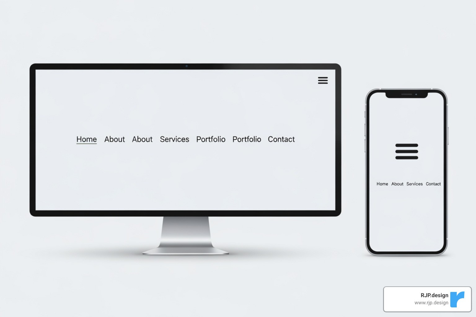
Designing User-Friendly Responsive Navigation
Desktop navigation menus don’t work well on mobile screens. The hamburger menu is a standard, space-saving pattern for mobile navigation that users understand.
When designing navigational drawers, ensure they are easy to use with smooth animations and clear links. Touch targets are also crucial; make sure buttons and links are large enough for easy tapping (at least 44×44 pixels) with ample whitespace.
Prioritize your navigation links on smaller screens. Not every link needs to be visible at first glance. You can hide less critical options in a secondary menu.
The key is maintaining consistency and clarity across all devices so users never feel lost. This attention to detail is part of what makes our Custom Website Solutions so effective.
Testing Your Design and Final Best Practices
Building a responsive website is only half the battle; you must also test it to ensure it works beautifully on every device. Testing is your quality control step to catch layout issues before your customers do.
Thorough testing ensures every visitor has a smooth experience, which is what separates a truly functional website from one that just looks good in screenshots.
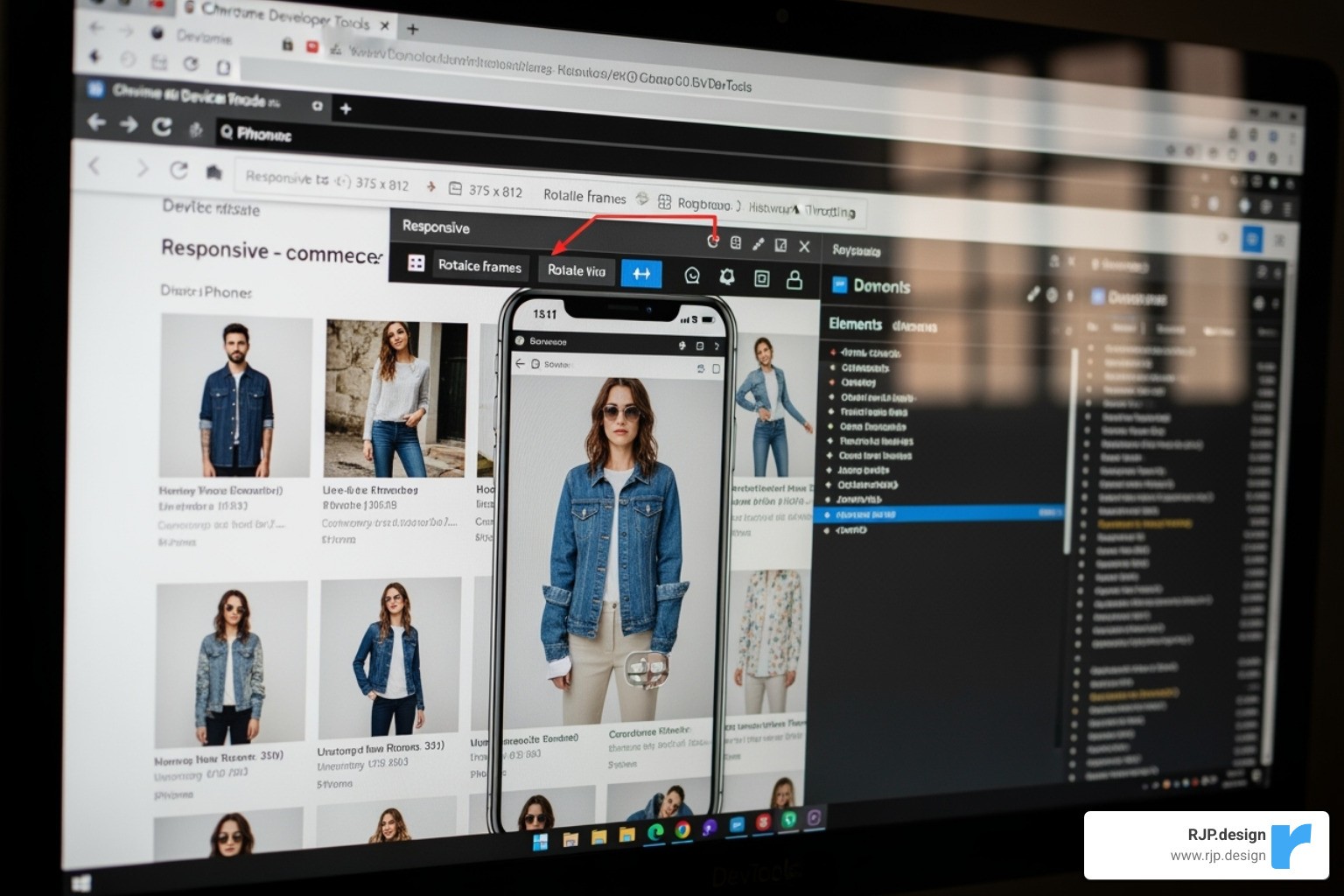
How to Implement Responsive Web Design Testing
When you’re learning how to implement responsive web design, testing is your best friend. Here are the key methods:
Browser Developer Tools: Use the tools built into Chrome, Firefox, and Safari to simulate different devices, resize the viewport, and inspect how your CSS breakpoints behave.
Google’s Mobile-Friendly Test: Use this free tool to see your site from Google’s perspective. Since Google uses mobile-first indexing, this test can highlight issues that affect your search rankings.
Real device testing: Simulators are great, but nothing beats testing on actual phones and tablets. Real devices reveal quirks in rendering and touch interactions that simulators can miss.
Cross-browser compatibility: Test your site on the latest versions of Chrome, Firefox, Safari, and Edge to ensure a consistent experience, as each browser can interpret CSS slightly differently.
Common Challenges and Solutions
Here are solutions to common responsive design challenges:
Performance: Optimize images using compression and modern formats like WebP. Use lazy loading so images only download when they are visible. Minify CSS and JavaScript to reduce file sizes.
Navigation: Simplify complex desktop menus for mobile using patterns like the hamburger menu. Prioritize key links and ensure touch targets are large enough for easy tapping.
Browser Support: For newer CSS features like Grid or Flexbox, provide simple fallbacks for older browsers to ensure the site remains usable for everyone.
Content Hiding: Avoid hiding important content on mobile. Instead, use accordions or tabs to keep content accessible without cluttering the layout.
Typography: Use relative units (
rem,em) and media queries to ensure text is readable on all screen sizes, from small phones to large monitors.Consistency: Maintain a cohesive brand identity across all devices. Key elements like your logo, colors, and calls-to-action should be prominent and consistent at all breakpoints.
Frequently Asked Questions about Responsive Design
As we help clients learn how to implement responsive web design, a few questions come up repeatedly. Here are the answers to the most common ones.
What is the first step in making a website responsive?
The first and most crucial step is adding the viewport meta tag to your HTML’s <head> section: <meta name="viewport" content="width=device-width, initial-scale=1.0">. This tag tells mobile browsers to display the page at the device’s actual width and prevents them from zooming out. It’s the foundation that makes all other responsive CSS work correctly.
How many breakpoints should a responsive website have?
There’s no magic number. A good practice is to start with 3-4 primary breakpoints that target general device categories: small screens (smartphones, <768px), medium screens (tablets, ≥768px), and large screens (desktops, ≥992px). However, the key is to let your content decide. Add a breakpoint wherever the layout starts to look awkward or cramped, rather than targeting specific device models.
Can I make my website responsive without using a framework?
Yes. Responsive design is a set of CSS principles, not a feature exclusive to frameworks like Bootstrap or Foundation. You can create a fully responsive website with plain HTML and CSS by using fluid grids (with percentages or CSS Grid), flexible images, and media queries. Building from scratch can result in cleaner, more efficient code and gives you a deeper understanding of how responsive design works.
Let’s Build a Website That Works Everywhere
Learning how to implement responsive web design means creating a site that can adapt as new devices and user habits emerge. The core steps—setting the viewport, using media queries, building flexible layouts, and optimizing content—are the foundation for a website that serves every visitor well.
A visitor on their phone deserves the same quality experience as someone on a desktop. Responsive design makes this happen, ensuring your site works beautifully everywhere. This approach also has a major business impact. Google’s mobile-first indexing rewards responsive sites, which means more visitors can find you online.
At RJP.design, we create digital experiences that grow with your business because we understand that behind every screen is a real person. With a solid responsive foundation, your website will be prepared for the future of the web.
Ready to create a website that works everywhere your customers are? Contact us for expert web design and development services and let’s build something that makes both you and your visitors smile, no matter the device.

