Web
The Ultimate Guide to Mobile Website Design: Examples and Best Practices
Aug 28, 2025

Mobile-friendly websites: Boost Success 2025
Why Mobile-Friendly Websites Are Essential for Your Business Success
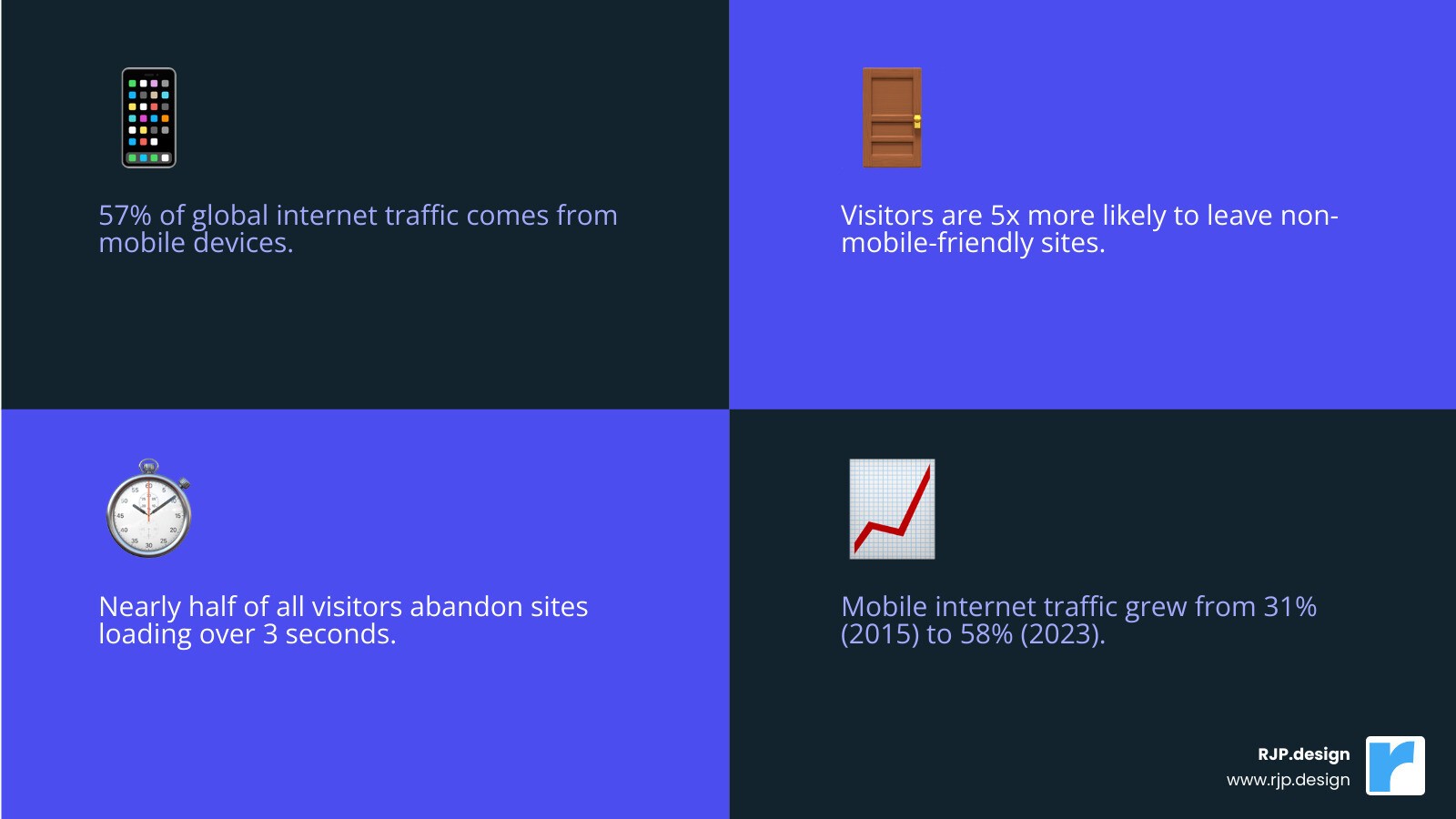
Mobile-friendly websites are no longer optional—they’re essential for business survival in today’s digital landscape. The stakes are high: with 57% of global internet traffic on mobile, visitors are 5 times more likely to leave a non-mobile-friendly site. Google’s mobile-first indexing uses your mobile site to determine search rankings, directly impacting your visibility.
Furthermore, nearly half of all visitors abandon a site if it takes more than 3 seconds to load. This isn’t just about user experience; it’s about your bottom line. A mobile-friendly site leads to higher conversions, better rankings, and happier customers.
Key Requirements for a Mobile-Friendly Website:
Responsive design that adapts to any screen size
Fast loading times (under 3 seconds)
Large, finger-friendly buttons (minimum 48 pixels)
Readable text without zooming (at least 12 pixels)
Simple navigation with hamburger menus
Optimized images and compressed files
I’m Ross Plumer, and I’ve helped high-revenue businesses create mobile-friendly websites that drive real results. I know what separates a successful mobile site from one that drives customers away.
Simple guide to Mobile-friendly websites terms:
Why Mobile-Friendly Websites are Non-Negotiable for Business Success
Imagine a potential customer finding you online, only to leave your site in seconds because it’s slow and unusable on their phone. This happens constantly, which is why mobile-friendly websites are essential for survival. With over half of all internet traffic coming from mobile, a poor mobile experience is like turning away customers. It’s not just about having a mobile presence; it’s about creating an experience that works for users on the go.
At RJP.design, we create websites that don’t just look good on phones—they load quickly and guide visitors to act. Our approach to Web Design & Digital Marketing Made Effortless turns your mobile site into a powerful business tool.
The SEO Advantage: Google’s Mobile-First Indexing Explained
Since 2019, Google’s mobile-first indexing means it primarily uses the mobile version of your site to determine search rankings. In Google’s eyes, your mobile site is your website. If it’s slow or confusing, Google assumes your entire business is low-quality, and your rankings will suffer. This isn’t just Google being picky; it’s a response to the reality that most searches happen on phones. Businesses with poor mobile experiences see their visibility plummet, while those with excellent mobile-friendly websites enjoy better rankings and more organic traffic. As Google explains in its guide on The impact of mobile-first indexing, getting mobile right is key to search engine visibility.
Enhancing User Experience (UX) and Boosting Conversions
Mobile users are impatient. If your site takes more than three seconds to load, nearly half of your visitors will leave. That’s lost revenue.
Mobile-friendly websites remove friction. Instead of tiny links, they have large, finger-friendly buttons. Instead of microscopic text, content is readable on any screen. Complex navigation is streamlined into intuitive menus. This improved experience leads to higher conversion rates. When visitors can easily read your content, tap your buttons, and complete your forms, they are far more likely to become customers. Smart features like click-to-call buttons and location services further boost conversions by making it easy for users to take action.
Reaching a Wider Audience in a Mobile-Dominated World
The mobile revolution is here. 57% of global internet traffic comes from mobile devices, and this number is climbing. Your customers live their digital lives on their phones—researching products, comparing services, and making purchases. A mobile-friendly website meets your audience where they are, making you accessible whenever they need you. It shows that you understand and respect how they prefer to interact with businesses today. When your website works beautifully on every device, you’re not just reaching more people; you’re building a better connection with them.
Core Principles of Excellent Mobile Website Design
Building a mobile-friendly website that truly works isn’t just about squishing your desktop site onto a smaller screen. It’s about designing for real-world moments, like when someone’s juggling coffee and groceries while trying to find your store hours. The magic happens when usability, readability, and accessibility come together with smart technical choices.
Responsive vs. Adaptive vs. Dynamic: Choosing Your Approach
You have three main paths for making your site mobile-friendly. The table below breaks them down.
Feature | Responsive Design | Adaptive Design | Dynamic Serving |
|---|---|---|---|
Flexibility | Highly flexible; adapts fluidly to any screen size. | Less flexible; serves pre-defined layouts for specific screen sizes. | Highly flexible; serves different HTML/CSS based on user agent. |
Cost | Generally cost-effective for unified development. | Can be more complex/costly due to multiple designs. | Can be complex/costly due to server-side logic. |
Maintenance | Single codebase, easier to maintain. | Multiple codebases, more complex to maintain. | Single URL, but server logic adds complexity. |
SEO Impact | Excellent; single URL, Google prefers. | Good; can optimize for device, but multiple versions. | Good; single URL, Google supports. |
Components | Fluid grids, flexible images, media queries. | Fixed layouts, breakpoints. | Server-side rendering based on user agent. |
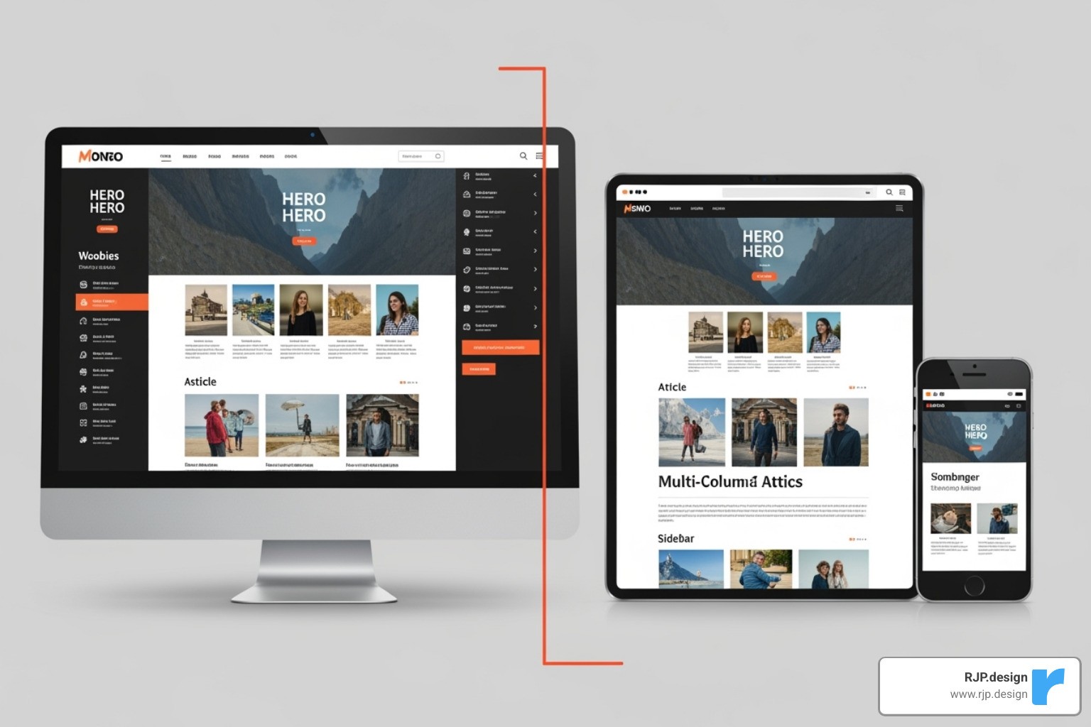
Responsive design is the most common choice. It uses fluid grids and media queries to gracefully reshape your site for any screen, from a small phone to a large desktop. This one-site-fits-all approach is preferred by Google and simplifies maintenance. Learn more in our guide to Responsive Web Design.
Adaptive design serves different, pre-built layouts for specific screen sizes, while Dynamic serving delivers different code to the same URL based on the user’s device. Both can be effective but are often more complex and costly. For most businesses, responsive design is the ideal solution.
Key Usability Factors for Mobile Users
Mobile design means thinking about real human fingers and real-world situations.

Legible fonts: Text should be easy to read without pinching and zooming (at least 12 pixels).
Large tap targets: Buttons and links should be at least 48 pixels to be easily tappable by a fingertip.
Ample spacing: Proper spacing around elements prevents accidental taps and creates a clean look.
Simple forms: Only ask for essential information. Use features like auto-fill to make data entry painless.
Thumb-friendly design: Place key navigation and buttons where they are easy to reach with a thumb.
Vertical scrolling: Content should fit the screen’s width, eliminating frustrating horizontal scrolling.
The Need for Speed: Optimizing Mobile Page Load Times
Speed is critical for mobile. Nearly half of visitors will abandon a site that takes more than three seconds to load. Here’s how to make your site faster:
Image compression: Optimize images to balance quality and file size. This is often the biggest win for mobile speed.
Browser caching: Allow returning visitors’ devices to remember parts of your site for much faster subsequent loads.
Minimizing code: Clean up bloated JavaScript and CSS files that slow your site down.
Lazy loading: Load images and videos only when a user scrolls to them, making the initial page load much faster.
See how your site performs with Google’s Test your site’s speed tool.
How to Create and Test Your Mobile-Friendly Website
Now that you know why mobile-friendly websites matter, let’s cover how to build and test one. It’s not just about making things smaller; it’s about rethinking the user interaction for mobile.

With the right approach, this is achievable. If you need help, our Website Redesign Service can transform your online presence to work beautifully on every device.
A Step-by-Step Guide to Building Mobile-Friendly Websites
The secret is a mobile-first approach: design for the smallest screen first. This forces you to prioritize what’s truly essential for a user on the go.
Prioritize content: Use a clear content hierarchy with strong headings and short paragraphs so the most important information is visible immediately.
Simplify navigation: Use the familiar hamburger menu to keep the interface clean while providing access to all pages.
Use clear CTAs: “Call Now” or “Buy Today” buttons should be large, clear, and placed in a thumb-friendly location.
Every mobile-friendly website we build is customized to the client’s business goals, whether it’s streamlining e-commerce checkout or making contact info prominent for a service business. For more on this, see our guide on Easy Responsive Design.
Common Issues and How to Fix Them
Even well-intentioned sites can have common mobile issues. Here are the most frequent problems and their fixes:
Content wider than screen: This forces horizontal scrolling. Fix it by ensuring all elements (like images) have a maximum width of 100%.
Text too small to read: If users have to zoom, they’ll leave. Use a base font size of at least 12 pixels and relative units that scale.
Clickable elements too close together: This causes frustrating mis-taps. Ensure touch targets are at least 48 pixels and have adequate spacing.
Incorrect viewport tag: This tag tells browsers how to scale your site. Adding
<meta name="viewport" content="width=device-width, initial-scale=1">to your site’s<head>fixes most display issues.
Testing Your Site’s Mobile-Friendliness
Thorough testing ensures your site works in the real world before your customers see it. Our process includes:
Manual testing: Using your site on actual iPhones, Android devices, and tablets is irreplaceable for finding real-world usability issues.
Cross-browser testing: Check your site on different mobile browsers (Chrome, Safari, etc.) to catch compatibility bugs.
Emulators: Browser developer tools can simulate various devices for quick checks, but they don’t replace real-device testing.
Google’s Mobile-Friendly Test: A free tool that gives you a simple pass/fail report card with feedback.
PageSpeed Insights: Analyzes performance and provides actionable recommendations to improve speed.
Understanding Breakpoints in Responsive Web Design helps you test more strategically. Every issue you fix is a potential customer you’ve saved.
Inspiring Examples of Mobile-Friendly Websites
Seeing great mobile-friendly websites in action is the best way to understand what works. The best examples make complex interactions feel effortless by embracing minimalist design, visual storytelling, and brand consistency.

Let’s look at three examples that showcase different approaches to mobile excellence.
E-commerce Excellence: Etsy
Etsy has mastered mobile commerce by prioritizing a fast, easy user experience. Their simplified search is front and center, acknowledging that mobile shoppers often have a specific goal. Large product images make visual browsing easy on a small screen, and clear categories provide another path to findy. Most importantly, their streamlined checkout removes all friction, understanding that mobile users have no patience for complex forms.
B2B Brilliance: Microsoft by the Numbers
Microsoft’s “by the numbers” site proves that data-heavy B2B content can be captivating on mobile. Their brilliant data visualization reimagines charts for small screens, making stats digestible. The scrollytelling technique turns a data dump into an engaging narrative that unfolds as you scroll. Despite the rich content, the clean layout and strong branding create a polished, mobile-first experience.
Creative Portfolios: Denys Nevozhai
Denys Nevozhai’s portfolio shows that artistic vision and mobile functionality can improve each other. Strategic minimalism makes the creative work the hero, which is crucial on a small screen. Subtle animation and an interactive timeline create a polished and engaging experience without being gimmicky. It’s a mobile-first portfolio that delivers a seamless user experience and inspires confidence.
Frequently Asked Questions about Mobile Website Design
We understand that creating mobile-friendly websites can feel overwhelming. Over the years, we’ve helped countless businesses steer these waters, and certain questions come up time and again. Here are the answers to the most common ones.
What is the most important element of a mobile-friendly website?
If I had to pick one, it would be responsive design. It’s the foundation that ensures your website automatically adjusts to fit any screen size, from a smartphone to a tablet. It uses techniques like fluid grids and flexible images to create a seamless experience. Without it, users might be forced to pinch, zoom, and scroll horizontally. However, responsive design works best with its two close partners: fast page speed and simple navigation. Together, these three elements create an effortless mobile experience.
How much does it cost to make a website mobile-friendly?
Costs vary dramatically based on your site’s current state and complexity. Here’s a general breakdown:
Minor Tweaks ($500 – $2,000): For modern sites that need adjustments like optimizing images or button sizes.
Substantial Redesign ($2,000 – $10,000): For creating a custom responsive design, restructuring content, or adding mobile-specific features.
Complex Projects ($10,000+): For large e-commerce sites or those with custom integrations that require a significant rebuild.
Factors like your platform, content volume, and level of customization influence the final cost. A Small Business Website Redesign can be a great starting point to transform your mobile presence.
What is the difference between a mobile-friendly site and a mobile app?
This is a common point of confusion. They both serve mobile users but are fundamentally different.
A mobile-friendly website is your regular website, optimized to work in a mobile browser (like Chrome or Safari). No download is required; users access it via your URL.
A mobile app is a separate program downloaded from an app store (like Apple’s App Store or Google Play). Apps are installed on the device and can use features like push notifications and offline access.
Interestingly, 50% of smartphone users prefer mobile websites over apps for browsing and shopping, as they don’t want the hassle of another download. For most businesses, a robust mobile-friendly website is the essential first step. It reaches a wider audience and is easier to maintain. Apps are best for specific use cases requiring deep device integration.
Conclusion
The verdict is in: mobile-friendly websites are no longer optional. With most internet traffic coming from mobile devices and Google’s mobile-first indexing determining your search rankings, a poor mobile experience is a closed door to potential customers.
As we’ve covered, a successful mobile site is built on responsive design, prioritizes speed, and focuses on a seamless user experience. It’s about putting the user first.
However, the mobile landscape is always evolving with trends like Progressive Web Apps (PWAs), voice search, and AI personalization. Staying competitive means staying flexible and focused on your mobile visitors’ needs.
At RJP.design, we see creating a mobile-friendly website as an ongoing process of care and improvement. Our team helps businesses build sites that work beautifully on every device, ensuring you welcome mobile visitors instead of turning them away.
Your customers are searching on their phones right now. Are you ready to meet them where they are? Get expert help with your Google Search Optimization and let’s build a website that works as hard as you do.

