Web
Responsive Design UX Explained – Because Size Does Matter
Aug 6, 2025

Responsive Design UX: Superior Guide 2025
Why Responsive Design UX Matters More Than Ever
Responsive design UX is the practice of creating websites that provide an optimal user experience across all devices, from smartphones to desktops. The key benefits include:
Single codebase – maintain one website instead of multiple versions
Better SEO – Google’s mobile-first indexing prioritizes responsive sites
Improved accessibility – meets WCAG guidelines for content reflow
Higher user satisfaction – seamless experience reduces bounce rates
Cost-effective – saves development time and maintenance costs
Mobile devices account for 54.2% of global web traffic, yet many business websites still fail on mobile. Users expect a flawless experience, whether browsing on their phone during lunch or their laptop at home.
Consider that 94% of people with smartphones search for local information on their phones, and 77% of those searches happen at home or work where desktops are also available. Your customers constantly switch between devices and expect a consistent experience.
When users must pinch, zoom, or scroll horizontally, they leave. Google’s mobile-first indexing rewards responsive websites with better search rankings for this exact reason.
I’m Ross Plumer, and I’ve helped businesses create websites that work beautifully across all devices, contributing to over $20 million in revenue. My expertise in responsive design UX comes from understanding that great design is about how it works for real people.
Responsive design ux terms you need:
What is Responsive Design and Why is it Crucial for UX?
Having to pinch and zoom to read text on your phone is a frustrating experience that responsive design UX was created to solve.
Coined by Ethan Marcotte, responsive design is an approach where a website automatically adjusts to look perfect on any device. Whether on a smartphone or a desktop monitor, the content flows naturally and remains easy to use. Instead of building separate sites for phones, tablets, and desktops, you build one website that works everywhere. This single, flexible codebase uses CSS to rearrange content based on screen size.
This approach makes websites more accessible and far easier to maintain. You can learn more about creating effective web design that truly serves your users.
The Impact on SEO and Accessibility
Responsive design directly affects your search engine rankings. Google’s mobile-first indexing means it primarily evaluates the mobile version of your site to determine its rank. If your website isn’t mobile-friendly, you’re signaling to Google that you don’t want to be shown to users on phones. Google’s mobile-first indexing prioritizes responsive websites because users expect a seamless experience on every device.
Beyond search engines, responsive design UX is about creating websites that everyone can use, including people with disabilities. The Web Content Accessibility Guidelines (WCAG) emphasize “reflow,” where content adapts gracefully without losing information or forcing horizontal scrolling.
Following WCAG’s success criterion guideline for accessibility creates positive user signals that search engines reward. Responsive sites work better with screen readers, text remains readable without zooming, and the overall experience is improved for all.
How Users Experience a Responsive Site
The average person switches between devices throughout the day, perhaps starting an article on their phone, continuing on a tablet, and finishing on a laptop. A well-designed responsive design UX makes these transitions seamless, with consistent branding and functionality.
A three-column desktop layout intelligently reorganizes into a single, easy-to-read column on mobile without losing important information. The best responsive design is unnoticeable to the user. There’s no pinching and zooming, no accidentally tapping the wrong button, and no horizontal scrolling.
When your website provides this level of smooth functionality, users stay longer, explore more pages, and complete their goals. This improved readability and higher task completion rate signals to search engines that your site provides real value, which can boost your rankings.
The Core Pillars of Responsive Design: Fluidity and Flexibility
Unlike traditional fixed-width web design, responsive design UX is flexible. It shapes itself to fit the container it’s in. This is achieved through three core techniques that favor flexibility over rigid, pixel-based measurements. Elements are designed to stretch, shrink, and rearrange based on the screen.

The fundamental shift is from absolute measurements (pixels) to relative ones (percentages). Instead of an element being “300 pixels wide,” it becomes “30% of the available space.” This transforms rigid layouts into fluid, adaptable experiences.
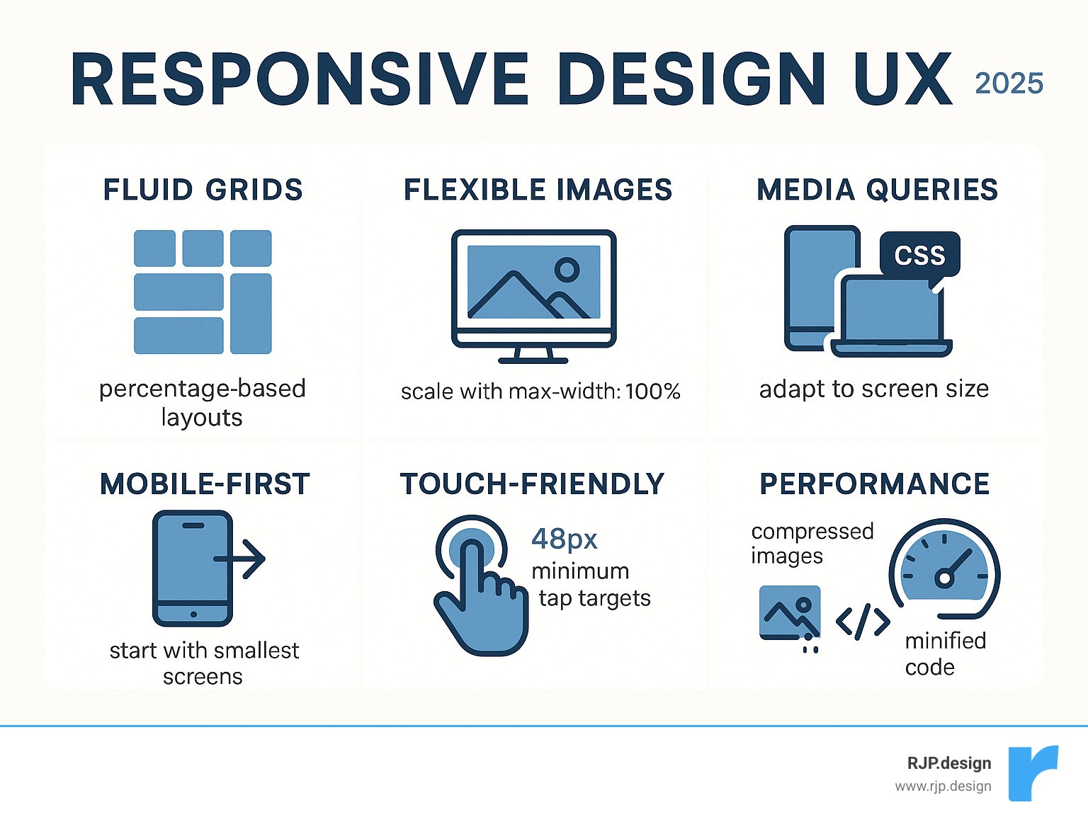
Fluid Grids: The Foundation of a Malleable Layout
Fluid grids are the foundation of responsive design UX. Instead of using fixed-width columns, we use percentage-based measurements that automatically adjust to fill the available space. A three-column layout on a wide desktop monitor will gracefully stack into a single-column layout on a phone, perfect for scrolling.
This proportional scaling applies to both the columns and the gutters (the spaces between them), maintaining the layout’s relational integrity at any size. Modern CSS tools like Flexbox and CSS Grid simplify the creation of these adaptive layouts. To learn more, you can get to know everything about grids.
Flexible Images and Media
An image that is too wide for a mobile screen breaks the user experience. The solution is a simple line of CSS: max-width: 100%. This tells an image to never be wider than its container, allowing it to shrink as needed without stretching beyond its original size and becoming blurry.
For logos and icons, SVG (Scalable Vector Graphics) files are ideal. They scale to any size without losing quality, making them perfect for all displays. Video content requires the same flexible treatment. Performance is also crucial; mobile users on slow connections shouldn’t be forced to download large, desktop-sized images. Mozilla has an excellent article on responsive images that details advanced techniques for serving appropriately sized images.
Media Queries: The Brains of the Operation
If fluid grids and flexible images are the muscles, media queries are the brain. These CSS3 features apply different styles based on the viewing device’s characteristics. They act as conditional rules, checking for properties like screen width, resolution, or orientation.
For example, a media query can check if a screen is smaller than 768 pixels and then apply styles to hide a sidebar or increase font size. This intelligence allows us to define breakpoints—specific points where the design transforms to better suit the user’s context. Media queries enable precise adjustments to layouts, fonts, and buttons, which is the key to creating easy responsive CSS.
When these three pillars—fluid grids, flexible media, and media queries—work together, the result is a responsive design UX that feels effortless to the user.
Mastering Responsive Design UX: From Mobile-First to Flawless Usability
Effective responsive design UX creates experiences that feel natural on every device. It requires a user-centric approach, where thoughtful content strategy and careful interaction design are crucial for crafting experiences that align with how people live and work.

Users expect seamless transitions as they move between their phones, tablets, and laptops. The experience should feel like a single, continuous conversation.
The Mobile-First Advantage for Responsive Design UX
Instead of designing for a large desktop and then shrinking it for mobile, the mobile-first approach starts with the smallest screen and expands from there. Championed by Luke Wroblewski, this method forces a focus on what truly matters to users.
This constraint is liberating, as it prioritizes core content and functionality. The benefits include faster load times on smartphones and better alignment with Google’s mobile-first indexing. Starting small and adding features for larger screens (progressive improvement) is more efficient than removing them when scaling down. You can learn more about the mobile-first approach proposed by Luke Wroblewski and explore our guide on good mobile website design.
Content Prioritization and Navigation Strategies
Mobile-first thinking necessitates content prioritization. Visual hierarchy is key; the most important information must be immediately visible, while secondary details can be revealed through progressive disclosure.
Desktop navigation menus are often too large for mobile screens. They must be transformed into more manageable patterns. Common mobile navigation solutions include:
Hamburger menus that tuck navigation behind an icon.
Navigation drawers that slide out from the side.
Accordions that let users expand only the sections they need.
The goal is to reorganize essential content for smaller screens, not hide it. Users should never have to hunt for what they need. You can read an in-depth analysis of responsive design to see how successful sites handle these challenges.
Ensuring Usability with Touch-Friendly Interactions
Fingers are not precise like mouse cursors, which fundamentally changes interaction design. Fitts’s Law suggests that larger targets are easier to hit. For touchscreens, this means designing for minimum touch target sizes of 48×48 pixels with enough space between elements to prevent accidental taps.
Design should also consider the “thumb zone”—the area of the screen easily reachable without shifting one’s grip. Frequently used actions should be placed within this zone. Gestures like swiping and tapping become primary interaction methods, and hover-dependent features must be avoided. Form usability is also critical; input fields and buttons must be large enough to be tapped accurately by human fingers.
Responsive vs. Adaptive Design: Making the Right Choice
While responsive design UX is the most common approach, it has a close relative: adaptive design. Both ensure your website looks great on any device, but they work differently. Responsive design is fluid, continuously molding to any screen size. Adaptive design uses a few distinct, pre-set layouts for specific device sizes.
Here’s a quick comparison:
Feature | Responsive Design | Adaptive Design |
|---|---|---|
Flexibility | Fluid, adapts continuously | Static layouts, loads specific layout based on detection |
Development | Single codebase, CSS media queries | Multiple fixed layouts, server-side detection |
Performance | Can be slower if not optimized (full desktop code) | Potentially faster (only loads necessary code) |
Maintenance | Easier (one codebase) | More complex (multiple codebases/layouts) |
Best Use Case | New projects, fluid experience, broad device range | Retrofitting old sites, complex apps, specific device targets |
The core difference is how they adapt. Responsive design UX is client-side; the browser downloads one set of code and uses CSS media queries to adjust the layout. Adaptive design is often server-side; the server detects the device and sends a pre-made layout specifically for it.
When to Choose Responsive Design
For most new projects, responsive design UX is the ideal choice. Its single codebase means less development time, easier updates, and a more cost-effective solution. The fluid experience it provides scales smoothly to any screen size, which users appreciate.
Google also favors responsive sites in search rankings. This approach is inherently future-proof, as it can accommodate new screen sizes without requiring a redesign. For a flexible, modern website, our responsive web solutions are the perfect fit.
When Adaptive Design Might Be a Better Fit
Adaptive design has specific use cases where it excels. It can be a practical solution for retrofitting old websites that were not built to be responsive. Instead of a complete overhaul, creating a few adaptive layouts for key device types can be more budget-friendly.
Adaptive design also offers precise control over the user experience on specific devices. For performance-critical applications or large e-commerce sites where speed is paramount, serving only the necessary code for a particular device can result in a faster experience. However, this control comes at the cost of more complex development and maintenance, as you are managing multiple versions of your site.
Best Practices: Implementation, Testing, and Avoiding Common Pitfalls
Creating outstanding responsive design UX requires a solid process for implementation and testing. The difference between a good and a great responsive site lies in the details, and collaboration between designers and developers from the start is essential for catching problems early.

A Practical Guide to Breakpoints
Breakpoints should be content-driven, not device-driven. Instead of designing for a specific “iPhone width,” resize your browser window and observe where the layout begins to look awkward. That’s where you need a breakpoint.
Common starting points for major breakpoints are around 320px (small phones), 768px (tablets), and 1024px (desktops). You may also need minor breakpoints in between to fine-tune spacing or font sizes. Involving developers early in this process ensures a smoother implementation. Our guide on breakpoints in responsive web design provides a more detailed walkthrough.
How to Effectively Test Your Responsive Design
Thorough testing is critical. While browser developer tools are a good starting point, they don’t always replicate real-world conditions. Always test on a variety of real devices, operating systems, and browsers.
Performance testing is just as important as visual testing. Check load times on different network speeds to ensure your site is fast for all users, not just those on high-speed internet. Finally, conduct usability testing with actual people to uncover issues you might have missed. Google’s free Mobile-Friendly Test can provide a quick check, but it’s no substitute for real user feedback.
Common Mistakes in Responsive Design UX and How to Avoid Them
Knowing what to watch for can help you avoid common pitfalls:
Forgetting landscape mode: Users frequently rotate their phones. Ensure your layout works well in both portrait and landscape orientations.
Hiding important content: Don’t use
display: noneon crucial elements for mobile users. Reformat content using accordions or other patterns instead.Using unoptimized images: Large images kill performance on mobile. Compress images and serve appropriate sizes for different viewports.
Making text and buttons too small: Text must be readable without zooming, and buttons need to be large enough for thumbs to tap accurately.
Designing for desktop first: Starting with desktop often leads to a cramped, compromised mobile experience. A mobile-first approach leads to cleaner, more focused designs on all screen sizes.
Using separate mobile URLs: This creates SEO problems and confuses users. A single, responsive URL is the correct approach.
Conclusion: Future-Proofing Your Website with Superior Responsive UX
Responsive design UX is the cornerstone of modern web development. It’s no longer a trend but a fundamental requirement for creating digital experiences that serve users on any device.
As we’ve covered, the core principles—fluid grids, flexible media, and smart media queries—combined with a mobile-first approach, lead to better websites. The benefits are clear: improved SEO, lower bounce rates, and higher user satisfaction. With Google prioritizing responsive sites and users demanding seamless cross-device experiences, it has become essential for business success.
At RJP.design, we specialize in creating websites that thrive on every screen. Our approach combines technical expertise with a deep understanding of user behavior. We believe a successful responsive design isn’t just about making things fit; it’s about making them work beautifully for every visitor.
The web will continue to evolve with new devices and screen sizes. By building on a solid foundation of responsive principles—user-centricity, flexibility, performance, and accessibility—your website will be prepared for the future.
Your website is your most important digital asset. Ensure it makes a great first impression, whether viewed on a phone, tablet, or desktop. Let’s discuss your next web design and development project and create a responsive experience that connects with your audience.

