Web
Responsive Web Apps Unleashed – Your Step-by-Step Development Guide
Jul 30, 2025

Responsive Web Application Development: Flawless 3
Introduction: Your Gateway to a Multi-Device World
What is responsive web application development?
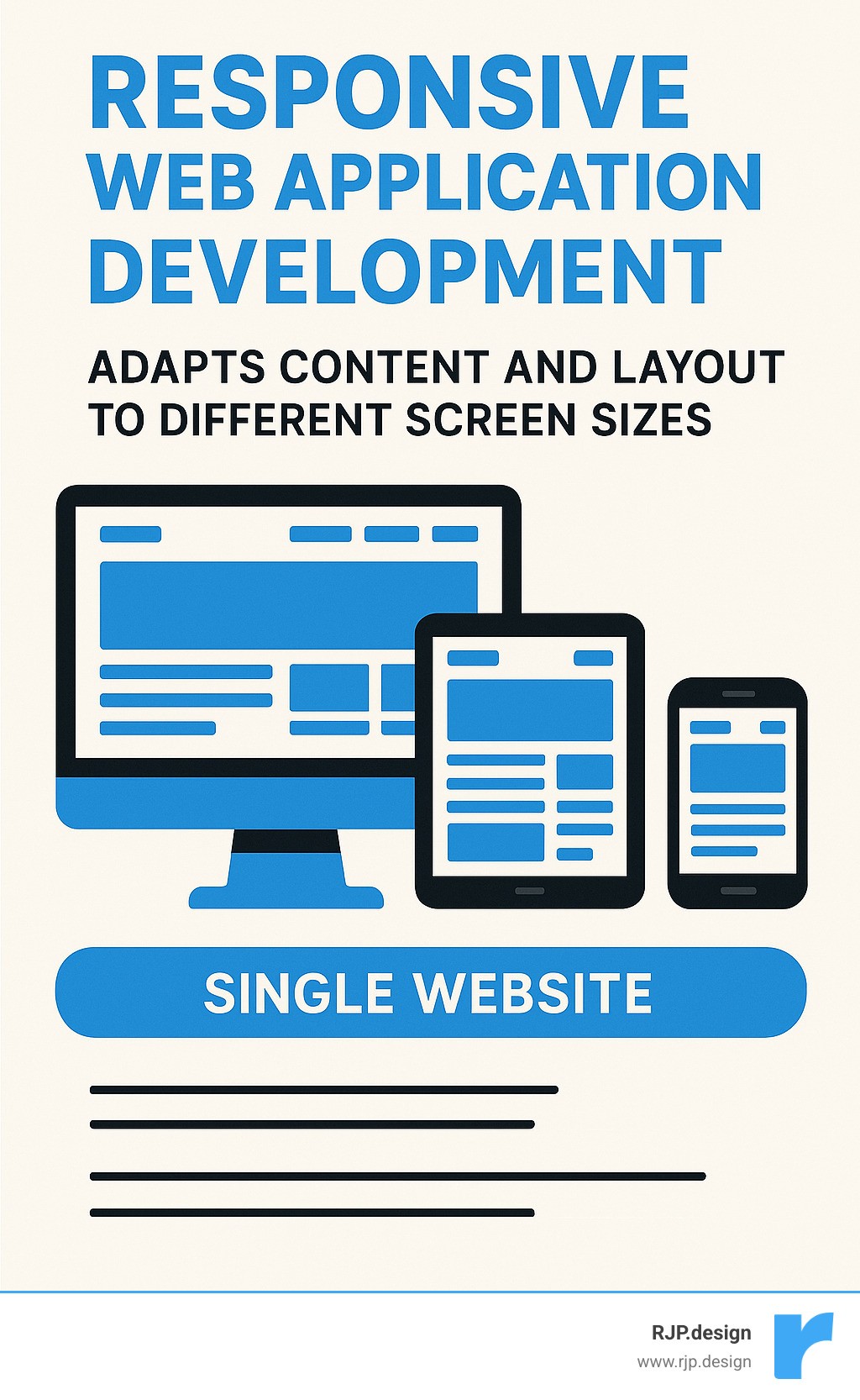
Responsive web application development is the practice of creating websites and applications that look and function perfectly on any device. The layout, content, and features automatically adjust to fit desktops, tablets, and smartphones, ensuring a seamless user experience.
Today’s users access the internet from a vast array of devices, each with a different screen size. With over half of all web traffic coming from mobile devices, a non-responsive site risks alienating a significant portion of its audience. In fact, nearly 60% of web developers cite a lack of responsiveness as a top reason for a website redesign.
This guide will show you how to build web applications that work perfectly everywhere. As an expert in responsive web application development, I’ve helped businesses craft digital experiences that adapt to every user, and this guide builds on that practical experience.
Common responsive web application development vocab:
Why Responsive Web Application Development is Non-Negotiable
Using a website on your phone that’s tiny, jumbled, or impossible to click is a frustrating experience. That’s why responsive web application development isn’t just an extra feature; it’s vital for any online business. People expect your website to work perfectly, no matter the device. If it doesn’t adjust, they’ll leave.
Embracing responsive web application development brings clear benefits:
Improved User Experience: A responsive app automatically adapts its layout and features to any screen size. This creates a smooth, intuitive experience that encourages visitors to stay longer.
Improved SEO Performance: Google’s “Mobilegeddon” update in 2015 began boosting the search rankings of mobile-friendly sites. A responsive design is crucial for visibility in search results. You can read about this directly from Google’s mobile-friendly update.
Reduced Bounce Rates & Increased Conversions: A “bounce” is when a user leaves your site immediately. Responsive design prevents this by making your site easy to steer, which keeps users engaged and turns them into customers.
Cost-Effectiveness & Easier Maintenance: Instead of building and maintaining separate sites for desktops, tablets, and phones, you build one site that works everywhere. This saves significant time, effort, and money.
Future-Proofing: New devices are always emerging. A flexible, adaptable web application is ready for future technology, protecting your investment for years to come.
At RJP.design, we help clients succeed by building a strong digital presence. Learn more about how we partner with businesses: More info about Business Website Development.
Understanding the Core Concept
The idea of “responsive web design” was introduced by Ethan Marcotte in a 2010 article for “A List Apart.” His concept was to use core web technologies—HTML and CSS—to build a single website that adapts to all devices. This method uses three main techniques to resize, hide, or move content for an optimal viewing experience:
Fluid Grids: Using flexible, relative units like percentages instead of fixed pixels, so the layout scales with the screen.
Flexible Images: Ensuring images automatically resize to fit their container without breaking the layout.
Media Queries: CSS rules that apply different styles based on the device’s characteristics, like its screen width.
As Marcotte’s groundbreaking article explains, the goal is for content to flow like water, adapting to any container. You can read it here: The foundational “Responsive Web Design” article.
The Critical Role of the Viewport
One line of HTML is essential for responsive design: the viewport meta tag. In the past, mobile browsers would pretend to be a wide desktop screen and shrink the entire page, forcing users to zoom in. The viewport tag fixes this.
Adding <meta name="viewport" content="width=device-width, initial-scale=1.0"> to your HTML’s <head> section tells the browser two things:
width=device-width: Sets the page width to the device’s actual screen width.initial-scale=1.0: Sets the initial zoom level to 100%, showing the page at its intended size.
This simple tag ensures your responsive designs appear correctly on mobile devices and prevents horizontal scrolling, a major usability issue. For more tips, see our insights on More info about Good Mobile Website Design.
The Three Pillars: Building Your Responsive Foundation
Just like building a house requires a strong foundation, responsive web application development relies on three key pillars. These are the core ingredients, powered by HTML and CSS, that allow your website to adapt beautifully to any screen.
These pillars work together to make your content adjust automatically, your images resize gracefully, and your site’s style change intelligently based on the viewing environment.
Pillar 1: Fluid Grids and Flexible Layouts
Old websites were often built with fixed-width layouts using exact pixel measurements, which look awkward on different screen sizes. Modern responsive web application development uses fluid grids instead.
This means we use relative units like percentages (%), em, or rem for layout elements like widths and margins. For instance, a column set to 50% width will always take up half of its container, no matter the screen size. A key technique is using the max-width property. Setting max-width: 100% on an element ensures it never overflows its container on smaller screens, preventing layout shifts and horizontal scrolling. For more tips, check out More info about Easy Responsive CSS.
Pillar 2: Responsive Images and Typography
Making images and text responsive is vital for a good user experience. For images, the CSS rule max-width: 100%; height: auto; is essential. It tells images to scale down to fit their container while maintaining their aspect ratio. For more advanced control, the <picture> element and srcset attribute allow the browser to load the most appropriate image size for the user’s device, saving bandwidth and improving load times.
Text can also be responsive using viewport units (vw, vh), where 1vw equals 1% of the screen’s width. This allows font size to scale with the browser window. However, to ensure accessibility and user control, we often combine vw with a fixed unit like rem using the calc() function. This provides scalability while respecting user zoom settings. As a rule, we aim for a comfortable line length of 70-80 characters for readability.
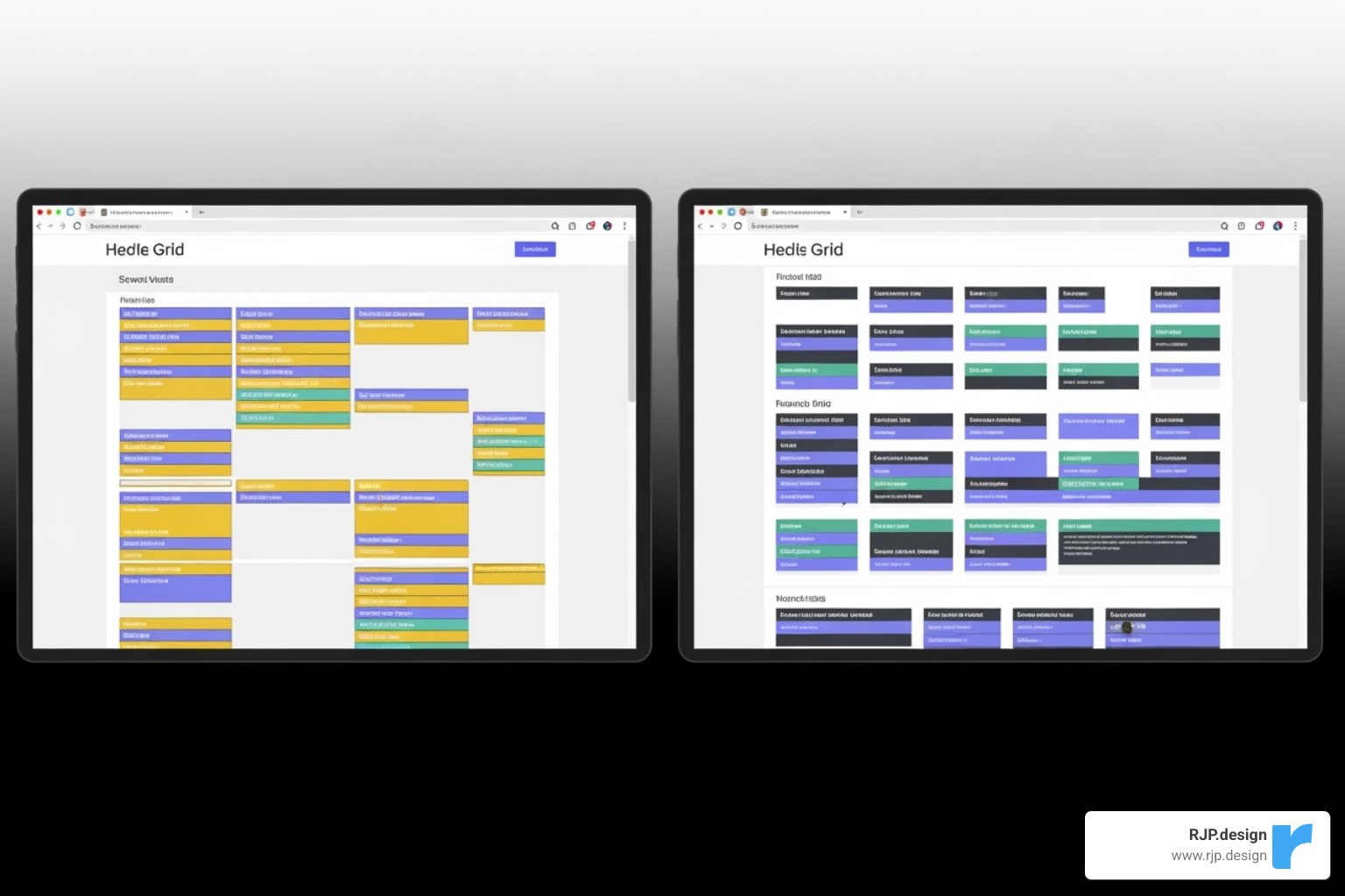
Pillar 3: Mastering Media Queries and Breakpoints
Media queries are the brains of responsive design. They are CSS rules that apply styles based on a device’s characteristics, such as its width, height, or orientation (portrait or landscape). Using @media rules with min-width and max-width allows us to define ranges where different layouts apply.
At RJP.design, we advocate for a mobile-first approach. We design for the smallest screen first, creating a clean, functional layout for mobile users. Then, we use media queries to add more complex features and layouts for larger screens. This ensures a fast, efficient experience for everyone, especially those on slower mobile connections.
Crucially, we set breakpoints—the points where the layout changes—based on the content, not specific devices. When a line of text becomes too long or a navigation bar looks cramped, that’s when we add a breakpoint. This content-driven strategy ensures the design looks its best on any screen. Learn more about this at More info about Breakpoints in Responsive Web Design.
Modern Layouts and Development Strategies
The world of web development is always evolving, which is great news for responsive web application development. Modern CSS has given us powerful and intuitive tools that make creating flexible layouts easier than ever, moving beyond the old days of floats and clearfixes.
CSS Flexbox vs. CSS Grid: The Modern Toolkit
CSS Flexbox and CSS Grid are the superstars of modern web layout, designed to create adaptable designs that work everywhere.
CSS Flexbox (Flexible Box Layout) is ideal for arranging items in a single dimension, either as a row or a column. It’s perfect for aligning items in a navigation bar, creating responsive forms, or distributing a row of cards evenly. If you need items to grow or shrink to fill space along one axis, Flexbox is the tool for the job. You can learn more here: Read more about Flexbox.
CSS Grid (Grid Layout) is designed for two-dimensional layouts—rows and columns. It excels at building complex, full-page structures like headers, sidebars, and footers. Grid is also fantastic for creating image galleries with perfect alignment, dashboards with multiple panels, or magazine-style layouts. It gives you precise control over the entire page. Learn more about it here: Read more about CSS Grid Layout.
Flexbox and Grid work wonderfully together. A common pattern is to use Grid for the main page structure and Flexbox to align the content inside each grid area.
Key Approaches to Responsive Web Application Development
There are several philosophies for building responsive apps. Here are the main ones:
Mobile-First Design (Progressive Improvement): This is our preferred approach at RJP.design. We start by designing for the smallest screens first, focusing on core content. Then, as screen size increases, we progressively add more complex features and layouts. This ensures a fast, lightweight experience for mobile users.
Desktop-First (Graceful Degradation): This older method starts with a large desktop design and then scales it down. It can often result in a clunky mobile experience with slow load times.
Adaptive Design: This approach uses a few fixed layouts for specific screen sizes (e.g., mobile, tablet, desktop). The app “adapts” by choosing the best layout. However, it isn’t truly fluid and can’t handle the vast range of screen sizes as smoothly as responsive design.
RESS (Responsive Web Design with Server-Side Components): In this advanced strategy, the server detects the user’s device and sends an optimized version of the site’s assets. This can significantly improve performance but adds backend complexity.
Testing and Best Practices for Flawless Responsiveness
Building a responsive application is only half the battle; rigorous testing is required to ensure it works perfectly on every device. At RJP.design, we follow key best practices to guarantee your app not only looks great but also performs exceptionally.
Key best practices include Performance Optimization (optimizing images and code for speed), Accessibility (WCAG) (ensuring the app is usable by everyone), creating large enough Touch Targets (at least 48×48 pixels) for easy tapping, and ensuring Cross-Browser Compatibility across Chrome, Firefox, Safari, and Edge.
How to Effectively Test Your Responsive App
Effective testing is a vital part of any responsive web application development project. Here’s how to ensure everything is right:
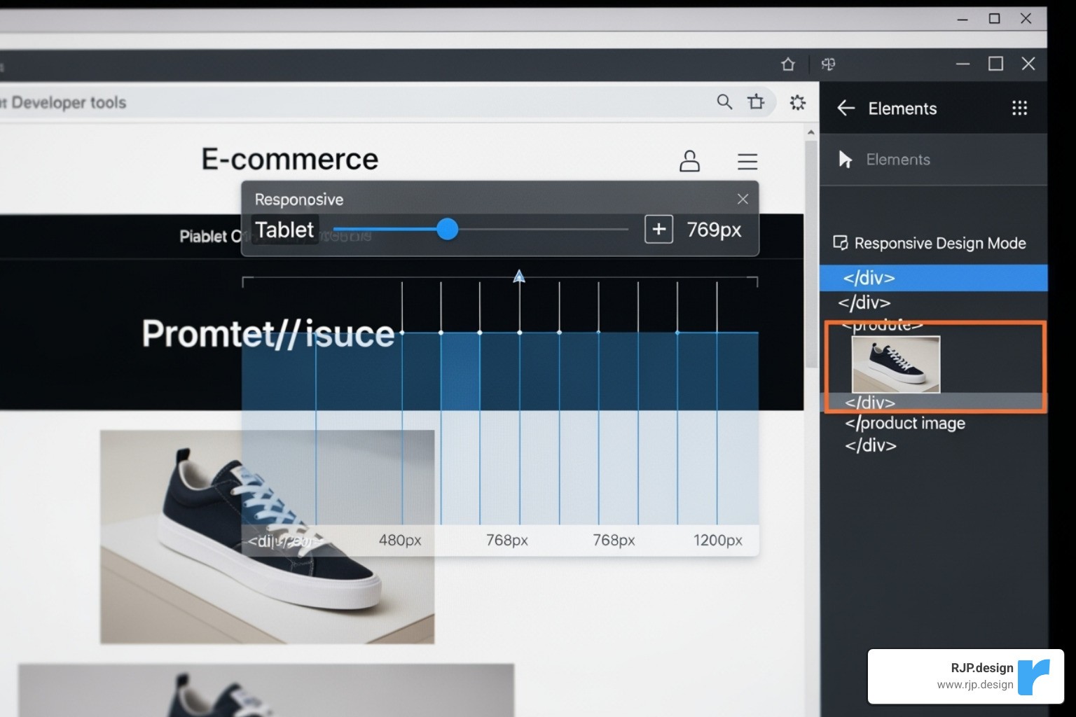
Browser Developer Tools: Modern browsers include a “Responsive Design Mode” that lets you simulate different screen sizes, resolutions, and devices. It’s an excellent first step for checking your layouts and media queries.
Google’s Mobile-Friendly Test: This free tool from Google gives you a quick pass/fail grade on your page’s mobile-friendliness and is a great check for SEO. Test your site here: Google’s Mobile-Friendly Test.
Emulators, Simulators, and Real Devices: While software emulators are useful for quick checks, nothing beats testing on real devices. Using actual phones and tablets is the only way to truly understand the user experience. For broader testing, real device cloud testing services provide access to hundreds of physical devices remotely.
User Testing: The most valuable feedback comes from real people. Watching users interact with your app on their devices can reveal usability issues that automated tests will miss.
Distinguishing Responsive Apps, PWAs, and Native Apps
It’s helpful to understand the difference between responsive web apps, Progressive Web Apps (PWAs), and Native Apps. While all aim for a great user experience, they are built differently.
Criteria | Responsive Web App | Progressive Web App (PWA) | Native App |
|---|---|---|---|
Installation | None (just visit a website) | Can be “installed” to home screen (no app store needed) | Installed from app stores (Google Play, Apple App Store) |
Platform | Works in any browser, on any device | Browser-based, but acts more like an app | Made specifically for iOS or Android |
Performance | Good (depends on internet & browser) | Very good (can be super fast, works offline) | Excellent (made for the device’s hardware) |
Offline Access | Limited (only if browser saves it) | Yes (can work without internet!) | Yes (always works offline) |
Push Notifications | Not usually | Yes (can send you alerts) | Yes (can send you alerts) |
Device Features Access | Limited (camera, location, with permission) | More access than standard web (camera, location, sensors) | Full access (GPS, camera, contacts, motion sensors, etc.) |
Development Cost | Low to Moderate (one set of code) | Moderate (one set of code, plus PWA features) | High (separate code for iPhone, separate for Android) |
Maintenance | Easy (one set of code to update) | Easy (one set of code to update) | Complex (update each platform separately) |
Findability | Search engines, links | Search engines, links, “Add to Home Screen” prompt | App stores |
SEO Impact | High (Google loves responsive sites) | High (indexed like websites, fast loading helps SEO) | Indirect (app store optimization, brand recognition) |
User Experience | Good (adjusts to screen) | Very good (feels like an app, fast, reliable, engaging) | Best (super smooth, made for the specific phone, deep features) |
Responsive web application development is the essential foundation. PWAs add app-like features, while native apps offer the most integrated experience at a higher cost. The best choice depends on your project’s goals and budget. For help finding the right solution, learn about our More info about Custom Web Applications.
Frequently Asked Questions about Responsive Web Application Development
Responsive web application development can seem complex, but many clients have the same key questions. Here are the most common ones, with straightforward answers.
What are the main benefits of choosing responsive web application development?
The primary benefits are both immediate and long-term. First, you’ll see improved SEO, as Google rewards mobile-friendly sites with better search rankings. This leads to a wider audience reach, connecting you with the majority of users who browse on mobile devices.
For users, it creates a better user experience, reducing frustration and bounce rates, which in turn increases conversions. For your business, it means simplified maintenance and lower costs, as you only manage one codebase instead of separate mobile and desktop sites. Finally, it’s about future-proofing your digital presence against the constant emergence of new devices and screen sizes.
How do I choose the right breakpoints for my design?
Forget trying to target specific devices like iPhones or iPads. The best practice is a content-first approach. Start with your design on a small mobile screen and gradually widen your browser window. When the content starts to look awkward—for example, when text lines become too long to read comfortably or navigation elements feel cramped—that’s where you should add a breakpoint.
In short, add breakpoints when the layout breaks. Let your content dictate the design changes, not a list of popular gadgets. This creates a more organic and universally effective design.
Can a non-responsive web application be converted to a responsive one?
Yes, absolutely. Converting an older, non-responsive site is a common project, as nearly 60% of developers agree that a lack of responsiveness is a top reason for a redesign. However, it’s rarely a quick fix.
The process typically requires refactoring the site’s HTML and CSS. Fixed-width pixel layouts must be converted to flexible, percentage-based ones, and media queries must be implemented. This often means rethinking layouts and rebuilding them with modern tools like CSS Flexbox and Grid for better results and easier maintenance.
While it can be a significant undertaking, sometimes involving a complete overhaul, the investment pays off with better user engagement, improved SEO, and simplified management. If you’re facing this challenge, our Website Redesign Service can guide you through the process strategically.
Conclusion: Build an App That Works for Everyone
From smartphones to desktops, the modern digital landscape demands flexibility. Responsive web application development is no longer optional; it’s the standard for creating websites that work for every user, on every device. This approach is essential for improving user experience, boosting SEO, and simplifying maintenance.
By building on a foundation of fluid grids, flexible media, and smart media queries, and by leveraging modern tools like Flexbox and Grid, you can create a seamless journey for all your visitors. It’s about designing with your users in mind to ensure your application is accessible and enjoyable everywhere.
At RJP.design, we specialize in building high-quality, functional, and truly adaptable websites and applications. Our team is dedicated to helping your business meet its goals by navigating the ins and outs of responsive web application development.
The future of the web is responsive. Ready to ensure your online presence reaches its full potential? Start your project with our Web Design Development services and let’s build something that adapts and thrives.

