Web
Responsive Web Design RWD for Beginners: Your Website’s New Best Friend
Aug 14, 2025

Responsive Web Design RWD: Your 2025 Best Bet
Introduction: What is Responsive Web Design and Why Does It Matter?
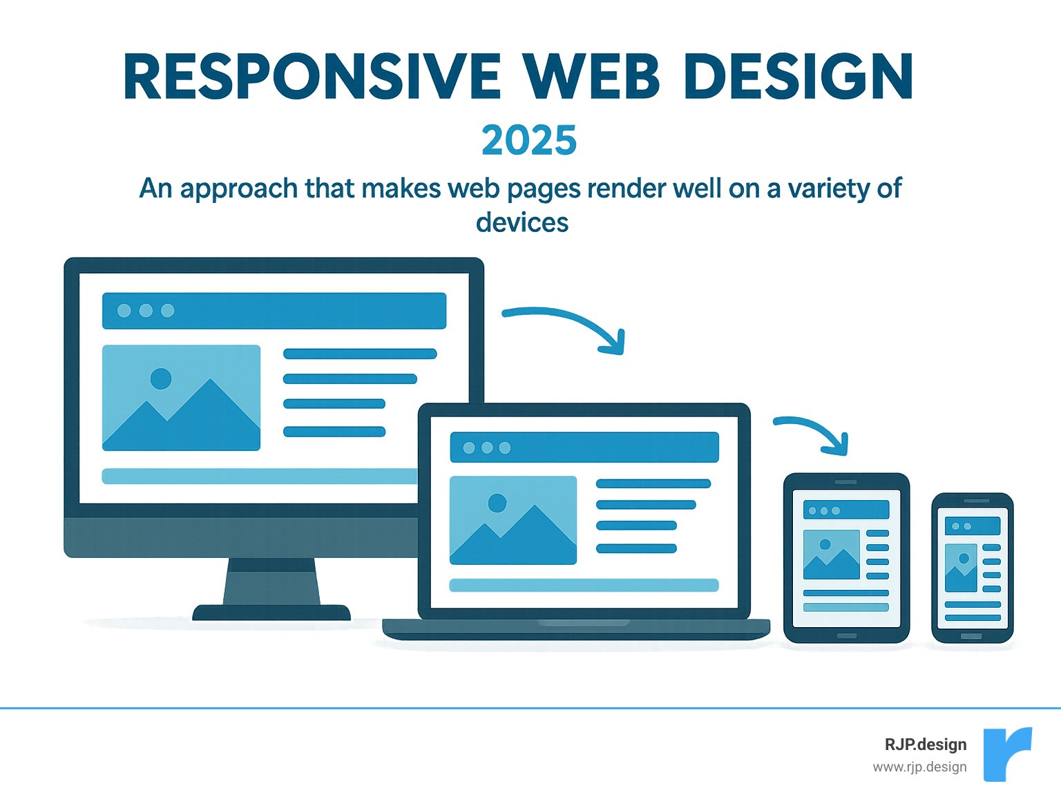
Responsive web design rwd is a web development approach that ensures websites display beautifully and function perfectly across all devices and screen sizes – from desktops to tablets and smartphones.
Where users access information from countless devices, responsive web design rwd is crucial. Think about it: whether someone visits your site on a large desktop monitor, a tablet, or their smartphone, they expect a seamless experience. No more pinching, zooming, or endless scrolling.
The internet has changed dramatically. Over half of all global web traffic now comes from mobile devices. This shift means your website must adapt, or you risk losing visitors. Google even emphasized this with its ‘Mobilegeddon’ update in 2015, boosting rankings for mobile-friendly sites.
For your business, this means a better user experience (UX). A responsive site ensures content is easy to read and steer, no matter the screen size. This keeps users happy and engaged.
As Ross Plumer, I’ve seen how vital responsive web design rwd is for businesses aiming to thrive online, especially having worked with companies marketing over $20 million in revenue. My expertise in website design and development, coupled with a deep understanding of digital marketing, has always centered on creating adaptable and high-performing digital presences.
Key terms for responsive web design rwd:
The Core Principles of Responsive Web Design RWD
Picture this: you’re browsing a website on your phone, and everything just works. The text is readable, the buttons are easy to tap, and you don’t need to pinch and zoom to see what’s going on. That’s responsive web design rwd in action – and it’s not magic, it’s smart design.
This brilliant approach was first introduced by Ethan Marcotte in his groundbreaking seminal article about responsive web design back in 2010. Instead of creating separate websites for every device (imagine the headache!), Marcotte proposed something revolutionary: one website that adapts to any screen.
The secret sauce? Three core ingredients that work together beautifully: flexible grids, fluid images, and CSS media queries. These elements, powered by modern HTML5 and CSS3, create websites that automatically adjust to different screen sizes, orientations, and platforms. Whether someone visits your site on their morning commute using a smartphone or during lunch break on their tablet, they’ll get the perfect experience every time.
Think of it as having a website that’s as adaptable as water – it takes the shape of whatever container it’s poured into, but it’s always the same high-quality content.
Flexible Grid-Based Layouts
Remember the old days when websites were built like brick walls – rigid and unchanging? Those days are long gone, thankfully. Modern responsive web design rwd uses flexible grids that bend and flow like a well-choreographed dance.
Here’s the key difference: instead of using fixed pixel measurements (like “this column is exactly 300 pixels wide”), responsive designs use relative units like percentages. This means your content can grow and shrink proportionally as screen sizes change.

Imagine a three-column layout on your desktop computer. On a tablet, those columns might reorganize into two columns for better readability. On a smartphone, they stack into a single column that’s easy to scroll through. It’s like having furniture that automatically rearranges itself to fit any room perfectly.
Modern CSS tools like Flexbox and CSS Grid have made this process incredibly smooth. These powerful layout methods give designers precise control over how elements stretch, shrink, and wrap. The best part? They completely eliminate that annoying horizontal scrolling that used to plague mobile users.
Fluid Images and Media
What good is a perfectly flexible layout if your images stick out like oversized puzzle pieces? Fluid images are essential for creating truly seamless responsive experiences.
The simplest solution is often the most neat. By applying the CSS property max-width: 100% to images, you ensure they’ll never overflow their containers. Think of it as giving your images permission to shrink when needed, but never grow beyond their original size (which would make them look blurry and unprofessional).
For websites that need to perform at lightning speed, we use more advanced techniques like the <picture> element and srcset attribute. These tools are like having a smart assistant that serves the perfect image for each situation. A smartphone user on a slower connection gets a smaller, optimized image, while someone on a high-resolution desktop gets the full-quality version.
This attention to performance considerations isn’t just about looking good – it’s about respecting your visitors’ time and data usage. For more insights on creating mobile-optimized experiences, check out our guide to good mobile website design.
CSS Media Queries
If flexible grids and fluid images are the body of responsive web design rwd, then CSS media queries are definitely the brain. These clever CSS rules act like a website’s decision-making center, applying different styles based on the device being used.
Breakpoints are where the magic happens. These are specific screen widths where your design needs to shift gears. You might have one design approach for screens wider than 1024 pixels (desktop territory), another for screens between 768 and 1023 pixels (hello, tablets), and a third for anything smaller (mobile devices).
Media queries use min-width and max-width properties to create these breakpoints. But they’re not just about changing layouts – they’re also smart about hiding or revealing content. That complex navigation menu might transform into a simple hamburger menu on mobile, while a detailed sidebar appears only when there’s enough screen real estate to make it useful.
The beauty lies in how these queries ensure users see exactly what they need, when they need it, without overwhelming smaller screens with unnecessary elements.
Understanding how to set effective breakpoints is crucial for smooth user experiences across all devices. If you want to dive deeper into this topic, our detailed guide on breakpoints in responsive web design covers everything you need to know.
Best Practices and Common Pitfalls
Building a truly great responsive website isn’t just about knowing the technical tricks; it’s about applying them wisely, with your users always in mind. Here at RJP.design, we always champion a mobile-first approach. This means we actually design and build for the smallest screens first. Think about it: if your site looks fantastic and works perfectly on a tiny phone, making it shine on a big desktop screen is a breeze! This method forces us to prioritize what’s truly important, leading to a cleaner, faster, and more focused experience for everyone. Plus, mobile users are often on slower connections, so optimizing for them helps all your visitors enjoy a speedy site.
Another huge piece of the puzzle is performance optimization. Even the most beautiful responsive site will frustrate users if it loads slowly. We make sure your site is snappy and quick, no matter the device or connection. This involves clever techniques like image compression (serving the right size image for the right device – no need for a massive desktop image on a tiny phone!), minimizing code (trimming down CSS and JavaScript files), and using smart browser caching.
And finally, our golden rule: cross-device testing, testing, and more testing! What looks perfect on your big desktop monitor might be a bit wonky on a specific tablet or smartphone. That’s why we rigorously check our designs across many different devices, browsers, and screen sizes. This helps us catch any unexpected glitches before your users do.
Here are some common missteps we help our clients avoid when diving into responsive web design rwd:
Ignoring Mobile-First Design: Trying to squeeze a big desktop design onto a small phone screen often leads to clunky, slow, and frustrating experiences. It’s much smoother to start small and then expand.
Overcomplicating Layouts: Just because you can create a super intricate layout doesn’t mean you should. Simple, clean designs are usually much more adaptable and user-friendly on smaller screens.
Skipping Cross-Device Testing: Relying only on your browser’s resize tool isn’t enough. You really need to test on actual devices (or reliable emulators) to see how your design truly behaves in the real world.
Neglecting Performance Optimization: Responsive design can sometimes lead to heavier pages if not managed well. We make sure you’re not sending huge images or unnecessary code to mobile users.
Using Absolute Units Everywhere: Sticking to fixed pixel widths for everything defeats the whole point of flexibility. Embracing relative units is key to a truly adaptable site.
Disabling User Zoom: Preventing users from zooming in on content is a big no-no for accessibility and usability. Imagine trying to read tiny text if you can’t zoom in – frustrating, right?
Mastering Responsive Typography
Your website’s text is your message, and your message needs to be clear and easy to read, whether it’s on a giant monitor or a small phone. That’s where responsive typography comes in! It’s all about making sure your words look great and are readable on any screen size.
Instead of fixed pixel units (px), we often use clever relative units like em and rem. These units scale based on other elements or the main page font size, giving us much more control over how text adapts. It’s like having flexible font sizes that grow and shrink with the screen.
For truly fluid text that scales smoothly, we can also use viewport units (vw for viewport width, vh for viewport height). A font size set in vw will scale up or down proportionally with the browser window’s width. However, using vw alone can sometimes make text too tiny on very small screens or too huge on massive ones, and it can stop users from zooming in.
The real magic happens when we combine vw with a fixed unit using the calc() function. For example, font-size: calc(1rem + 1vw); creates a font size that has a comfortable starting point (1rem) but then grows gently as the screen gets wider. This ensures your text scales gracefully, stays perfectly readable, and remains accessible – so users can still zoom if they need to. It’s a delicate balance, but one we’ve mastered to ensure your message always comes through loud and clear.
Getting Started with Responsive Web Design RWD: Tools and Frameworks
Ready to roll up your sleeves and dive deeper into responsive web design rwd? The good news is, you don’t have to build everything from scratch. There are some fantastic tools and frameworks out there that can really speed up your development process.
For quick checks and troubleshooting, your browser’s built-in Developer Tools are your best friends! Just right-click on any webpage and select “Inspect” (or press F12). They include awesome responsive design testers that let you instantly see how your site looks on different device sizes and orientations without needing a pile of gadgets.
To get Google’s official take on your site’s mobile-friendliness, we often recommend their free and easy Google’s Mobile-Friendly Test. It’s a super quick way to get a report on how well your page performs on mobile.
When it comes to actually building the site, CSS Frameworks are incredibly popular. They give you a head start with pre-built, responsive components and styles that you can easily customize. Bootstrap has been a long-standing favorite, offering a huge collection of responsive grids, ready-to-use components, and even JavaScript plugins. Tailwind CSS, another popular choice, is more about utility-first classes, which means it gives you immense flexibility to build highly customized responsive designs very quickly. These frameworks handle a lot of the complex CSS behind the scenes, letting you focus more on your content and how it’s structured. If you’re curious about how Tailwind CSS can make your website development smoother, you can find more information about responsive website tailwind on our site.
Learning and mastering responsive design truly comes alive with hands-on practice. Start with simple layouts, then gradually add fluid images and media queries. There are tons of online tutorials, courses, and even the fun challenge of trying to recreate existing responsive websites to build your skills.
The Impact of RWD on User Experience (UX) and SEO
When we talk about responsive web design rwd, it’s easy to focus on how beautiful your website looks on different screens. But the truth is, the benefits run much deeper than just aesthetics. A truly responsive site fundamentally transforms how users experience your brand and how search engines like Google see your business. It’s a win-win!
From a user experience (UX) perspective, a responsive site is like a warm, welcoming handshake. When visitors land on your site, no matter if they’re on a tiny phone or a giant desktop monitor, they immediately feel comfortable. This comfort leads to a reduced bounce rate – meaning fewer people leave your site right away because it’s difficult to use. Instead, they stay, explore, and engage. This smooth, frustration-free journey naturally leads to increased conversions, whether you want them to make a purchase, fill out a form, or simply learn more about what you do. Plus, your brand’s message and visual identity remain perfectly consistent across every device, building trust and recognition with every click.
In the “old days,” businesses often had to choose between building one website for desktops and a completely separate “m-dot” site (like m.example.com) just for mobile users. Can you imagine the headache? That meant maintaining two sets of code, updating content twice, and generally doubling the effort. With responsive web design rwd, those days are thankfully behind us. You get a single codebase, which makes development and ongoing maintenance significantly easier and more cost-effective. One update, and it’s live everywhere! This approach also offers incredible future-proofing. As new devices pop up (and they always do!), your responsive site is inherently designed to adapt without needing a total overhaul. And perhaps best of all, there are no redirects. Users land directly on the right content, instantly, without being bounced around different URLs. It’s faster, smoother, and much more user-friendly.
Why Responsive Web Design RWD is a Non-Negotiable for Modern SEO
If you want your website to truly shine in Google’s search results, responsive web design rwd isn’t just a perk; it’s absolutely essential. Think of it as a golden ticket to better visibility. Google has been incredibly clear about its preference for responsive sites, and for good reason!
Firstly, it’s about Google’s recommendation. The search giant officially suggests responsive design as the best way to make your website mobile-friendly. They consider it a gold standard, and following their advice is always a smart move. More importantly, Google now primarily uses the mobile version of your content for indexing and ranking, a process known as Mobile-First Indexing. If your mobile experience is clunky or non-existent, it can seriously hurt your rankings. Furthermore, a well-implemented responsive design directly contributes to strong Core Web Vitals – those crucial performance metrics Google uses for ranking, like how fast your site loads, how interactive it is, and how stable its layout remains.
Beyond these technical points, a single responsive site offers significant advantages for how Google crawls and understands your content. It leads to improved crawlability because Google’s bots only have one version of your site to visit and understand, avoiding issues with duplicate content or missed pages that can plague separate mobile sites. This brings us to the single URL benefits: having one web address for all devices simplifies everything. It makes sharing your content easier, linking to it more straightforward, and drastically reduces the chances of those tricky SEO errors that can pop up when managing multiple URLs.
A well-designed responsive website sends a clear, positive signal to Google: “This website cares about its users!” And because Google’s mission is to provide the best possible user experience, they reward sites that do the same. For even more ways to boost your online visibility and ensure your website is found by the right people, explore our comprehensive SEO services and internet marketing solutions.
Frequently Asked Questions about RWD
We often chat with folks who are curious about responsive web design rwd. It’s a topic that comes up a lot! Let’s clear up some of the most common questions we hear, helping you understand why it’s such a big deal for your online presence.
What is the difference between responsive and adaptive design?
This is a fantastic question, and it’s one we get all the time! Both responsive web design rwd and adaptive design want your website to look great on any device. But they go about it in slightly different ways.
Think of responsive design like water. You pour water into any container, and it just flows to fit that shape perfectly. That’s how a responsive website works! It uses clever tricks like flexible grids, images that shrink and grow, and special CSS rules (called media queries) to constantly adjust as someone changes their screen size. It’s one website, one set of code, always adapting smoothly. It’s graceful and seamless, like magic!
Now, adaptive design is a bit different. Imagine having a few different t-shirts in various sizes – small, medium, large. When you want to wear one, you pick the t-shirt that best fits you. Adaptive design works like that. It has a few pre-made layouts, each designed for a specific screen size (like a phone, a tablet, or a desktop). When someone visits your site, the system figures out what device they’re on and serves up the best-fit layout. This can sometimes feel faster for specific devices because it loads only what’s needed for that size. However, it often means more work behind the scenes, as you’re essentially managing multiple distinct versions of your site.
For most businesses and websites today, responsive web design rwd is the go-to choice. It’s generally simpler to maintain because you’re working with a single codebase, and its flexibility handles new devices as they pop up without needing a whole new design.
Is responsive design difficult to learn?
Learning responsive web design rwd is like learning any new skill – it takes a little time and practice. But here’s the good news: it’s definitely not rocket science! In fact, with modern web tools and techniques like CSS Flexbox and CSS Grid, creating responsive layouts is much easier now than it was when the concept first came out.
The biggest hurdle for many is simply shifting their mindset. Instead of thinking in fixed boxes and exact pixel sizes, you start thinking about things that can stretch, shrink, and rearrange. Once that click happens, it becomes much more intuitive. There are tons of amazing free guides, online courses, and helpful tutorials out there. If you know the basics of how websites are built (HTML and CSS), you’re well on your way. With a bit of dedication and some hands-on practice, anyone can get the hang of it!
How much does a responsive website cost?
Ah, the million-dollar question! Or perhaps, the many-thousand-dollar question. The truth is, the cost of a responsive web design rwd can vary a lot, just like the price of a car. It really depends on what you need!
Factors that influence the price include:
How complex your design is
The number of pages your site will have
Any custom features or functionalities you need (like a booking system or a special calculator)
If you need e-commerce capabilities (an online shop)
Content creation (writing text, taking photos)
Ongoing maintenance
You might find that a high-quality, professionally built responsive website has a higher initial price tag than a very basic, non-responsive site. Why? Because it involves more careful planning, clever coding for all those adaptations, and thorough testing across many different devices.
However, that initial investment really pays off in the long run. Think about it:
You reduce maintenance headaches because you’re only dealing with one website, not two or three.
You boost your SEO, leading to more people finding you online.
You offer a fantastic user experience, which means happier visitors who are more likely to become customers.
You future-proof your business, so your site is ready for whatever new gadgets come next!
While we can’t give you a number right here without knowing your specific needs, we can confidently say that investing in a top-notch, professionally built responsive web design rwd is one of the smartest moves you can make for your online presence. It’s not just a website; it’s an investment in your business’s future success and reach.
Conclusion: Future-Proof Your Website with RWD
Picture this: your website working perfectly on every device, from the tiniest smartphone to the largest desktop monitor. That’s the power of responsive web design rwd, and it’s not just nice to have anymore – it’s absolutely essential.
We’ve explored how mobile traffic now dominates the web, how Google’s algorithms favor mobile-friendly sites, and how a responsive website can dramatically improve both user experience and your search rankings. The evidence is clear: websites that adapt seamlessly to any screen size don’t just look better – they perform better too.

The three pillars we discussed – flexible grids, fluid images, and CSS media queries – work together like a well-oiled machine. They create websites that flow naturally from one device to another, ensuring your visitors always get the best possible experience. No more pinching and zooming. No more frustrated users bouncing away from your site.
Responsive web design rwd has become the standard practice for good reason. It means maintaining one codebase instead of juggling multiple versions. It means easier updates and lower costs over time. Most importantly, it means your website is ready for whatever new device comes next – and trust us, there’s always something new around the corner.
At RJP.design, we’ve seen how responsive design transforms businesses online. Our down-to-earth team understands that your website isn’t just a digital brochure – it’s a vital business tool that needs to work flawlessly for every visitor, every time. We specialize in creating websites that don’t just look stunning but also deliver the robust, adaptable foundation that modern businesses need.
The beauty of professional implementation lies in the details. It’s not enough to simply make a site “work” on mobile – it needs to shine. Every element should feel intentional, every interaction smooth, and every page load lightning-fast.
Don’t let your website become yesterday’s news in tomorrow’s digital world. Future-proofing your online presence with responsive design isn’t just smart business – it’s essential for staying competitive.
Ready to give your website the responsive makeover it deserves? Get a professional web design and development quote from our team today. Let’s create a website that works beautifully on every screen and helps your business thrive in our multi-device world.

