Web
Responsive Web Design: Making Your Internet Site Shine on Every Screen
Sep 26, 2025

Site internet responsive: 1 Flawless Design 2025
Why Your Website Needs to Work Perfectly on Every Device
A site internet responsive is a website that automatically adjusts its layout and content for an optimal viewing experience on any device, from desktops to smartphones. It’s a single site that looks great and works perfectly on a 27-inch monitor or a 5-inch phone screen.
Key characteristics of a responsive website:
Fluid layouts that adapt to any screen size
Flexible images that scale without breaking
Touch-friendly navigation for mobile users
Fast loading times on all devices
Single URL for all versions (no separate mobile site needed)
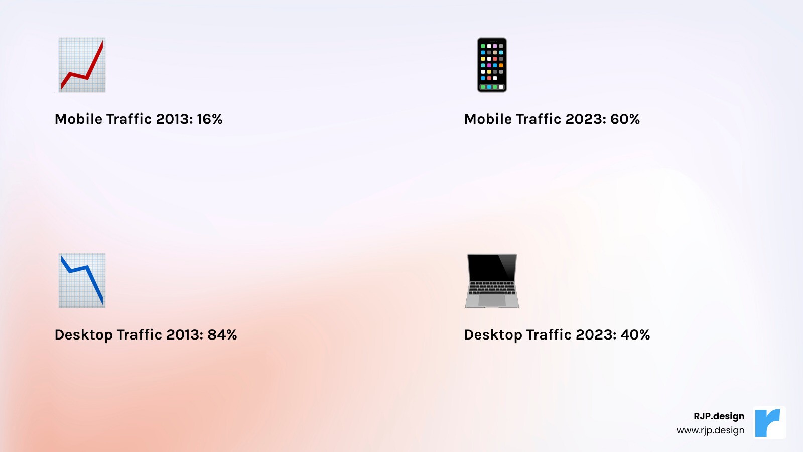
The numbers are clear: mobile traffic accounts for about 60% of all web traffic, and Google reports that 61% of all searches come from mobile devices. If your site isn’t mobile-friendly, you’re turning away over half of your potential customers.
Think about your own habits. If you have to pinch and zoom to read a site on your phone, you leave. Visitors on non-responsive sites do the same—they bounce to a competitor with a better mobile experience.
Google recognized this shift years ago. In 2015, they launched “Mobilegeddon”—an algorithm update prioritizing mobile-friendly websites. Today, Google uses mobile-first indexing, meaning they primarily look at the mobile version of your website to determine your search rankings.
I’m Ross Plumer, and I’ve helped businesses market over $20 million in revenue. I’ve seen how a well-designed site internet responsive dramatically improves engagement, search rankings, and sales. Responsive design isn’t a luxury; it’s essential for success in today’s mobile-first world.
Site internet responsive vocab to learn:
What is Responsive Web Design and Why Is It Essential?
A site internet responsive automatically adjusts its layout, images, and content to look perfect on every device. Whether a visitor is on their phone or a laptop, they get the same great experience.
The beauty of responsive design is its simplicity. Instead of managing separate mobile and desktop sites, you have one website with a single URL that works everywhere. This simplifies content updates and eliminates confusion for Google’s crawlers, making it far more manageable.
Responsive design excels at user experience. We’ve all encountered frustrating sites that require pinching and zooming on a phone, with tiny text and impossible-to-tap buttons. These sites drive visitors away instantly. A well-designed site internet responsive eliminates this frustration. Text is readable, buttons are thumb-friendly, and navigation feels natural. Happy visitors stay longer, explore more, and convert into customers.
From an SEO perspective, responsive design is essential. With Google’s mobile-first indexing, your mobile site’s quality primarily determines your search ranking. A poor mobile experience hurts your rank, while a responsive design gives Google the mobile-friendly site it prioritizes.
This leads to increased conversions and better brand credibility. A smooth experience builds trust, encouraging visitors to convert. A clunky mobile site suggests your business is outdated, which is the wrong impression to make.
The concept of responsive design was first introduced by Ethan Marcotte in 2010, and it completely transformed how we think about building websites. You can dive deeper into the foundational concept of responsive design to understand how this approach came to be.
Today, responsive design isn’t cutting-edge technology—it’s the standard. Anything less just doesn’t cut it in our mobile-first world.
The Core Principles: How Responsive Design Works
Building a site internet responsive relies on three core principles: fluid grids, flexible images, and media queries. Together, they ensure your site adapts seamlessly to any screen.
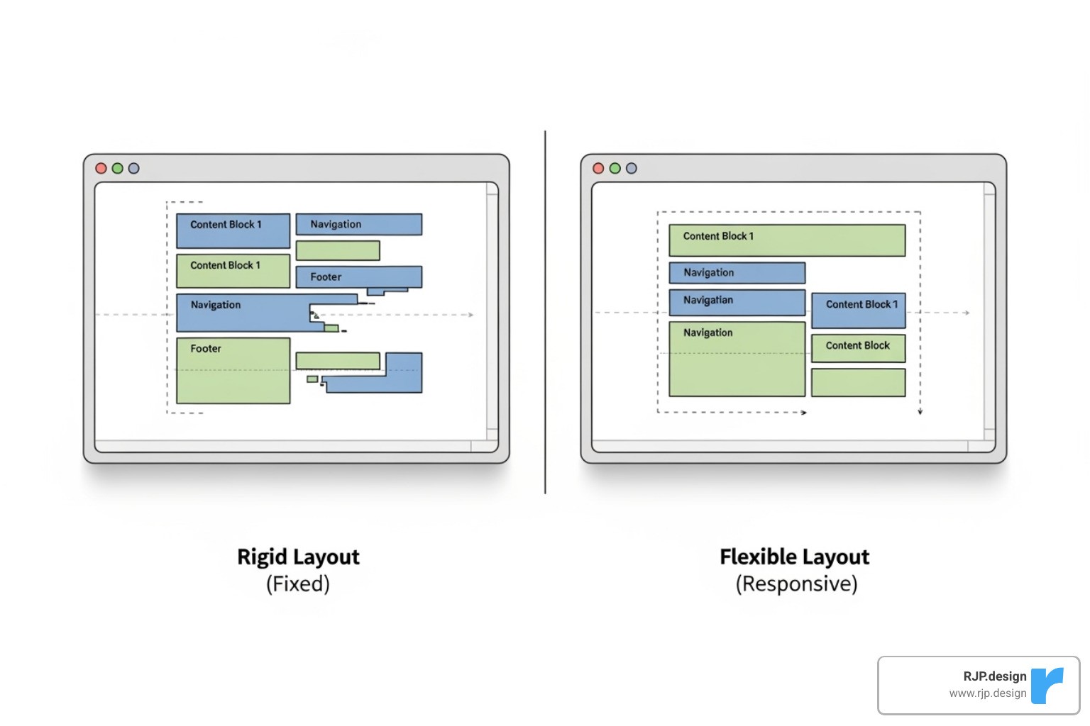
Fluid grids are the foundation. Unlike old, rigid layouts that used fixed pixel widths, fluid grids use relative units like percentages. For example, a sidebar might take up 25% of the screen space, allowing the layout to expand or contract to fit any device, from a phone to a large desktop monitor.
Flexible images are the next key. To prevent images from breaking the layout or being too small on mobile, a simple rule is applied: images scale with their container but never stretch beyond their original size. This ensures your visuals look crisp and correctly sized on every device.
Media queries are the final piece. They apply different styling rules based on screen characteristics like size or orientation. This is how a three-column desktop layout can transform into a single-column mobile view or how text can be made larger on smaller screens for readability. They conduct the responsive experience, ensuring every element adapts perfectly.
A crucial element is the viewport meta tag. This line of code tells mobile browsers to use the device’s actual width instead of shrinking a desktop view. It’s a small but essential detail that enables a truly responsive experience, preventing your site from looking like a tiny, unreadable miniature on mobile.
At RJP.design, we’ve mastered these principles through years of creating websites that work beautifully on every device. We understand that responsive design isn’t just about making things fit—it’s about creating an experience that feels natural and intuitive, no matter how someone visits your site. You can explore more about our approach to Responsive Web Design.
How to create a site internet responsive with CSS
Creating a responsive website with CSS involves using the right techniques and tools to build designs that adapt to any screen size.
Relative units are essential. Instead of fixed pixels, use units that scale naturally. Percentages (%), font-size relative units (em, rem), and viewport units (vw, vh) allow elements and text to resize proportionally based on their container or the screen itself.
The max-width property, often set to 100%, prevents images and other elements from overflowing their containers. This avoids broken layouts and horizontal scrolling, ensuring content scales down on mobile without stretching on larger screens.
CSS Flexbox is a powerful tool for creating flexible one-dimensional layouts. It simplifies aligning and distributing space among items, making it ideal for navigation menus or content grids that need to adapt to different screen sizes.
CSS Grid provides a two-dimensional layout system for more complex designs. It allows you to define rows and columns, making it easy to create sophisticated, grid-based layouts that can be completely rearranged for different devices.
These techniques work together to create websites that feel natural and polished on every device. We focus on writing clean, maintainable code that performs well and is easy to update. You can learn more about our streamlined approach in our guide to Easy Responsive CSS.
The Mobile-First Approach: Designing for the Modern User
The mobile-first approach means designing for the smallest screen first and then scaling up. This forces you to prioritize essential content and features, leading to a cleaner, more focused user experience.
This core content first strategy ensures the most important information is front and center. By starting with mobile constraints, the resulting design is cleaner and more effective for all users, not just those on phones.
Progressive improvement is the core idea: build a solid mobile foundation, then add features and complexity for larger screens. The experience is great on all devices, with improvements for users who have more screen space.
A key benefit is faster mobile performance, as small screens aren’t burdened with loading unnecessary desktop elements. Fast load times improve user engagement and SEO rankings.
Mobile-first also leads to a simplified design process. Starting small and building up creates cleaner, more intuitive designs by eliminating clutter from the outset, resulting in a more appealing and functional website.
We’ve found that mobile-first isn’t just a design trend—it’s the smart way to build websites in today’s world. When you design for the most challenging constraints first, everything else becomes easier. For more insights on how we determine the perfect points to improve designs for larger screens, check out our guide on Breakpoints in Responsive Web Design.
Best Practices for a Flawless Responsive Experience
A functional site internet responsive is good, but a delightful one is better. The difference lies in the details that create a memorable user experience on every device.

Performance optimization is crucial. A beautiful site that loads slowly on mobile is ineffective. We focus on techniques like lazy loading images (loading them only when needed), minifying CSS and JavaScript, and using browser caching to ensure fast load times for all visitors.
Image compression is essential. Large, high-resolution photos slow down mobile connections. We optimize images with modern formats like WebP and use HTML features like <picture> and srcset to serve the appropriately sized image for each device, improving performance without sacrificing quality.
Readable typography is often overlooked. Text that’s clear on a desktop can be unreadable on a phone. We use media queries to adjust font sizes, line heights, and spacing for comfort on any screen. Good text-to-background contrast is also vital for accessibility.
Touch-friendly navigation is key for mobile. Since fingers are less precise than a mouse, buttons and links need to be large enough to tap easily (Google recommends at least 48×48 pixels). We convert large desktop menus into clean mobile versions, like the common “hamburger” menu, for easy access.
For simple forms, less is more on mobile. Long forms are frustrating on a phone. We streamline them to include only essential fields, with clear labels and large, easy-to-tap input areas.
Key principles: Do use fluid grids, flexible images, a mobile-first approach, and performance optimization. Ensure large touch targets, prioritize content, and test on real devices. Don’t use fixed widths, unoptimized images, or ignore the user experience.
Using Website Builders and WordPress for an easy site internet responsive
You don’t need to be a coding expert to get a responsive website. Modern tools like website builders and WordPress make creating a site internet responsive accessible to everyone.
These platforms offer pre-built themes that are fully responsive foundations. They automatically adapt to different screen sizes, giving you a professional starting point for your design.
Drag-and-drop editors are game-changers, allowing you to build and preview your site on desktop, tablet, and mobile in real-time. This provides instant visual feedback and makes the design process intuitive.
Customization options let you adjust colors, fonts, and layouts to match your brand. WordPress extends this with a massive ecosystem of plugins for adding functionality like e-commerce or appointment booking, with most reputable plugins being mobile-friendly.
WordPress has earned its reputation as the world’s most popular website platform for good reason. Its combination of flexibility, ease of use, and responsive capabilities makes it perfect for businesses of all sizes. At RJP.design, we love working with tools like Elementor to create stunning, responsive websites that our clients can easily manage themselves. You can learn more about our approach with Responsive Website Elementor.
Overcoming Common Responsive Design Challenges
Even with the best tools, creating a flawless site internet responsive has its challenges. However, most common issues have straightforward solutions.
Complex navigation menus that work well on desktop often fail on mobile. The solution is to convert them into a mobile-friendly format, like the familiar and intuitive hamburger menu, which keeps the design clean while providing full access.
Data tables with many columns are unreadable on mobile. Solutions include allowing horizontal scrolling, stacking table cells vertically, hiding less critical columns, or reflowing the data into a card-based layout for small screens.
Slow-loading media like videos and heavy scripts can cripple performance on mobile. We address this by lazy-loading videos, optimizing animations, and carefully managing third-party scripts to prevent them from becoming bottlenecks.
Third-party embeds from social media or maps often have fixed dimensions that break responsive layouts. We use CSS techniques to wrap these embeds, ensuring they scale proportionally and fit seamlessly into the design.
Every challenge in responsive design is solvable with the right approach and experience. At RJP.design, we’ve encountered and overcome these obstacles countless times, ensuring your website remains perfectly functional and beautiful across all devices. Explore more about our problem-solving approach in Responsive Web Solutions.
Frequently Asked Questions about Responsive Websites
Here are answers to the most common questions we receive about creating a site internet responsive.
What are the key differences between responsive and adaptive design?
Responsive design is fluid, using one layout that adjusts to fit any screen size. It’s like a rubber band that stretches or shrinks as needed.
Adaptive design uses several distinct, fixed layouts for specific screen sizes. The site detects the device and serves the pre-designed layout that fits best, like choosing the right-sized box from a set.
Feature | Responsive Design | Adaptive Design |
|---|---|---|
Layout Approach | One fluid layout for all screens | Multiple fixed layouts for specific screens |
Flexibility | Smooth adaptation to any screen size | Fixed breakpoints with predetermined layouts |
Development | Single codebase, easier to maintain | Multiple versions, more complex to manage |
Loading Speed | Loads one version, optimized for performance | Can load faster by serving device-specific content |
SEO Impact | Single URL, better for search engines | May require multiple URLs or redirects |
Most modern websites, including the ones we build at RJP.design, use responsive design because it’s more future-proof and user-friendly.
How can I test if my website is truly responsive?
There are several ways to test if your site internet responsive works correctly on all devices.
Browser developer tools: Right-click on your site, select “Inspect,” and use the device toggle icon to simulate different screen sizes and devices. This is the fastest way to spot obvious layout issues.
Online testing tools: Websites like A simple tool to test your design let you enter your URL to see screenshots of your site on various devices at once, helping you catch problems you might otherwise miss.
Real device testing: The most reliable method is to test on actual phones and tablets. This helps you check for touch-specific issues and browser inconsistencies that emulators might miss. Test on a few popular devices like an iPhone, an Android phone, and an iPad.
The combination of these three testing methods gives you confidence that your website will work beautifully for everyone who visits, regardless of what device they’re using.
How does responsive design impact my website’s SEO?
Having a site internet responsive significantly boosts your SEO in several key ways.
Mobile-first indexing: Google primarily uses the mobile version of your site for ranking. A responsive design ensures your mobile version is high-quality, which is critical for your search performance.
Lower bounce rates: A good mobile experience keeps visitors on your site longer. When users don’t immediately leave in frustration (or “bounce”), it signals to Google that your site is valuable, which can improve your rankings.
Improved user signals: Positive user behavior, such as longer time on site and more pages visited, tells search engines your site is high-quality and deserves a better ranking.
Single URL advantage: Responsive design uses one URL for all devices. This avoids confusing search engines and splitting your SEO authority between separate mobile and desktop sites, concentrating all your ranking power on a single address.
At RJP.design, we’ve seen how responsive design transforms not just user experience, but search rankings too. It’s one of those investments that keeps paying dividends long after your site goes live. Our Web Design & Development approach always puts mobile-first responsive design at the center, because we know it’s essential for your online success.
Conclusion
In conclusion, a site internet responsive is not just a technical feature; it’s a foundational business asset. It ensures your website works beautifully for every visitor, on every device, securing your online presence for the future.
Your website is your digital first impression. A seamless mobile experience—with readable text, easy-to-tap buttons, and fast load times—builds immediate trust and credibility for your brand.
By using core principles like fluid grids, flexible images, and a mobile-first approach, you create a site that is both functional and user-friendly. And with modern tools like WordPress, creating a responsive site is more accessible than ever.
At RJP.design, we’ve seen how a well-crafted responsive website transforms a business. For the companies we’ve helped market over $20 million in revenue, a flawless cross-device experience consistently leads to better SEO, higher engagement, and increased conversions.
The reality is simple: a non-responsive website is like a store that turns away half its customers. A site that adapts seamlessly to every screen doesn’t just keep up with the competition—it sets you apart.
Ready to give your website the responsive design it deserves? Take the next step with our professional Web Design & Development services. Let’s build a site that looks fantastic and works perfectly for every visitor. Your future customers are waiting.

