Web
Design Like a Pro – Effective Web Design Tips You Need
Jul 8, 2025

Effective web design: 8 Flawless Principles
Why First Impressions Matter in Web Design
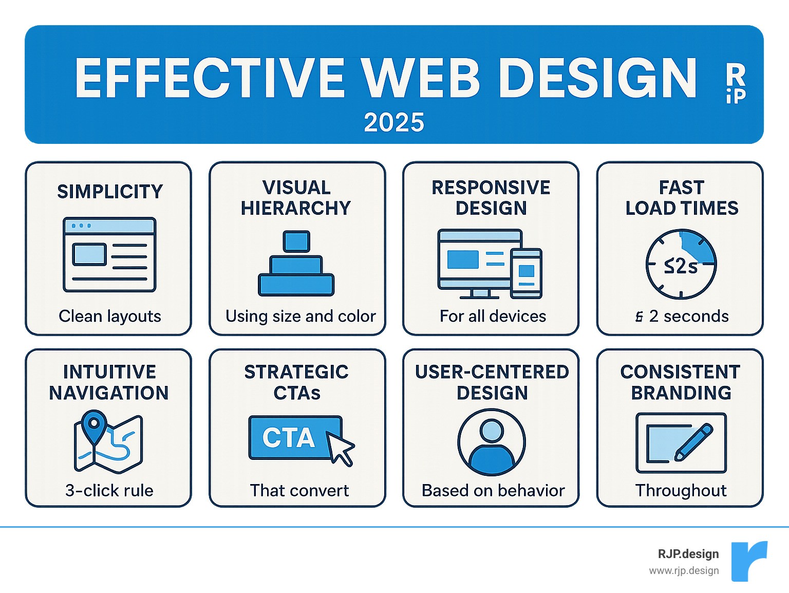
Effective web design combines visual appeal with seamless functionality to create websites that not only look professional but also drive real business results. The key elements include:
Core Principles:
Simplicity – Clean, uncluttered layouts that guide users naturally
Visual Hierarchy – Strategic use of size, color, and spacing to prioritize content
Responsive Design – Flawless performance across all devices
Fast Load Times – Pages that load in under 2 seconds
Intuitive Navigation – Users can find what they need in 3 clicks or less
Strategic CTAs – Clear, compelling calls-to-action that convert visitors
User-Centered Design – Built around how people actually browse and interact
Consistent Branding – Cohesive visual identity throughout the site
Your website has just 10-15 seconds to make a lasting impression before visitors decide whether to stay or leave. That’s barely enough time to scan a headline, yet it’s all you get to communicate your value proposition and establish trust.
The stakes couldn’t be higher. Nearly half of web visitors expect a site to load in 2 seconds or less, and 50% of all web traffic now comes from mobile devices. A single second of delay can increase bounce rates by 103%, while effective design improvements can boost conversions by up to 30%.
But here’s what many business owners get wrong: effective web design isn’t about choosing pretty colors or trendy layouts. It’s about understanding how people think, scan, and make decisions online – then building experiences that work with human psychology, not against it.
I’m Ross Plumer, and I’ve helped businesses market over $20 million in revenue by combining psychology-driven design principles with proven conversion strategies. My approach to effective web design focuses on creating websites that don’t just look professional – they actually drive measurable business growth.
Similar topics to effective web design:
Understand Your User: The Psychological Foundation
Here’s something that might surprise you: effective web design isn’t really about making pretty websites. It’s about understanding how the human brain works when someone lands on your page.
Think about your own browsing habits for a moment. When you visit a new website, do you carefully read every word from top to bottom? Of course not. You scan, you skip around, and you make lightning-fast decisions about whether this site is worth your time.
That’s exactly what your visitors are doing too. Research shows people form their first impression of a website in just 50 milliseconds – that’s literally faster than you can blink. During this split second, they’re not analyzing your product features or reading your carefully crafted headlines. They’re making a gut decision about whether your site looks trustworthy and professional.
This is where something called cognitive load becomes crucial. Every single element on your page – from the navigation menu to the color of your buttons – either helps your visitor’s brain process information quickly, or it makes their brain work harder than it wants to.
When we overwhelm people with too many choices, conflicting colors, or unclear pathways, we’re essentially asking their brain to do extra work. And here’s the thing about brains: they hate extra work. They’ll usually just leave and find an easier option.
At our creative web design agency, we’ve learned that the most successful websites feel almost effortless to use. They guide people naturally toward their goals without making them think too hard about where to click next.
Understanding how people read on the web according to eye-tracking studies reveals something fascinating: people don’t actually “read” web pages at all. They scan them in very predictable patterns, looking for specific anchors and hot spots that catch their attention.
F-Shaped & Z-Shaped Patterns
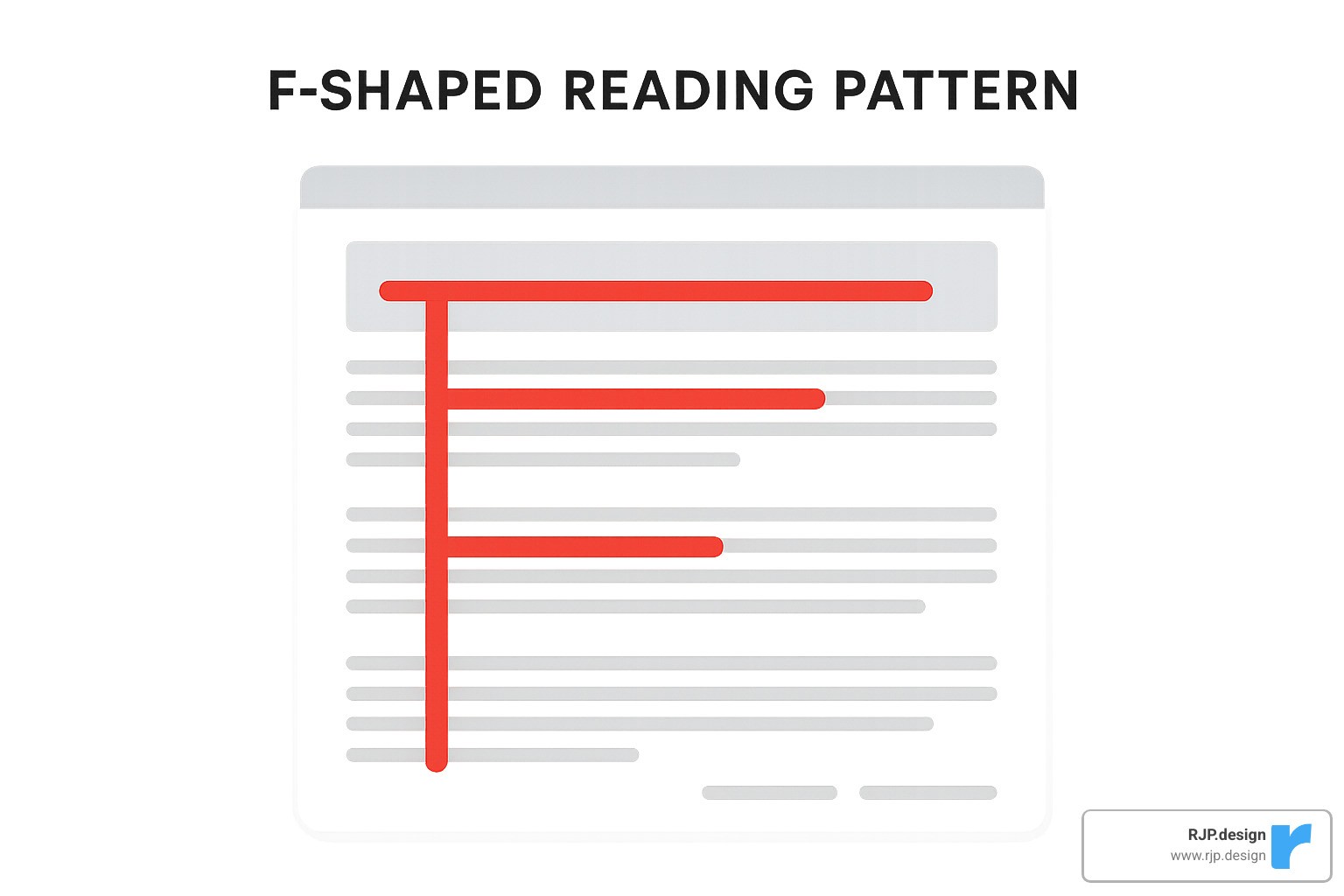
Eye-tracking research has uncovered something remarkable: when people scan websites, they follow two main patterns that are surprisingly predictable. These aren’t random behaviors – they’re hardwired responses that come from how we naturally process written information.
The F-shaped pattern happens when people visit pages with lots of text content. They start by reading horizontally across the top of the page, then move down and read horizontally again (but usually for a shorter distance), and finally scan vertically down the left side. This creates an F-like shape in their viewing pattern.
This findy has huge implications for effective web design. Your most important content – headlines, key benefits, and calls-to-action – should be positioned exactly where people naturally look first. Put your primary headline at the top of the F, place secondary information in that middle horizontal sweep, and use bullet points or short paragraphs along the left margin to catch that vertical scan.
The Z-shaped pattern is more common on pages with minimal text and clear visual hierarchy. People start at the top-left, scan horizontally to the top-right, then diagonally down to the bottom-left, and finally horizontally across to the bottom-right. This pattern works exceptionally well for landing pages, where you want to guide visitors from your headline straight to your main call-to-action.
We use these patterns strategically in our designs. For content-heavy pages like blog posts or service descriptions, we structure information to support the F-pattern. For conversion-focused pages, we often employ the Z-pattern to create a clear visual flow from problem to solution to action.
Hick’s Law: The Paradox of Choice
Here’s one of the most counterintuitive principles in effective web design: giving people more options often leads to fewer conversions. This psychological phenomenon, known as Hick’s Law, shows that the time it takes to make a decision increases with the number of choices available.
In practical terms, this means every additional menu item, button, or link on your page makes it harder for visitors to decide what to do next. The paradox of choice doesn’t just slow down decision-making – it can completely paralyze it. When faced with too many options, people often choose to do nothing at all.
Hick’s Law explained shows us that reducing complexity in navigation and page structure directly improves user experience and conversion rates. We’ve seen this principle work dramatically in our client projects – simplifying a cluttered navigation menu from 12 items to 6 can increase user engagement by 40% or more.
The solution isn’t to hide important information, but to organize it more intelligently. Instead of overwhelming visitors with every possible option upfront, we use something called progressive disclosure – revealing information and choices gradually as people demonstrate interest and intent.
For navigation, we recommend limiting main menu items to 5-7 options maximum. For product catalogs or service offerings, we implement smart filtering systems that help people narrow down choices based on their specific needs rather than presenting everything at once.
Fitt’s Law: Making Actions Easy

Fitt’s Law is a fundamental principle that directly impacts how easy it is for people to interact with your website. Simply put, the time required to click on something depends on two factors: how big the target is and how far away it is.
This law has profound implications for effective web design, especially in our mobile-first world. Smaller buttons that are positioned far from where people naturally expect them will be slower and more frustrating to use. Conversely, large buttons placed in logical locations feel effortless and intuitive.
The practical applications are everywhere. Your primary call-to-action button should be larger than secondary buttons. Important navigation elements should be positioned where people’s thumbs naturally rest on mobile devices. Links within text should have adequate spacing to prevent accidental clicks.
We apply Fitt’s Law rigorously in our mobile designs. The minimum touch target size should be 44×44 pixels, but we often make primary CTAs even larger – sometimes taking up 60-80% of the mobile screen width. This isn’t just about usability; it’s about conversion psychology. A button that’s easy to tap feels more inviting to click.
Distance matters too. If people are reading a product description, the “Add to Cart” button should be immediately below the text, not hidden in a sidebar or footer. Every pixel of distance between user intent and the desired action creates friction that reduces conversions.
The Core Principles of Effective Web Design
At RJP.design, we’ve learned that great sites share four fundamentals: clarity, hierarchy, readability and brand cohesion. Below is the streamlined playbook we use on every project.
Simplicity
The job of a webpage is to help visitors accomplish a goal quickly. If an element doesn’t support that goal, it goes. Strategic white space, concise copy and a single clear message per page routinely lift conversions for our clients.
Modernize your site without the hassle shows this in action.
Visual Hierarchy & Grids
Size, contrast and position guide the eye. We start every layout on a simple grid, place the main heading where scanning patterns land first, then let progressively smaller text guide readers toward the CTA. The Rule of Thirds and The Golden Ratio keep things balanced without over-thinking design theory.
Readability & Typography
Clear fonts, 50–80-character line lengths and informative headings make content scannable. Sans-serif families (e.g., Helvetica, Inter) remain our default for body copy; serif accents add personality sparingly. See how copy and type work together in our professional web design services.
Color & Imagery
Colour choices reflect brand personality and steer action. A high-contrast accent colour highlights CTAs, while authentic photos build trust faster than stock images. Explore real examples in our amazing ecommerce website designs.
By focusing on these four essentials instead of chasing trends, your site stays intuitive, fast and on-brand for years to come.
Build a Flawless Technical & Structural Framework
Visual polish collapses if the underlying tech is shaky. Here’s the condensed checklist we follow so that never happens.
Intuitive Navigation
A 5-to-7-item main menu and a clear “next step” on every page keep users oriented. Anything deeper than three clicks gets reorganised or surfaced with contextual links. Read our practical website navigation tips.
Blazing-Fast Load Speed
Half of visitors bail after three sluggish seconds. We therefore compress images, minify code and host on a CDN-backed platform. Each second saved can recover up to 7 % in lost conversions.
Seamless Responsive Design
Over 50 % of traffic is mobile, so we design for thumbs first. Fluid grids plus targeted media queries let layouts adapt gracefully from 320 px phones to 4K displays. Cross-device testing is built into our responsive web design services.
Faster, simpler and mobile-ready—those three traits form the bedrock that lets great aesthetics (and your message) shine.
Drive Action and Continuously Improve
Launching a site is day one, not done. We rely on tight feedback loops to turn traffic into revenue.
Craft Compelling CTAs
Button copy such as “Get My Free Quote” outperforms generic “Submit.” Place the primary CTA above the fold, repeat it near decision points and colour it with the strongest contrast on the page. Test one change at a time—text, size, colour or position—to see what moves the needle. Need inspiration? Check our CTA design tips.
Test, Measure, Iterate
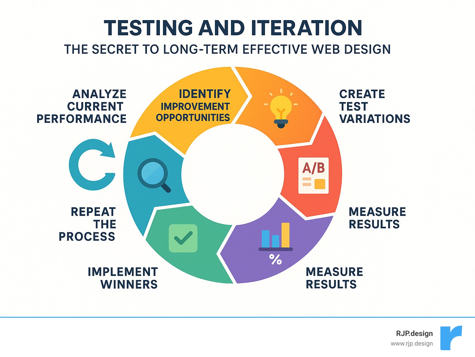
• Usability sessions with even five users uncover most pain points.
• A/B tests validate improvements before you roll them out.
• Analytics show where visitors drop; surveys tell you why.
Small, data-backed tweaks made monthly often beat a giant overhaul made yearly. Our professional website redesign program bakes this philosophy in from day one.
Frequently Asked Questions about Effective Web Design
What is the most important element of effective web design?
If I had to choose just one element that makes the biggest difference, it would be clarity of purpose. Every page on your website should have a crystal-clear goal, and every single element should either help achieve that goal or get removed entirely.
This doesn’t mean stripping away content or making your site boring. It means being intentional about what you include and how you present it. When visitors land on your homepage, they should immediately understand what you do and how you can help them. When they visit a product page, the path to purchase should be obvious.
From a technical perspective, page load speed runs a close second in importance. We’ve seen beautiful, well-designed websites fail completely because they took too long to load. If your site doesn’t appear within 2 seconds, most visitors will leave before they even see your carefully crafted design.
Visual hierarchy deserves equal attention because it guides users through your content in a logical sequence. Without proper hierarchy, even the most compelling content can feel overwhelming. Use size, color, contrast, and strategic spacing to create a clear information structure that immediately shows users what matters most.
The beauty of effective web design is that these elements work together. Fast loading gets users to your content, clear hierarchy helps them steer it, and purposeful design converts them into customers.
How does web design affect SEO?
Many business owners think of web design and SEO as separate concerns, but they’re actually deeply connected. Your design decisions directly impact how well your website ranks in search results.
Site structure and navigation affect how search engines crawl and understand your content. A well-organized website with logical navigation helps Google’s bots make sense of your content hierarchy and the relationships between your pages. When search engines can easily understand your site, they’re more likely to rank it well.
Page load speed is a confirmed ranking factor that Google takes seriously. Slow-loading websites get penalized in search results, while fast-loading sites receive a ranking boost. This means performance optimization isn’t just about keeping users happy – it’s about staying visible in search results.
Mobile responsiveness has become critical for SEO success. Google now uses mobile-first indexing, which means it primarily looks at the mobile version of your website when deciding how to rank it. If your site doesn’t work well on smartphones and tablets, it will struggle to rank well regardless of how great your content is.
User experience signals like bounce rate, time spent on page, and click-through rates also influence your SEO performance. When users quickly leave your site or don’t engage with your content, it sends negative signals to search engines. Good design that keeps users engaged naturally improves these metrics and can boost your rankings.
How often should I redesign my website?
The honest answer is: it depends on your specific situation. Most businesses benefit from a complete redesign every 2-3 years, but this timeline can vary significantly based on your industry, business growth, and how technology evolves.
Rather than waiting for one big redesign, I recommend thinking about your website as a living system that needs regular updates and improvements. Small, continuous improvements often deliver better results than infrequent major overhauls.
Technology changes can sometimes force your hand on redesign timing. Shifts in mobile usage, browser capabilities, or security requirements can make older websites feel outdated or even stop working properly. Staying current with web standards ensures your site remains functional and secure.
Business growth often outpaces website capabilities. If you’ve expanded your services, entered new markets, or changed your positioning, your website should evolve to reflect these changes. Your website should support your business growth, not hold it back.
Performance monitoring provides the clearest signals about when updates are needed. If your load times are increasing, conversion rates are declining, or you’re getting more user complaints, these issues should be addressed promptly rather than waiting for a scheduled redesign.
The best indicator comes from user feedback and analytics data. If users consistently struggle with specific tasks or abandon your site at predictable points, these problems need immediate attention. Your website should make it easy for customers to do business with you, and any friction in that process costs you money.
Conclusion
Effective web design isn’t just about making your website look pretty – it’s about creating a powerful business tool that actually works for you. Throughout this guide, we’ve explored the psychological principles, technical foundations, and strategic approaches that separate websites that convert from those that just sit there looking nice.
Think of your website as your hardest-working employee. It’s available 24/7, never takes a sick day, and can handle unlimited customers simultaneously. But like any employee, it needs the right training and tools to perform at its best. That’s where the principles we’ve covered come in.
Simplicity creates clarity in a world where people make decisions in milliseconds. When visitors land on your site, they shouldn’t have to work hard to understand what you offer or how to take the next step. Visual hierarchy guides their attention naturally, while responsive design ensures your message comes through clearly whether they’re on a phone, tablet, or desktop.
The technical foundation we’ve discussed – fast load speeds, intuitive navigation, and seamless mobile experience – isn’t just about impressing web developers. These elements directly impact your bottom line. A two-second delay in loading can cost you 103% more visitors who simply give up and leave.
A user-centric approach means designing for real people, not just search engines or industry awards. We’ve learned that understanding how people actually scan web pages, make decisions, and interact with websites is far more valuable than following the latest design trends. Your visitors don’t care if your site looks like everyone else’s – they care if it helps them solve their problems quickly and easily.
At RJP.design, we’ve seen how these principles transform businesses. Our commitment to quality goes beyond creating websites that look professional. We focus on building strategic assets that grow with your business and adapt to your changing needs. Our down-to-earth team understands that behind every website is a real business with real goals.
Partnering with a professional team can save you months of trial and error while helping you avoid costly mistakes. While the strategies in this guide can definitely improve your website, implementing them effectively requires experience, ongoing testing, and technical knowledge that most business owners simply don’t have time to develop.
The investment in professional web design pays for itself through increased conversions, better user satisfaction, and stronger brand credibility. Your website is often the first impression potential customers have of your business – and you only get one chance to make that first impression count.
Ready to transform your website into a conversion machine that actually drives business growth? Let’s work together to create something that not only looks exceptional but delivers real results for your business. Make your web design and digital marketing effortless with RJP.design’s comprehensive approach to online success.

