Web
Responsive Website Elementor Style – Because Your Site Shouldn’t Break Hearts (or Screens)
Jul 12, 2025

Responsive Website Elementor: 10 Powerful Ways for Amazing 2025
Why Your Website Needs to Work Everywhere
Creating a responsive website Elementor style means your site automatically adapts to any screen size – from desktop monitors to smartphones. Here’s what you need to know:
Key Responsive Features in Elementor:
Device Preview Modes: Switch between desktop, tablet, and mobile views
Custom Breakpoints: Set up to 7 different screen sizes
Inheritance Rules: Changes flow from desktop → tablet → mobile
Visibility Controls: Hide or show elements on specific devices
Fluid Typography: Use viewport units for scalable text
Column Management: Adjust widths and stacking order per device
With people accessing websites from a wide variety of devices these days, it’s more important than ever to make sure your website looks and functions as intended at any size. Mobile devices now account for over 50% of website traffic, and search engines like Google prioritize mobile-friendly sites in their rankings.
The reality is stark: if your website doesn’t work well on mobile, you’re losing customers. Period.
Elementor makes responsive design achievable without writing code. You can preview your site on different devices, adjust layouts per screen size, and ensure every visitor gets a great experience – whether they’re on a massive desktop monitor or a tiny phone screen.
I’m Ross Plumer, and I’ve helped businesses market over $20 million in revenue by creating websites that work beautifully across all devices. My experience with responsive website Elementor design has shown me that the right approach can transform a business’s online presence overnight.
Responsive website elementor terms explained:
Why Responsive Web Design Matters Today
Let’s face it – we’re living in a multi-device world. Your customers might find your business on their phone during lunch, research you on their tablet at home, and finally make a purchase on their desktop at work. If your website fails them at any stage, they’ll bounce faster than a rubber ball on concrete.
The statistics don’t lie: mobile devices now account for a major portion of website traffic in most industries. But here’s the kicker – Google’s mobile-first indexing means search engines primarily use your mobile site version for ranking. If your mobile experience is broken, your SEO rankings will suffer.
We’ve seen this at RJP.design. When we redesign a client’s website to be truly responsive, their bounce rates typically drop by 30-40%, and their conversion rates increase significantly. It’s not magic – it’s just good user experience.
What Is Responsive Design?
Responsive design is like having a shape-shifting website that automatically adjusts to fit any screen size. Instead of creating separate mobile and desktop versions, you build one flexible layout that uses fluid grids, flexible images, and CSS media queries to adapt to different viewing environments.
Think of it as designing a website that’s part yoga instructor, part magician – it bends and transforms to look perfect whether it’s displayed on a 27-inch monitor or a 5-inch phone screen.
The key components include:
Flexible layouts that use percentages instead of fixed pixels
Media queries that apply different styles based on screen size
Content prioritization that shows the most important information first on smaller screens
Benefits for UX & SEO
Responsive design isn’t just about making your site look pretty on phones (though that’s important too). It delivers real business benefits:
User Experience Benefits:
Faster loading speeds across all devices
Improved dwell time as users can actually steer your site
Higher conversion rates when the checkout process works smoothly
Reduced bounce rates because users don’t immediately leave
SEO Benefits:
Google prioritizes mobile-friendly websites in search results
Single URL structure makes it easier for search engines to crawl
Improved page speed scores contribute to better rankings
Better user engagement signals boost your search visibility
Mastering the Responsive Website Elementor Controls
Now let’s get into the meat and potatoes of building a responsive website Elementor style. Elementor’s responsive controls are like having a Swiss Army knife for web design – they give you precision tools for every situation.
The beauty of Elementor’s approach is that you don’t need to write a single line of code. The platform handles all the technical heavy lifting while you focus on creating an amazing user experience.
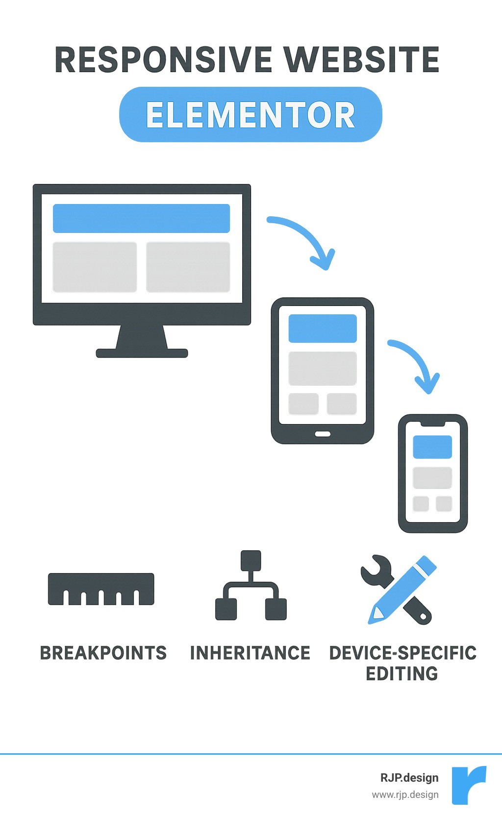
Device Preview & Editing Hierarchy
Elementor creates three default device versions: desktop (>1024px), tablet (1024px-767px), and mobile (<767px). But here’s the crucial part – responsive edits in Elementor follow a top-down inheritance system:
Changes made on desktop cascade down to tablet and mobile
Changes made on tablet cascade down to mobile only
Changes made on mobile affect only mobile
This inheritance system is brilliant because it saves you time. Make your base design on desktop, then fine-tune for smaller screens. You’re not starting from scratch each time.
Device Type | Default Breakpoint | Inheritance Flow |
|---|---|---|
Desktop | >1024px | Affects all devices |
Tablet | 1024px-767px | Affects tablet and mobile |
Mobile | <767px | Affects mobile only |
The viewport icons next to each setting tell you which device you’re currently editing. Look for these icons – they’re your best friend for avoiding accidental edits on the wrong device.
Customizing Breakpoints Like a Pro
Here’s where Elementor really shines – you can customize breakpoints to match your specific needs. While most sites work fine with the default three breakpoints, you can add up to 7 custom breakpoints for pixel-perfect control.
To add custom breakpoints:
Go to Site Settings > Layout > Breakpoints
Click the plus icon to add a new breakpoint
Choose from six additional breakpoint options
Set your custom pixel values
Save changes
This flexibility means you can target specific devices like large tablets, small laptops, or even ultra-wide monitors. We use this feature when clients have unique audience demographics or specific device usage patterns.
Section, Column & Container Best Practices
When building responsive layouts, think in terms of fluid widths rather than fixed pixels. Elementor’s default column behavior is smart – it automatically stacks columns vertically on mobile to prevent cramped layouts.
Here are our go-to techniques:
Column Width Management:
Use percentages for flexible layouts (50% for two columns, 33.33% for three)
Adjust column widths per device to control wrapping
Set columns to 50% on mobile to maintain two-column layouts when needed
Stacking and Order:
Use the “Reverse Columns” option to change stacking order on mobile
Group footer columns by adjusting widths (e.g., change five 20% columns to three 33.33% columns)
Leverage Easy Responsive Design principles for consistent layouts
Container Best Practices:
Use Flexbox containers for better alignment control
Set container widths using percentages for fluid responsiveness
Apply consistent padding and margins across breakpoints
Responsive Typography & Spacing
Typography can make or break your responsive design. Text that looks perfect on desktop might be illegible on mobile, while mobile-optimized text might seem tiny on large screens.
Typography Units:
VW units (viewport width) for truly fluid typography that scales with screen size
REM units for consistent scaling based on root font size
EM units for relative sizing within elements
Pixels for precise control when needed
Global Font Strategy:
Set up global fonts in Elementor to maintain consistency across your site. This saves hours of manual adjustments and ensures your brand typography stays consistent across all devices.
Spacing Considerations:
Use relative units (em, rem, %) for padding and margins
Reduce spacing on mobile to maximize content area
Maintain adequate touch target spacing (minimum 44px between interactive elements)
Hiding or Showing Elements per Device
Sometimes the best responsive design decision is knowing what to leave out. Not every element that works on desktop needs to appear on mobile.
Visibility Controls:
Use Advanced > Responsive settings to hide elements per device
Create mobile-specific versions of complex elements
Duplicate content when you need different layouts per device
Content Prioritization Strategy:
Hide decorative elements on mobile to focus on core content
Replace complex interactive elements (like flip boxes) with simple text on mobile
Show contact information prominently on mobile devices
We often duplicate text widgets and show different versions per device – one optimized for desktop reading, another condensed for mobile scanning.
Advanced Techniques for a Pixel-Perfect Layout
Once you’ve mastered the basics, these advanced techniques will take your responsive website Elementor designs to the next level.
Making Media Truly Responsive
Images and videos can be the biggest responsive design headaches, but Elementor makes media management surprisingly straightforward.
Image Optimization:
Use Elementor’s built-in image optimization for automatic compression
Leverage the srcset attribute for serving different image sizes
Set aspect ratios to prevent layout shifts during loading
Enable lazy loading for images below the fold
Video Considerations:
Use responsive embed codes for YouTube and Vimeo videos
Set max-width: 100% for self-hosted videos
Consider hiding background videos on mobile for better performance
For more detailed media optimization strategies, check out our Easy Responsive CSS guide.
Building a Responsive Navigation Menu
Navigation is where responsive design gets tricky. You need to balance accessibility, usability, and aesthetics across all devices.
Mobile Navigation Strategy:
Set hamburger menu breakpoint (typically 768px or 1024px)
Ensure touch targets are minimum 44×44 pixels
Use clear, readable fonts for menu items
Consider off-canvas panels for complex navigation structures
Touch-Friendly Design:
Maintain adequate spacing between menu items
Use button-style navigation for better touch interaction
Implement hover states that work on touch devices
Test navigation with actual fingers, not just mouse cursors
Performance & Accessibility Tips
Responsive design isn’t just about looks – it’s about creating inclusive, fast-loading experiences for all users.
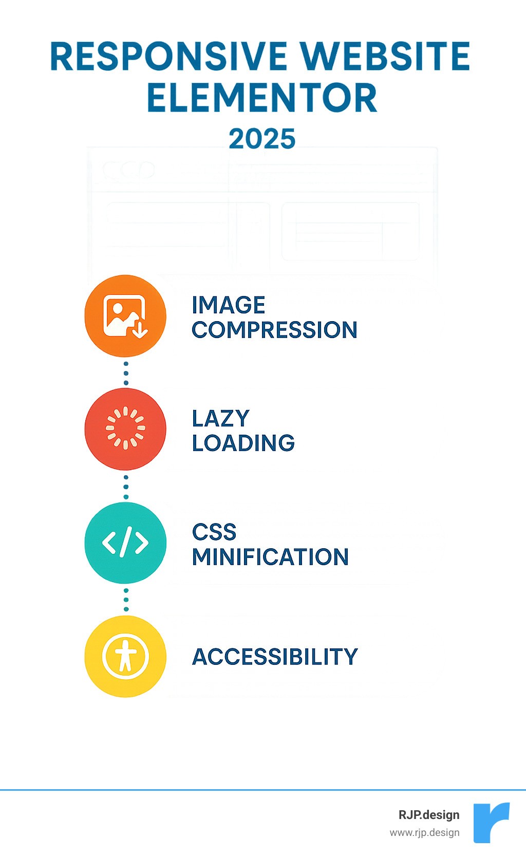
Performance Optimization:
Minimize Cumulative Layout Shift (CLS) by setting image dimensions
Use lazy loading for off-screen content
Optimize images with next-gen formats (WebP, AVIF)
Minimize motion effects on mobile devices
Accessibility Essentials:
Add descriptive alt text for all images
Ensure keyboard navigation works across all devices
Maintain sufficient color contrast ratios
Use semantic HTML structure for screen readers
Testing & Troubleshooting Your Layout
Building a responsive site is only half the battle – thorough testing ensures it actually works in the real world.
Testing Strategy:
Use browser developer tools for initial testing
Test on actual physical devices, not just emulators
Check your site across different browsers (Chrome, Firefox, Safari, Edge)
Use tools like BrowserStack for comprehensive device testing
Real Device Testing:
Nothing beats testing on actual devices. We keep a collection of different phones and tablets in our office specifically for this purpose. Emulators are great for quick checks, but they can’t replicate the real user experience of scrolling with your thumb or dealing with poor network connections.
Debugging Common Glitches
Even with Elementor’s robust responsive tools, you’ll occasionally run into issues. Here are the most common problems and their solutions:
Column Wrapping Issues:
Check total column percentages don’t exceed 100%
Verify custom widths are set correctly per device
Use the responsive preview to identify breaking points
Font Overflow Problems:
Reduce font sizes on smaller screens
Use viewport units for truly scalable typography
Check line-height settings for readability
Image Stretching:
Set max-width: 100% for responsive images
Use aspect-ratio CSS property to maintain proportions
Check image dimensions match container sizes
Cache Conflicts:
Clear browser cache when testing changes
Use hard refresh (Ctrl+F5) to bypass cache
Check if caching plugins are interfering with responsive styles
Tools & Checklists
Essential Testing Tools:
Chrome DevTools Responsive Design Mode
Firefox Responsive Design Mode
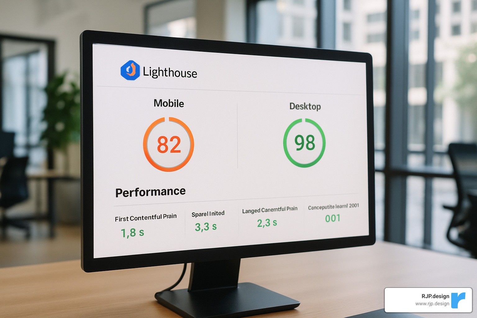
Google Lighthouse for performance testing
WebPageTest for detailed performance analysis
Our Responsive Design Checklist:
[ ] All breakpoints display correctly
[ ] Navigation works on all devices
[ ] Images scale properly
[ ] Text remains readable at all sizes
[ ] Touch targets meet 44px minimum
[ ] Page loads quickly on mobile networks
[ ] All interactive elements function properly
[ ] Content hierarchy makes sense on mobile
Frequently Asked Questions about Responsive Website Elementor
What units should I use for fonts and spacing?
For responsive typography, we recommend:
REM units for consistent scaling based on root font size
VW units for truly fluid typography that scales with viewport width
EM units for spacing that relates to the element’s font size
Pixels only when you need precise control
The key is consistency. Pick a unit strategy and stick with it across your site.
How do edits inherit across devices in Elementor?
Elementor uses a top-down inheritance system:
Desktop changes affect tablet and mobile
Tablet changes affect mobile only
Mobile changes affect mobile only
This means you should design desktop-first, then refine for smaller screens. The viewport icons next to each setting show which device you’re currently editing.
Can I add more than three breakpoints?
Yes! Elementor Pro allows up to 7 custom breakpoints. Go to Site Settings > Layout > Breakpoints to add custom breakpoints for specific devices or screen sizes. This is particularly useful for targeting large tablets, small laptops, or ultra-wide monitors.
Conclusion
Creating a responsive website Elementor style isn’t just about following best practices – it’s about crafting experiences that work seamlessly across every device your customers use. When you get it right, your site becomes a powerful business tool that converts visitors into customers, regardless of how they access it.
The techniques we’ve covered – from mastering breakpoints to optimizing media – form the foundation of professional responsive design. But remember, responsive design is an ongoing process. New devices, screen sizes, and user behaviors emerge constantly, so stay flexible and keep testing.
At RJP.design, we’ve seen how proper responsive design transforms businesses. Our clients consistently report improved user engagement, better conversion rates, and stronger SEO performance after implementing these strategies. The investment in responsive design pays dividends in customer satisfaction and business growth.
Ready to create a website that works beautifully everywhere? Whether you’re building from scratch or improving an existing site, these responsive design principles will help you deliver exceptional user experiences across all devices.
Your customers deserve a website that works as hard as you do – on every screen, every time. For more guidance on creating responsive, high-performing websites, explore our Creative Website Solutions and let’s build something amazing together.

