Web
No More Pinch and Zoom! Mastering Magento Responsive Design
Jun 30, 2025

Magento Responsive Design: 7 Powerful Ways to Boost Success 2025
Why Mobile-First Design Is No Longer Optional for Your Magento Store
Magento responsive design is an approach that ensures your eCommerce store automatically adapts its layout, images, and navigation across desktop, tablet, and mobile devices using fluid grids, flexible images, and CSS media queries. Here’s what you need to know:
Key Components:
Fluid Grids – Layouts that scale proportionally across screen sizes
Flexible Images – Images that resize without breaking layout structure
CSS Media Queries – Code that applies different styles based on screen width
Mobile-First Approach – Designing for smartphones first, then scaling up
Quick Benefits:
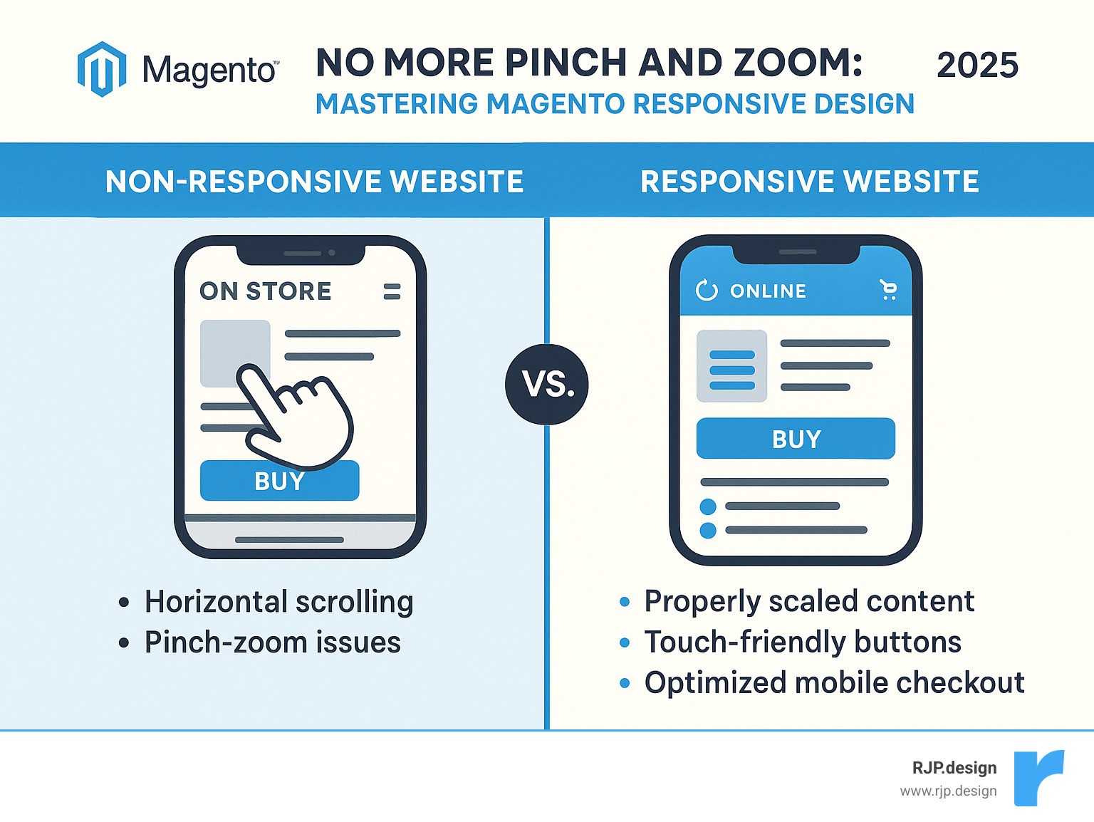
Eliminates pinch-and-zoom frustration for mobile users
Improves Google search rankings (mobile-friendly sites get priority)
Increases conversion rates – responsive sites see better mobile sales
Reduces maintenance costs compared to separate mobile sites
The numbers tell the story clearly. Two out of three shoppers now use mobile devices to make purchases, and Google prioritizes mobile-friendly websites in search rankings. If your Magento store forces customers to pinch and zoom to steer your checkout process, you’re literally watching revenue walk away.
Your website needs to adapt to survive. Web design faces constant change – new devices, screen sizes, and user expectations emerge monthly.
I’m Ross Plumer, and I’ve helped businesses that have marketed over $20 million in revenue optimize their Magento responsive design for peak performance across all devices. My experience integrating psychology and user behavior research into eCommerce design has shown me exactly what separates stores that convert from those that frustrate mobile shoppers.
Quick magento responsive design terms:
Why Responsive Design Matters for eCommerce Success
Picture this: A potential customer finds your Magento store through Google search while commuting on the train. They’re interested in your product, but your site forces them to pinch and zoom just to read the product description. Frustrated, they close the tab and buy from a competitor instead.
This scenario plays out thousands of times daily across the internet. Mobile commerce isn’t just growing—it’s dominating. Recent data shows that mobile devices now account for over 50% of all eCommerce traffic, a dramatic jump from just 25-30% a few years ago. Latest research on mobile commerce confirms this trend will only accelerate.
Google doesn’t just notice mobile traffic—it actively rewards sites that handle it well. Since 2015, Google has given preference to mobile-friendly sites in search rankings. With Core Web Vitals now factoring into rankings, your magento responsive design directly impacts whether customers can even find you online.
The business benefits are compelling. Responsive sites see significantly higher conversion rates because customers can seamlessly switch between devices during their shopping journey. They might research on their laptop during lunch, compare prices on their tablet at home, then complete the purchase on their phone while waiting for coffee.
From a practical standpoint, responsive design makes financial sense too. Maintaining one responsive site costs far less than managing separate desktop and mobile versions. You eliminate duplicate content management, reduce development time, and simplify your maintenance workflow.
There’s also the future-proofing advantage. New devices with different screen sizes appear constantly—foldable phones, ultra-wide monitors, smart watches with browsers. A well-executed responsive design automatically adapts without requiring expensive redesigns.
The math is simple: businesses without mobile-optimized sites are turning away roughly half their potential customers. In today’s competitive eCommerce landscape, that’s not a risk worth taking.
Magento Responsive Design Fundamentals
Think of Magento responsive design like a Swiss Army knife for your online store. Instead of carrying separate tools for every job, you get one neat solution that adapts to whatever situation comes up. That’s exactly what Magento 2.0 brought to the table when it revolutionized eCommerce by building responsive design right into the core platform.
The magic happens through three fundamental principles working together seamlessly. Fluid grids replace those rigid, fixed-pixel layouts that break the moment someone views your site on a different screen size. Instead, Magento uses proportion-based layouts that flow naturally. Your three-column desktop layout smoothly transforms into a single column on mobile without any awkward breaks or overlapping content.
Flexible images solve the age-old problem of photos that either get cut off or force users to scroll horizontally. Magento automatically applies smart scaling rules to ensure images resize proportionally when screens get smaller. No more tiny product photos that customers can’t see properly, and no more giant images that push content off the screen.
CSS3 media queries act like the brain of the operation, making intelligent decisions about when and how to adjust your layout. Magento’s implementation uses sophisticated mixins that make responsive development much more straightforward than coding everything from scratch.
Magento gets really clever with its CSS architecture. The platform splits your CSS into two strategic files: styles-m.css handles mobile devices, while styles-l.css takes care of larger screens. This means mobile users never waste bandwidth downloading desktop-specific styles they’ll never use. Your site loads faster, and your customers stay happier.
Magento ships with two responsive themes right out of the box. The Blank theme serves as your starting point for custom development – think of it as a clean canvas ready for your creative vision. The Luma theme provides a complete storefront experience that works beautifully without any customization needed.
Both themes follow a mobile-first strategy, which means they’re designed for smartphones first, then improved for larger screens. This approach ensures your mobile experience never feels like an afterthought.
For deeper customization, you can explore advanced Responsive Web Design techniques and dive into Magento’s Page Builder viewports for more sophisticated content management.
Core Components of Magento Responsive Design
Understanding how Magento responsive design works under the hood helps you make smarter customization decisions. Fluid layouts form the foundation of everything. Instead of saying “this sidebar is exactly 300 pixels wide,” Magento says “this sidebar takes up 25% of available space.” When someone views your store on a tablet, that 25% automatically adjusts to the smaller screen.
The viewport meta tag might look like technical gibberish, but it’s actually your site’s way of introducing itself to mobile browsers. Every responsive Magento theme includes this little piece of code that tells smartphones “hey, display this site at actual mobile width, don’t try to squeeze a desktop layout into a tiny screen.”
Magento’s .media-width mixin is where the real magic happens. Traditional responsive development means scattering media queries throughout your CSS files, making maintenance a nightmare. Magento’s approach lets you group related styles together using a simple, consistent format.
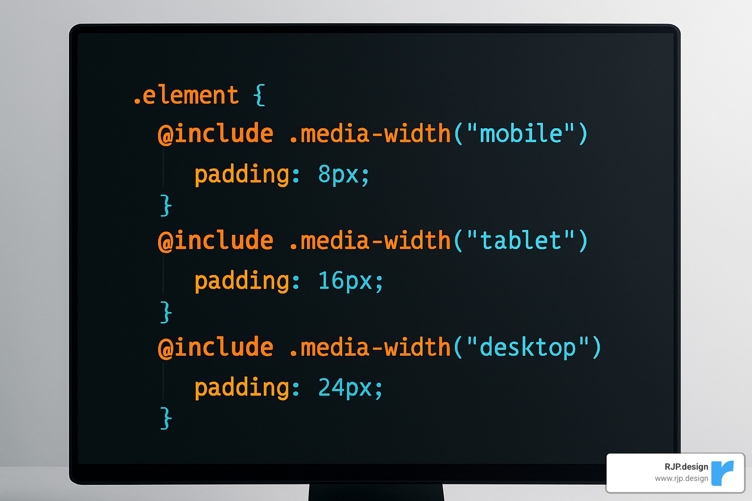
The @media-common block eliminates duplicate code by defining styles that appear on both mobile and desktop. Less variables make customization painless. Want to change when your layout switches from mobile to desktop view? Just modify one variable instead of hunting through dozens of CSS files.
Breakpoints & Viewports in Magento Responsive Design
Magento responsive design uses a breakpoint system that balances flexibility with real-world performance needs. Think of breakpoints as the moments when your layout says “okay, I need to reorganize myself for this screen size.”
Magento’s default breakpoints follow industry standards while giving you complete control over customization. The @screen variables range from tiny phone screens at 320px all the way up to large desktop displays at 1440px and beyond.
The Page Builder includes viewport controls right at the top of the editor, letting you design and preview content for different screen sizes in real-time. You can even define custom viewports beyond the standard mobile and desktop options.
Breakpoint Variable | Default Value | Device Target | Usage |
|---|---|---|---|
@screen__xxs | 320px | Small phones | Emergency fallback |
@screen__xs | 480px | Standard phones | Primary mobile |
@screen__s | 640px | Large phones/small tablets | Transition zone |
@screen__m | 767px | Tablets | Major layout shift |
@screen__l | 1024px | Small desktops | Desktop baseline |
@screen__xl | 1440px | Large desktops | Improved layouts |
Choose breakpoints based on when your content starts looking awkward, not when specific devices demand it. Start with the smallest screen and gradually increase the width. The moment your layout feels cramped or unbalanced, that’s your natural breakpoint.
Implementing & Customizing Magento Responsive Design in Magento 2
Magento already ships with a solid mobile-first framework, so your job is mainly about fine-tuning rather than reinventing the wheel.
Start with a child theme
Copy the Blank theme, declare it as the parent in
theme.xml, and keep core files untouched.
Use Less/Sass variables
Override breakpoint values once in
_responsive.less; call them with Magento’s.media-width()mixin instead of scattering raw media queries everywhere.
Leverage Page Builder
Drag-and-drop content, then tweak the built-in viewport controls to hide, stack, or resize blocks for mobile.
Optimize assets early
Add
max-width:100%to images, lazy-load non-critical media, and serve WebP where supported.
Test on real devices
Chrome DevTools is great, but always finish with physical phones/tablets. Follow up with Lighthouse or PageSpeed Insights for objective scores.
Step-by-Step Mobile-First Workflow
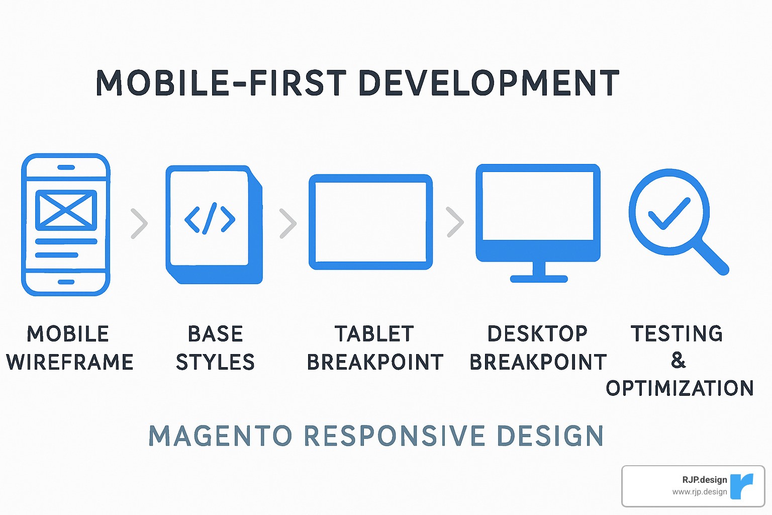
Wireframe for phones first – focus on core actions (search, add-to-cart, checkout).
Write base CSS for mobile – smallest bundle, fastest render.
Progressively improve
.media-width(min, @screen__m)for tablets.media-width(min, @screen__l)for desktops
Performance pass – minify CSS/JS, enable HTTP/2 or better, and defer anything that isn’t needed above the fold.
Responsive vs. Adaptive vs. Separate Mobile Sites
Approach | Codebase | UX Consistency | Long-term Cost |
|---|---|---|---|
Responsive (recommended) | Single | Seamless | Lowest |
Adaptive | Multiple layouts | Good but rigid | Medium |
Separate m.* site | Two sites | Often inconsistent | Highest |
Most retailers find responsive the sweet spot: one storefront to maintain, automatic support for new screen sizes, and no SEO headaches from duplicate content.
Fixing Common Issues & Choosing High-Quality Responsive Themes
Even Magento’s solid base can stumble on mobile when a few details slip through. Here are the problems that cause most of the pain—and the quick wins that solve them.
Fast Fixes for Everyday Glitches
Layout overflow – Replace fixed widths with percentages or
max-widthso content never pushes sideways.Tiny touch targets – Make buttons and menu items at least 44 × 44 px and add visual feedback on tap.
Slow checkout – Compress images, reduce third-party scripts, and lazy-load anything below the first step of the form.
Blurry product shots – Use
srcsetso browsers pull the right image size automatically.
Debugging Luma Theme Pain Points
Hamburger lag – Increase tap area and add a simple CSS animation so users know it worked.
Form stacking – Switch to one-column inputs on phones and ensure labels sit above fields to avoid overlap.
Apply fixes in a child theme with
.media-width()so future Magento updates don’t overwrite your work.
How to Pick a Theme That Won’t Hold You Back
Speed first – Run the demo through Lighthouse; aim for 90+ on mobile.
Clean, semantic HTML – Helps SEO and accessibility in one go.
True customization – Look for documented variables and no core edits.
Active support & updates – Check changelogs; a stale theme is a security risk.
For stores that need more than theme tweaks, our Professional Website Redesign service tackles performance and UX at the architecture level.
Frequently Asked Questions about Magento Responsive Design
After helping countless businesses transform their mobile shopping experiences, I’ve noticed the same questions come up again and again. Let me share the answers that matter most when you’re planning your Magento responsive design project.
These aren’t just technical questions – they’re the real concerns that keep business owners awake at night. Will this actually help my sales? How much will it cost? Can I do this without breaking my existing store?
What is Magento responsive design and how is it different from adaptive?
Think of Magento responsive design like water in a container – it flows and adapts to fit whatever space it’s in. Your website uses one flexible layout that automatically adjusts to every screen size, from tiny phones to massive desktop monitors.
The magic happens through CSS media queries and flexible grids. When someone rotates their phone from portrait to landscape, the layout smoothly adjusts in real-time. No jarring jumps or broken elements.
Adaptive design works differently. It’s more like having several different containers – one for phones, one for tablets, one for desktops. The website detects what device you’re using and serves you the “right” version.
Why responsive wins every time: You only maintain one website instead of three or four separate versions. When Apple releases a new iPhone with a different screen size, your responsive site automatically handles it. Adaptive sites might need updates.
Plus, responsive design feels seamless to users. They can start shopping on their laptop during lunch, then finish the purchase on their phone while walking to their car. The experience flows naturally.
How do I customize breakpoints in Magento without touching core files?
Here’s the golden rule of Magento development: never modify core files. Ever. I’ve seen too many stores break during updates because someone took shortcuts.
The proper way involves creating a custom theme that inherits from Magento’s base themes. Think of it like building an addition to your house – you don’t tear down the foundation, you build on top of it.
Start by creating a custom theme directory and setting up proper inheritance from Blank or Luma. Then override the _responsive.less file in your theme folder. This gives you complete control over breakpoint variables like @screen__m: 767px without touching any core code.
The beauty of this approach: When Magento releases updates, your customizations stay safe. Your breakpoints continue working exactly as you designed them, but you still get security patches and new features.
Use Magento’s .media-width mixin throughout your custom CSS. It’s cleaner than writing separate media queries and integrates perfectly with the platform’s responsive framework.
Testing is crucial here. What looks perfect in Chrome’s device simulator might behave differently on actual phones and tablets.
How much time & budget should I plan for a custom responsive theme?
This question usually comes with a nervous laugh, and I get it. Nobody wants to hear “it depends,” but the reality is that every store has different needs.
For basic responsive improvements – fixing mobile navigation, optimizing checkout flow, adjusting breakpoints – plan for 2-4 weeks. These projects typically involve enhancing an existing theme rather than building from scratch.
Custom themes built from the ground up need 4-8 weeks. This includes unique design elements, custom page layouts, and mobile-specific functionality that goes beyond standard responsive behavior.
Enterprise-level implementations can take 8-12 weeks or more. These involve complex integrations, advanced performance optimization, and extensive custom development.
What affects the timeline most: The number of unique page layouts you need, how complex your product catalog is, and whether you need custom functionality beyond standard eCommerce features. Integration with existing systems can add significant time.
Budget reality check: Yes, quality responsive development requires investment upfront. But here’s what I tell every client – maintaining separate mobile and desktop sites costs far more in the long run. Plus, the conversion rate improvements often pay for the project within months.
At RJP.design, we work with you to create realistic timelines that won’t disrupt your business operations. We’ve learned that rushing responsive design projects usually backfires – it’s better to do it right the first time.
Conclusion
Your customers are shopping on their phones right now. While you’re reading this, someone is trying to buy from a mobile store that makes them pinch and zoom just to see product details. Don’t let that be your store.
Magento responsive design transforms your eCommerce site from a mobile afterthought into a conversion machine that works beautifully on every device. The numbers don’t lie – with mobile traffic hitting 45-50% of all eCommerce visits and Google giving mobile-friendly sites priority in search results, responsive design isn’t optional anymore.
The beauty of getting this right lies in the single codebase benefit. Instead of juggling separate mobile and desktop sites, you maintain one responsive store that automatically adapts to smartphones, tablets, and desktops. This means lower maintenance costs, consistent branding, and automatic compatibility with whatever new devices Apple or Samsung dream up next year.
Think of responsive design as future-proofing your shopping experience. When you build it right the first time using Magento’s mobile-first approach, your store stays ahead of the curve without constant redesigns.
Here’s what makes the difference: starting with mobile-first thinking instead of trying to squeeze desktop layouts onto phones, leveraging Magento’s built-in responsive framework rather than fighting against it, and focusing on performance optimization because mobile shoppers have zero patience for slow sites.
The real test happens on actual devices, not just in browser simulators. Touch interactions, loading speeds, and checkout flows behave differently on real phones than they do on your desktop screen.
At RJP.design, we’ve watched businesses transform their mobile performance by getting responsive design right. Our approach combines technical know-how with understanding how people actually shop on their phones. The result? Stores that don’t just look good on mobile – they convert visitors into customers.
The mobile commerce revolution happened while many businesses were still debating whether it mattered. Now the question isn’t whether to implement Magento responsive design, but how quickly you can stop losing mobile customers to competitors who already figured this out.
Your responsive design becomes a competitive advantage that keeps working year after year. While other stores frustrate mobile shoppers with outdated layouts, yours delivers the smooth experience that turns browsers into buyers.
Ready to stop watching mobile revenue walk away? Our Web Design Development team knows how to transform Magento stores into responsive powerhouses that convert across every device your customers use.

