Web
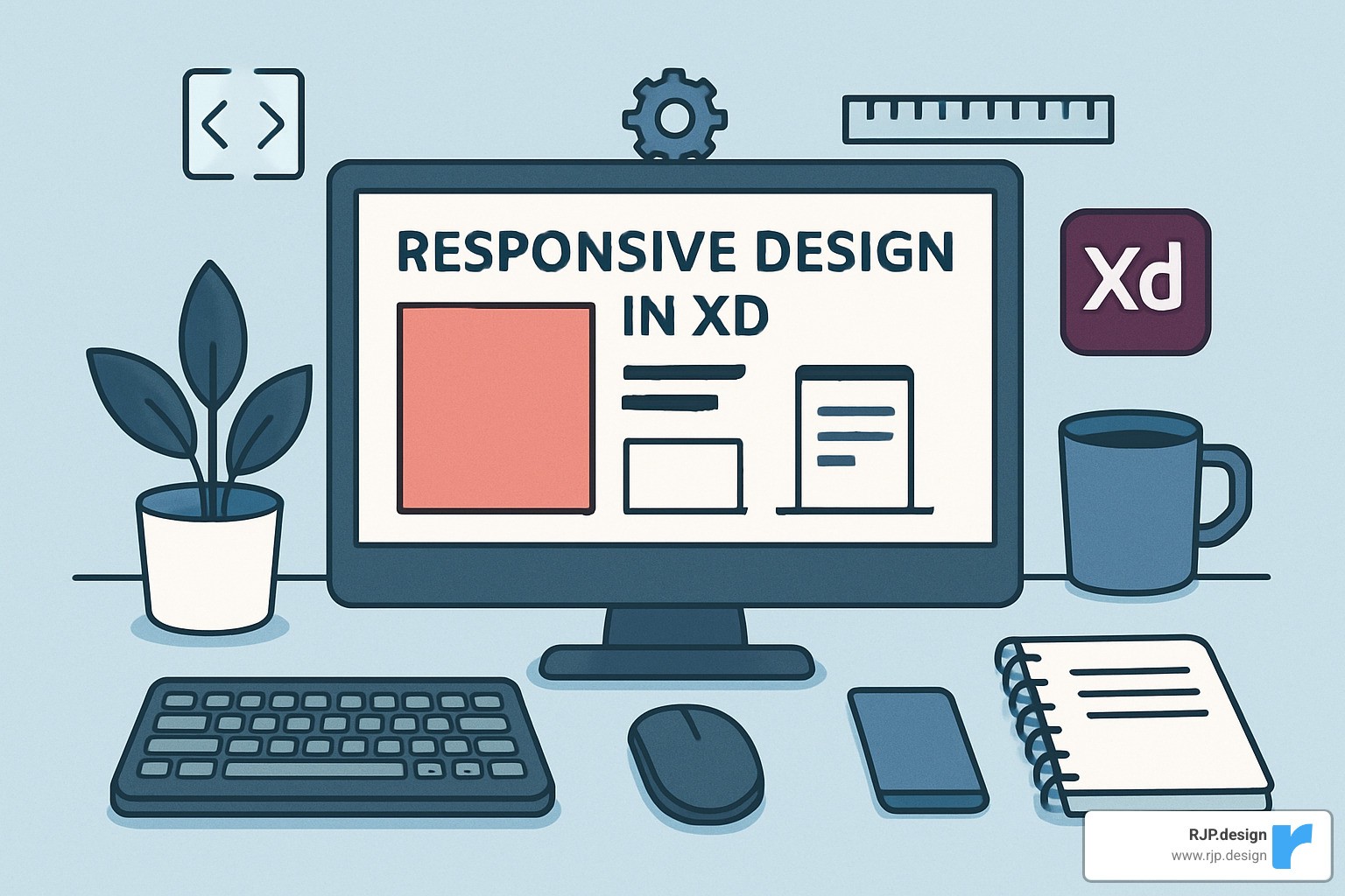
Adobe XD Responsive Design Made Easy (No Magic Required!)
May 30, 2025

Responsive Design in XD: 7 Powerful Tips for Success 2025
Why Responsive Design in XD Is Essential for Modern Websites
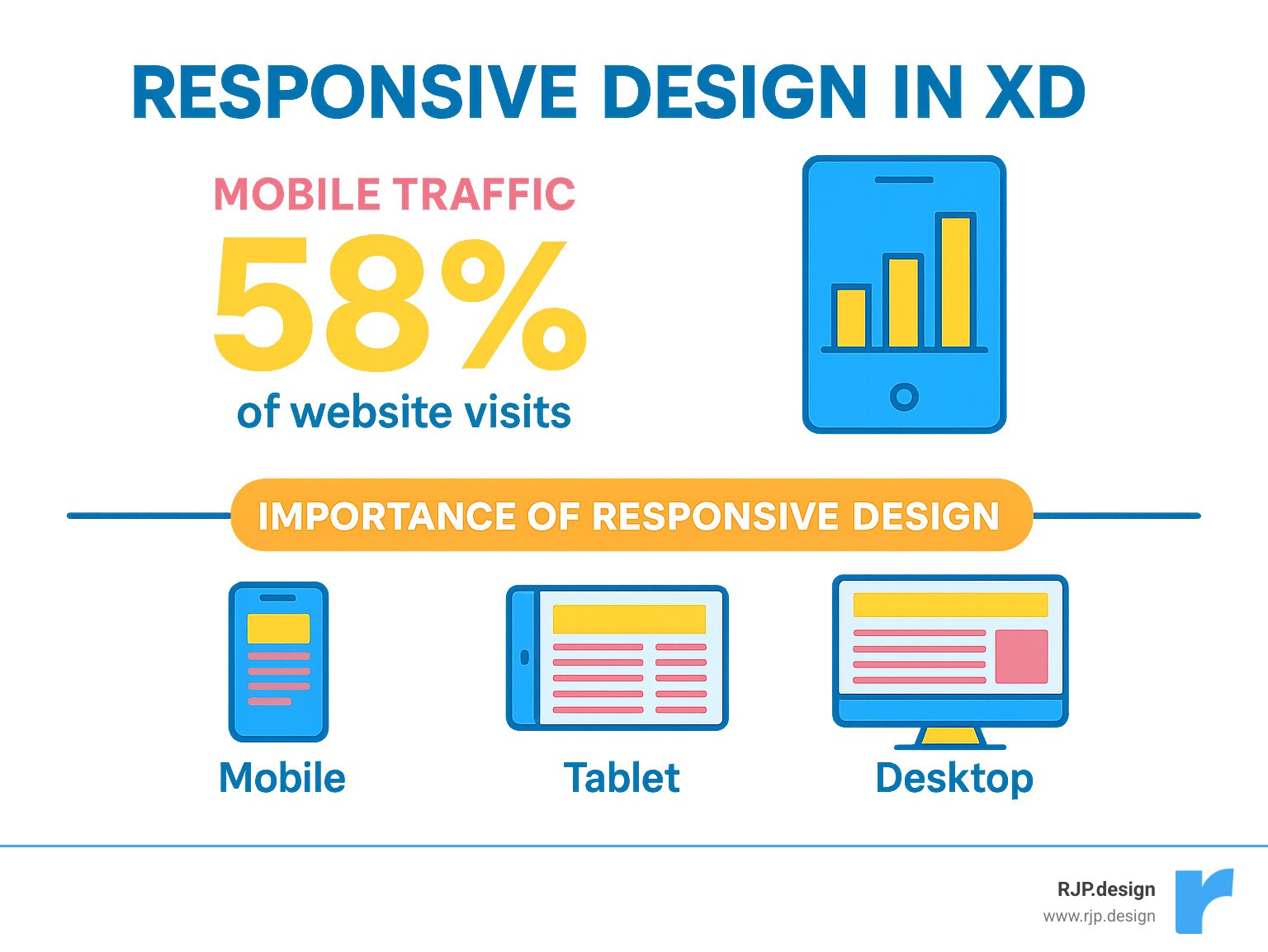
Responsive design in xd has become a non-negotiable skill for anyone creating websites that work across all devices. With over 50% of global web traffic now coming from mobile devices, your designs must adapt seamlessly from desktop to tablet to phone – or risk losing half your potential customers.
Here’s what you need to know about responsive design in XD:
• Responsive Resize feature – Automatically adjusts layouts when you resize artboards
• Constraints system – Controls how elements behave when screens change size
• Auto vs Manual modes – Choose automatic predictions or set custom rules
• Live preview options – Test your designs across different screen sizes
• Plugin integrations – Tools like Anima add breakpoints and browser testing
The mobile revolution didn’t just change how people browse the web – it fundamentally transformed how we must approach design. As Ethan Marcotte noted when he coined the term “responsive web design” in 2010, we need to think of content as water that molds to any container.
Adobe XD’s Responsive Resize feature can reduce manual resizing time by up to 70%, letting you focus on creativity instead of tedious adjustments. The tool uses predictive constraints and visual feedback through pink crosshairs to show exactly how your elements will behave.
But here’s the thing – many designers still struggle with XD’s responsive features because they don’t understand the underlying principles or workflow.
I’m Ross Plumer, and I’ve helped businesses market over $20 million in revenue through strategic web design and development. My experience with responsive design in XD has taught me that success comes from understanding both the technical constraints and the bigger picture of user experience across devices.
Quick responsive design in xd definitions:
– easy responsive css
– custom website solutions
– good mobile website design
What Is Responsive Design and Why It Matters Today
Think of responsive design as creating a website that’s like a smart piece of clothing – it automatically adjusts to fit perfectly no matter who’s wearing it. Instead of clothing sizes, we’re talking about screen sizes, from tiny smartwatches to massive desktop monitors.
Responsive design in XD starts with understanding what responsive actually means. It’s a design approach that uses flexible grids, media queries, and fluid media to make your website respond intelligently to different devices. Your layout literally reshapes itself based on screen size, platform, and even how someone holds their device.
The whole concept became essential when the first iPhone hit the scene. Suddenly, people weren’t just browsing websites on desktop computers anymore. That little device combined a phone, music player, and web browser into one pocket-sized powerhouse – and it changed everything.
Designers had to throw out their fixed-width layouts and accept flexibility. Today, we’re designing for an even wilder range of devices. Your website needs to look amazing on everything from an Apple Watch to an ultrawide gaming monitor.
Here’s why responsive design isn’t just nice to have anymore – it’s absolutely critical. User experience comes first because people expect websites to work perfectly on their device of choice. No pinching, zooming, or sideways scrolling just to read your content.
Performance optimization matters because responsive sites can deliver the right content for each device. Mobile users get streamlined experiences, while desktop users can enjoy richer features. SEO benefits are huge too – Google actively prioritizes mobile-friendly sites in search rankings, meaning responsive design directly impacts your visibility.
The cost efficiency aspect is pretty compelling. Building one responsive site costs significantly less than creating separate mobile and desktop versions. Plus, you get automatic future-proofing – when new devices hit the market, your responsive design adapts without requiring a complete rebuild.
Under the hood, responsive design relies on three key technical ingredients. Flexible layouts use relative units like percentages instead of fixed pixels. Media queries apply different styling rules at different screen sizes. Flexible images and videos scale proportionally with their containers instead of breaking your layout.
The touch targets principle ensures buttons and links are large enough for fingers on mobile devices – typically at least 44 pixels square. This seemingly small detail makes a massive difference in user experience.
For the complete foundation of these principles, Ethan Marcotte’s original article remains the definitive starting point. He coined the term and laid out the framework we still use today.
Responsive vs. Adaptive vs. Mobile-First
Understanding these three design philosophies will transform how you approach projects. Each has distinct advantages depending on your goals and constraints.
Approach | How It Works | Pros | Cons |
|---|---|---|---|
Responsive | Uses CSS media queries for dynamic layouts that fluidly adapt | One codebase, flexible, future-proof | Can be complex to implement |
Adaptive | Static layouts at set breakpoints, serves different versions | Precise control, optimized per device | Multiple codebases, less flexible |
Mobile-First | Starts with mobile design, progressively improves for larger screens | Forces content prioritization, better performance | Requires mindset shift |
Responsive design treats your content like water – it flows and adapts to any container you pour it into. When you resize a responsive layout, elements move smoothly and proportionally. Everything feels natural and fluid.
Adaptive design works more like ice cubes – specific shapes for specific containers. At exactly 768 pixels wide, you get the tablet layout. At 1024 pixels, the desktop layout kicks in. There’s no smooth transition between these breakpoints, just distinct jumps.
Mobile-first design represents a fundamental content priority shift. Instead of starting with a full desktop design and trying to cram it onto mobile, you begin with the smallest screen. This forces you to identify your most important content and features first.
The mobile-first approach creates better multi-device patterns because you’re building up from a solid foundation rather than stripping down from complexity. It’s like packing a suitcase – you start with essentials, then add extras if you have room.
We recommend combining responsive techniques with mobile-first thinking for responsive design in XD. Start with your core content on mobile, then use responsive principles to improve the experience on larger screens. This approach comparison consistently delivers the best results for both users and developers.
Mastering Responsive Design in XD
Here’s where the magic happens. Responsive design in XD becomes incredibly manageable once you understand how the Responsive Resize feature works. Think of it as having a smart assistant that watches your design and predicts how elements should behave when screens change size.
The beauty of XD’s approach is that it eliminates hours of tedious manual setup that used to kill the creative momentum. Instead of getting bogged down in technical constraints, you can focus on what matters most – creating amazing user experiences.
Responsive Resize is XD’s secret weapon for this workflow. When you enable it, the software analyzes your layout structure, looking at how objects are grouped, their proximity to edges, and their relationships to each other. Then it makes intelligent predictions about how everything should adapt.
You’ll know the feature is working when you see those distinctive pink crosshairs appear. These visual indicators show exactly which constraint rules are active on your elements. It’s like having X-ray vision into your responsive behavior.
XD gives you two ways to handle constraints: Auto Mode lets the software make predictions for you based on its layout analysis, while Manual Mode puts you in complete control to set fixed or variable dimensions and margins yourself. Most designers find that starting with Auto Mode and then fine-tuning specific elements manually gives the best results.
Here’s a pro tip that makes everything work better: group related objects before applying Responsive Resize. When you group a headline with its supporting text, or a button with its icon, you preserve their spatial relationships during scaling. This prevents your carefully crafted layouts from falling apart when viewed on different devices.
To get started, simply select an artboard in design mode and toggle Responsive Resize on in the Property Inspector. You’ll immediately see how XD predicts your layout behavior, and you can start experimenting with different constraint combinations.
For the complete technical details, check out Adobe XD’s Responsive Resize documentation.
Setting Constraints for Responsive Design in XD
Understanding constraints is like learning the grammar of responsive design. These rules determine how elements behave when their parent container changes size, and getting them right makes the difference between layouts that gracefully adapt and ones that break apart.
Think of constraints as simple instructions you’re giving each element. You might tell a logo to “stay 30px from the left edge” or instruct a background image to “stretch to fill the full width.” Each element follows these rules as screens resize.
The fundamental choice you’ll make is between fixed and fluid constraints. Fixed width and height keep elements the same size regardless of container changes – perfect for logos or buttons that need consistent proportions. Variable width and height let elements scale proportionally with their container, which works great for backgrounds or flexible content areas.
Margins follow the same logic. Fixed margins maintain consistent spacing from edges, while variable margins adjust proportionally as the layout scales. The key is understanding when each approach serves your design goals.
Every element’s constraints work relative to its parent relationship – whether that’s an artboard, group, or component. This hierarchical system ensures predictable behavior, but it means you need to think about your layout structure from the beginning.
Some patterns you’ll use constantly include setting left and right constraints to make elements stretch across full width, applying top constraints with fixed height to keep navigation bars stable, and using equal left and right margins to maintain center alignment across different screen sizes.
Here’s a handy trick: hold the Shift key while dragging a corner handle to temporarily override responsive constraints and lock the aspect ratio. This lets you make quick adjustments without changing your underlying constraint rules.
The secret is remembering that constraints always work relative to the element’s immediate parent. If you have a button inside a navigation group, the button’s constraints relate to that group, not the entire artboard.
Previewing Responsive Design in XD Prototypes
Testing your responsive designs isn’t optional – it’s where you find whether your constraints actually work in practice. XD offers several preview methods that help you catch issues before they reach real users.
The built-in preview is your first line of defense. Use XD’s desktop preview to manually resize the window and watch your constraints respond in real-time. You’ll see those pink crosshairs activate as elements adapt, giving you immediate visual feedback on your layout behavior.
Share links take testing to the next level by letting stakeholders test your prototypes on their actual devices. This real-world feedback reveals issues with touch targets, text readability, and interaction patterns that you might miss on your desktop screen.
When Responsive Resize is enabled, you can drag artboard edges to see instant feedback on layout adaptation. This live resize testing helps you spot problems early in the design process, when they’re still easy to fix.
Setting up separate artboards for desktop (1920px), tablet (768px), and mobile (375px) gives you a clear visualization of your design across major breakpoints. This multi-device view helps ensure consistency and catch layout issues before they become problems.
For inspiration on what’s possible, take a look at this preview of a responsive website that showcases smooth adaptation across different screen sizes.
The golden rule is to test early and often. Don’t wait until your design feels “finished” to check responsiveness – build preview testing into your workflow from day one. Your future self (and your developers) will thank you.
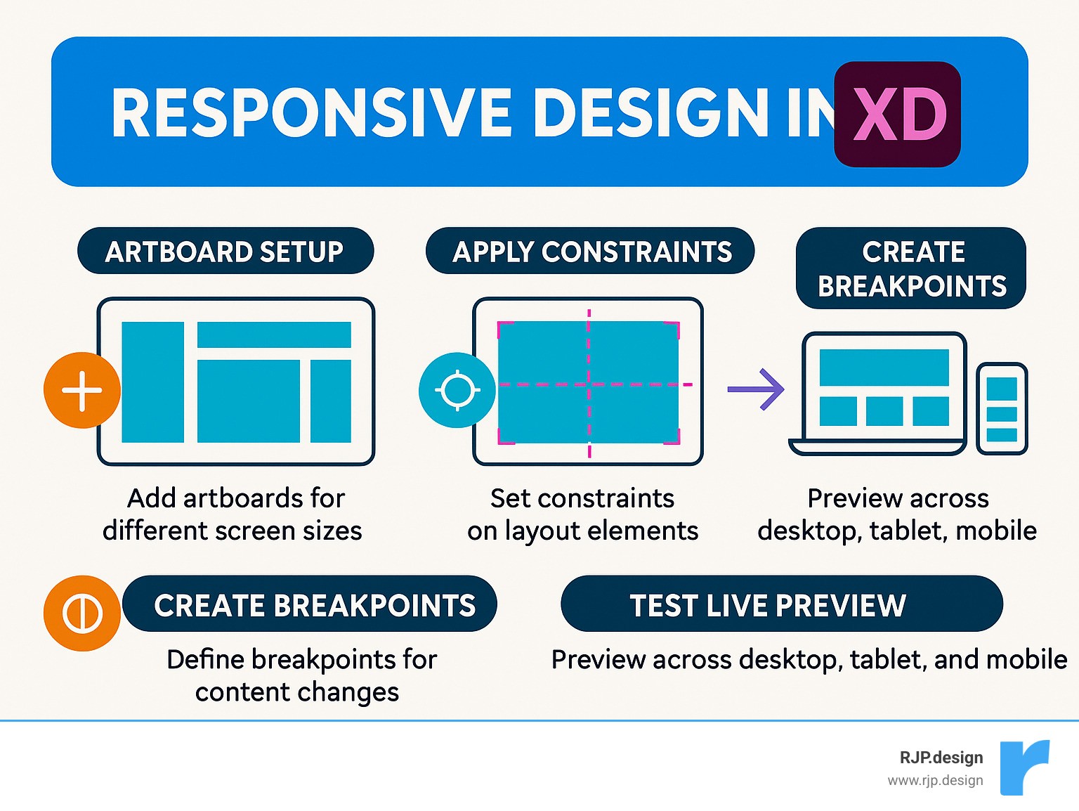
Hands-On Workflow: From Artboards to Breakpoints
Creating effective responsive design in XD is like learning to cook – once you understand the basic recipe, you can adapt it to any project. Let me walk you through the workflow I’ve refined over years of designing responsive websites that actually work.
Start big, then scale down. This is the golden rule I always follow. Begin with your desktop artboard at 1920×1080 and enable Responsive Resize right away in the Property Inspector. Why start large? Because it’s much easier to simplify a complex layout than to add complexity to a cramped mobile design.
The magic happens when you set up your grid system properly. I use XD’s Repeat Grid feature to create responsive column guides that serve as my layout foundation. Draw a 1170px-wide rectangle as your maximum site width, add 15px margins on both sides, then create 67.5px column guides using Repeat Grid. Set the opacity to around 3% and lock those layers – trust me, you’ll thank yourself later when you’re not accidentally moving guide elements.
Grouping is everything. Before you even think about applying responsive behavior, group related elements together. Your logo and navigation items should be buddies. Headlines and their supporting text need to stick together. This isn’t just organization – it’s how XD understands the relationships between your design elements.
Now comes the fun part – applying constraints. I typically start with Auto mode to see what XD predicts, then switch to Manual mode for elements that need precise control. XD’s predictions are surprisingly good for standard layouts, but sometimes you need to take the wheel for complex interactions.
Testing across breakpoints is where most designers rush – don’t be one of them. Create additional artboards for the most common device widths: 375px for mobile, 768px for tablet, 1024px for tablet landscape, 1440px for standard laptop, and 1920px for full HD monitors. These aren’t arbitrary numbers – they represent real devices your users actually own.
Here’s where things get exciting. The Anima plugin transforms your XD designs into browser-ready prototypes with real breakpoints. Anima for Adobe XD v1.0.7 fully supports XD’s Responsive Resize feature, meaning your constraints translate directly into live browser behavior. It’s like having a developer sitting right next to you.
The final step – and this is crucial – is browser testing. Don’t just assume your design works because it looks good in XD. Use plugins like Anima to preview your responsive prototype in an actual browser, where you can test real-time resizing and see how your design behaves on actual devices.
Want to dive deeper into responsive workflows? Check out our Easy Responsive Design resource for more advanced techniques.
Responsive Design in XD vs. Adaptive Code Handoffs
The biggest misconception I encounter is thinking that responsive design in XD automatically translates to responsive code. It’s more like creating a detailed blueprint – incredibly valuable, but the builder still needs to construct the actual house.
Your XD responsive settings provide the foundation, but developers need to implement the real magic through CSS media queries and flexible grid systems. Think of your constraints as instructions rather than final code.
What actually transfers to development includes your constraint logic (which elements should be fixed versus flexible), your breakpoint decisions, spacing relationships, and component hierarchy. These decisions guide developers toward the right implementation approach.
What requires developer expertise includes CSS media queries for different screen sizes, flexible grid systems using CSS Grid or Flexbox, performance optimizations for various devices, and advanced responsive features that go beyond basic layout adaptation.
The Anima plugin bridges this gap beautifully by exporting HTML and CSS with responsive behavior intact. XD’s design specs show spacing and sizing information, while component libraries ensure consistency across all breakpoints.
Clear communication makes all the difference. Document your responsive intentions, test prototypes together, and make sure the final code matches your design vision. The handoff should feel like passing a well-written recipe to an experienced chef.
Creating a Table of Automatic vs. Manual Constraints
Knowing when to use Auto versus Manual constraints will save you countless hours of tweaking and re-tweaking. I’ve learned this through plenty of trial and error, so let me save you the frustration.
Constraint Type | Best For | How It Works | When to Use |
|---|---|---|---|
Automatic | Standard layouts, quick prototyping | XD analyzes object relationships and applies predicted constraints | When XD’s predictions match your intent |
Manual | Precise control, complex layouts | You set specific fixed/variable rules for width, height, margins | When you need exact behavior or Auto doesn’t work |
Fixed Width | Logos, buttons, icons | Element maintains exact pixel width | When size consistency is critical |
Variable Width | Backgrounds, content areas | Element scales proportionally | When elements should grow/shrink with container |
Fixed Margins | Navigation spacing, gutters | Maintains consistent pixel distance from edges | When spacing must remain constant |
Variable Margins | Centered content, flexible spacing | Margins adjust proportionally | When spacing should scale with container |
Start with Auto mode to see XD’s suggestions – they’re often spot-on for typical layouts. Then switch to Manual mode to fine-tune specific elements that don’t behave as expected. This hybrid approach combines XD’s intelligence with your design expertise.
The key insight? Auto mode works great for about 80% of your layout decisions. It’s that remaining 20% where Manual mode becomes your best friend, giving you the precise control needed for complex responsive behaviors.
Pro Tips, Pitfalls, and Resources
After helping businesses create responsive designs that have driven millions in revenue, I’ve seen what separates successful projects from frustrating ones. Let me share the insights that will save you time and headaches with responsive design in XD.
The biggest game-changer is thinking about scalable typography from the start. Instead of setting text at fixed pixel sizes, consider how your headlines and body text will look on a tiny phone screen versus a large monitor. Your beautiful 48px headline might overwhelm a mobile layout, while 12px body text becomes unreadable.
Image compression is another area where many designers stumble. That gorgeous hero image might look perfect in XD, but if it takes 10 seconds to load on mobile, your users will bounce before they see it. Tools like Squoosh can reduce file sizes by 70% without noticeable quality loss.
Here’s something that catches even experienced designers off guard: touch targets. What works perfectly with a precise mouse cursor can become impossible to tap with a finger. Buttons need to be at least 44px tall, and you need enough whitespace so users don’t accidentally tap the wrong element.
Common Pitfalls to Avoid:
The most expensive mistake I see is over-constraining elements. New users often set constraints on every single object, creating rigid layouts that break unexpectedly. Sometimes the simplest approach works best – let XD’s auto-predictions handle standard layouts and only intervene when needed.
Content hierarchy becomes critical on mobile screens. You can’t just shrink everything down and hope it works. Mobile forces you to make tough decisions about what’s truly important. That sidebar full of secondary links? It might need to become a simple menu icon.
Don’t fall into the performance trap either. Responsive doesn’t just mean “fits on screen” – it means your site loads quickly on slower mobile connections. A beautiful responsive design that takes 8 seconds to load defeats the purpose.
Navigation patterns can make or break your mobile experience. Off-canvas menus work brilliantly for hiding secondary navigation without cluttering the screen. Priority+ patterns show your most important menu items while tucking less critical ones behind a “more” button. For app-style experiences, tab bars provide familiar navigation that users expect.
When things go wrong – and they will – check the parent-child relationships first. Those pink crosshairs in XD are your diagnostic tool. If an element isn’t behaving as expected, it’s usually because it’s grouped incorrectly or the constraints are fighting each other.
For a head start on your next project, this responsive UI kit includes 14 screens and 164 components that are already set up with proper responsive behavior. It’s like having a responsive design mentor built into your toolkit.
At RJP.design, we’ve learned that the best responsive designs happen when technical precision meets real user needs. Our Web Design & Development services focus on creating websites that don’t just adapt to different screens – they deliver exceptional experiences that drive business results across every device.
Grouping & Organizing for Responsive Design in XD
Think of organizing your XD file like arranging a toolbox. When you’re deep into a project with tight deadlines, you need to find exactly what you’re looking for without digging through a mess of unnamed layers.
Layer naming makes the difference between smooth sailing and frustration. Instead of “Rectangle 1” and “Group 47,” use names that tell the story: “nav-primary,” “hero-headline,” or “footer-social-links.” When you’re working across multiple breakpoints, add indicators like “hero-desktop” and “hero-mobile” so you always know which version you’re editing.
Component nesting is where responsive design in XD really shines. Create master components for elements that repeat across your site – navigation bars, buttons, cards. Then use nested components for different states and variations. This keeps everything consistent when you’re adapting layouts for different screen sizes.
Your hierarchy should tell a clear story from top to bottom. Start with major page sections like header, main content, and footer. Within each section, group related content areas. Then organize individual elements like text, buttons, and images. Finally, create states and variations at the deepest level.
Here’s a pro tip that saves hours: create component states for different breakpoints instead of duplicating entire artboards. Your navigation component might have “desktop,” “tablet,” and “mobile” states. This approach keeps your file clean and ensures changes propagate consistently across all screen sizes.
File organization becomes crucial as projects grow. Name your artboards clearly: “Homepage – Desktop 1440px” or “Product Page – Mobile 375px.” Create a dedicated artboard for your style guide with typography scales, color palettes, and spacing rules. Document your responsive breakpoints and constraint decisions so team members can understand your logic.
Good organization isn’t just about staying neat – it’s about maintaining your sanity and delivering consistent results when you’re juggling multiple breakpoints and countless design iterations.
Breakpoints & Live Testing
While XD doesn’t have built-in breakpoints like some other tools, plugins like Anima bridge this gap beautifully by connecting your artboards and creating smooth transitions between screen sizes.
Most successful responsive projects follow a three-tier breakpoint strategy. Mobile covers 320px to 767px – start designing at 375px since that’s the iPhone standard. Tablet spans 768px to 1023px – begin with 768px for iPad portrait orientation. Desktop handles 1024px and up – design for 1440px but test all the way up to 1920px for full HD monitors.
Anima’s breakpoint features transform static XD artboards into fluid, interactive prototypes. You can connect artboards to create smooth transitions, preview responsive behavior in real browsers, and test touch interactions on actual devices. The plugin even exports production-ready HTML and CSS, which makes developer handoffs much smoother.
Real-time preview testing reveals issues that static artboards miss completely. Text that looks perfect at 375px might wrap awkwardly at 390px. Images that scale beautifully in XD might pixelate in the browser. Anima’s browser preview lets you drag the window edges and watch your design adapt in real-time.
Don’t forget about touch emulation when testing on desktop. Browser developer tools can simulate touch devices, helping you verify that buttons are big enough to tap comfortably and spacing prevents accidental touches.
The goal is catching problems before they reach development. Every issue you spot and fix in XD saves hours of back-and-forth with developers later. Your future self will thank you for the extra testing time.
Frequently Asked Questions about Responsive Design in XD
Let’s tackle the most common questions we get about responsive design in XD. These are the real-world challenges that trip up designers when they’re trying to create layouts that work beautifully across all devices.
How does Responsive Resize work in XD?
Think of Responsive Resize as your smart design assistant. When you enable it on an artboard, XD becomes a detective – it analyzes how you’ve arranged your elements, looks at their grouping, checks their proximity to edges, and studies their relationships to each other.
Based on this analysis, XD makes educated guesses about how your layout should behave when the screen size changes. Those pink crosshairs you see? They’re XD’s way of showing you exactly which constraint rules are active and working behind the scenes.
You get to choose between two approaches. Auto mode lets XD do the thinking for you – it predicts constraints based on your layout structure. Manual mode gives you complete control, letting you set specific rules for whether elements should have fixed or variable width, height, and margins.
The beauty of the system is that it works hierarchically. Each element’s constraints relate to its nearest parent container – whether that’s an artboard, a group, or a component. This creates predictable behavior that makes sense once you understand the parent-child relationships.
Can I add breakpoints directly inside XD?
Here’s where XD shows its limitations. The software doesn’t have built-in breakpoint functionality like you’d find in web development tools. But don’t worry – there are practical workarounds that get the job done.
The most straightforward approach is creating multiple artboards for different screen sizes. Set up your desktop layout at 1440px, your tablet version at 768px, and your mobile design at 375px. This gives you clear visualization of how your design adapts across devices.
For true breakpoint behavior with smooth transitions, you’ll want to explore the Anima plugin. This tool bridges the gap by connecting your artboards representing different screen sizes. You can actually preview the transitions in a browser, giving you responsive behavior that closely matches how websites work in the real world.
Anima transforms your static artboards into something that feels alive – you can resize the browser window and watch your design flow from desktop to tablet to mobile seamlessly.
What’s the best way to hand off responsive XD files to developers?
This is where good communication makes or breaks a project. XD’s Responsive Resize is a design tool – developers will implement the actual responsive behavior using CSS media queries and flexible grid systems.
The most effective handoff starts with clear documentation of your breakpoints. Specify exactly where layouts should change and how. Don’t assume developers will guess your intentions – spell out which elements should be fixed versus flexible.
Consistent naming is your friend here. When you name layers and components descriptively, developers can quickly understand your structure and intentions. “nav-primary” tells a much better story than “Rectangle 1.”
Multiple artboards showing key breakpoints give developers visual references for each screen size. But go beyond just showing the layouts – explain the logic behind your constraint decisions.
Consider using tools like Anima for code export. While the generated HTML and CSS might not be production-ready, it gives developers a solid starting point and helps them understand your responsive intentions.
The goal is creating a handoff so clear that developers can implement your vision without constantly coming back with questions. At RJP.design, we’ve found that investing time in thorough documentation upfront saves weeks of back-and-forth later in the project.
Conclusion
Responsive design in XD has transformed from a nice-to-have feature into an absolute necessity for modern web design. With the tools and techniques we’ve covered, you now have everything you need to create websites that look stunning and work flawlessly on every device your users might pick up.
The journey from static layouts to fluid, adaptive designs might seem overwhelming at first. But here’s the thing – once you master XD’s Responsive Resize feature and understand how constraints work together, responsive design becomes second nature. You’ll find yourself thinking in terms of flexible grids and scalable elements rather than fixed pixels.
Great responsive design starts with mobile-first thinking. When you prioritize the most important content for small screens first, then progressively improve for larger displays, you create experiences that truly serve your users. XD’s Auto mode gets you started quickly, while Manual mode gives you the precision control needed for complex layouts.
The grouping strategy we discussed isn’t just about organization – it’s about preserving the relationships between elements as they adapt across screen sizes. Those pink crosshairs aren’t just visual feedback; they’re your guide to understanding how your design will behave in the real world.
Testing early and often saves countless hours down the road. Whether you’re using XD’s built-in preview or plugins like Anima for browser testing, catching responsive issues during design prevents expensive fixes during development.
At RJP.design, we’ve seen how proper responsive design directly impacts business success. When your website works beautifully on every device, you’re not just improving user experience – you’re removing barriers between your business and potential customers. Our down-to-earth approach to Web Design & Development ensures your responsive designs translate into websites that actually drive results.
The mobile revolution didn’t just change screen sizes – it changed user expectations. Today’s visitors expect instant loading, intuitive navigation, and seamless experiences regardless of whether they’re on a phone during their commute or a desktop at work.
With XD’s responsive features in your toolkit, you’re ready to meet those expectations and exceed them. The future will bring new devices and screen sizes we haven’t even imagined yet, but the principles and workflows you’ve learned here will adapt right along with them.

