
Web
Beyond the Grid: A Guide to the New Web Design Philosophy
Jun 12, 2026

The Web Design Shift Every Business Owner Needs to Understand
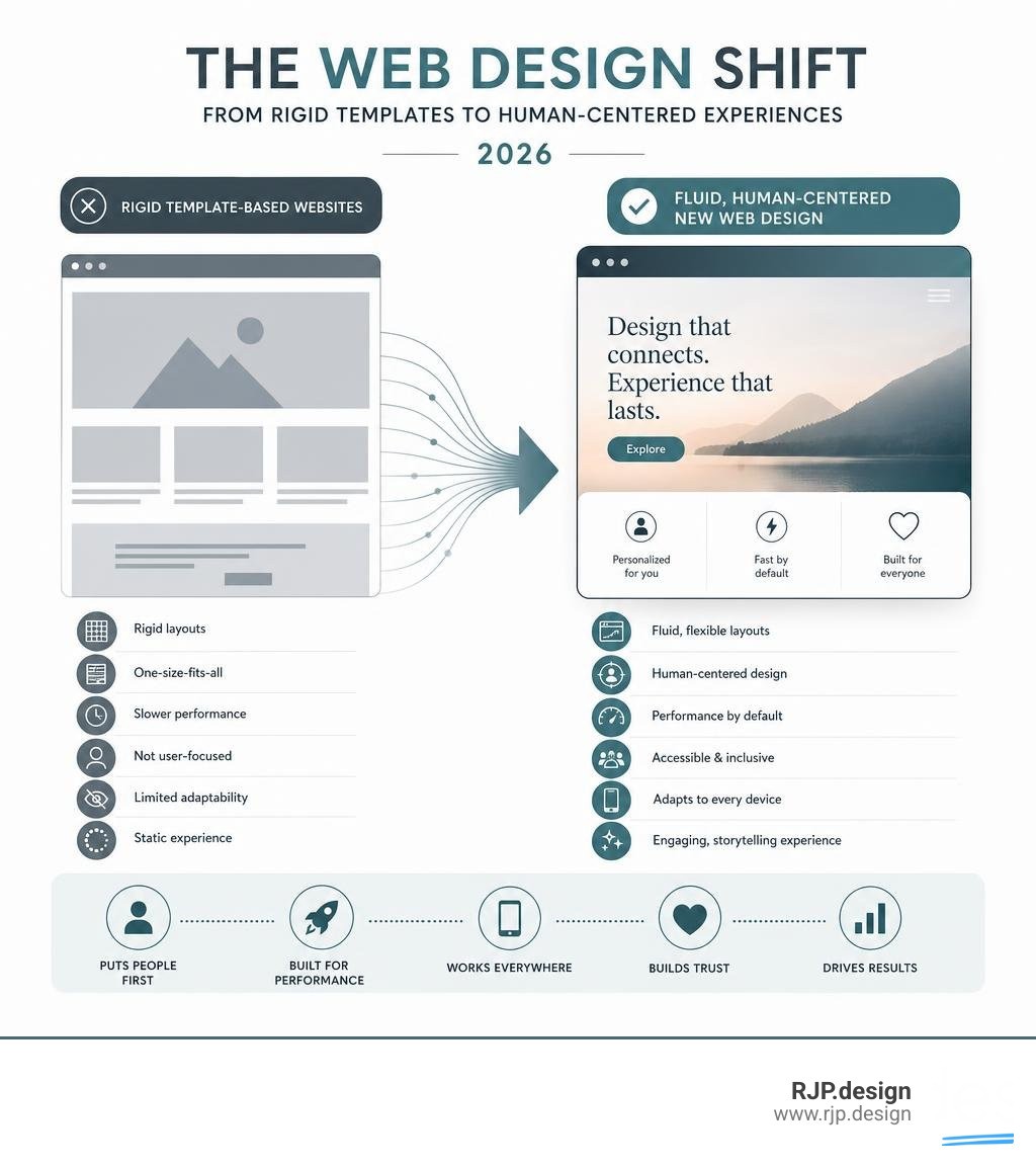
New web design in 2026 looks fundamentally different from what most small business websites were built on — and the gap is growing fast. Here's a quick snapshot of what that means today:
What defines new web design in 2026:
Human-centered aesthetics — designs that feel warm, intentional, and personal rather than templated and cold
Mobile-first, responsive layouts — with mobile devices accounting for over 58% of global web traffic, this is no longer optional
AI-powered personalization — interfaces that adapt to individual user behavior in real time
Performance by default — fast load times, clean code, and strong Core Web Vitals scores baked in from the start
Accessible, inclusive design — built for every user, on every device, in every context
Motion and storytelling — micro-animations, scroll-triggered effects, and visual narratives that guide users through a brand's story
Think about the last website that genuinely impressed you. Chances are it didn't feel like a template. It felt built — with purpose, personality, and a clear sense of who it was talking to.
That's the shift happening right now. The old model — pick a theme, fill in the blanks, go live — is giving way to something more considered. Websites are no longer just digital brochures. They're experiences. And the businesses that understand this are seeing real results: sites with modern, responsive design report up to 73% higher conversion rates than their outdated counterparts.
Meanwhile, over 57% of users will abandon a site that takes more than three seconds to load. First impressions happen in milliseconds. And for most small businesses, the website is the first impression.
The challenge is that "new web design" can feel like a moving target — full of jargon, trend lists, and technical decisions that are hard to navigate without a guide. That's exactly what this article is here to fix.
I'm Ross Plumer, a digital marketing and new web design strategist who has helped businesses across industries — including companies marketing over $20 million in revenue — build websites that actually work. In the sections that follow, I'll break down the philosophy, the trends, and the practical steps behind modern web design so you can make smarter decisions for your business.
Embracing the New Web Design Philosophy

At its core, the philosophy of new web design isn't about chasing every fleeting visual trend. It is about moving away from cookie-cutter structures and embracing layouts that prioritize human connection, clarity, and performance.
For years, websites were built on rigid, predictable grids. While grids provide order, they also led to a sea of identical-looking corporate websites. Today, 70% of consumers state that website design directly influences their perception of a brand's credibility. If your website looks exactly like your competitor's, you lose that vital competitive edge.
By utilizing modern minimalism and ample white space, businesses can increase user engagement by up to 20%. White space gives your content room to breathe, helping visitors focus on what actually matters: your message and your call to action.
Feature | Traditional Template-Based Design | Modern Fluid New Web Design |
|---|---|---|
Layout Structure | Rigid, boxy, template-bound | Fluid, organic, custom-tailored |
User Experience | Static, linear navigation | Dynamic, responsive, personalized |
Performance | Often bloated with unnecessary plugins | Highly optimized, fast-loading, clean code |
Brand Expression | Generic visuals and standard layouts | Unique storytelling, custom typography, and micro-interactions |
Human-Centered Aesthetics and the Evolution of New Web Design
In 2026, we are seeing a massive pushback against the overly polished, sterile designs produced by early automated tools. Audiences crave authenticity, warmth, and a touch of human imperfection. This desire has birthed several exciting visual movements:
Cute-alism: This trend beautifully merges brutalist, stripped-back structures with playful, warm, and cute elements. Think blocky layouts and stark fonts paired with friendly, cartoonish illustrations.
Dial-Up Delight: A nostalgic, energetic nod to the late '90s and early 2000s. It remixes candy-colored gradients, metallic textures, and retro fonts to capture the attention of Gen Z.
Resonant Stark: A highly intentional form of minimalism. It strips websites down to their absolute essentials while using ultra-thin typography, soft gradients, and delicate micro-interactions to build an emotional connection.
Human Scribble: Adding hand-drawn doodles, sketchy overlays, or handwritten notes over clean, professional layouts. It provides an immediate human touch that counters machine-made perfection.
Even major tech foundations are evolving to balance the new with the familiar. For instance, when looking at how Mozilla approached Designing Firefox for the future, the focus was on delivering a cleaner, warmer, and faster interface that prioritizes accessibility and user comfort.
If you are thinking about updating your own online presence, aligning your brand with these human-centric values is key. Be sure to check out our guide on Website Revamp Best Practices 2025 to see how you can begin infusing these modern elements into your current site structure.
The Technical Core: Performance, Accessibility, and Responsive Layouts
A beautiful website is useless if it takes forever to load or breaks on a smartphone. The technical foundation of new web design relies on three non-negotiable pillars: speed, mobile responsiveness, and universal accessibility.
With mobile devices driving over 58% of global web traffic, designing with a mobile-first mindset is mandatory. This goes beyond making sure your desktop layout shrinks down cleanly. It means designing fluid typography using modern CSS functions like clamp(), ensuring touch targets are easy to tap, and building navigation menus that feel natural to use on a phone.
We can see excellent practical examples of this in the developer community. In his personal design journey, Matt Fantinel highlighted how he optimized mobile navigation by avoiding clunky hamburger menus in favor of intuitive, highly visible mobile controls. You can read all about his technical breakdown in I did it again: Meet fantinel.dev version 6! - Matt Fantinel.
Furthermore, Google's Core Web Vitals now actively measure page experience metrics like Interaction to Next Paint (INP). Subtle micro-animations and smooth page transitions—often built using the native View Transitions API—help keep your site feeling incredibly snappy. If your budget is tight but your mobile experience needs a serious lift, explore our options for an Affordable Mobile Website Redesign to get your technical metrics back on track.
Intelligent Interfaces: How AI and Emerging Tech Shape New Web Design
Artificial Intelligence and immersive technologies are no longer futuristic concepts; they are actively reshaping how users interact with websites today.
AI-Powered Personalization: Modern websites can dynamically alter their layouts, copy, and product recommendations based on real-time user behavior, skill level, or browsing history.
Conversational UI: Static contact forms are being replaced by proactive, multi-step AI agents that can assist visitors, answer complex questions, and guide them through lead funnels.
3D and AR Previews: E-commerce platforms are increasingly using WebGL and Augmented Reality (AR) to allow customers to preview products in 3D or virtually place them in their homes before buying.
These technologies work wonders for keeping users on your site longer. If you run an online storefront, integrating these features can dramatically improve your sales. Take a look at our Ecommerce Website Redesign Guide 2026 to learn how to seamlessly blend AI personalization and 3D elements into your e-commerce strategy.
Storytelling and Brand Identity Beyond the Grid
Your website shouldn't just list your services; it should tell your brand's story. Modern web design utilizes custom typography, motion, and visual metaphors to guide users through an editorial-style journey.
One popular layout style that has dominated modern interfaces is the Bento Grid. Inspired by the compartments of a Japanese lunchbox, bento grids organize different pieces of content into clean, rounded, asymmetrical blocks. This makes complex information highly visual and incredibly easy to scan.
We can see the power of a strong visual metaphor in action during major corporate redesigns. For example, the team behind FutureAGI chose a "starship" metaphor to map out their entire product workflow, turning a complex AI observability platform into an engaging, understandable visual narrative. You can explore their design sprints and keyframe details in Redesigning futureagi.com: A Starship, A Stutter, 308 Keyframes.
Similarly, when creative agencies update their own digital homes, they often build custom typefaces and interactive motion systems to reflect their evolving identity. A great example of this is detailed in Designing Ourselves: The New Obys Identity and Website | Codrops, where the design team started with custom typography to build a living, adaptive brand system.
Whether you are a startup or an established enterprise, using visual storytelling helps establish immediate trust. If you are operating in the corporate space, check out our insights on B2B Web Redesign to discover how to translate complex business values into clean, compelling digital layouts.
Measuring Success and Avoiding Common Redesign Pitfalls
Undertaking a website redesign is an investment, and like any investment, you need to measure its return. However, many businesses fall into common pitfalls during the process:
Falling for Bloated Templates: Using heavy, pre-made themes packed with unnecessary plugins that kill your page speed.
Ignoring User Testing: Designing for your own personal aesthetic preferences rather than testing what actually works best for your target audience.
Neglecting SEO During the Transition: Failing to map out proper redirects, which can lead to a sudden drop in search engine traffic.
To ensure your project is a success, focus on key performance indicators (KPIs) like conversion rates, average time-on-page, bounce rates, and organic traffic growth. If you want a step-by-step roadmap to navigate this complex process safely, our Complete Website Redesign Guide covers everything you need to know from planning to post-launch optimization.
Conclusion: Partnering for the Future of Digital Experiences

The landscape of new web design is fast, exciting, and deeply human. Moving beyond the rigid grids of the past allows us to build digital experiences that are faster, more accessible, and highly engaging for your clients.
At RJP.design, we specialize in helping businesses enhance their online presence. We build custom web solutions that don't just look spectacular, but are also highly optimized to ensure you are easily found online. Our down-to-earth, high-quality team prioritizes your satisfaction and strategic growth every single step of the way.
Ready to take your business to the next level with a website built for the future? Explore our professional web design and development services today, and let's build something incredible together!