Web
Why Responsive Matters: An Introduction to HTML5 and CSS3 for All Devices
Mar 10, 2026
Why Your Website Needs to Work on Every Device
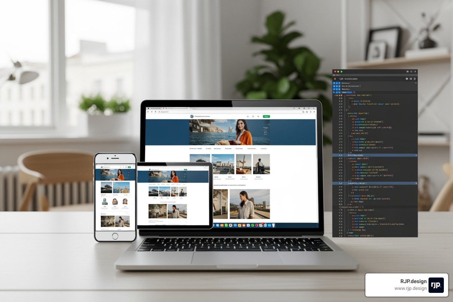
Responsive web design with html5 and css3 is the practice of building websites that automatically adapt to any screen size, from desktop monitors to tablets to smartphones. Using modern HTML5 markup and CSS3 styling, you can ensure your content looks great everywhere while keeping one codebase that is easier to maintain.
This matters because people do not browse in one predictable way anymore. A potential customer might find you on a phone during a commute, compare options on a tablet at home, and finally convert on a laptop at work. If your layout breaks at any step, you introduce friction that can cost you leads, sales, and trust.
What you gain with responsive design:
Better user experience: No pinching, horizontal scrolling, or tiny tap targets.
Stronger conversion rates: Clearer calls to action and easier forms on mobile.
More consistent branding: Your site feels cohesive across devices and browsers.
Simpler upkeep: One site to update instead of separate mobile and desktop versions.
SEO and performance wins: Search engines prefer mobile-friendly pages, and responsive layouts avoid duplicate content.
Core Components:
Viewport Meta Tag - Instructs browsers on how to scale your page.
Flexible Images - Uses CSS like
max-width: 100%to prevent layout breaks.Media Queries - Applies different styles based on the device's screen size.
Fluid Layouts - Uses flexible grids like CSS Grid or Flexbox.
Responsive Typography - Scales text using relative units for readability.
More than half of all web traffic now comes from mobile devices. If your site forces visitors to pinch and zoom, you are losing potential customers. Modern HTML5 and CSS3 provide the tools to create seamless experiences without needing separate mobile sites.
A practical way to think about it is mobile-first: design the essential content and actions for smaller screens first, then improve the layout for larger screens. This approach keeps pages focused, reduces clutter, and often improves load speed because you prioritize what matters most.
I'm Ross Plumer, and at RJP.design, I've helped businesses generate significant revenue by creating digital experiences that work across all devices. My approach to responsive web design with html5 and css3 focuses on practical, high-quality solutions that help small businesses thrive.
Basic vocab for your journey:
If you are not sure whether your current site is truly responsive, a quick check is to open it on your phone and look for these red flags:
Text that is too small to read without zooming
Buttons that are hard to tap accurately
Layouts that spill off the screen (horizontal scrolling)
Images that distort, crop awkwardly, or push content around
Navigation that becomes unusable on smaller screens
Fixing these issues early is one of the most cost-effective improvements you can make to your website because it impacts every visitor, on every device.
Core Techniques for Responsive Web Design with HTML5 and CSS3
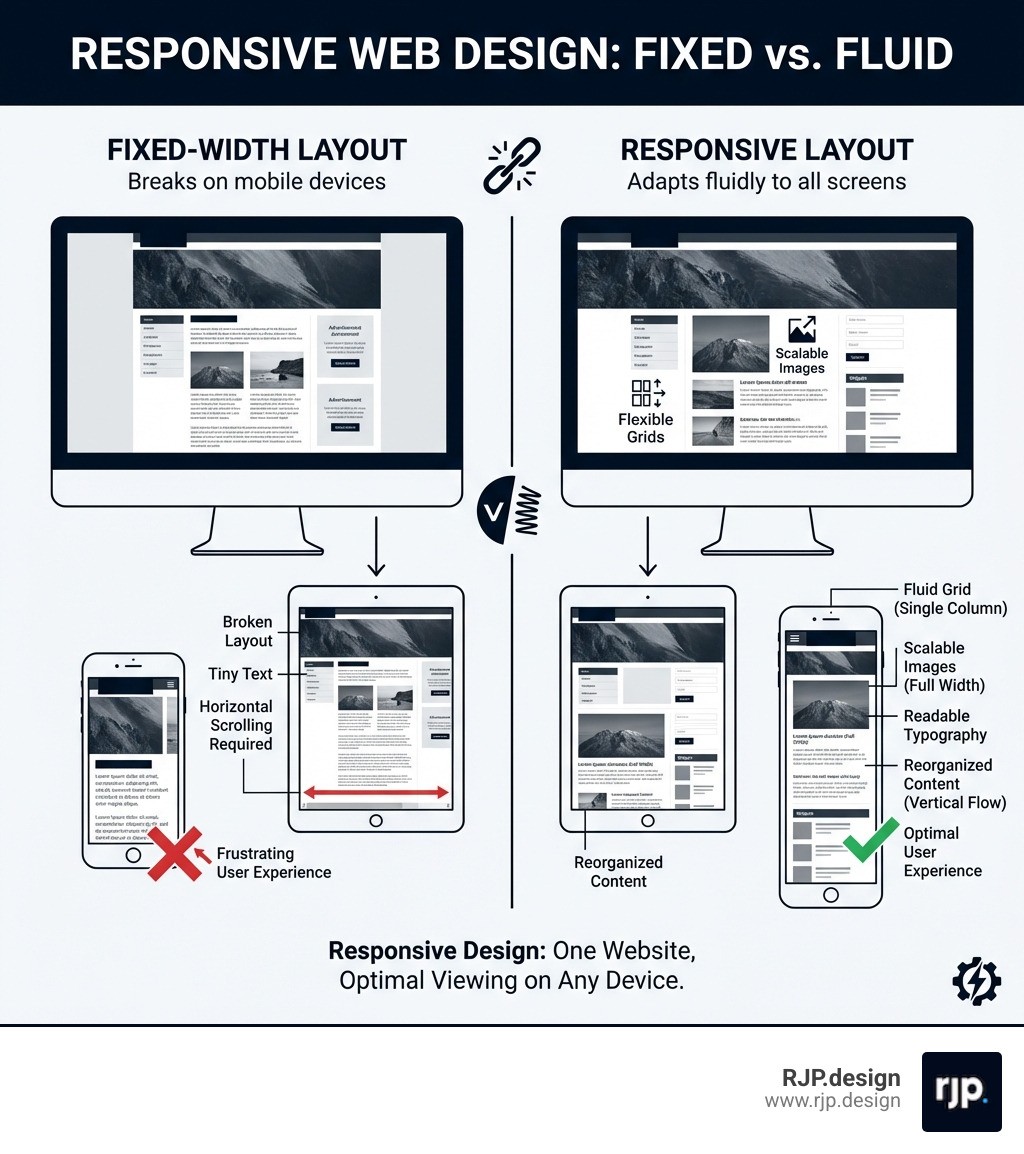
Responsive design ensures your website looks its best on everything from smartphones to large desktop monitors. By using a single, flexible codebase, you avoid the expense of maintaining separate versions for mobile and desktop.
The Viewport Meta Tag
The viewport meta tag is the first thing to add to any responsive page. It tells the browser to match the website's width to the device's screen width and sets the initial zoom level to normal. Without it, mobile browsers render your site at desktop width and zoom out, making text unreadable and buttons impossible to tap.
You place this single line inside the head of your HTML document, and it immediately ensures the browser respects the actual screen size rather than guessing.
Media Queries and Breakpoints
Media queries are the decision-makers of responsive design. They let you apply different styles depending on the visitor's screen width. You define specific widths, called breakpoints, where the layout changes. For example, a three-column desktop view can shift to a single-column layout on phones.
A common mobile-first approach starts with styles for small screens, then adds rules for tablets and desktops at wider breakpoints like 768 pixels and above. This keeps your base styles simple and layers on complexity only when the screen has room for it.
Flexible Grids
Using relative units instead of fixed pixel values ensures elements resize proportionally as the screen changes.
Feature | Fixed Pixel Units | Relative Units |
|---|---|---|
Scaling | Stays the same size regardless of screen | Scales with the screen or parent element |
Flexibility | Rigid and can cause horizontal scrolling | Adapts fluidly to any width |
Readability | Text and elements can become too small | Maintains comfortable readability |
Mastering Layouts with Grid and Flexbox
Flexbox works best for one-dimensional layouts, such as aligning items in a navigation bar or arranging a single row of cards. CSS Grid handles two-dimensional layouts, letting you structure entire pages with rows and columns at the same time. Combining these two tools gives you stable, complex structures that rearrange gracefully on any screen. For more guidance, you can Get started for free ❯ HTMLResponsive Web Design.
Implementing Responsive Images
Images are one of the most common causes of broken layouts on smaller screens. Making images fluid means they shrink to fit their container without overflowing or distorting. You achieve this by setting a maximum width of 100 percent and letting the height adjust automatically.
For art direction, where you want to show a different crop or composition on different devices, HTML5 provides the picture element. This lets you specify multiple image sources, each tied to a screen size, so the browser downloads only the most appropriate version.
Responsive Typography
Text that looks perfect on a desktop can feel oversized on a phone or tiny on a tablet. Viewport-based sizing lets your font scale smoothly with the screen width. One viewport width unit equals one percent of the browser's width, so text grows and shrinks naturally.
To prevent extremes, the CSS clamp function sets a minimum size, a preferred scalable size, and a maximum size all in one rule. This keeps your headings and body text readable without manual adjustments at every breakpoint.
Building and Testing Modern Responsive Sites
Efficient responsive web design with html5 and css3 relies on modern frameworks and thorough testing to ensure quality across every device your visitors use.
Leveraging CSS Frameworks
Frameworks like Bootstrap and W3.CSS give you pre-built responsive grids and components so you do not have to write every layout rule from scratch. Bootstrap uses a 12-column system that handles most layout scenarios, while W3.CSS is a lightweight alternative that works without any JavaScript dependencies.
Benefits include:
Pre-built Grids: Complex layout logic is handled for you, saving hours of development time.
Responsive Components: Navigation bars, cards, and forms are mobile-ready from the start.
Consistency: A unified design language keeps your site looking polished across every page.
To track your learning progress with these tools, you can Sign in to track progress.
Testing Across Devices
Building a responsive site is only half the job. Testing it thoroughly is what separates a good experience from a frustrating one.
Browser Developer Tools: Every modern browser includes built-in tools that let you emulate different screen sizes, switch between portrait and landscape, and simulate touch interactions. This is the fastest way to catch layout issues early.
Real Device Testing: Emulators are helpful for quick checks, but testing on actual phones and tablets reveals subtle rendering differences and performance issues that simulators can miss.
Smart Form Inputs: Using the right HTML5 input types, like email or number fields, triggers the correct keyboard on mobile devices and provides built-in validation. These small details make forms easier to complete and reduce errors for your visitors.
Conclusion: Future-Proofing Your Digital Presence
Responsive web design with html5 and css3 is not optional. It is a fundamental requirement for any business that wants to reach customers wherever they are. A site that does not adapt to different screens frustrates users and directly hurts your bottom line.
At RJP.design, our down-to-earth team specializes in creating high-quality, professional websites that perform flawlessly on every device. We focus on practical solutions that help small businesses grow their online presence and convert more visitors into customers.
Don't let an outdated site hold you back. Ready to reach every customer? Explore our Web design and development services to see how we can help.

