Web
CSS Responsive Media: Making Your Site Look Great on Any Screen
Jan 13, 2026

Why CSS Responsive Media Matters for Your Website
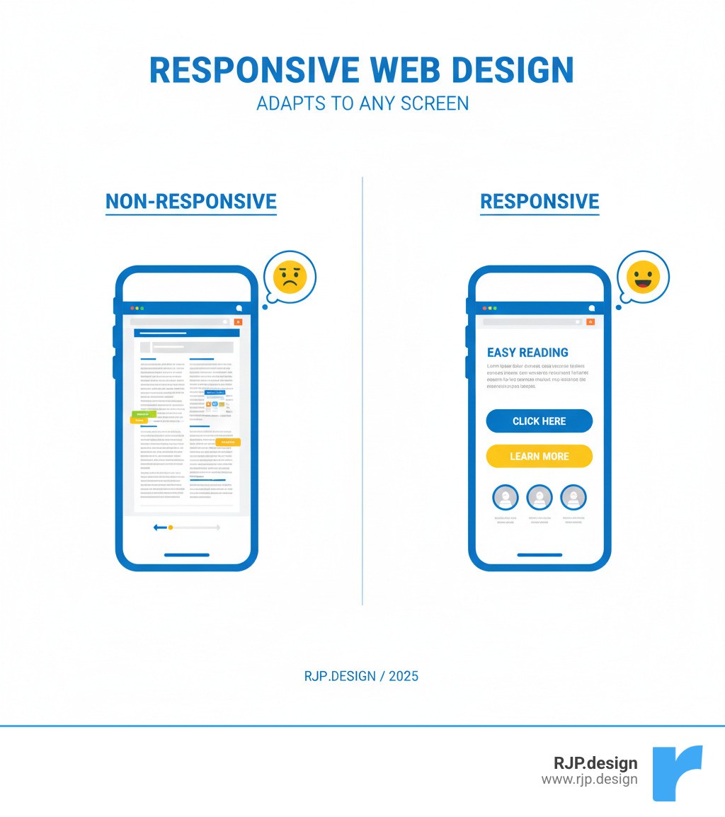
CSS responsive media is the modern web design practice that allows your website to automatically adapt to any screen size, from smartphones to desktops. It eliminates the frustrating experience of pinching and zooming on a mobile device, ensuring your content is always accessible and easy to read.
Quick Answer: How CSS Responsive Media Works
Use the
@mediarule to apply different CSS styles based on screen characteristics (width, height, orientation).Set breakpoints at common device widths (e.g., 640px, 768px, 1024px).
Design mobile-first, starting with styles for small screens and enhancing for larger ones.
Test across devices to ensure your content looks great everywhere.
Since Google's mobile-first indexing, a responsive website is crucial for SEO. But more importantly, it's practical. With countless device sizes, a single, adaptable site is the only sustainable solution. The core technique is CSS media queries, a feature that lets you apply styles based on device characteristics like screen width. This allows you to adjust layouts, change font sizes, and transform your site's appearance to fit the viewer's screen perfectly.
I'm Ross Plumer, and I've helped businesses create websites that work seamlessly across all devices using css responsive media techniques. This guide will walk you through how to implement responsive design, from the basics to advanced strategies.
Similar topics to css responsive media:
How to Implement CSS Responsive Media from Scratch
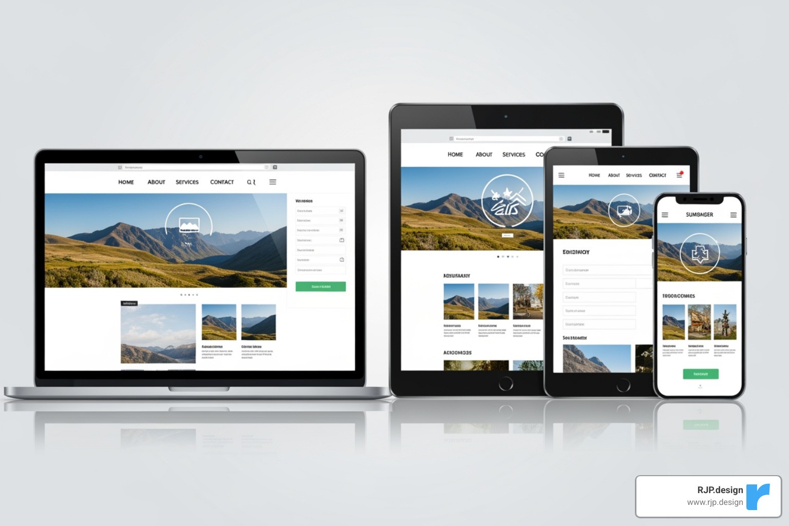
Creating a responsive website is a straightforward process built on css responsive media queries. These special rules allow your site to adapt its layout for any device, from phones to desktops. Instead of building multiple sites, you build one intelligent site that uses a flexible, fluid grid with relative units (like percentages) instead of fixed pixels. This ensures the layout flows gracefully on any screen.
Here's what a basic media query looks like:
The styles inside the query only apply when the condition (a screen 600px or narrower) is met. For a step-by-step introduction, see our guide on Easy Responsive CSS.
The Anatomy of a Media Query: Syntax and Media Types
Every media query begins with the @media rule, following the pattern: @media media-type and (media-feature) { /* styles */ }.
The media type specifies the device category. For web browsing, you'll almost always use screen. For creating printer-friendly pages, you can use print to hide navigation and optimize for paper. The all type is the default and covers every device. Other legacy types are now deprecated. For more technical details, see the official spec for media types.
The media feature is the condition you're checking, like width and height of the browser window or the device's orientation (portrait or landscape).
Setting Breakpoints to Adapt Your Layout
Breakpoints are the specific widths where your design adjusts. For example, a three-column layout might become two columns on a tablet and a single column on a phone. You control this using the min-width ("at least this wide") and max-width ("at most this wide") media features.
The modern standard is a mobile-first approach: design for small screens first, then use min-width queries to add complexity for larger screens. This improves performance and focuses on the essential content.
While breakpoints should be based on your content, common starting points are:
Small (Phones): up to 640px
Medium (Tablets): 641px to 1024px
Large (Desktops): 1025px and up

You can achieve this with a few lines of CSS:
For a deeper dive, read our article on Breakpoints in Responsive Web Design.
Practical Examples of CSS Responsive Media in Action
Let's look at common responsive patterns.
Hiding or showing elements is a frequent task. For example, you can hide a desktop sidebar on mobile and show a hamburger menu icon instead.
Changing font sizes ensures readability on all devices.
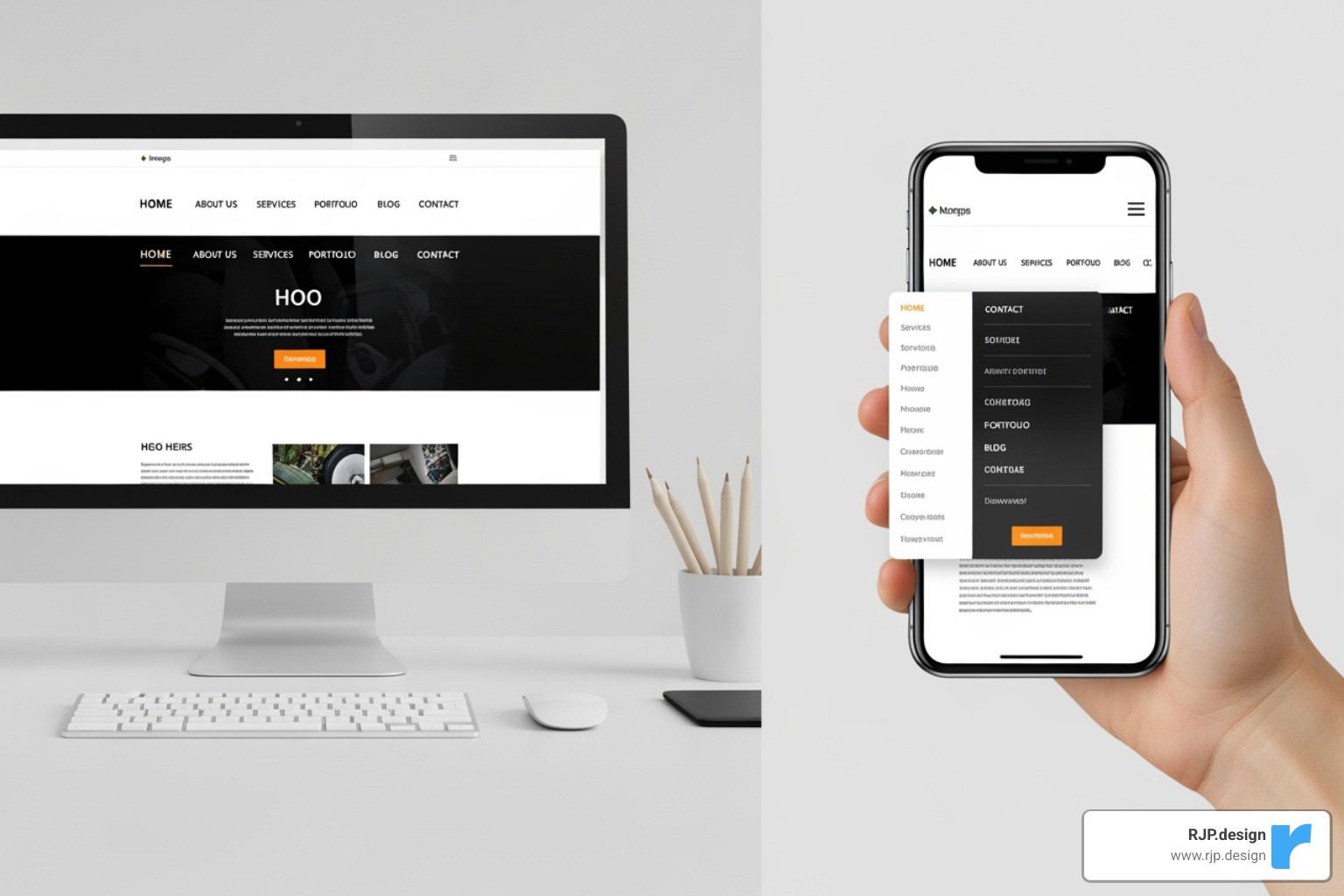
Navigation menus must adapt. A horizontal desktop menu often becomes a vertical list on mobile.
Creating Complex Queries with Logical Operators
You can combine conditions for more precise control.
The
andoperator requires all conditions to be true. This is great for targeting a specific screen size range, like tablets.A comma acts as an
oroperator, applying styles if any of the queries match.The
notoperator reverses a condition. Theonlykeyword is a legacy feature to hide queries from old browsers and is generally not needed today.
By combining features like orientation, resolution (for high-DPI screens), and hover (to detect mouse users), you can create experiences that adapt not just to screen size, but to how users interact with their devices.
Advanced Techniques and Best Practices
As you become more comfortable with css responsive media, you'll find there's much more to explore beyond basic breakpoints. The real magic happens when you combine media queries with modern CSS features, accessibility considerations, and even JavaScript to create websites that truly excel on every device.
You can use media queries in your HTML to conditionally load stylesheets, which can improve performance. For example, to load a print-specific stylesheet:
Media queries also integrate with JavaScript via window.matchMedia(). This lets you run scripts or change component behavior based on screen size, going beyond simple styling.
This powerful combination of CSS and JavaScript enables truly dynamic user experiences. For more on these principles, see our guide on Responsive Web Design.
Designing for Users: Accessibility and Container Queries
Responsive design is about making sites work for everyone. Modern CSS includes features that respect user preferences.
prefers-reduced-motion: Disables or reduces animations for users who are sensitive to motion.prefers-color-scheme: Detects if the user has requested a light or dark theme and applies styles accordingly.
A game-changing new feature is container queries. While media queries respond to the entire viewport, container queries let a component respond to the size of its parent container. This makes components truly modular and reusable. Imagine a card component that you can place in a wide content area or a narrow sidebar, and it adapts its own layout automatically.
This allows for more robust, context-aware components. Learn More on container queries to level up your skills.
Best Practices for Maintainable CSS Responsive Media
Writing effective responsive CSS means building sites that are performant, accessible, and easy to maintain.
Feature | Media Queries | Container Queries |
|---|---|---|
Scope | Entire viewport (browser window) | Specific parent element |
Primary Use | Overall page layout, global styling changes | Component-level styling, reusable UI elements |
Responsiveness | Adapts page layout to device screen size | Adapts component layout to available space within a parent |
Syntax |
|
|
Best For | Adjusting navigation, sidebars, main content areas | Cards, widgets, media objects, dynamic content blocks |
Here are key best practices to follow:
Let Content Drive Breakpoints: Don't design for specific devices. Add a breakpoint when your content looks awkward or breaks.
Use Relative Units: Use
rem,em,%, andvwinstead ofpxfor fonts and layouts to ensure your design scales and respects user font-size settings.Adopt Mobile-First: Writing styles for small screens first and adding complexity for larger ones leads to cleaner, more performant CSS.
Optimize Performance: Large images slow down mobile sites. Use responsive images (
<picture>,srcset) with modern formats like WebP or AVIF, and lazy-load images below the fold.Keep CSS Organized: Group media queries logically, either with their components or by breakpoint. Use CSS variables for theming (like dark mode) and avoid deeply nested queries.
Test on Real Devices: Emulators are helpful, but nothing beats testing on actual phones and tablets to catch layout and performance issues.
At RJP.design, we specialize in building websites that are both beautiful and functional on every device. We use these css responsive media techniques to create digital experiences that delight users and drive business results.

