
Web
How to Build a Responsive Website with Adobe XD Magic
Sep 23, 2026

Mastering Adobe XD Responsive Design: Core Tools and Techniques
To build a responsive website in Adobe XD, configure Responsive Resize constraints, apply Layout Grids, use Stacks and Content-Aware Padding, and set Component States for each breakpoint. These tools let your designs adapt fluidly across mobile, tablet, and desktop viewports while preserving structural hierarchy and content flow.
Implementing Adobe XD Responsive Design with Resize and Constraints
When you adjust an artboard or a container group in Adobe XD, the smart layout engine predicts how nested elements should react. It evaluates proximity, element types, and alignment to automatically pin items or adjust their widths. While this automated calculation handles a significant portion of basic adjustments, mission-critical interfaces demand precise control.
You can switch the Responsive Resize toggle in the Property Inspector from Auto to Manual. Manual mode gives you fine-grained controls:
Edge Pinning (Left, Right, Top, Bottom): Lock UI components to specific container edges so navigation links, logos, or floating action buttons remain anchored as viewports scale.
Fix Width & Fix Height: Prevent items like avatars, search icons, and standard buttons from stretching out of proportion.
Proportional Scaling: Allow hero banners and card containers to adapt fluidly while child elements maintain their internal geometry.
Group hierarchy plays a critical role here. If elements are left loose on the root artboard, the layout engine struggles to infer relationships. Grouping related items—such as an icon and its label inside a button container—establishes clear parent-child rules that scale predictably. To dive deeper into core sizing strategies, explore Best Practices for Designing with Responsive Resize in Adobe XD alongside our detailed walkthrough on mastering responsive design in xd.
Structuring Breakpoints, Grids, and Content Stacks in Adobe XD Responsive Design
Clean responsive layouts depend on consistent spatial rules. We recommend designing with an 8px base unit system paired with standard layout grids.
Viewport Category | Artboard Width (px) | Grid Columns | Gutter Width (px) | Margin (px) |
|---|---|---|---|---|
Mobile | 375 – 390 | 4 | 16 | 16 – 20 |
Tablet | 768 – 834 | 8 | 24 | 32 |
Small Desktop | 1280 – 1440 | 12 | 24 | 64 – 80 |
Large Desktop | 1920 | 12 | 32 | Auto-centered |
Adobe XD includes Stacks and Content-Aware Padding, which transform how dynamic content flows across screens. Stacks operate within groups or components, letting you establish vertical or horizontal layouts with fixed gaps.
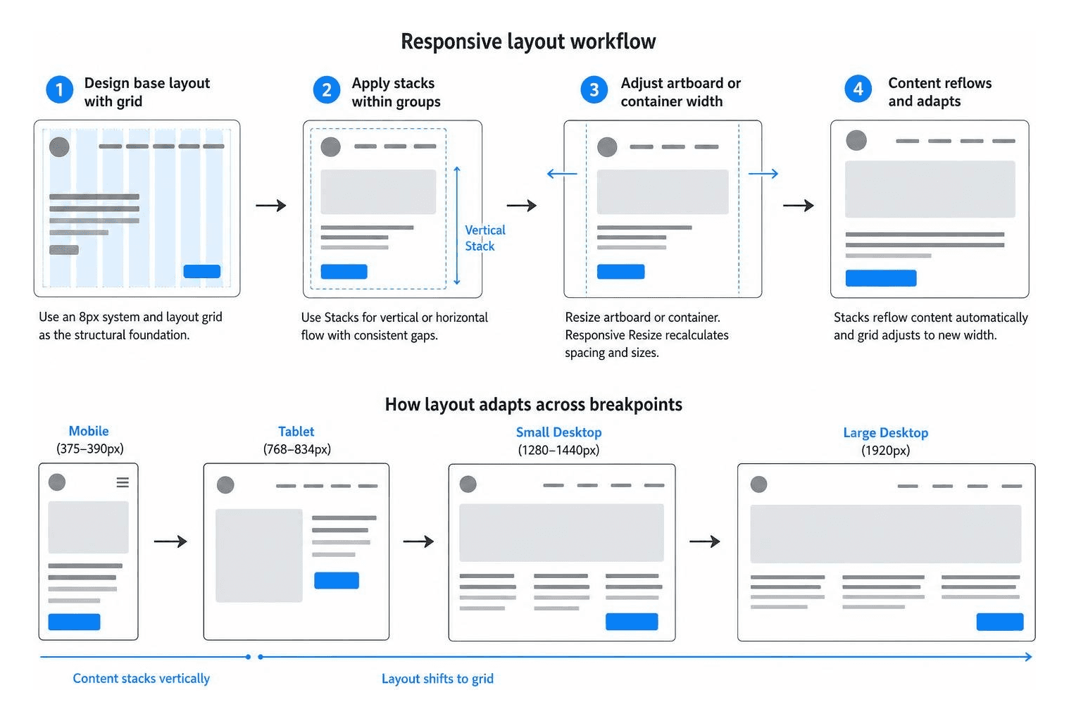
A survey by Adobe indicated that designers using Stacks reported a 25% increase in efficiency for managing content-heavy layouts. When a headline wraps to two lines, a vertical Stack automatically pushes down the subsequent paragraphs, buttons, and section wrappers without manual adjustments. You can learn more about configuring layout systems by reviewing the official resource on Working with Layout Tools in Adobe XD and reading our guide on breakpoints in responsive web design.
Managing Adaptive Components, States, and Fluid Typography
A study published in the Journal of Digital Media found that using a well-structured component library could reduce design iteration time by up to 30%. In Adobe XD, you can create master components and manage responsive variations across breakpoints using Component States.
Navigation Variations: Use a single master navigation component where the "Default State" represents the expanded desktop menu, and a "Mobile State" replaces the links with a toggle hamburger icon and dropdown panel.
Card Layouts: Create states that switch a product card from a horizontal list layout on mobile viewports to a vertical stacked card on desktop grids.
Hover and Focus Micro-Interactions: Build interactive micro-states directly within your responsive elements to clarify interactive behaviors for handoff.
Typography also needs deliberate scaling across breakpoints. Setting a base font size of 16px for body copy ensures legibility on mobile, while desktop viewports can leverage larger heading scales to establish clear hierarchy without overwhelming smaller viewports. For a wider perspective on building structured design systems, see our breakdown of responsive web design rwd.
Mobile-First Strategy and Avoiding Common Responsive Resize Pitfalls
Starting your design process with mobile viewports forces clarity. A survey by eMarketer noted that 73% of consumers say a mobile-first experience is crucial. Designing mobile-first ensures core messaging and key conversion paths are prioritized before you expand layouts to utilize wider desktop canvas space.
When working with responsive tools, avoid these frequent pitfalls:
Text Wrapping Distortion: Fixed text boxes can clip content when resized. Set body text to "Auto Height" within vertical Stacks so containers expand gracefully as text reflows.
Ungrouped Element Drifting: Loose icons or decorative shapes on an artboard will drift apart when the artboard width changes. Always bundle related elements into dedicated groups before resizing.
Aspect Ratio Distortion in Images: Stretching image containers without setting constraints can warp photographs. Use shape masks with locked aspect ratios or apply explicit fill constraints.
Over-Engineering Breakpoints: Designing for ten different screen sizes creates unneeded overhead. Stick to three or four primary breakpoints (mobile, tablet, desktop, large screen) and allow fluid constraints to handle the minor variances in between.
To explore foundational mobile-first methodologies in greater depth, review our guide on how to implement responsive web design.
Bringing It All Together: Prototyping, Testing, and Developer Handoff
A responsive layout is only as good as its real-world implementation. Validating interactive behavior and documenting layout rules bridges the gap between static design files and functional code.
Interactive Prototyping and Testing Fluid Layouts
Prototyping responsive behavior within Adobe XD allows you to test transitions, menus, and adaptive layouts before development starts. Industry data shows that extensive prototyping can reduce development costs by 15–20% by catching issues early.

Auto-Animate Breakpoint Transitions: Link mobile and desktop artboards using Auto-Animate to visualize how elements reflow between layout states.
Interactive Overlays: Prototype flyout menus, mobile navigation drawers, and modal dialogs using overlay triggers to test ergonomics and tap targets.
Real-Device Testing: Use the Adobe XD mobile app to preview prototypes on physical iOS and Android devices. This helps verify that touch targets remain at least 44x44px and typography remains readable under real-world viewing conditions.
For a comprehensive overview of modern multi-device prototyping strategies, consult our fully responsive design complete guide.
Streamlining the Responsive Developer Handoff Workflow
Over 80% of designers agree that clear communication with developers is the most crucial factor for successful implementation, according to a 2023 survey. When publishing your responsive designs using Adobe XD's Share for Development mode, include detailed layout documentation:
Design Tokens & CSS Variables: Document global color codes, typography scales, line heights, and standard spatial values (e.g., 8px, 16px, 24px, 32px).
Explicit Breakpoint Values: Clearly note the intended viewport thresholds where grid layouts shift (e.g.,
@media (min-width: 768px)).Asset Export Densities: Mark vector assets for automatic SVG export and ensure raster images are provided at 1x, 2x, and 3x resolutions to support high-density Retina displays.
Behavior Notes for Dynamic States: Add canvas annotations explaining how content-heavy containers expand or truncate when user data varies.
Performance during implementation directly impacts your bottom line. Data from Akamai and Aberdeen Group indicates that a 1-second delay in page load time can lead to a 7% reduction in conversions. Designing optimized, lightweight assets in your responsive files ensures the final build stays lightning-fast.
At RJP.design, our down-to-earth team prioritizes high-quality execution and client satisfaction on every project. If you are looking to build a high-performing digital presence that adapts effortlessly across all devices, explore our expert website design and development services to see how we can bring your digital vision to life.