Web
Fully Responsive Design: Making Your Website Flexible Enough for Yoga
Apr 30, 2026

Why Fully Responsive Design Is No Longer Optional for Your Website
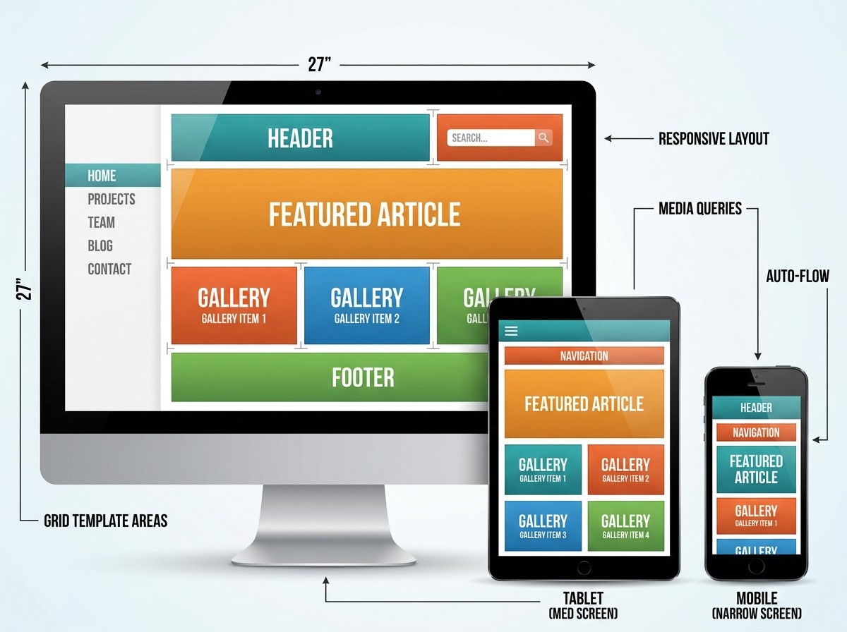
Fully responsive design is a web development approach that makes your website automatically adapt its layout, images, and text to look great on any screen — from a 5-inch smartphone to a 27-inch desktop monitor.
Here's a quick snapshot of what that means in practice:
What It Does | Why It Matters |
|---|---|
Adjusts layout to screen size | No more zooming or horizontal scrolling on mobile |
Scales images and text fluidly | Content stays readable and usable on every device |
Uses CSS media queries and breakpoints | Different layouts trigger at different screen widths |
Follows Google's mobile-first indexing | Better search rankings and organic visibility |
Delivers consistent user experience | 74% of users are more likely to return to a mobile-friendly site |
Think about the last time you visited a website on your phone and had to pinch, zoom, and scroll sideways just to read a paragraph. That frustrating experience is almost always the result of a site that hasn't been built with responsive design in mind.
It's not just a usability problem — it's a business problem. Google has prioritized mobile-friendly websites in its search rankings since its landmark "Mobilegeddon" update in 2015, and mobile devices now account for the majority of web traffic worldwide. A site that doesn't adapt isn't just annoying — it's invisible.
The good news? Responsive design isn't magic. It's a set of clear, learnable principles — fluid grids, flexible media, and smart CSS — that work together to make your website as flexible as it needs to be.
I'm Ross Plumer, and having worked with businesses generating over $20 million in revenue, I've seen how fully responsive design can be the difference between a website that converts and one that quietly drives customers away. This guide will walk you through everything you need to know to get it right.
Quick fully responsive design terms:
The Core Pillars of a Fully Responsive Design
To understand how a website performs its "digital yoga," we need to look at the foundational elements that allow it to stretch and shrink without breaking. A Responsive Web Design (RWD) - Glossary | MDN definition tells us that RWD is a concept focusing on making sites look and behave optimally on all computing devices. We achieve this through three main technical pillars.
1. Fluid Grids
In the early days of the web, we built sites using "fixed" layouts. We would say, "This sidebar is exactly 300 pixels wide." This worked fine when everyone used the same desktop monitor, but it failed miserably on mobile. If a screen is only 320 pixels wide, a 300-pixel sidebar leaves no room for anything else.
In a fully responsive design, we use fluid grids. Instead of pixels, we use relative units like percentages (%). A sidebar might be set to width: 25%. Whether the screen is a giant iMac or a small iPhone, that sidebar always takes up exactly one-quarter of the available space. This allows the content to "reflow"—wrapping text and shifting elements naturally as the browser window changes size.
2. Flexible Images
An image that is 800 pixels wide will "overflow" a mobile screen, forcing the user to scroll horizontally. To prevent this, we use flexible media. By setting a simple CSS rule like max-width: 100%;, we tell the image: "You can be your original size, but never grow wider than the container you are sitting in." This ensures images scale down automatically on smaller devices.
3. Media Queries
If fluid grids are the "muscles" of the site, media queries are the "brain." They allow us to apply different styles based on the characteristics of the device, such as its width, resolution, or orientation. For example, we can tell the browser: "If the screen is narrower than 600 pixels, hide the sidebar and show a hamburger menu instead."
Mastering Media Queries and Breakpoints
Breakpoints are the specific pixel widths where a website's layout changes. For instance, a three-column layout on a desktop might become a two-column layout on a tablet and a single-column stack on a smartphone.
While many developers use standard device widths (like 768px for iPads), the best practice is to use content-driven breakpoints. This means you expand your browser window until the design starts to look "broken" or cramped—that is exactly where you should place your breakpoint.
Commonly used ranges include:
Mobile: 320px – 480px
Tablets: 481px – 768px
Laptops/Desktops: 769px – 1024px
Large Screens: 1025px and above
To dive deeper into how to choose these points, check out our guide on Breakpoints in Responsive Web Design.
The Power of the Viewport Meta Tag
You can have the most beautiful CSS in the world, but without one specific line of HTML code, your mobile site will likely still look like a tiny, zoomed-out version of your desktop site. This is because mobile browsers default to a "virtual" width (usually around 980px) to try and fit desktop sites on small screens.
To fix this, we use the viewport meta tag: <meta name="viewport" content="width=device-width, initial-scale=1.0">
This tag tells the browser to match the width of the page to the actual width of the device in "device-independent pixels." It also sets the initial zoom level to 100%. According to Responsive web design basics | web.dev, this is the most crucial step for mobile optimization. Without it, your media queries won't trigger correctly because the phone thinks it's a desktop.
Responsive Media and Asset Optimization
Images and videos are often the heaviest parts of a website. In a fully responsive design, we don't just want media to look right; we want it to load fast.
The Picture Element: Sometimes, simply shrinking an image isn't enough. A wide landscape photo might look great on desktop but become too small to see on a phone. The
<picture>element allows us to serve different image files for different screen sizes—a process called "art direction."SVGs: Scalable Vector Graphics (SVGs) are perfect for logos and icons. Because they are math-based rather than pixel-based, they stay crystal clear at any size and have tiny file sizes.
Video Containers: Videos can be tricky. We often use a "padding-bottom" hack or modern CSS aspect-ratio properties to ensure videos maintain their 16:9 shape while resizing.
For more technical tips on handling media, see our resource on CSS Responsive Media.
Modern Techniques and Testing Strategies
As web technology has evolved, we've moved beyond simple percentages and floats. Today, we have powerful CSS tools that make building a fully responsive design much more intuitive.
Modern Layouts with Flexbox and CSS Grid for a Fully Responsive Design
If you are still using "floats" to build your website layouts, you are working much harder than you need to. Modern CSS has given us two "superpowers":
1. Flexbox (Flexible Box Layout) Flexbox is designed for one-dimensional layouts—either a row or a column. It is incredibly good at distributing space between items. For example, if you have a navigation bar with four links, Flexbox can automatically space them out evenly or center them, regardless of how wide the screen is. It's the go-to tool for CSS Responsive Column Layout needs.
2. CSS Grid CSS Grid is for two-dimensional layouts (rows and columns simultaneously). It allows you to create complex magazine-style layouts with ease. One of its best features for responsiveness is the repeat(auto-fit, minmax()) function. This tells the browser: "Fill the row with as many columns as possible, as long as each column is at least 200px wide." As the screen gets smaller, the columns automatically drop to the next line without you needing to write a single media query.
Using fractional units (fr) instead of percentages also makes math easier. An fr unit represents a fraction of the available space, handling all the "gap" calculations for you automatically.
Responsive Typography and Mobile-First Strategy for Fully Responsive Design
Typography shouldn't just be "legible"—it should be comfortable. In the past, we changed font sizes at specific breakpoints (e.g., 16px on mobile, 20px on desktop). Today, we use "fluid typography."
The clamp() function is a game-changer: font-size: clamp(1rem, 2.5vw, 2rem);
This single line of code tells the text: "Stay at 2.5% of the viewport width, but never go smaller than 1rem or larger than 2rem." The result is text that grows and shrinks smoothly as you resize the window, providing a truly Mobile-Friendly Websites experience.
Mobile-First vs. Adaptive Design
When we build a fully responsive design, we highly recommend a Mobile-First approach. This means we write the styles for the smallest screens first and then add complexity for larger screens using "min-width" media queries. This results in leaner code and faster load times on mobile devices, where performance matters most.
It is also important to distinguish between "Responsive" and "Adaptive" design:
Feature | Responsive Design | Adaptive Design |
|---|---|---|
Approach | One fluid layout that flows like water. | Multiple fixed layouts for specific sizes. |
Complexity | More complex CSS, but easier to maintain. | Multiple versions of the site to manage. |
User Experience | Smooth transitions between all sizes. | "Snap" changes at specific widths. |
Future Proofing | Works on devices that haven't been invented yet. | Needs new layouts for new device sizes. |
Testing Strategies and Professional Workflow
A fully responsive design isn't finished until it's been tested. At RJP.design, we believe testing should happen early and often.
Browser DevTools: Every modern browser has a "Device Mode." You can toggle this to see how your site looks on an iPhone, a Pixel, or a tablet. You can even simulate slow 3G connections to see how your responsive images perform.
Figma Prototyping: Before we write a single line of code, we use tools like Figma to design how the site will look at different sizes. This "design-to-code" handoff ensures that the final product matches the vision.
Real Device Testing: Emulators are great, but nothing beats holding a real phone in your hand. We test for "fat-finger" issues—ensuring buttons have at least a 44x44 pixel touch target and enough "white space" to prevent accidental clicks.
Core Web Vitals: We monitor metrics like Largest Contentful Paint (LCP) and Cumulative Layout Shift (CLS). A responsive site that "jumps" around while loading is a major turn-off for users and search engines alike.
Common Mistakes to Avoid
Tiny Click Targets: Buttons that are too close together on mobile.
Fixed Widths: Using
width: 800pxinstead ofmax-width: 100%.Hiding Content: Don't hide important information on mobile just to save space. If it's important for desktop users, it's important for mobile users.
Ignoring Performance: Large, unoptimized images will kill your mobile user experience regardless of how "responsive" the layout is.
Conclusion: Let Your Website Breathe
Creating a fully responsive design is about more than just technical checkboxes; it's about respect for your user. Whether they are browsing your site on a train using a cracked smartphone screen or in a high-tech office on a 4K monitor, they deserve a seamless, fast, and beautiful experience.
By embracing fluid grids, flexible media, and modern CSS tools like Grid and Flexbox, you ensure your website is "future-proof." You won't need a new website every time a new gadget hits the market—your site will simply adapt.
At RJP.design, we specialize in building these high-performance, flexible digital homes for businesses. We combine high-quality technical expertise with a down-to-earth approach that puts your goals first. If your current website feels a bit "stiff" and could use some digital yoga, we're here to help.
Ready to make your site truly flexible? More info about web design services is just a click away. Let's build something that looks great everywhere.
Further Reading & Resources:

