Web
Mastering Responsive CSS Columns: From Basic Principles to Advanced Techniques
Dec 10, 2025
Why CSS Responsive Column Layout is Essential for Modern Web Design
A css responsive column layout is the foundation of modern web design, ensuring your content adapts seamlessly across all devices. The challenge isn't making a site responsive—it's keeping it responsive while implementing a custom design. Today, this is achieved with three primary methods:
CSS Grid: Best for two-dimensional layouts (rows and columns).
CSS Flexbox: Ideal for one-dimensional layouts and component alignment.
CSS Multi-column: Perfect for newspaper-style text flow.
With over half of all web traffic coming from mobile and near-universal browser support for Grid and Flexbox, responsive layouts are essential. Google's mobile-first indexing means your mobile site directly impacts search rankings. A non-responsive site frustrates visitors and hurts your visibility.
I'm Ross Plumer, and I help businesses implement effective css responsive column layout strategies that improve user experience and search performance. My approach integrates technical best practices with a deep understanding of how layout choices impact business goals.
Learn more about css responsive column layout:
What are Responsive Columns and Why They Matter
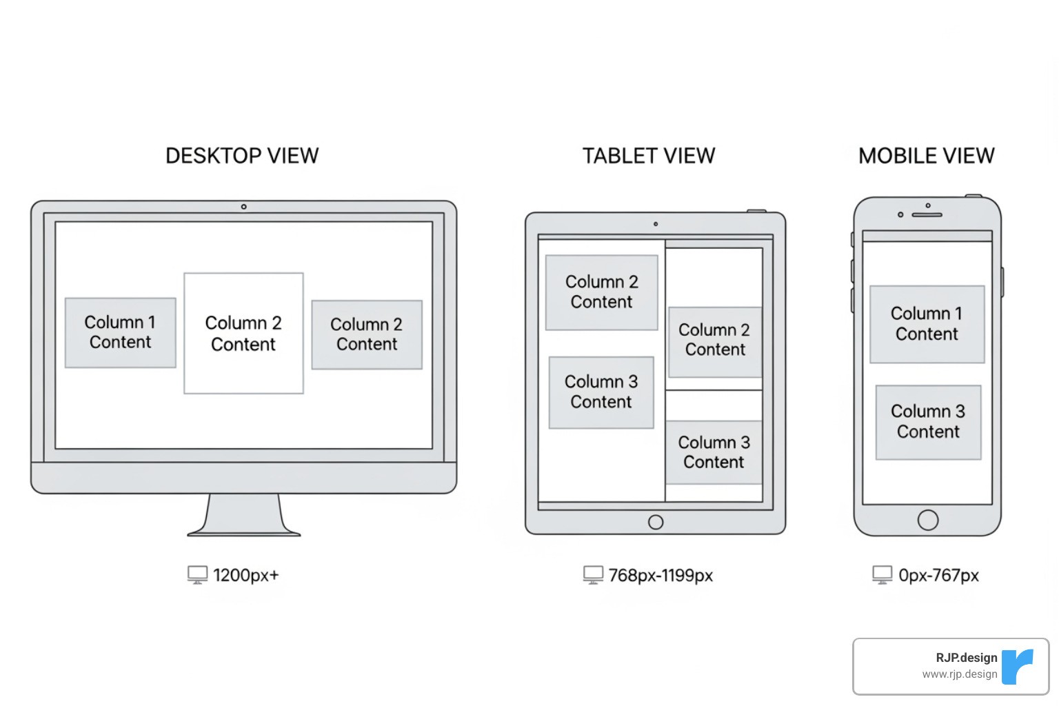
Users access the web from a vast array of devices, each with a different screen size. A css responsive column layout is the key to ensuring your website looks and functions perfectly on every single one. Instead of building separate sites for each device, responsive design allows a single website to adapt its layout to fit the available screen space using fluid grids and flexible content.
This adaptability is no longer optional. With over 50% of web traffic coming from mobile, a poor mobile experience—featuring tiny text or horizontal scrolling—leads to high bounce rates and lost opportunities. Users on small screens prefer to read in a linear, top-to-bottom fashion, a behavior that responsive columns naturally support.
Furthermore, responsive design is critical for your online visibility. Google's "mobile-first indexing" means the mobile version of your site is the primary one used for search ranking. A non-responsive site doesn't just frustrate users; it actively harms your search performance, making it harder for customers to find you.
At RJP.design, we know a well-executed responsive layout is about business success. It ensures your message is clear and your brand looks professional on all platforms, helping you convert visitors into customers.
The Modern Toolkit for CSS Responsive Column Layout
Modern CSS provides powerful, purpose-built tools for creating a css responsive column layout. Gone are the days of wrestling with floats and tables. Today, we rely on three main technologies: CSS Grid, CSS Flexbox, and CSS Multi-column. Understanding when to use each tool is key to writing clean, efficient, and maintainable code.
CSS Grid: The Two-Dimensional Powerhouse
CSS Grid is our go-to for two-dimensional layouts, giving us simultaneous control over both rows and columns. This makes it perfect for structuring entire pages, complex dashboards, or any design requiring precise alignment across both axes. With 97.04% browser support, it's a foundational tool for modern web development.
We start by applying display: grid to a container. Then, we define our columns with grid-template-columns. Here, fractional units (fr) are invaluable, allowing columns to take up a proportional share of available space. For example, grid-template-columns: 1fr 2fr; creates two columns where the second is twice as wide as the first.
The real power comes from combining the repeat() and minmax() functions. A declaration like grid-template-columns: repeat(auto-fit, minmax(250px, 1fr)); tells the browser to create as many columns as can fit, each at least 250px wide but able to grow. This creates a truly responsive column layout that adjusts automatically without media queries. The gap property adds consistent spacing between items, simplifying our code.
Grid moves layout logic into CSS, allowing for more semantic HTML and eliminating the need for extra classes that plagued older frameworks. For a deep dive, check out this complete guide to CSS grid. At RJP.design, we use CSS Grid in our Web Design Development services to build robust, adaptable layouts.
CSS Flexbox: The One-Dimensional Champion
While Grid handles 2D layouts, Flexbox excels at arranging items in a single direction—either a row or a column. It's perfect for component layouts like navigation menus, button groups, or aligning items within a card. With 98.77% browser support, it's an incredibly reliable choice.
To use it, we set display: flex on a parent element. A key property for responsive columns is flex-wrap: wrap, which allows items to wrap onto new lines when space runs out. This alone can create a responsive layout without any media queries.
The flex shorthand property controls how items grow, shrink, and their base size. For example, flex: 1 1 300px; tells an item to start at 300px but allows it to grow or shrink as needed, creating flexible columns that distribute space automatically.
Flexbox also provides powerful alignment capabilities. justify-content distributes space along the main axis (e.g., space-between), while align-items handles alignment on the cross-axis. This makes it easy to create equal-height columns or perfectly centered content. We often use Flexbox inside a CSS Grid container, using Grid for the page structure and Flexbox for the components within it. For more details, see this CSS Tricks flexbox guide. For more practical tips, explore our article on Easy Responsive CSS.
Choosing the Right Tool for Your CSS Responsive Column Layout
Choosing between Grid, Flexbox, and multi-column isn't about which is "best"—it's about matching the right tool to the job.
For flowing continuous text into newspaper-style columns, we use the CSS Multi-column layout. Properties like column-count: 3 or the responsive column-width: 200px are perfect for improving the readability of long articles on wide screens. It's specialized for text and doesn't offer control over individual content blocks.
Here's the fundamental difference:
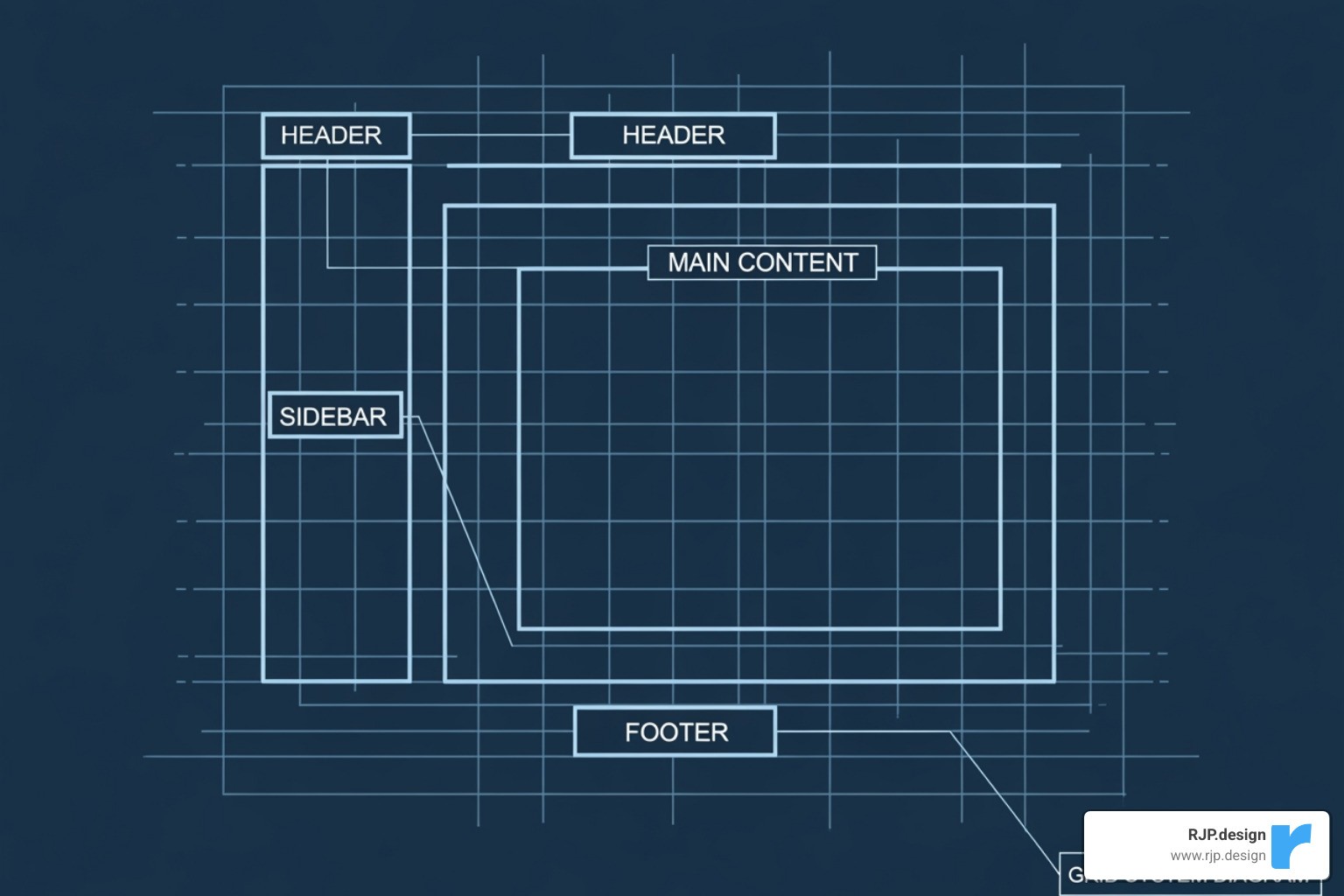
CSS Grid is layout-first and two-dimensional. You define a grid structure and place items into it. It's ideal for overall page architecture (headers, sidebars, footers).
CSS Flexbox is content-first and one-dimensional. It arranges a group of items along a single axis. It excels at component-level layouts (navigation bars, card groups).
CSS Multi-column is text-flow focused. It automatically breaks a single block of text into columns for readability.
In practice, we combine these tools. A page might use Grid for the main layout, Flexbox for the navigation bar within the header, and multi-column for the article body. This hybrid approach leverages the strengths of each tool, leading to cleaner, more maintainable code. Learn more about how these tools work across screen sizes in our guide on Breakpoints in Responsive Web Design.
Best Practices and Advanced Techniques
Effective responsive column layouts require more than just knowing CSS properties. It's about strategic thinking: understanding user behavior, SEO implications, and writing maintainable code. Here are the best practices we follow at RJP.design.
Implementing a Mobile-First Approach
We build every css responsive column layout with a mobile-first approach. This means we design for the smallest screens first and then progressively improve the experience for larger screens. This isn't just a trend; it's a practical strategy that leads to faster, more focused, and SEO-friendly websites.
By starting with mobile, you're forced to prioritize the most critical content and calls to action, which benefits all users. This approach also leads to leaner code and better performance, especially on slower mobile connections. Since Google uses mobile-first indexing, your mobile experience is paramount for search rankings.
In practice, we start with simple, single-column base styles. Then, we use @media (min-width: ...) queries to introduce more complex Grid or Flexbox layouts as the screen size increases. This ensures a functional experience for everyone and results in cleaner, easier-to-maintain code. This is the foundation of Good Mobile Website Design.
Mastering Your Layout with Media Queries
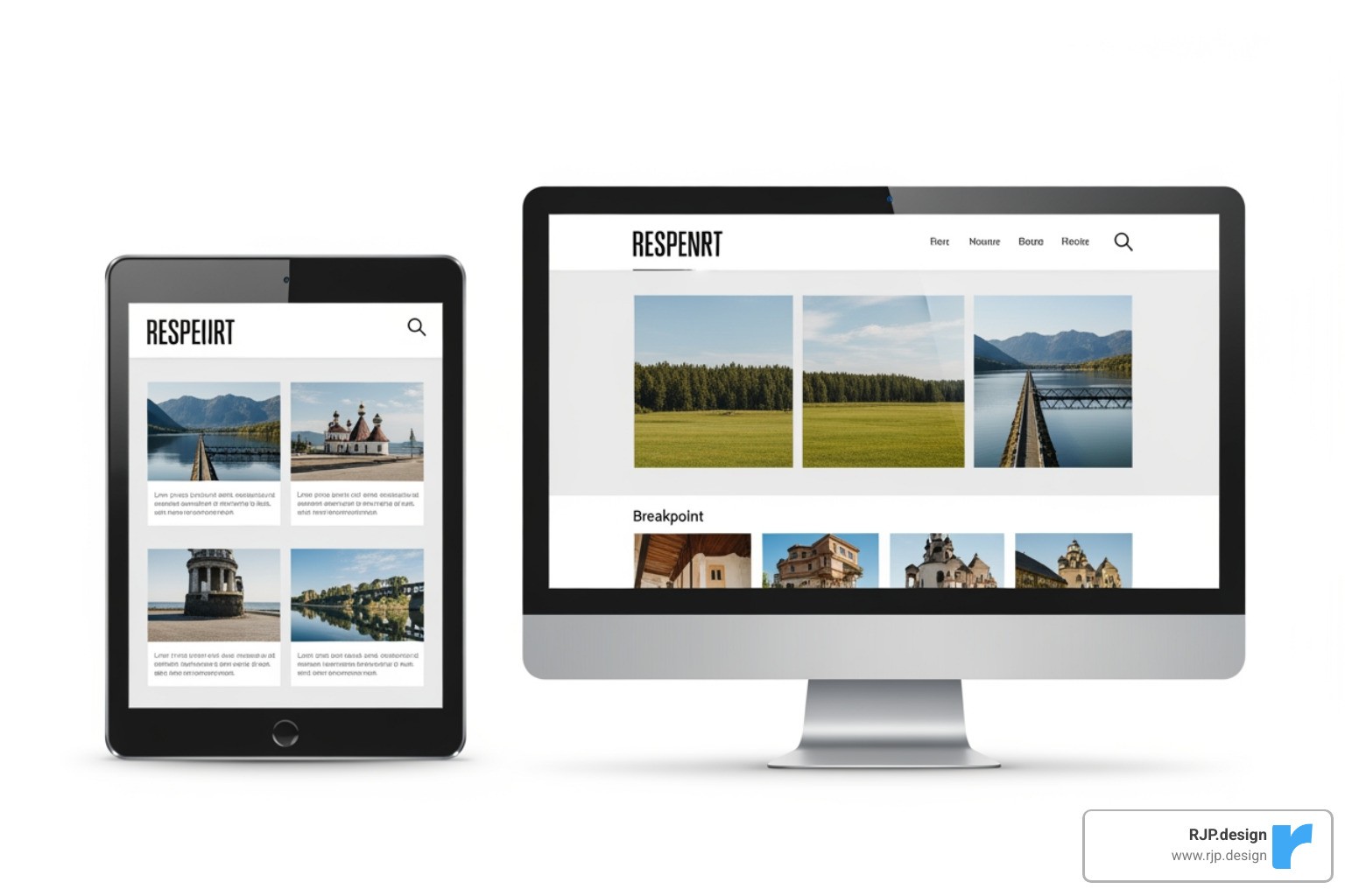
While modern CSS like Grid and Flexbox handle many responsive behaviors automatically, media queries remain essential for precise control. With 97.78% browser support, they are a reliable tool for making significant layout shifts, such as changing from a single-column mobile layout to a multi-column desktop layout.
Media queries are also perfect for fine-tuning. If a layout feels cramped on a laptop, a media query can adjust column widths, gaps, or font sizes for that specific breakpoint. Beyond screen size, they can also detect user preferences. Media features like prefers-reduced-motion and prefers-color-scheme allow us to create more accessible and personalized experiences, such as disabling animations or enabling a dark mode. This attention to detail is central to our Responsive Web Solutions.
Ensuring Accessibility and Avoiding Common Pitfalls
A great-looking layout must also be accessible and robust. Here’s how to avoid common issues:
Start with Semantic HTML: A logical HTML structure is the foundation for accessibility, ensuring screen readers can interpret your content correctly.
Avoid Visual Reordering: CSS Grid and Flexbox can change the visual order of elements with properties like
order. This creates a disconnect between the visual layout and the source order, which confuses keyboard and screen reader users. Keep the visual and source order consistent.Use
box-sizing: border-box: This is the most common pitfall. By default, padding and borders are added to an element's width, breaking layouts. Applyingbox-sizing: border-box;globally makes layout math predictable by including padding and borders within the specified width.Manage Content Overflow: Prevent content from spilling out of its container with properties like
overflow: auto. In Grid, useminmax()to stop columns from becoming too narrow.Use the
gapProperty: For consistent spacing between columns or rows in Grid and Flexbox, use thegapproperty instead of relying on margins, which can be inconsistent.
By focusing on these practices, we build layouts that are not only beautiful but also accessible and maintainable. This attention to detail is key to every Professional Website Redesign we undertake.
Conclusion
A well-executed css responsive column layout is the foundation of a successful website. It's what makes your site connect with your audience instead of frustrating them.
We've seen how to use the right tool for the job: CSS Grid for overall page structure, CSS Flexbox for components, and CSS Multi-column for readable text. By combining these with a mobile-first approach, smart use of media queries, and a commitment to accessibility, you can create layouts that are both beautiful and functional.
The core principles are clear: build fluid, adaptable experiences that work for everyone. At RJP.design, our Web Design & Development expertise is built on these principles. We create sites that look great on every device, perform well in search, and deliver a seamless customer experience.
Your website is your first impression. Making sure it adapts gracefully to any screen isn't just a good idea—it's essential for business. Ready to build a website that works as hard as you do? Get a professional Web Design & Development quote from our team today.

