Web
Code Like a Pro: Crafting Responsive Websites Using HTML5, CSS3, and JavaScript
Feb 20, 2026

Why Responsive Design is Non-Negotiable
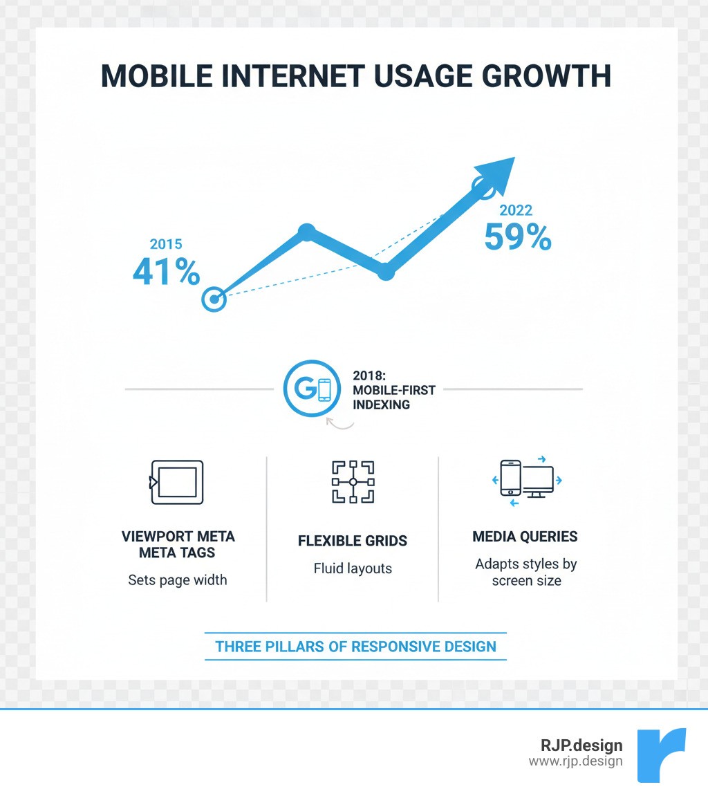
Ever visited a website on your phone and had to pinch, zoom, and scroll endlessly? That's the frustration of a non-responsive site. With mobile devices driving 59% of global web traffic and Google prioritizing mobile-first indexing, a website that doesn't adapt to every screen size is losing visitors and search engine visibility.
To build responsive website with html5 and css3 is no longer optional—it's the foundation of modern web development. Coined by Ethan Marcotte in 2010, responsive design uses HTML5 and CSS3 to create one fluid website that works everywhere. It's not just about looks; it's about accessibility, user experience, and ensuring your business thrives in a mobile-first world.
Essential Steps to Build Responsive Websites:
Set the viewport using
<meta name="viewport" content="width=device-width, initial-scale=1.0">Use flexible layouts with CSS Grid or Flexbox instead of fixed pixel widths
Make images responsive by setting
max-width: 100%in your CSSApply media queries to adjust styles based on screen size
Adopt a mobile-first approach by designing for small screens first, then scaling up
I'm Ross Plumer. At RJP.design, I've helped businesses generate over $20 million in revenue by changing their sites into responsive, high-converting experiences. We build responsive website with html5 and css3 principles to create sites that don't just look good—they convert visitors into customers.
Basic build responsive website with html5 and css3 terms:
The Core Toolkit: How to Build Responsive Website with HTML5 and CSS3
To build responsive website with html5 and css3, you need the right toolkit. We've moved past clunky "m.website.com" mobile sites. Modern responsive design, a concept pioneered by Ethan Marcotte in 2010, uses a single, intelligent codebase. The core of this is HTML5's semantic structure (<header>, <main>, <section>) and CSS3's powerful features like media queries, flexible layouts, and responsive units. Together, they create a living experience that adapts to every user, as detailed in MDN's Responsive web design guide.

Setting the Foundation: The Viewport and Mobile-First Design
Your responsive journey starts with one critical line of HTML in your <head> section. Without the viewport meta tag, mobile browsers will shrink your desktop layout, making it unreadable.
Here, width=device-width sets the page width to the device's screen width, and initial-scale=1.0 establishes a 1:1 zoom level on load. This tag is non-negotiable.
Next, adopt a mobile-first philosophy. Instead of designing for a large desktop and then trying to shrink it, you start with the smallest screen and scale up. This approach forces content prioritization, leading to cleaner designs and better performance. You build a solid foundation and progressively improve it for larger screens, ensuring a good mobile website design is your starting point, not an afterthought.
Creating Flexible Layouts: A Guide to build responsive website with html5 and css3
Rigid, pixel-based layouts are a thing of the past. To build responsive website with html5 and css3, you must accept fluidity with relative units. Instead of fixed pixels, use percentages (%), em, rem, and viewport units (vw, vh) to create elements that scale proportionally with the screen.
For complex structures, CSS offers two powerful tools:
Flexbox: Ideal for one-dimensional layouts (rows or columns). Use it for aligning items in a navigation bar or distributing space in a component.
CSS Grid: Perfect for two-dimensional layouts (rows and columns). Use it for overall page structure, allowing you to create sophisticated grids that reflow easily.
Media queries are the key to applying different styles at different screen sizes. The points where your design changes are called breakpoints. For example, @media (min-width: 768px) { ... } applies styles only on screens 768px or wider. Pro tip: Use em or rem for your breakpoints in responsive web design instead of pixels for better accessibility.
Adapting Content: Responsive Images and Typography
A responsive layout is incomplete without responsive content. Images and text must adapt to ensure readability and fast load times on any device.
Start by making all images fluid with this simple CSS rule:
This rule prevents images from overflowing their container (max-width: 100%) while maintaining their aspect ratio (height: auto).
For performance, use HTML5's <picture> element or the srcset attribute to serve different image sizes based on screen width. This prevents mobile users from downloading unnecessarily large desktop images.
Responsive typography ensures text is readable on all screens. While you can use media queries to change font sizes, a more fluid and accessible solution is the calc() function, which combines a stable unit like rem with a viewport unit like vw.
This provides a minimum readable size while allowing the font to scale smoothly with the viewport, creating a fluid and zoomable experience. For more on these techniques, see our guide to HTML5 and CSS3.
Testing, Tools, and Taking Your Skills Further
Building a responsive site is just the first step. To ensure it works flawlessly, you must test, refine, and leverage the right tools. This phase is what makes a website truly responsive.
Speeding Up Development with Popular CSS Frameworks
While know how to build responsive website with html5 and css3 from scratch, CSS frameworks can dramatically speed up development by providing pre-built, mobile-first components and grid systems.
Popular options include:
Bootstrap: A comprehensive toolkit with a robust grid system and extensive pre-styled components.
W3.CSS: A lightweight, simple framework perfect for fast prototyping and straightforward sites.
Tailwind CSS: A utility-first framework that gives you maximum flexibility to build custom designs. Explore a responsive website Tailwind approach for highly optimized results.
Frameworks accelerate your workflow, but remember they are tools, not crutches. A solid understanding of HTML5 and CSS3 is crucial for customization and troubleshooting.
How to Test and Ensure Your Website is Truly Responsive
A design isn't responsive until it's tested. Here’s how to ensure your site works everywhere:
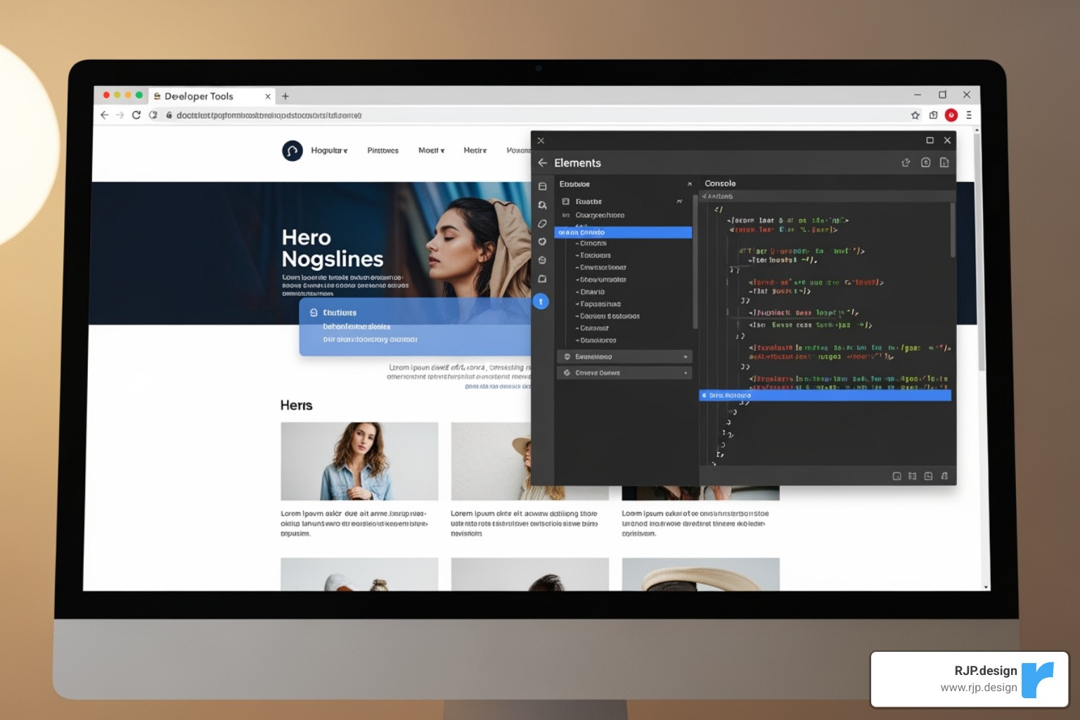
Browser Developer Tools: Use the device mode in Chrome, Firefox, or Edge (F12 or Inspect) to quickly simulate different screen sizes during development.
Physical Device Testing: Emulators aren't perfect. Always test on real smartphones and tablets to check for touch interactions, performance, and rendering quirks.
Cross-Browser Testing: Use services like BrowserStack or LambdaTest to verify your site works across different browsers and operating systems that you don't have physical access to.
Performance Testing: A slow site is a frustrating site. Use tools like Google Lighthouse or PageSpeed Insights to analyze load times and optimize performance, especially for mobile users.
A Step-by-Step Example to build responsive website with html5 and css3
Let's combine these concepts in a simple, step-by-step example.
Step 1: The HTML Structure
We start with semantic HTML5 and the viewport meta tag.
Step 2: The CSS Styling
We apply mobile-first styles and use media queries to improve the layout for larger screens.
How It Works:
Mobile-First: The default styles create a single-column layout with a stacked navigation, perfect for small screens.
Tablet Breakpoint (
@media (min-width: 768px)): We use Flexbox to switch to a two-column layout and a horizontal navigation bar.Desktop Breakpoint (
@media (min-width: 1024px)): We add amax-widthto the main container to improve readability on wide screens.Fluid & Accessible: Images are responsive (
max-width: 100%), and typography scales smoothly using thecalc()function, ensuring a great experience on any device.
This example shows how to build responsive website with html5 and css3 using modern best practices. At RJP.design, our expertise in web design development is about more than just code—we build digital experiences that convert visitors into customers, no matter the device. If you want a website that's optimized for today's multi-device world, we're here to help.

