Web
The Ultimate Guide to Call to Action Button Design and Inspiration
Aug 14, 2026

Why Call to Action Button Design Can Make or Break Your Website
Call to action button design is one of the highest-leverage decisions you can make on any webpage — and most small business websites get it wrong.
Here's a quick snapshot of what makes a CTA button actually work:
Element | What to Do |
|---|---|
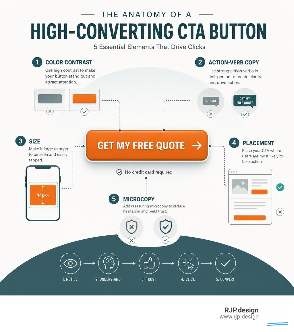
Color | Use high contrast against the background; red and orange consistently generate 32–40% higher click rates |
Copy | Start with a strong action verb; use first-person language ("Get My Free Quote") |
Size | Minimum 44×44px on mobile; large enough to dominate its section visually |
Placement | Above the fold for simple offers; after benefits for complex ones |
Microcopy | Add reassuring text below the button ("No credit card required") |
Focus | One primary CTA per page — reducing to a single CTA can lift conversions by 266% |
Think about the last time a "Shop Now" or "Get Started" button caught your eye on a website. That wasn't an accident. Every color choice, every word, every pixel of padding was — ideally — a deliberate decision designed to move you toward clicking.
The stakes are real. Personalized, well-designed CTAs perform 202% better than generic ones. A single, focused CTA in an email has been shown to increase clicks by 371% and sales by 1,617%. And yet, the average small business website treats the CTA as an afterthought — a button slapped at the bottom of the page with the word "Submit" on it.
That's a costly mistake.
Whether you're running an e-commerce store, a service business, or a local brand trying to generate leads online, your CTA button is the moment where all your content, design, and marketing either converts — or collapses.
I'm Ross Plumer, a digital marketing and web design strategist with hands-on experience helping businesses market over $20 million in revenue, and call to action button design is one of the most impactful areas I focus on when optimizing a client's website. In this guide, I'll walk you through everything you need to know — from the psychology behind why people click to the exact tools and techniques you can use to build buttons that drive real results.
The Science of Call to Action Button Design
Behind every successful click is a fascinating mix of human psychology and visual engineering. When we design websites at RJP.design, we do not treat buttons as mere decoration. Instead, we look at them as functional tools designed to guide user behavior.
To understand why a user decides to click or scroll past, we look to the Fogg Behavior Model. This behavioral framework states that a behavior (the click) occurs when three elements converge simultaneously: Motivation, Ability, and a Prompt.
Motivation: The user's desire to solve their problem or obtain your offer.
Ability: How easy it is for the user to take the action.
Prompt: The call-to-action button itself.
If your visitor has high motivation but your button is hard to find or the form is too long, they will abandon the page. Conversely, if the button is incredibly easy to click (high ability) but they do not understand the value proposition, they will not click.
Our goal is to reduce cognitive load—the mental effort required to process information. When a web page presents too many choices, users experience decision paralysis. Research shows that reducing the number of CTAs to a single primary action can increase conversion rates by up to 266%. By limiting the choices, we make the path forward obvious.
To explore this psychological foundation further, you can read The Ultimate Guide to Call to Action Design That Converts | Essential Addons for Elementor , which breaks down the structural anatomy of conversion-focused buttons.
Visual Principles of Call to Action Button Design
To stand out in the attention economy, your button must look clickable. This visual "affordance" is achieved through careful manipulation of color, contrast, shape, and depth.
Color Psychology and Contrast
There is no single "magic" color that guarantees conversions. Instead, the magic lies in contrast. Your CTA button color should be reserved almost exclusively for clickable elements on your page. If your brand color is blue and your entire website is blue, a blue CTA button will blend into the background.
However, testing shows that warm colors like red and orange often generate 32% to 40% higher click rates because they naturally draw the human eye. In one famous case study, simply changing a button color from green to red increased conversions by 21%.
To ensure your design is accessible to everyone, we always design to meet WCAG AA contrast ratios (a minimum of 4.5:1 for standard text against its background). Using accessibility tools ensures that visually impaired or colorblind users can still easily navigate your page.
Shape and Depth
The physical shape of your button tells the user's brain that it can be pressed. Slightly rounded corners (a border-radius between 6px and 12px) are processed more quickly by the brain than sharp corners and are associated with a friendlier, more positive user experience. Adding subtle drop shadows or gradient transitions can create a 3D effect that makes the button pop off the screen.
When organizing multiple buttons on a single page, we establish a clear visual hierarchy. Use the table below to structure your button styles:
Style Tier | Design Characteristics | Intended Use Case |
|---|---|---|
Primary | Solid, high-contrast background fill, bold typography, subtle drop shadow. | The main goal of the page (e.g., "Start Free Trial"). |
Secondary | Outline or "ghost" style, transparent background, matches primary color scheme. | Alternative paths with lower commitment (e.g., "Watch Demo"). |
Tertiary | Simple text link with an underline or arrow icon, minimal styling. | Low-intent exploratory links (e.g., "Learn More"). |
For a deep dive into how interactive hover states and visual hierarchy keep buttons feeling "alive," check out Designing CTA buttons: Actionable best practices with examples - LogRocket Blog .
Writing Copy That Compels Clicks
The words on your button carry immense weight. Generic labels like "Submit," "Next," or "Click Here" are conversion killers because they focus on the work the user has to do rather than the value they will receive.
To write high-converting copy, we rely on three rules:
Lead with Action Verbs: Start your button text with strong, specific verbs like Get, Start, Claim, Unlock, or Download.
Frame in the First Person: Changing your button copy from second-person ("Start Your Free Trial") to first-person ("Start My Free Trial") can boost click-through rates by 7% to 15%. It reinforces a sense of ownership and personal agency.
Embed the Value Proposition: Make it clear what the user gets immediately after clicking. Instead of "Sign Up," use "Get My Free Marketing Guide."
The Power of Microcopy
Sometimes, a user hesitates at the very last second due to friction or anxiety. "Will they spam me?" "Do I need a credit card?"
This is where reassuring microcopy placed directly beneath the button can save the conversion. Adding a simple line of text like "No credit card required. Cancel anytime." or "We value your privacy. Zero spam." addresses objections before they can cause a bounce.
To explore how copy aligns with different stages of the customer journey, read our guide on Website Conversion Strategies. For more copywriting frameworks and trigger-word strategies, refer to Mastering the Call to Action: Words, Color, Size, & Location | CXL .
Mobile Optimization and Responsive Call to Action Button Design
In June 2026, mobile traffic dominates the web. If your CTA buttons are not optimized for thumb taps, you are leaving money on the table. In fact, optimizing your CTAs for mobile screens can improve overall conversion rates by 32.5%.

When designing for mobile viewports, keep these responsive practices in mind:
Tap Target Size: Google recommends a minimum tap target size of 48×48 pixels, while Apple recommends 44×44 points. Your button should never fall below these dimensions, or users will struggle to tap them accurately.
The Thumb Zone: Place your primary CTAs within easy reach of a user's thumb—typically in the center or bottom third of the screen.
Full-Width Buttons: On smaller screens, stretching your CTA button to full width makes it incredibly easy to tap and ensures it remains highly visible on first screen load.
Sticky Footers: For longer landing pages, implement a sticky or floating CTA button that remains anchored to the bottom of the viewport as the user scrolls. This keeps the prompt accessible at any stage of their reading journey.
Placing and Testing Your Buttons for Maximum Conversions
Even the most beautiful, perfectly worded button will fail if nobody sees it. Strategic placement is about matching the user's reading flow and visual habits.
To learn how this fits into your broader layout, read our deep dive into High Converting Landing Pages.
Strategic Placement and Visual Hierarchy
Humans scan web pages in predictable visual patterns. By aligning your call to action button design with these natural scanning habits, you dramatically increase its visibility.
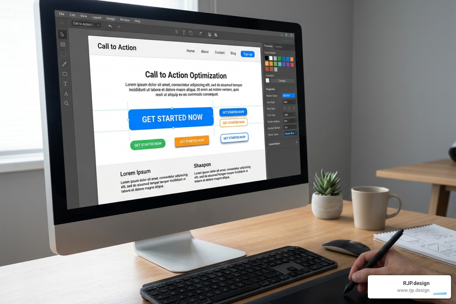
Above the Fold: For simple, low-friction offers (like a free newsletter signup), place your CTA above the fold where it is visible instantly without scrolling.
The Z-Pattern: Ideal for landing pages with minimal text. The eye moves from left to right, drops down diagonally to the left, and sweeps right again. Placing your primary CTA at the end of this visual path captures the user right as they finish scanning.
The F-Pattern: Common on text-heavy pages like blog posts. Users scan the headline, read the first few lines, and then scan vertically down the left side.
Inline CTAs: Placing contextual, inline link CTAs within blog content actually performs 121% better than standard sidebar CTAs because they appear right where the reader is already focused.
A/B Testing and Avoiding Common Mistakes
Designing a high-converting CTA is an iterative process. You should never rely on gut instinct alone. Instead, we use A/B testing to let real user behavior guide our decisions.
When running an A/B test, change only one variable at a time (e.g., test two different button copy options, then test two different colors) and run the test until you reach statistical significance. For reliable results, aim to test variations with at least 1,000 unique visitors per variant.
Common CTA Design Mistakes to Avoid:
The Grey Button Trap: Avoid using grey for primary buttons. Users have been trained by modern UI design to interpret grey elements as disabled or unclickable.
Manufactured Urgency: Adding fake countdown timers or dishonest "limited stock" warnings damages your brand's credibility. Use genuine urgency, or don't use it at all.
Decision Overload: Placing two primary buttons with equal visual weight side-by-side confuses users. Always make it clear which action is the primary path.
Cluttered Padding: Giving your button too little white space makes it look cramped and hard to read. Ensure your surrounding padding is generous.
Real-World Inspiration and Implementation Tools
To build these high-converting elements, you don't need to write complex code from scratch. Modern web design frameworks make it easy to deploy beautiful CTAs.
If you are using WordPress, page builders like Elementor (paired with Essential Addons) offer dedicated CTA widgets that give you complete control over typography, hover animations, and margins. For developers building custom web templates, Bootstrap 5 provides clean, responsive utility classes (like .btn-primary, .btn-lg, and responsive display utilities like .d-grid .d-sm-block) to quickly style and scale buttons across devices.
At RJP.design, we specialize in putting these principles into practice. We combine high-quality web design with a down-to-earth approach that prioritizes your business growth. We make sure your primary calls to action are perfectly positioned, beautifully styled, and technically optimized to convert traffic into loyal customers.
If you are ready to build a website that doesn't just look pretty but actively grows your business, take a look at our Small Business Website Setup Guide to see how we can help you build your online presence today.