Web
A Quick Start Guide to Web Design Inspiration
Aug 11, 2026

Build a Web Design Landing Page That Turns Visits Into Action
A web design landing page is a focused, standalone page built to help one audience take one meaningful action: book a consultation, request a quote, start a trial, buy a product, or join a list.
For a quick starting point, a strong landing page should include:
A clear, benefit-led headline that explains the outcome.
A relevant visual that makes the offer easier to understand.
One prominent call-to-action button.
Proof that the business is credible, such as reviews, client logos, or trust signals.
A mobile-friendly layout that loads quickly and stays easy to scan.
Unlike a homepage, which must serve many visitors and send them in several directions, a landing page narrows the path. That focus matters: most visitors will make a fast decision from the hero section, and roughly 57% of internet traffic now comes from mobile devices. Your first screen needs to communicate what you offer, why it matters, and what to do next without making people work for the answer.
A great landing page is not simply a polished web page. It is a practical conversion tool, combining clear copy, visual hierarchy, trust, and a low-friction next step. The sections ahead will help you find useful inspiration, recognize the patterns worth borrowing, and shape them around your business rather than copying a generic template.
I am Ross Plumer, an entrepreneur and digital marketing professional with experience in website design and development for businesses that have collectively marketed more than $20 million in revenue. I bring that mix of marketing, design, and buyer psychology to every web design landing page conversation, starting with the simple question: what does your ideal customer need to see before they are ready to act?
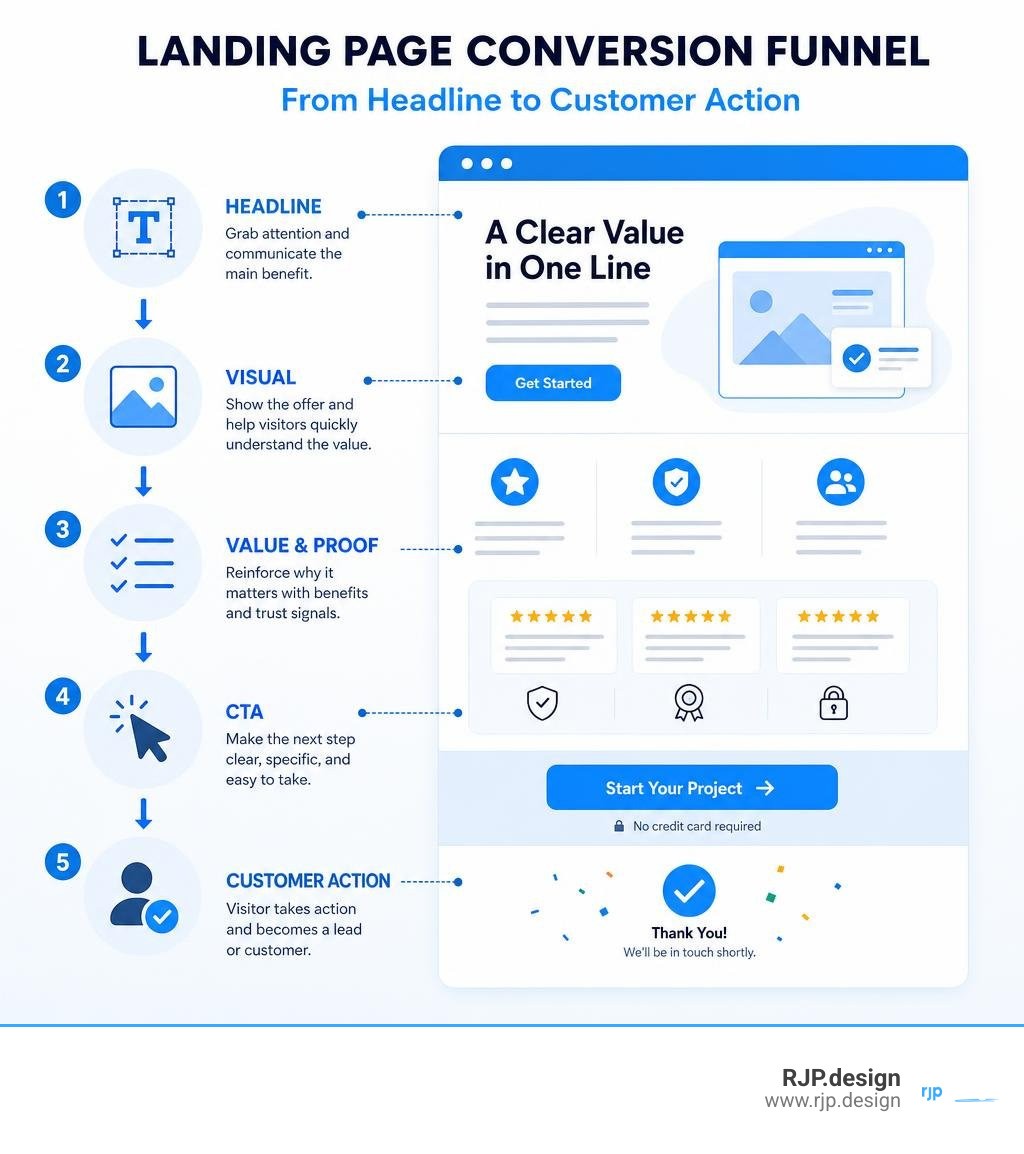
Web Design Landing Page Architecture and Core Components
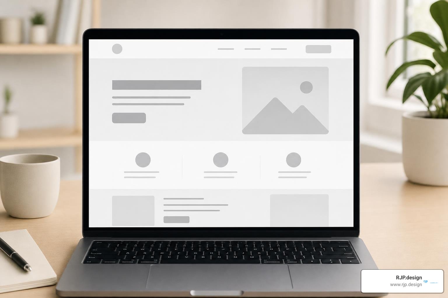
When we evaluate a web design landing page, we look at how every visual element works together to guide visitor focus. The architecture of a landing page is not about adding flashy features; it is about establishing a clear layout flow. By using smart visual hierarchy and strategic white space around key conversion drivers, we make it effortless for users to move from initial curiosity to final action.
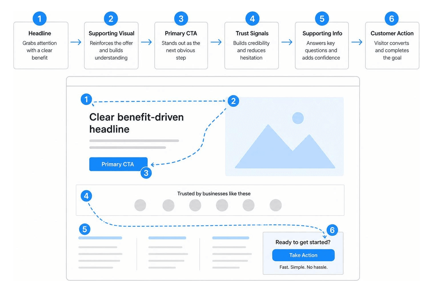
Web Design Landing Page vs Homepage Differentiation
A common mistake is sending campaign traffic to a general homepage. A homepage is designed for broad exploration, filled with navigation links and multi-directional menus. In contrast, a web design landing page maintains a singular focus.
When visitors land from a specific ad or promotional campaign, they expect exact alignment with what brought them there. Removing site header navigation and secondary links eliminates distractions, drastically lowering bounce rates. To explore how targeted pages drive superior conversion rates, take a look at our guide on High Converting Landing Pages.
Essential Elements of a Web Design Landing Page
Every high-performing landing page relies on core elements that reassure and persuade visitors:
Benefit-Led Headline: A concise headline (ideally under 10 words) focused on the buyer's desired outcome rather than just product features.
High-Contrast Call-to-Action (CTA): A prominent CTA button using action-oriented verbs like "Get Started" or "Book a Call."
Social Proof & Trust Badges: Verified customer reviews, headshots, case study metrics, or industry badges that build instant credibility.
Scannable Graphic Lists: Short bullet points or graphic lists (limiting headings to 6 words or fewer and body text to around 30 words) to highlight primary benefits clearly.
If you want tailored assistance setting up these core components for your business, discover our Custom Web Design Services.
Visual Hierarchy, Layouts, and Mobile Optimization
With around 57% of global internet traffic coming from mobile devices, mobile-first design is essential. Search engines evaluate mobile layout quality primarily for indexing and ranking, making fast-loading, mobile-friendly pages critical for both search rankings and user satisfaction.
We also use quick diagnostic tests during design, such as the 5-second glance test. Show your hero section to someone for five seconds: if they cannot explain what you offer and what action to take next, your messaging needs simplifying. You can dive deeper into these strategies in our resource on Landing Pages and SEO.
Driving Results with Inspiration, Testing, and Optimization
Designing a high-converting page requires balancing creative inspiration with conversion science. Different business models require distinct layouts to serve their specific audiences effectively.
Industry Type | Primary Goal | Recommended CTA Strategy | Key Page Features |
|---|---|---|---|
SaaS | User Signup / Trial | "Start Free Trial" or "Book Demo" | Feature mockups, interactive preview, security badges |
E-Commerce | Direct Purchase | "Buy Now" or "Claim Offer" | High-quality imagery, customer reviews, direct checkout |
Lead Generation | Inquiry / Consultation | "Get Your Free Quote" | Short multi-step form, client testimonials, service scope |
Industry Variations for SaaS, E-Commerce, and Lead Generation
The specific layout you choose depends heavily on your customer's buying process:
SaaS & Web Apps: These pages highlight product interfaces, interactive demos, and simple pricing tables paired with free trial CTAs. See how we structure software showcases in our detailed breakdown of a Web App Landing Page.
E-Commerce: Product launch pages focus heavily on crisp imagery, urgency offers, and streamlined checkout flows.
Lead Generation & Professional Services: High-value consulting or agency services focus on establishing authority through client results, structured multi-step forms, and consultation bookings. Learn more by reviewing our framework for a Consultancy Landing Page.
A/B Testing and Common Mistakes to Avoid
Optimization is a continuous refinement process. Systematic A/B split testing allows us to compare alternative headlines, CTA microcopy, or hero images to see what truly resonates with your audience.
When optimizing your page, avoid these frequent errors:
Including top navigation bars or external links that give users exit points.
Mismatching ad copy and page headlines, which causes instant user confusion.
Overloading forms with too many initial fields, raising friction for visitors.
Hiding your core value proposition below the fold where many visitors will never scroll.
Understanding potential design investment costs is also key when planning your launch. We detail project scopes and considerations in our guide on Landing Page Design Price.
Curated Templates and Inspiration Sources
When seeking design inspiration, studying real-world, high-performing websites saves time and reveals effective design patterns. Browse curated UI component libraries and visual galleries to observe how leading brands arrange hero sections, pricing tables, and social proof blocks.
Rather than copying competitors, use templates as structural wireframes to speed up development while keeping your messaging, typography, and brand identity unique.
At RJP.design, our approachable team combines modern web design principles with practical conversion strategies to build landing pages that look great and convert visitors into active clients. Ready to transform your digital presence with custom, results-driven web pages? Partner with us through our Professional Web Design Services to start building your next high-converting page today.