Web
Flex Your Site: W3's Essential Guide to Responsive Web Design
Dec 25, 2025

Why Responsive Web Design W3 Matters for Your Business
Responsive web design w3 is the practice of using HTML and CSS—following W3C standards—to build websites that automatically adapt to any screen size. Here's what you need to know:
What it is: A design approach using flexible layouts, media queries, and responsive images so websites look great on all devices.
Core components: Viewport meta tag, flexible grids, CSS media queries, and adaptive images/media.
Why it matters: Google prioritizes mobile-friendly sites, and most users browse from multiple devices.
Key benefit: One website that works everywhere, eliminating the need for separate mobile and desktop versions.
Your customers are on phones, tablets, and desktops. If your site doesn’t adapt seamlessly to each screen, you’re losing business.
Following modern web practices, responsive design uses HTML and CSS to automatically resize, hide, or enlarge content. It’s not just about fitting content on a screen; it’s about ensuring call-to-action buttons are tappable, images load quickly, and text is readable on any device.
I'm Ross Plumer, and I've helped businesses generate over $20 million in revenue with effective responsive web design. In this guide, I'll show you how to make your website work beautifully on every device.
Helpful resources:
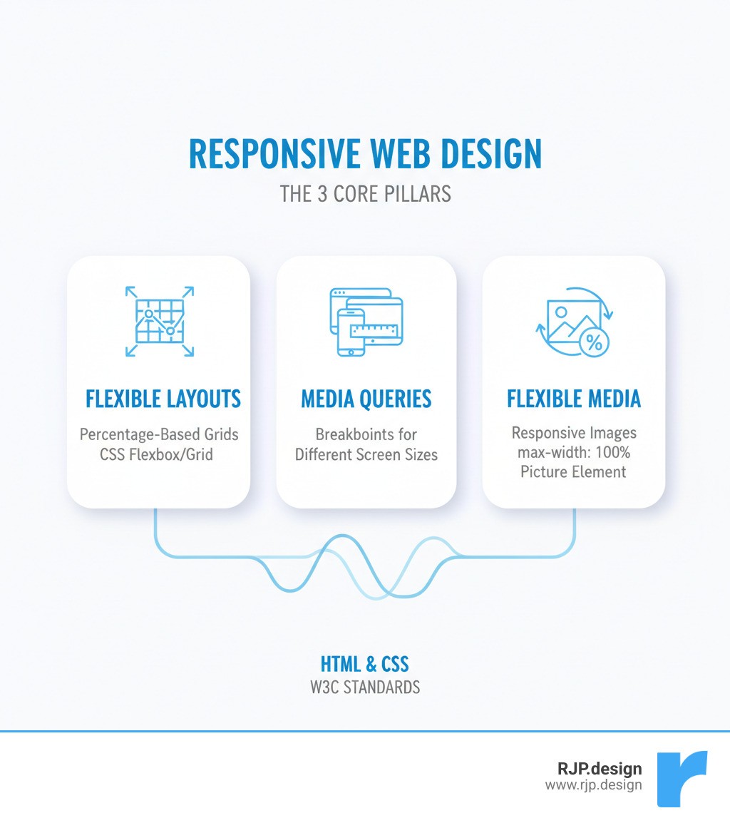
The Core Components of Responsive Web Design W3
Building a truly responsive website involves a few fundamental techniques. Think of responsive web design w3 as a three-legged stool: the viewport, flexible layouts, and media queries. Here's how each part contributes to a seamless user experience.
Setting the Viewport and Building Flexible Layouts
Without the right setup, mobile browsers render your website at desktop width (around 980 pixels) and shrink it down, resulting in tiny, unreadable text.
The fix is a single meta tag in your HTML that tells the browser to use the actual screen width.
Here, width=device-width tells the browser to match the page width to the device, while initial-scale=1.0 sets a normal zoom level on page load. Place this in the <head> section of your HTML—it’s the foundation for everything else.
Next, your content must flow with the screen size. This is where flexible layouts come in. Instead of rigid pixels, use fluid proportions. A sidebar that’s “300px wide” becomes “30% of the available space.” By building with percentages and relative units like em, rem, or vw, your layouts adapt naturally.
Modern CSS offers two powerful tools:
CSS Flexbox: great for one-dimensional layouts like nav bars or aligning items along a single axis.
CSS Grid: ideal for two-dimensional layouts, giving precise control over rows and columns. Perfect for complex page structures that reorganize from desktop to mobile.
For a deeper dive into making your CSS flexible, check out easy responsive CSS.
Adapting with Media Queries for Responsive Web Design W3
Flexible layouts are great, but sometimes you need bigger changes—like turning a three-column layout into a single column on phones. This is where media queries come in.
Media queries are conditional CSS rules that say, “If the screen is this wide, apply these styles.” That’s how you transform layouts, adjust spacing, or hide sections based on the device.
Here’s a practical example:
The magic happens at breakpoints—the specific widths where your layout shifts. Common breakpoints are up to 600px for phones, 601px to 992px for tablets, and 993px+ for desktops. The best approach is to test your content and add breakpoints where the layout naturally breaks, rather than sticking to arbitrary device widths.
Use a mobile-first approach: design for the smallest screens first, then use min-width media queries to improve the experience on larger screens. This ensures a solid mobile experience and often leads to cleaner CSS.
To learn more about choosing breakpoints, see breakpoints in responsive web design.
Implementing Responsive Images and Typography
Even with a responsive layout, overflowing images or tiny text can ruin the experience. Fix images first with this CSS:
max-width: 100% keeps images within their containers, and height: auto maintains proportions. For more control, use the HTML <picture> element to serve different image files based on screen size—great for performance and art direction.
The browser picks the first matching source, with the <img> tag as a fallback, resulting in faster loads and better visuals.
Typography needs similar attention. Fixed font sizes don’t work well across devices. A simple option is using viewport width units (vw) to scale text with the screen:
Combine vw with CSS functions like min() and max() or use media queries to avoid text becoming too small on phones or too large on wide monitors.
Frameworks and Ensuring a Perfect User Experience
You can build responsive web design w3 from scratch, but frameworks speed things up. They provide pre-built, responsive components and utility classes, saving hours of coding and testing.
Using W3.CSS for Easy Responsive Web Design W3
W3.CSS is a free, lightweight CSS framework from W3Schools that’s simple and effective. It’s designed to be responsive by default with a mobile-first approach, so it works on small screens out of the box and adapts as the screen grows.
At its core, W3.CSS has a 12-column responsive grid system that automatically stacks columns on mobile and arranges them horizontally on larger screens. It uses straightforward classes to control layout. For example, the w3-mobile class makes any element full-width on screens smaller than 600px. Visibility classes like w3-hide-small and w3-show-large let you control what appears on different devices.
The grid uses classes like w3-col combined with prefixes for small (s), medium (m), and large (l) screens. The numbers (1 to 12) define how many columns an element spans.
Here’s how to create a layout that’s three columns on desktop, two on tablet, and one on mobile:
On large screens (l4), each column takes up one-third of the space. On medium screens (m6), the first two are half-width, and the third (m12) drops below. On small screens (s12), all three stack vertically. Using a framework like W3.CSS offers speed, consistency, and easier maintenance.
Final Checks for a Good Mobile Website Design
Responsive code is just the start. A great user experience is the real goal. Before launch, make sure to:
Test on real devices: Emulators help, but real smartphones and tablets reveal touch, performance, and rendering issues.
Optimize performance: Compress images, minify CSS/JS, and leverage caching. Fast sites improve Core Web Vitals.
Check touch targets: Buttons and links should be at least 48x48 pixels for easy tapping.
Simplify navigation: Make menus obvious on small screens and keep key calls-to-action prominent.
Ensure readability: Use adequate font sizes, line height, and strong color contrast. Make forms mobile-friendly with appropriate input types (e.g.,
type="tel").Prioritize content: Show the most important information first. Hide or move secondary details lower on the page when space is tight.
Responsive design transforms a static desktop site into an experience that works beautifully everywhere your customers are.
At RJP.design, we build websites that don’t just look great—they perform exceptionally across every device. Our down-to-earth team focuses on creating experiences that genuinely work for your customers, whether they’re browsing on a phone, tablet, or desktop.
For more insights into creating an excellent mobile experience, check out good mobile website design. And if you're ready to build a website that truly shines on every screen, let's build your responsive website together.

