
Web
The Eye Candy Directory: Curated Sources for Beautiful Web Design
Jul 21, 2026

Why Beautiful Web Design Is the First Impression That Counts
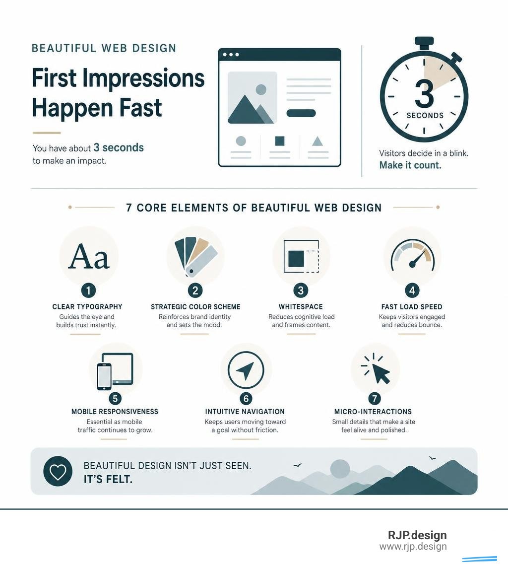
Beautiful web design is the difference between a visitor who stays and one who clicks away in seconds — and according to the 3-second rule, you have roughly that long to make your case.
Here's a quick snapshot of what makes a website visually compelling and functional:
Element | Why It Matters |
|---|---|
Clear typography | Guides the eye and builds trust instantly |
Strategic color scheme | Reinforces brand identity and sets the mood |
Whitespace | Reduces cognitive load and frames content |
Fast load speed | 40% of visitors leave if a page takes over 3 seconds to load |
Mobile responsiveness | Essential as mobile traffic continues to dominate |
Intuitive navigation | Keeps users moving toward a goal without friction |
Micro-interactions | Small animations that make a site feel alive and polished |
Most small business owners know their website needs work. The harder question is where to start — and more importantly, what "beautiful" even means when it has to work just as hard as it looks.
Good web design isn't decorative. It's strategic. The best websites balance aesthetics with usability, performance, and brand clarity — all at once. That's a tighter brief than most people expect.
This directory is here to cut through the noise. Whether you're hunting for inspiration, trying to understand current trends, or figuring out whether to hire an agency or build in-house, you'll find exactly what you need below.
I'm Ross Plumer, a digital marketing and beautiful web design specialist with hands-on experience helping businesses market over $20 million in revenue. I'll walk you through the best curated sources, principles, and decisions that go into building a website worth admiring.
The Core Pillars of Beautiful Web Design
To build a website that truly converts, we must look beyond surface-level decoration. True beauty in the digital space lies at the intersection of aesthetics, functionality, user experience (UX), and performance. A gorgeous page that takes ten seconds to load is, functionally, an invisible page.
To achieve this balance, we rely on structured design systems. A design system acts as a single source of truth, ensuring that every button, font choice, and spacing rule works together harmoniously. By establishing these rules early on, we create a digital environment where stunning visuals and high-speed performance coexist seamlessly.
Essential Elements That Define Beautiful Web Design
Every memorable website is built on a foundation of carefully balanced design elements. When we dissect award-winning digital experiences, we find that their success relies on a few key pillars:
Typography: The voice of your text. Pairing a distinctive display face for headings with a highly legible sans-serif for body copy creates an immediate visual hierarchy.
Color Schemes: Color dictates emotion. We recommend limiting your palette to one anchor hue and keeping accent colors under five percent of the overall layout to maintain visual focus.
Whitespace: Often referred to as "negative space," this is the digital equivalent of a high-end retail storefront. It gives your content breathing room, reduces eye strain, and naturally guides the user's eye to key areas.
Interactivity & Micro-interactions: Subtle hover states, smooth transitions, and gentle button animations make a website feel responsive and alive.
When these elements are executed with precision, you achieve effective web design that feels both human and intentional.
In an era where automated tools can generate generic templates in seconds, human intentionality is more valuable than ever. To combat the rise of sterile, repetitive layouts, tools like Hallmark — A design skill that refuses to look AI-generated help designers enforce strict, classical graphic design rules—such as asymmetrical grids, organic font pairings, and restrained color palettes—ensuring your brand stands out with an authentic, artisanal feel.
Current Trends in Beautiful Web Design Across Industries
Web design is constantly evolving, but the most successful trends are those that enhance storytelling and user engagement. Depending on your industry, different design aesthetics can be leveraged to build trust and authority:
Luxury Editorial (High-End Services & E-Commerce): Moving away from standard grid layouts toward spacious, magazine-like aesthetics. For example, the case study of the Spain Collection: Evolving a Luxury Website into a Digital Ecosystem | Codrops showcases how a premium travel brand transitioned to an elegant, editorial layout. By curating high-contrast photography and implementing advanced WebGL animations (like a interactive 3D "petal rain" background), they transformed a standard catalog into an immersive digital ecosystem.
Cinematic Storytelling (Tourism & Entertainment): Structuring a landing page like a three-act film sequence. A great example of this is the Northern Lights Tour Landing Page Template , which uses a dark volcanic color scheme, a slow-brightening video header to capture attention, and real-time trust signals (such as live weather data) to address customer objections upfront.
Technical & Dark Mode Aesthetics (SaaS, Tech, & Finance): High-contrast dark backgrounds paired with sharp neon highlights and bold typography. This style conveys precision, modern capability, and cutting-edge innovation.
By aligning these trends with your specific industry, you can create a highly tailored experience. Dive deeper into these strategies in our engaging website design complete guide.
Designing for Accessibility and Responsiveness
A website cannot be truly beautiful if it is unusable for a large portion of your audience. Designing with a mobile-first mindset is no longer optional—with over 40% of e-commerce transactions occurring on mobile devices, responsive layouts are critical.
Furthermore, we must design with WCAG (Web Content Accessibility Guidelines) compliance in mind. This means ensuring high contrast between text and backgrounds, providing keyboard navigation, and offering reduced-motion alternatives for users sensitive to animations.
To understand the difference in how we approach layout adaptability, consider this comparison:
Responsive Design | Adaptive Design |
|---|---|
Uses fluid grids that scale smoothly across any screen size. | Uses static layouts that snap to specific device breakpoints. |
Highly flexible; accommodates future device sizes automatically. | Requires designing multiple distinct layouts for different screens. |
Best for content-heavy sites and standard business homepages. | Best for highly specialized, device-specific user experiences. |
For developers looking to bridge the gap between stunning UI and high performance, resources like adrianhajdin/xora demonstrate how to build pixel-perfect, mobile-first SaaS landing pages using modern frameworks like React and Tailwind CSS. By defining custom design tokens in a central configuration, you can achieve both structural responsiveness and rapid load times.
To learn more about optimizing your site for all screens, check out our guides on responsive web design and good mobile website design.
Common Mistakes to Avoid on Your Homepage
The homepage is the virtual front door of your business. Unfortunately, many businesses clutter this crucial space, leading to high bounce rates. When designing your homepage, we recommend avoiding these common pitfalls:
Overwhelming Clutter: Trying to say everything at once. Keep the layout focused and let whitespace do the heavy lifting.
Slow Loading Times: Heavy, unoptimized images and excessive scripts can destroy your performance. 40% of users will abandon a site that takes longer than 3 seconds to load.
Intrusive Pop-Ups: Bombarding visitors with newsletters or discount prompts the moment they land on your site destroys trust.
Walls of Text: Users rarely read every word on a screen. Instead, they scan in "E" or "F" patterns (left to right, then down). Break up copy with bold headers, bullet points, and clear visual hooks.
Ambiguity: If a visitor cannot figure out what you sell within three seconds of landing on your page, the fault lies entirely with the design.
By studying award-winning responsive websites, you can learn how top-tier brands keep their homepages clean, fast, and highly focused on user conversion.
How to Maintain Visual Consistency Across All Pages
As your website grows, keeping a unified look and feel across dozens of subpages can become a major challenge. Inconsistency in colors, fonts, or button styles chips away at buyer confidence and makes your business look less reputable.
To solve this, we implement modular design systems. By using pre-built UI kits and component libraries (such as Figma community templates), we can build reusable headers, footers, and content blocks.
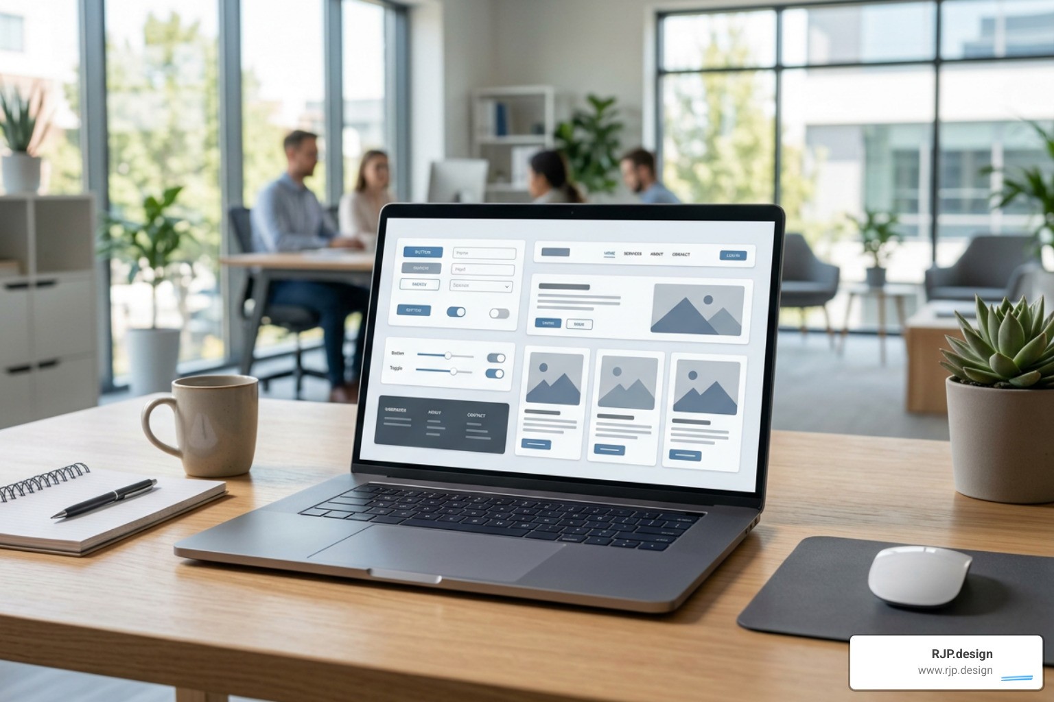
This modular approach ensures that whether a user is reading a blog post, browsing a service catalog, or filling out a contact form, the experience feels cohesive and familiar. For a step-by-step approach to structuring your site’s architecture, explore our website design strategy complete guide.
Choosing Your Path: Agency vs. In-House Development
When it is time to build or redesign your website, you face a critical organizational decision: do you build it in-house or hire an external design agency?
This choice depends on your budget, timeline, and the level of technical expertise required to execute your vision.
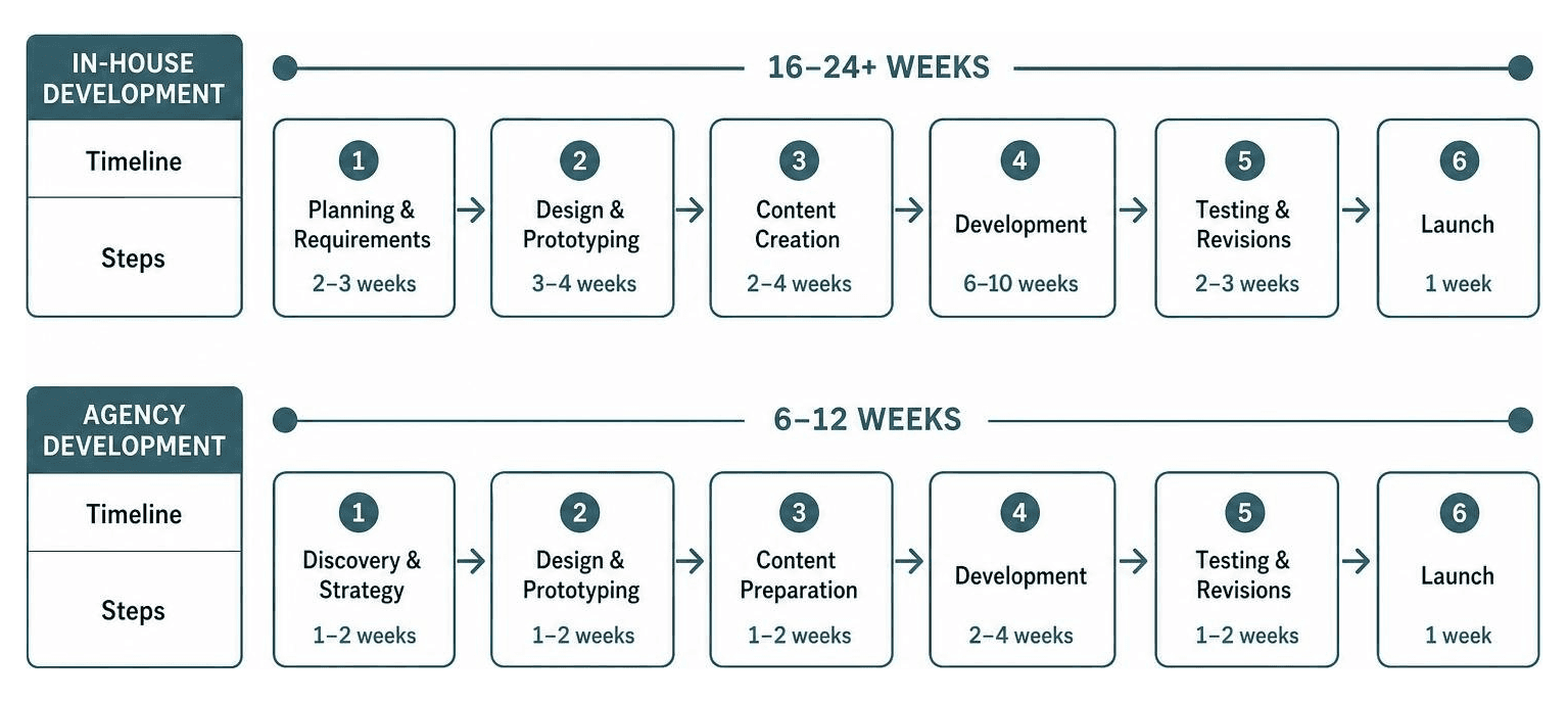
Evaluating Your Options: In-House vs. Hiring an Agency
Building in-house can be highly appealing for businesses with existing technical staff. It offers absolute control over daily updates and keeps communication entirely internal. However, many businesses quickly discover that designing a truly bespoke, high-performing website requires a diverse range of specialized skills—including UX/UI design, copywriting, front-end development, SEO optimization, and ongoing security management. Expecting one or two in-house employees to master all these disciplines often leads to delayed launches and compromised quality.
Partnering with a creative web design agency grants you immediate access to an entire team of specialists. Agencies bring years of collective experience, refined workflows, and a fresh, objective perspective to your brand. Furthermore, reputable agencies don't just hand over a template; they provide custom web design services tailored specifically to your business goals, backed by reliable post-launch support and performance monitoring.
At RJP.design, we specialize in creating beautiful, highly responsive websites that establish your brand as a market leader. Our down-to-earth team prioritizes client satisfaction, ensuring your digital presence is not only visually stunning but also optimized to drive real business growth.
If you are ready to transform your website from an administrative burden into your greatest marketing asset, read more about why you should choose us as your web design agency and explore our comprehensive web design and development services to start your journey today.