Web
Why BlueGriffon Responsive Design is Waving Goodbye to the Web
Apr 13, 2026
Is BlueGriffon Responsive Design Still Worth Using in 2025?
BlueGriffon responsive design has become increasingly difficult to rely on for modern websites. Here's a quick answer for anyone evaluating it right now:
Question | Quick Answer |
|---|---|
Does BlueGriffon support responsive design natively? | No - its built-in wizard generates fixed, non-mobile-friendly layouts |
Is BlueGriffon still actively maintained? | No - last meaningful update was around 2019; development appears abandoned |
Does it work on modern macOS (Big Sur, Monterey+)? | No - users report serious UI bugs including see-through windows and rendering failures |
Can it handle CSS Flexbox, Grid, or media queries? | Only via manual code editing - not through its visual interface |
Should you use it to build a website today? | Generally no - better alternatives exist for responsive, mobile-first design |
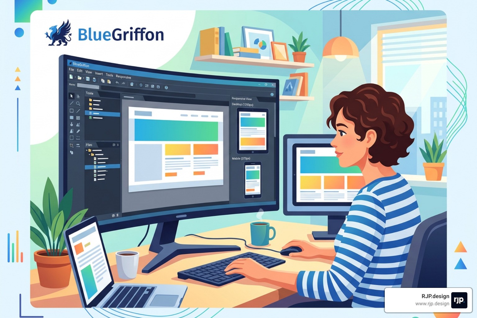
Once a respected name in open-source web editing, BlueGriffon built its reputation on a solid foundation - powered by Gecko, the same rendering engine behind Firefox, and trusted by organizations ranging from universities to government bodies. It gave non-coders a genuine path to building standards-compliant HTML5 pages without touching a line of code.
But the web didn't stand still.
The shift from fixed 960-pixel desktop layouts to fluid, device-agnostic responsive design fundamentally changed what a web editor needs to do. As one developer community put it bluntly: "WYSIWYG editing like MS FrontPage style is outdated with HTML5, CSS3, Flexbox, Grid, semantic HTML, web components, responsive designs, and HiDPI displays." BlueGriffon, for all its historical strengths, never fully made that leap.
For small business owners trying to maintain or build a website today, this gap matters enormously. A site that looks great on a desktop but breaks on a phone isn't just inconvenient - it actively costs you customers.
I'm Ross Plumer, a digital marketing and web design specialist with experience helping businesses generate over $20 million in revenue through smarter digital strategies - including navigating the exact BlueGriffon responsive design limitations that trip up so many site owners. In the sections below, I'll walk you through what BlueGriffon can and can't do, and what actually works for building responsive websites in today's environment.
Bluegriffon responsive design terms to remember:
The Reality of BlueGriffon Responsive Design in a Modern Browser World
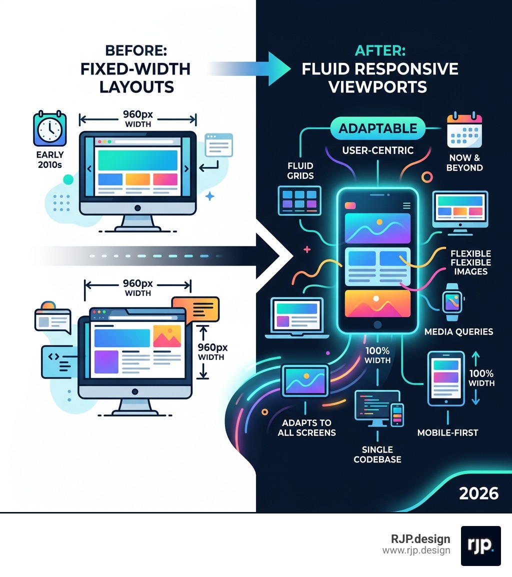
When we talk about bluegriffon responsive design, we have to address the elephant in the room: the software was built for an era where the "960-pixel grid" was king. Back then, most users browsed on monitors with a resolution of 1024x768. Designers could create a fixed-width box, center it, and be reasonably sure it would look the same for everyone.
Today, that approach is a recipe for disaster. Users access your site from 4-inch smartphone screens, 10-inch tablets, and 32-inch ultra-wide monitors. A fixed-width layout created in BlueGriffon won't shrink to fit a phone; instead, the user will be forced to scroll horizontally, or worse, the content will simply cut off.
To understand where BlueGriffon falls short, let’s look at how it compares to modern mobile-first requirements:
Feature | BlueGriffon Wizard Output | Modern Responsive Requirement |
|---|---|---|
Layout Logic | Fixed Pixel Widths (e.g., 950px) | Fluid Percentages and Viewport Units |
Mobile Scaling | Often missing Viewport Meta Tag | Required |
Structural Tools | Table-based or absolute CSS positioning | CSS Flexbox and CSS Grid |
Breakpoints | None by default | Multiple breakpoints for Phone, Tablet, Desktop |
Image Handling | Fixed dimensions |
|
Limitations of the BlueGriffon Responsive Design Wizard
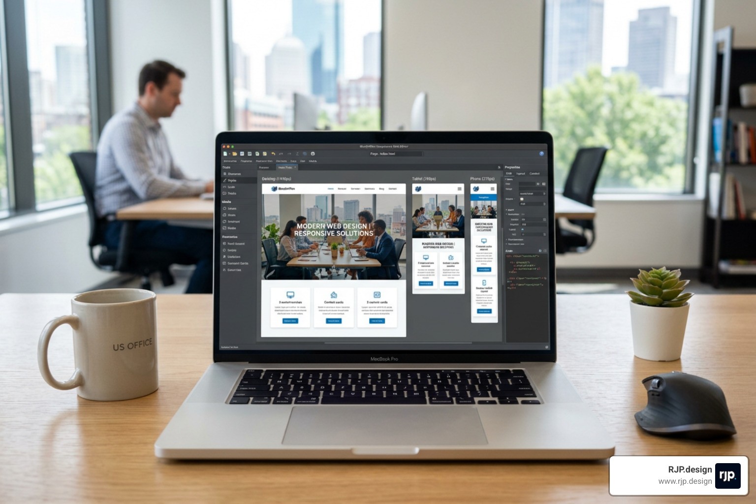
If you open BlueGriffon and use the "New Document Wizard," you might feel like you're off to a great start. It asks you for your page title, colors, and layout. However, this is where the trouble begins. The wizard typically offers predefined layouts, such as a "950px width with a 180px sidebar."
While this looks tidy in the editor, it is inherently non-responsive. Because these values are "hard-coded" into the CSS generated by the wizard, the sidebar will always try to be 180 pixels wide, even if the user's phone screen is only 320 pixels wide. This leaves almost no room for your actual content!
To fix this, we have to look at how to implement responsive web design manually. One of the biggest omissions in legacy editors is the "viewport meta tag." This tiny line of code tells a mobile browser: "Hey, don't pretend you're a desktop; scale the content to fit the actual width of this device." Without this, even a "fluid" layout might look tiny and unreadable on an iPhone.
Achieving true responsive-web-design requires moving away from the wizard entirely. Instead of letting BlueGriffon set your widths, you would need to manually enter the source code and change every pixel value to a percentage. For most users, this defeats the purpose of using a WYSIWYG (What You See Is What You Get) editor in the first place.
Handling Modern CSS and BlueGriffon Responsive Design Workarounds
Can BlueGriffon handle modern standards like HTML5 and CSS3? Technically, yes. Because it uses the Gecko engine, it knows how to render modern code. However, its visual interface—the buttons and panels you click—doesn't have built-in support for the tools that make modern design easy, such as CSS Flexbox or CSS Grid.
If you want to use Flexbox to create a row of items that automatically wrap to the next line on a mobile screen, you won't find a "Flexbox" button in the free version of BlueGriffon. You have to write that code yourself in the Source View.
There are some workarounds. Some users turn to external tools, like a "Layout Wizard" found on third-party sites, to generate responsive HTML and CSS code. You then copy that code, paste it into BlueGriffon, and use the editor only for minor text tweaks. While this works, it’s a clunky "Frankenstein" workflow.
For those determined to stick with the software, the BlueGriffon official site used to offer a "CSS Editor Pro" as a paid add-on. This version included a visual media query editor, which allowed you to set different styles for different screen sizes. However, since the software is no longer being updated, purchasing these licenses can be risky, and the interface remains far behind modern standards.
If you are looking for a deep dive into these coding requirements, our ultimate-responsive-web-design-guide-html5-css3 covers the manual steps needed to bridge the gap between old-school editors and modern browsers.
macOS Compatibility and UI Stability Issues
For our Mac users, the news is unfortunately even tougher. As macOS evolved from Mojave to Big Sur, Monterey, and now Sequoia, the underlying system architecture changed significantly. Because BlueGriffon hasn't seen a major update in years, it has become increasingly unstable on modern Apple hardware.
Common issues reported on forums like the Support FAQ include:
See-through windows: The main editing area becomes transparent, showing your desktop wallpaper instead of your website code.
Rendering failures: The WYSIWYG view may not show changes in real-time.
64-bit architecture bugs: While the app is 64-bit, the way it interacts with modern macOS graphics libraries often causes crashes.
When software is effectively abandoned, it loses the ability to "talk" to new operating systems. This is why many long-time fans of the app are finally waving goodbye. It’s hard to focus on bluegriffon responsive design when you can't even see the buttons on your screen!
Moving Beyond BlueGriffon for Future-Proof Websites
If you’re feeling frustrated, don't worry—the "post-WYSIWYG" world is actually a much better place for your business. We’ve moved into an era of "Visual Development," where tools are designed from the ground up to be responsive.
Modern responsive-web-solutions don't just "shrink" a desktop site; they reorganize the content. A three-column layout on a laptop might become a single vertical stack on a phone. The navigation menu might turn into a "hamburger" icon. These aren't just visual tricks; they are essential for user experience (UX).
Why Traditional WYSIWYG is Fading
The traditional WYSIWYG model (like BlueGriffon or the old Dreamweaver) relied on a "canvas" where you dragged items to specific spots. This worked when screens were all the same size. But in a world of dynamic viewports, "absolute positioning" is the enemy.
Today, we use semantic HTML and component-based design. Instead of saying "put this image 200 pixels from the left," we say "this image is a component that should take up 100% of its container, but never more than 500 pixels wide."
This requires understanding breakpoints-in-responsive-web-design. A breakpoint is a specific screen width (like 768px for tablets) where the design "breaks" and reforms into a new layout. Managing these breakpoints visually is something BlueGriffon simply wasn't built to do efficiently.
Furthermore, search engines like Google now use "mobile-first indexing." This means Google looks at the mobile version of your site to decide how high to rank you in search results. If your bluegriffon responsive design is actually just a fixed desktop site that looks "okay" on a phone, your SEO will likely suffer. Investing in modern responsive-ui-ux is no longer optional; it’s a business requirement.
The RJP.design Advantage: Professional Responsive Solutions
At RJP.design, we understand the nostalgia for simple editors like BlueGriffon, but we also know the technical hurdles that modern businesses face. You shouldn't have to spend your weekends fighting with "see-through windows" or manual CSS injections just to get a gallery to look right on an Android phone.
We specialize in taking the stress out of web development. Our team leverages advanced development tools that go far beyond the limitations of legacy software. We don't use "one-size-fits-all" wizards; we implement modern design principles that ensure your site is fluid, fast, and future-proof.
The RJP.design advantage includes:
Expert Implementation: We use clean, modern code (Flexbox, Grid) that browsers love.
Custom Solutions: Every business is unique. We build layouts that match your brand, not a 10-year-old template.
Comprehensive Testing: We test your site on real devices—not just "simulators"—to ensure every button works perfectly.
Down-to-Earth Support: We’re a team of real people who prioritize your satisfaction. No jargon, just results.
If you’ve been trying to DIY your way through easy-responsive-design, let us show you how much better a professional implementation can feel. We focus on the tech so you can focus on running your business.
Conclusion: Achieving Professional Results with RJP.design
While BlueGriffon served the web community well for over a decade, the era of bluegriffon responsive design has largely come to an end. Between the lack of updates, the broken macOS compatibility, and the shift toward complex mobile-first standards, it’s time to move toward more robust solutions.
Creating a website that looks great and functions perfectly across all devices shouldn't be a struggle. At RJP.design, we pride ourselves on delivering high-quality service with a personal touch. Whether you are looking to refresh an old site or build a brand-new digital presence from scratch, our team is here to help you navigate the complexities of the modern web.
Don't let legacy software hold your business back. Reach out to us today to explore our Web Design and Development Services and see how we can build a responsive home for your brand that truly stands out.
Ready to wave goodbye to outdated editors? Let’s build something amazing together.

