Web
The Ultimate Guide to Figma Responsive Web Design and Auto Layout
May 20, 2026

Why Figma Responsive Web Design Is Essential in 2026
Figma responsive web design is the practice of using Figma's layout tools — Auto Layout, constraints, breakpoints, and components — to build websites that adapt seamlessly across desktop, tablet, and mobile screens.
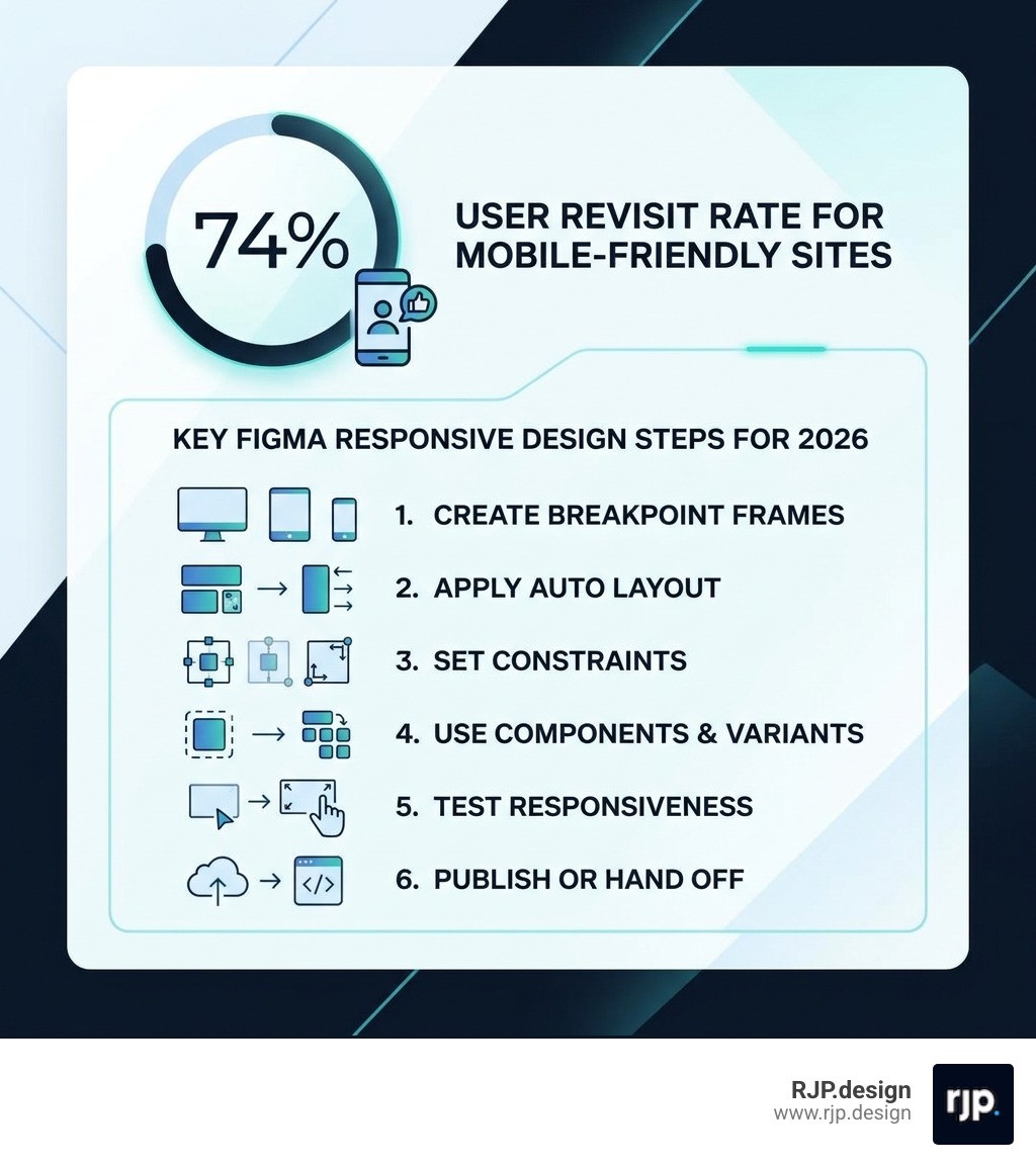
Here's a quick overview of how it works:
Create frames for each breakpoint (desktop at 1440px, tablet at 768px, mobile at 390px)
Apply Auto Layout (Shift + A) to sections and components so they resize automatically
Set constraints to control how elements pin, scale, or stretch when the frame changes size
Use components and variants to manage different layouts for each screen size
Test responsiveness by resizing frames and stress-testing with real content
Publish or hand off using Figma Sites or Dev Mode for clean, code-ready designs
Think about the last time you visited a website on your phone and had to pinch, zoom, and squint just to read a paragraph. Frustrating, right? That experience is exactly what responsive design is meant to prevent — and in 2026, there's simply no excuse for it.
With over half of all web traffic coming from mobile devices and Google actively prioritizing mobile-friendly sites in its search rankings, a website that doesn't adapt to different screen sizes isn't just inconvenient — it's costing you customers. In fact, 74% of users are more likely to return to a website that works well on mobile. That's not a small edge. That's the difference between a site that grows your business and one that quietly drives people away.
Figma has become the go-to design tool for building responsive websites, and for good reason. It brings together layout intelligence, reusable components, and direct publishing capabilities — all in one place. Whether you're designing your first website or rebuilding an outdated one, understanding how to use Figma's responsive design features can save you enormous time and produce far better results.
I'm Ross Plumer, a digital marketing and web design specialist with hands-on experience helping businesses transform their online presence using tools like Figma responsive web design to build sites that look great and perform on every device. In the sections ahead, I'll walk you through everything you need — from Auto Layout fundamentals to developer handoff — so you can build responsive layouts with confidence.
Quick look at figma responsive web design:
Mastering Figma Responsive Web Design with Auto Layout
If you want to master figma responsive web design, you have to fall in love with Auto Layout. Before Auto Layout existed, designers had to manually move every button and text box whenever a headline got longer or a screen got narrower. It was, quite frankly, a nightmare.
Today, Auto Layout acts like a "smart container." It uses logic very similar to CSS Flexbox, allowing elements to stack, wrap, and grow based on the rules we set. When we apply Auto Layout to a frame, we are telling Figma exactly how the content inside should behave when the world around it changes.
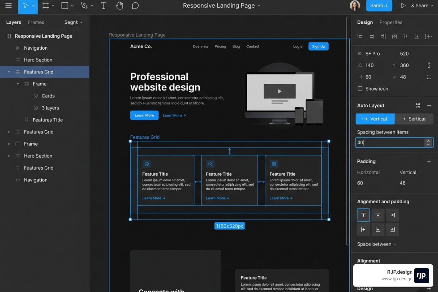
One of the best Tips for creating a responsive webpage in Figma Sites – Figma Learn - Help Center is to use Auto Layout as much as possible. By nesting these smart frames, we create a hierarchy where a change at the top level ripples down correctly to the smallest button. This is the foundation of responsive web design in the modern era.
Core Properties of Figma Responsive Web Design
To build layouts that don't break, we need to understand the "Big Five" properties of Auto Layout:
Direction: Do you want your elements to stack vertically (like a blog feed) or sit horizontally (like a navigation bar)? In 2026, Figma also supports "Wrap," which is a game-changer for card grids that need to flow from three columns to one.
Spacing (Gap): This defines the distance between items. Instead of eyeballing it, we set a mathematical value.
Padding: This is the "breathing room" inside the frame. We usually recommend using multiples of 8 (like 16px, 24px, or 32px) to keep things looking "tight" and professional.
Alignment: This tells Figma where to "stick" the content—top-left, center, or bottom-right.
Resizing (Fixed vs. Hug vs. Fill): This is the secret sauce. "Hug" means the frame shrinks to fit the content. "Fill" means the frame stretches to take up all available space.
We also use Absolute Positioning when we want an element (like a "Sale" badge) to float over a card without being pushed around by the Auto Layout rules. This gives us the perfect balance of structure and creative freedom. For more on these principles, check out our guide on responsive ui ux.
Setting Up Breakpoints and Frames for Figma Responsive Web Design
We don't just design one "page" anymore; we design a system that works across different "breakpoints." A breakpoint is simply the screen width where the layout needs to change to remain usable.
In our workflow at RJP.design, we typically start with these industry-standard frames:
Desktop: 1440px (Our primary design canvas)
Tablet: 768px to 834px (The "middle child" that often gets ignored but is crucial for iPad users)
Mobile: 390px (The safe zone for modern smartphones, though we ensure it works down to 320px)
When setting these up, we use Layout Grids. For desktop, a 12-column grid is standard. For mobile, we drop down to a 4-column grid. This ensures that as we move between breakpoints in responsive web design, our margins and gutters remain consistent.
Building Scalable Systems with Components and Tokens
Great sites aren't lucky; they are systematic. To ensure our figma responsive web design stays consistent, we use Design Tokens and Magic Numbers. A "magic number" is a base unit—usually 8px—that we use for all our spacing and sizing. If every margin, padding, and button height is a multiple of 8, the design feels harmonious.
We also rely heavily on Components and Variants. Instead of designing three different headers, we design one "Header" component with variants for "Desktop," "Tablet," and "Mobile." This way, if the client wants to change the logo, we update it in one place, and it fixes itself across all screen sizes.
Resizing Behavior | What it does | Best used for... |
|---|---|---|
Fixed | Stays exactly the same size regardless of content. | Icons, logos, and specific sidebar widths. |
Hug Contents | The frame shrinks or grows to fit what's inside. | Buttons, text boxes, and navigation menus. |
Fill Container | The element stretches to fill the parent frame. | Hero sections, full-width images, and body text. |
Workflow Best Practices and Developer Handoff
Designing a beautiful responsive site in Figma is only half the battle. The other half is ensuring that design can actually be built by a developer (or published via Figma Sites) without losing its soul. We always recommend following the steps outlined in How to Use Figma for Responsive Web Design | Envato Tuts+ to bridge that gap.
One of the most important things we do is Stress Testing. Before we call a design "done," we try to break it. What happens if the headline is three lines long instead of one? What happens if the user has a tiny iPhone SE? If the layout holds up under these "extreme" conditions, we know it's ready for the real world. This is a key part of how to implement responsive web design.
Testing and Stress-Testing Your Layouts
When we test for figma responsive web design, we aren't just looking at pretty pictures. We are looking at Content Reflow. This is the way elements shift position as the screen gets smaller. For example, a three-column feature section on desktop should gracefully stack into a single column on mobile.
We also look at:
Tap Targets: Are buttons at least 44x44px? If they are too small, users with larger thumbs will struggle.
Fluid Typography: We use the CSS
clamp()function logic to ensure text scales smoothly between a minimum and maximum size, rather than just "jumping" at a breakpoint.Image Scaling: We set our images to "Fill" and use "Scale" constraints so they don't look stretched or squashed.
For those looking for a simpler path, mastering easy responsive design often comes down to keeping your nesting simple and your constraints clear.
Streamlining the Handoff to Development
The days of sending a flat PDF to a developer are long gone. In 2026, we use Figma Dev Mode and Code Connect. These tools allow developers to click on any element and see the exact CSS Flexbox or Grid code needed to build it.
By using semantic naming (like calling a frame "Main-Container" instead of "Frame 4502"), we make the developer's life much easier. We also ensure all assets—icons, photos, and logos—are marked for export in the correct formats (SVG for icons, WebP for photos). This ensures responsive web solutions that load fast and look sharp.
Conclusion: Launching Your Responsive Site with RJP.design
Mastering figma responsive web design is a journey, not a destination. As technology evolves and new devices like foldable phones and wearable screens become more common, the principles of adaptability will only become more vital. By using Auto Layout, sticking to a 8px grid, and testing your designs rigorously, you're setting yourself up for success.
At RJP.design, we believe that every business deserves a website that works perfectly for every visitor, regardless of what device they are holding. Our down-to-earth team is dedicated to taking the complexity out of the process, providing high-quality service that prioritizes your satisfaction and your bottom line.
Whether you need a brand-new responsive site or want to optimize your current online presence, we're here to help. We combine professional design workflows with a personal touch to ensure your business doesn't just look great—it gets found.
Ready to take your digital presence to the next level? Explore more about our web design and development services and let's build something amazing together.
More Resources to Explore:

