Web
Beyond Media Queries: The Angular Way to Responsive Web Design
Mar 26, 2026

Why Angular Responsive Design Is the Smart Choice for Modern Web Apps
Angular responsive design is the practice of building Angular applications that adapt fluidly to any screen size — from mobile phones to widescreen monitors — using a combination of CSS techniques and Angular-specific tools.
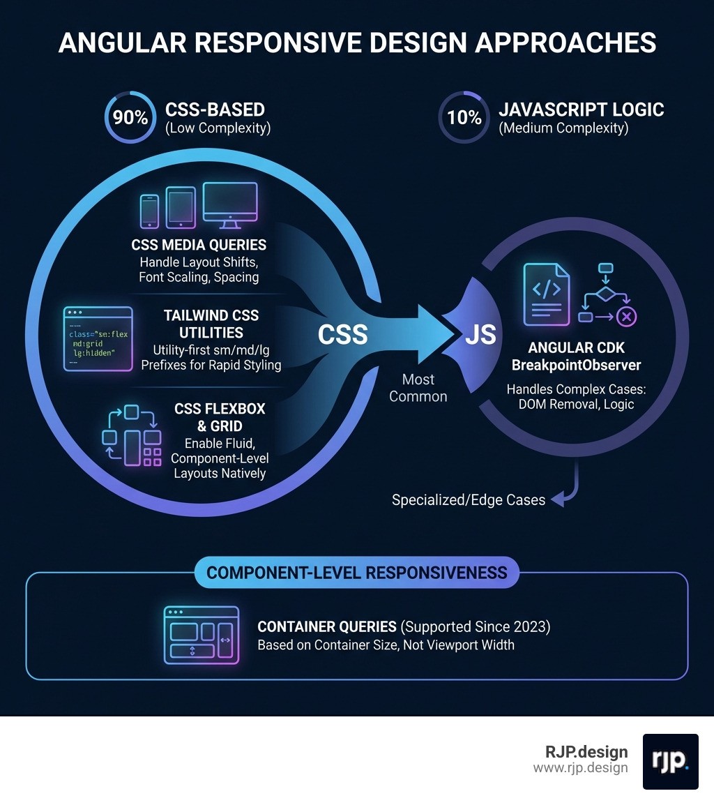
Here's a quick overview of the main approaches:
Approach | Best For | Complexity |
|---|---|---|
CSS Media Queries | Layout shifts, font scaling, spacing | Low |
Tailwind CSS Utilities | Rapid, utility-first responsive styling | Low-Medium |
Angular CDK BreakpointObserver | DOM removal, JS-driven logic | Medium |
CSS Flexbox & Grid | Fluid, component-level layouts | Low |
Container Queries | Component-aware, container-based layouts | Medium |
The good news? Around 90% of your responsive design needs can be handled with CSS alone. Only a small fraction of cases — like removing heavy elements from the DOM on mobile or feeding screen size data into a charting library — actually require JavaScript-based solutions like Angular's BreakpointObserver.
That said, knowing when to reach for each tool makes all the difference between a smooth, performant app and one that lags every time a user resizes their browser window.
This guide walks you through every major approach — from simple CSS media queries and Tailwind utility classes to Angular CDK observables and modern container queries — so you can make confident, informed decisions for your project.
I'm Ross Plumer, a digital marketing and web development specialist with experience helping businesses build high-performing, responsive digital experiences — including projects built around Angular responsive design. Let's cut through the noise and look at what actually works.
Angular responsive design word guide:
Core Strategies for Angular Responsive Design
When we talk about responsive web design, we are moving away from the old days of WML language and the WAP protocol. Modern Angular development allows us to build Single Page Applications (SPAs) that feel native on every device.
The foundation of any angular responsive design strategy should be a mobile-first approach. This means we design for the smallest screen first and then use Media queries to add complexity as the screen grows. This is more efficient than "desktop-first" because it forces us to prioritize content and reduces the amount of CSS the browser has to override.
CSS Grid and Flexbox: The Native Powerhouses
Before reaching for any library, we should lean on CSS Grid and Flexbox. These are inherently responsive. A Flexbox container can wrap items automatically, and css responsive column layout strategies using CSS Grid can change from a single column to a three-column layout with just a few lines of code.
CSS Media Queries vs. Angular BreakpointObserver
A common debate in the community is whether to use CSS or TypeScript to handle screen changes. Here is how they stack up:
Feature | CSS Media Queries | Angular BreakpointObserver |
|---|---|---|
Performance | Extremely high (handled by browser) | Moderate (handled by JS thread) |
DOM Impact | Can only hide elements ( | Can physically remove elements ( |
Maintainability | Can become messy in large files | Highly readable and reactive |
Use Case | 90% of styling and layout | 10% complex logic/performance |
While easy responsive css is usually the goal, sometimes we need to stop a heavy component from even initializing on a mobile device to save battery and data. That is where JavaScript-based detection shines.
Leveraging Tailwind CSS for Angular Responsive Design
Tailwind CSS has become a favorite for many of us at RJP.design because it integrates so well with the component-based nature of Angular. Instead of writing separate stylesheets with scattered breakpoints in responsive web design, you apply utility classes directly in your HTML.
Using responsive website tailwind patterns, you can write code like class="w-full md:w-1/2 lg:w-1/3". This tells Angular that the element should be full width on mobile, half width on tablets, and one-third width on desktops. It removes the "context switching" between your template and your CSS file, making development significantly faster.
Mastering the Angular CDK BreakpointObserver
For that 10% of cases where CSS isn't enough, we use the BreakpointObserver from the Angular CDK. This service uses the browser's matchMedia API under the hood to provide an observable stream of layout changes.
To implement this effectively, we recommend creating a shared "Layout Service." This service can subscribe to the BreakpointObserver and expose simple boolean observables like isMobile$ or isTablet$. This prevents every component from having its own resize listener, which can cause performance lag (especially during rapid window resizing).
We should always use the distinctUntilChanged() operator in our subscriptions. This ensures that the component only reacts when a breakpoint is actually crossed, rather than firing on every single pixel change.
Implementing Container Queries in Angular Components
One of the most exciting shifts in angular responsive design is the rise of container queries. Traditional media queries look at the viewport (the whole screen). Container queries look at the parent element.
Why does this matter? Imagine you have a "Card" component. If you place that card in a narrow sidebar, it should look like a mobile card. If you place that same card in a wide main content area, it should look like a desktop card. Container queries allow the component to be "self-aware" and adjust its layout based on how much room it actually has, rather than how big the user's screen is. This is the ultimate goal for modular, reusable responsive ui ux.
Best Practices and Performance Optimization
Performance is a feature. A site that looks responsive but takes 10 seconds to respond to a screen rotation isn't truly responsive. When building for easy responsive design, we need to be mindful of the "Resize Lag" that can happen if we have too many JavaScript listeners.
Avoiding Template Duplication in Angular Responsive Design
A common pitfall is creating two entirely different templates—one for mobile and one for desktop—and toggling them with *ngIf. This often leads to "copy-paste" bugs where a change is made to the desktop version but forgotten on mobile.
Instead, we should use a "Single Template" approach:
Use CSS (Flexbox/Grid) to handle 90% of layout shifts.
Use the Angular Material In Depth approach of using
ngClassto toggle specific styles.Only use
*ngIfto remove "heavy" components (like 3D viewers or complex data grids) that aren't needed on small screens.
This keeps your code DRY (Don't Repeat Yourself) and ensures a consistent responsive design ux across all devices.
Testing and Debugging Across Real Devices
You can't fully trust a browser emulator. While Chrome DevTools is great for initial development, real-world issues like "notch" interference on iPhones or keyboard overlays on Android can only be caught on real hardware.
We recommend a multi-step testing process:
Local Testing: Use the Chrome Device Toolbar to check standard breakpoints.
Orientation Checks: Ensure your layout doesn't break when a user flips from portrait to landscape.
Real Device Cloud: Tools like BrowserStack provide access to over 3500 real devices. This is crucial for verifying that your how to implement responsive web design strategy works on older OS versions.
Performance Audits: Run Lighthouse reports to ensure your responsive images and lazy-loaded modules are actually improving mobile speed.
Scaling Your Project with RJP.design
Building a truly professional angular responsive design requires more than just a few media queries; it requires a deep understanding of component architecture and user behavior. At RJP.design, we specialize in creating websites that don't just "fit" on a phone—they thrive there.
Our down-to-earth team prioritizes client satisfaction by building high-quality, performant applications that are easy for your users to navigate and easy for your team to maintain. Whether you are looking to fix a lagging legacy app or start a new project from scratch, we ensure your online presence is both beautiful and functional.
More info about web design services
Summary Checklist for Angular Success
To wrap up, here are the key takeaways for your next project:
Start Mobile-First: Use relative units like
rem,vw, and%instead of fixed pixels.CSS First: Use Media Queries and Tailwind for 90% of your work.
Be Reactive: Use
BreakpointObserverfor logic-heavy responsive needs.Think Modular: Explore container queries for components that need to live anywhere.
Test Real: Don't rely solely on emulators; test on real devices to ensure the best UX.
By following these principles, you'll create an Angular app that is ready for whatever device comes next. If you need help navigating the complexities of modern web development, the team at RJP.design is here to help you scale.

