
Web
Adobe Responsive Web Design and Making Screens Play Nice
Sep 16, 2026

Why Adobe Responsive Web Design Matters for Every Screen
Adobe responsive web design is the practice of building websites that automatically adapt their layout, images, and content to look and function great on any device — from a widescreen desktop monitor down to a smartphone in someone's pocket.
Here's a quick breakdown of what that means in practice:
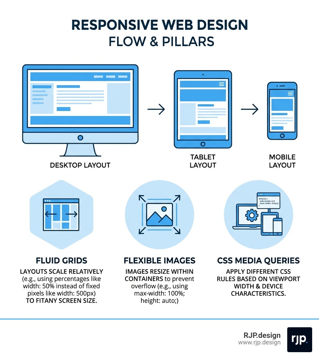
What it is: A web design approach where a single site fluidly adjusts to any screen size using fluid grids, flexible images, and CSS media queries
Why it matters: More than 60% of all web traffic now comes from mobile devices — a site that isn't responsive is losing visitors constantly
Adobe's role: Tools like Adobe Experience Manager Sites, Adobe Dreamweaver, and Adobe Commerce all include built-in features to help developers and designers build responsive sites faster and more reliably
The core goal: One website, every device, zero frustration for the user
Think about the last time you visited a site on your phone and had to pinch, zoom, and scroll sideways just to read a paragraph. That's the problem responsive design solves. And when it's done well? You never even notice it's there.
Poor mobile experiences don't just annoy users — they erode trust, increase bounce rates, and directly hurt your search rankings. Google has used mobile-friendliness as a ranking factor for years, meaning an unresponsive site is also an invisible one.
I'm Ross Plumer, and with over $20 million in marketed revenue across businesses of all sizes, I've seen how adobe responsive web design separates the websites that convert from the ones that quietly bleed traffic. In this guide, I'll walk you through everything you need to know to make your screens play nice — no matter what device your visitors are using.
Learn more about adobe responsive web design:
Core Pillars of Adobe Responsive Web Design
To understand how adobe responsive web design functions, we have to look at the three technical pillars that hold the whole thing up. Without these, a website is just a static digital poster that breaks the moment it hits a smaller screen.

First, we have fluid grids. In the old days of the web, we built everything using fixed pixels (like saying a box is exactly 800 pixels wide). Today, we use proportion-based units like percentages. This ensures that if a column takes up 50% of a desktop screen, it still takes up 50% of a mobile screen—until we tell it otherwise.
Second is flexible media. This ensures that images and videos don't "spill out" of their containers. By using CSS rules like max-width: 100%, we make sure that high-resolution photos scale down gracefully. Adobe tools often automate this by creating different "renditions" of an image so a phone doesn't have to download a massive desktop-sized file.
Finally, we use CSS media queries. These are the "brains" of Responsive Web Design. They allow the site to ask the browser: "How wide is this screen?" Based on the answer, the site applies different styling rules. You can learn more about responsive design using fluid grid layouts to see how these elements interact to create a seamless experience.
Implementing Breakpoints in Adobe Responsive Web Design
Breakpoints are the specific screen widths where a website's layout changes. Think of them as the "decision points" for the code. For example, a three-column layout on a desktop might become a single column on a phone to keep the text readable.
While every project is unique, we generally follow these standard thresholds in our Breakpoints In Responsive Web Design strategy:
Extra-Small (up to 500px): Typically for smartphones in portrait mode. We often use a 4-column grid here.
Small (500px to 1200px): Tablets and larger phones. This usually utilizes an 8-column grid.
Medium/Large (1200px and up): Laptops and desktops, often utilizing a full 12-column grid.
Responsive vs. Adaptive Design Approaches
It is common to hear "responsive" and "adaptive" used interchangeably, but they are actually different animals.
Responsive design is fluid. It flows like water to fill whatever container it is in. Whether the browser window is 1150px or 1151px, the design adjusts instantly. Adaptive design, on the other hand, uses fixed layouts that "snap" into place only when a specific breakpoint is reached.
Feature | Responsive Design | Adaptive Design |
|---|---|---|
Fluidity | Completely fluid; adjusts to any size | Static layouts for specific sizes |
Effort | More complex to code initially | Requires multiple distinct designs |
User Experience | Seamless on all devices | Can feel "jumpy" when resizing |
Maintenance | Single codebase for all devices | Often requires managing multiple layouts |
In Responsive Design Ux, we almost always prefer the responsive approach because it is more future-proof. As new devices with weird screen sizes enter the market, a responsive site is already ready for them.
Best Practices for Mobile-First Development
We always recommend a "mobile-first" approach. This means we design for the smallest screen first and then add complexity as the screen gets larger. It forces us to prioritize what is truly important. If it doesn't fit on a phone, does it really need to be on the desktop version?
Key steps in our How To Implement Responsive Web Design process include:
Content Prioritization: Place your most important call-to-action (CTA) at the top.
Thumb-Friendly Design: Place navigation and buttons where they are easy to reach with a thumb—usually the middle or bottom of the screen.
Touch Targets: Ensure buttons are large enough to be tapped without hitting the wrong link.
Typography: Use relative units for font sizes so text remains legible across all viewports.
For more on these strategies, check out responsive web design basics: The essentials.
Leveraging Adobe Tools for Modern Web Experiences
Adobe provides a powerhouse suite for managing adobe responsive web design at scale. The heavy hitter here is Adobe Experience Manager (AEM) Sites.
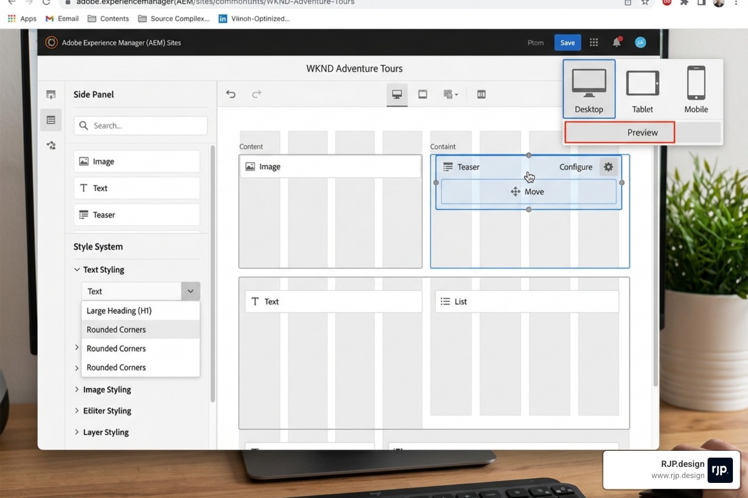
AEM Sites uses a Universal Editor that allows non-technical users to drag and drop components into a responsive grid. One of its best features is the Style System, which lets us create preset style variations. This means a marketer can change how a component looks on mobile without writing a single line of CSS.
By using Responsive Web Design | Adobe Experience Manager Sites, businesses can ensure that their brand remains consistent whether a customer is browsing on a 5G connection in a coffee shop or a high-speed fiber line at the office.
Streamlining Adobe Responsive Web Design with Dreamweaver
For those who prefer a more hands-on coding environment, Adobe Dreamweaver remains a staple. It offers a "Smart Coding Engine" that provides code hints for HTML and CSS, which is perfect for Easy Responsive Design.
Dreamweaver’s Live View is a game-changer. It allows you to edit text and image properties directly in a preview that mimics a real browser. You can even use starter Bootstrap templates to jumpstart your project. These templates are mobile-first by default, giving you a solid foundation to Build responsive sites without starting from a blank page.
Optimizing Assets and Commerce Themes
A responsive site is only as good as its performance. If your site takes ten seconds to load on a mobile network, the responsiveness doesn't matter—the user is already gone.
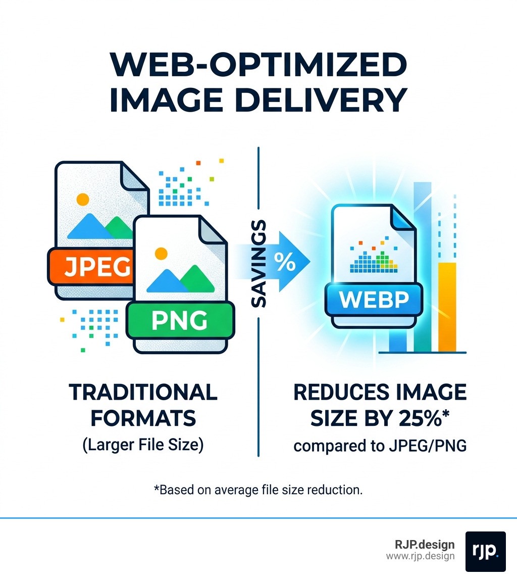
Adobe Experience Manager Assets helps solve this with Web-Optimized Image Delivery. By automatically serving images in the WebP format, it can reduce download sizes by an average of 25%.
In e-commerce, Magento Responsive Design (now part of Adobe Commerce) utilizes the "Blank" and "Luma" themes. These themes are built from the ground up to be responsive. We always suggest inheriting from the Blank theme when building a custom storefront, as it provides the cleanest responsive architecture to build upon.
Testing and Previewing Across Devices
The final, and perhaps most important, step is testing. You can't just assume a site works because it looks good on your laptop.
Adobe tools include built-in emulator toolbars that let you toggle between different device profiles—iPhone, iPad, Android, and various desktop resolutions. At RJP.design, we take this a step further by testing on actual physical devices to ensure the "feel" of the navigation is correct.
If you're looking for Responsive Web Solutions/, we are here to help. Our team focuses on building sites that aren't just "mobile-friendly" but are truly "mobile-optimized." For More info about web design services, reach out to us. We pride ourselves on being a down-to-earth team that prioritizes your business goals and client satisfaction above all else.
Overcoming Common Responsive Design Challenges
Even with great tools, adobe responsive web design can present hurdles. Here are a few we frequently tackle:
Complex Data Tables: Tables are notoriously difficult on mobile. We often transform them into "cards" or use horizontal scrolling for specific data sets.
Navigation Overload: A massive desktop menu won't fit on a phone. We use "hamburger" menus or priority+ patterns to hide less critical links.
Performance Bloat: It’s easy to accidentally load desktop-heavy assets on mobile. Using Adobe's automated renditions ensures users only download what they need.
By focusing on a component-level design—where we build individual pieces like headers, cards, and footers to be responsive—we create a system that is scalable and easy to maintain.
Whether you are using AEM, Dreamweaver, or Adobe Commerce, the goal of adobe responsive web design remains the same: making sure your audience has a flawless experience, no matter how they choose to find you. At RJP.design, we make sure your screens don't just "play nice"—we make sure they work hard for your business.
Ready to make your website truly responsive? Let's chat about how we can enhance your online presence today.
Learn more about our approach: