Web
Responsive Web Design in NYC: Don't Let Your Website Break a Sweat on Mobile
Mar 13, 2026
Why NYC Responsive Website Design Is Essential for Your Business Success
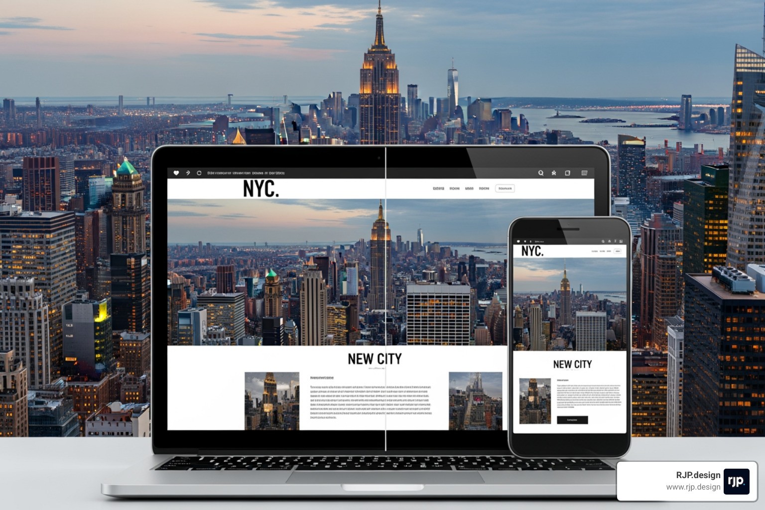
NYC responsive website design ensures your website adapts seamlessly to any device-smartphone, tablet, or desktop-providing an optimal viewing experience without frustrating resizing, panning, or scrolling. Here's what you need to know:
Key Benefits of Responsive Design:
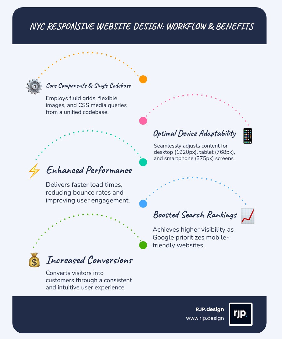
Single codebase works across all devices, reducing maintenance costs
Improved search rankings as Google prioritizes mobile-friendly sites
Better user experience increases engagement and conversions
Future-proof solution adapts to new devices automatically
Essential Components:
Fluid grids that resize proportionally
Flexible images that scale within containers
Media queries that detect screen size
Touch-friendly navigation optimized for fingers, not cursors
In New York City, this matters more than ever. With 2.2 million small businesses competing for attention and 70% of US website traffic coming from mobile devices, your website isn't just a digital business card-it's often the first impression you make on potential customers scrolling through their phones on the subway, in coffee shops, or walking through Manhattan.
The stakes are high. Search engines like Google actively penalize non-responsive sites in their rankings, making you virtually invisible to the majority of users who search on mobile devices. Meanwhile, visitors who encounter a clunky, desktop-only experience will simply tap the back button and choose your competitor instead.
I'm Ross Plumer, and over my career working with businesses that have marketed over $20 million in revenue, I've seen how NYC responsive website design transforms struggling online presences into powerful lead-generation engines. My approach combines psychology-driven user experience with technical excellence to create websites that don't just look good-they convert visitors into customers across every device.
The Core of NYC Responsive Website Design: Why Your Business Needs It
In the city that never sleeps, your customers are constantly on the move. Whether they are checking restaurant menus while riding the L train or researching a law firm during a quick lunch break in Bryant Park, their primary tool is the smartphone. Last year, more than 65% of global web visits were from mobile devices. If your site isn't built with Responsive Web Design RWD, you are essentially closing your doors to two-thirds of your potential market.
Investing in Responsive Web Solutions isn't just about "looking nice" on a phone; it's about survival. New York is home to 2.2 million small businesses, making up 99.8 percent of all businesses in the state. In such a saturated market, friction is the enemy. If a user has to "pinch and zoom" to read your contact info, they’re gone.
Furthermore, Google has shifted entirely to mobile-first indexing. This means the search engine primarily uses the mobile version of your content for indexing and ranking. If your desktop site is a masterpiece but your mobile site is a mess, your rankings will suffer across the board.
Feature | Responsive Website | Non-Responsive (Desktop-Only) |
|---|---|---|
Mobile Traffic Retention | High (User stays and engages) | Low (Immediate bounce) |
Google Search Ranking | Favored (Mobile-friendly boost) | Penalized (Lower visibility) |
Maintenance Cost | Low (One site to update) | High (Separate mobile/desktop versions) |
User Experience | Seamless across all screens | Frustrating on small devices |
Essential Elements of a Mobile-First NYC Responsive Website Design Strategy
When we talk about a mobile-first approach, we mean designing for the smallest screen first and then scaling up. This forces us to prioritize the most important content and ensures that the core message isn't lost in the clutter. To master nyc responsive website design, several technical pillars must be in place:
Fluid Grids: Instead of using fixed pixels (which break on different screens), we use percentages. This allows the layout to expand or contract based on the screen size.
Flexible Images: We ensure images never exceed the width of their container. This prevents a giant photo from "breaking" your layout on an iPhone.
Media Queries: These are the "brains" of Responsive Web Design. They detect the device's resolution and tell the website which CSS rules to apply.
Touch-Friendly Navigation: NYC users are often using one hand. Buttons need to be large enough to tap easily, and menus should be intuitive. This is a core part of Responsive UI/UX.
Learning how to implement responsive web design requires a deep understanding of how New Yorkers interact with technology—fast, efficient, and direct.
How Search Engines and Diverse Audiences View NYC Responsive Website Design
New York City is one of the most diverse places on earth. Your website needs to cater to everyone, from tech-savvy Gen Zers in Brooklyn to seniors in Queens accessing city services. Accessibility isn't just a "nice to have"—it's often a legal requirement.
The NYC Digital Design System sets the standard for this, emphasizing that digital products should be accessible by design. When we build SEO Friendly Websites, we ensure they meet WCAG standards, allowing users with disabilities to steer your site as easily as anyone else. Search engines love this. By providing a clean, accessible, and fast experience, you signal to Google that your site is a high-quality resource. You can even find what you need on nyc.gov to see how the city itself prioritizes these standards to serve its millions of residents.
Overcoming Implementation Challenges for New York Businesses
Implementing nyc responsive website design isn't always a walk in Central Park. Many established NYC firms struggle with legacy systems—old websites built a decade ago that are difficult to update. Common challenges include:
Speed Optimization: Mobile users in NYC are impatient. If your site takes more than three seconds to load, you’ve lost them.
Cross-Browser Compatibility: Your site needs to look identical whether it's viewed on Safari, Chrome, or Firefox.
Content Prioritization: Deciding what stays and what goes on a small screen is a strategic challenge.
Whether you are looking for a Professional Website Redesign or following a Website Redesign Complete Guide, the goal is to eliminate these problems. You can visit nyc.gov to see the design system in action to understand how even the most complex organizations can achieve a unified, responsive presence.
Driving Digital Success: Choosing the Right Partner in the Five Boroughs

Choosing an agency for your nyc responsive website design is a major decision. You need a partner who understands that a website is a living system, not a static brochure. The right partner focuses on ROI and Website Conversion Strategies rather than just "pretty" colors.
A great example of high-stakes responsive design is the website for NYC Health + Hospitals. As the largest municipal healthcare system in the US, they must provide quality care and information to all New Yorkers. Their site must work perfectly for a doctor on a desktop or a patient looking for a clinic on their phone. If your business needs to reach a wide audience, you need that same level of Digital Marketing Services and technical precision.
The Impact of Responsive Design on NYC Digital Marketing and Engagement
Your digital marketing efforts are only as strong as your landing page. If you run a brilliant social media campaign but lead users to a non-responsive site, you are throwing money away.
Social Media Integration: Most social media browsing happens on mobile. Your site must be ready for that traffic.
Local SEO: For NYC businesses, appearing in "near me" searches is vital. A mobile-friendly site is a prerequisite for ranking in local search results. Check out our Local SEO Guide 2025 for more on this.
Reduced Bounce Rates: When a site is responsive, users stay longer. This improves your SEO and Website Traffic metrics, telling Google your site is valuable.
Consistent Brand Image: A Digital Presence for Business must be consistent. Your brand should feel the same on a 27-inch monitor as it does on a 6-inch screen.
Latest Trends and Innovations in the NYC Responsive Website Design Market
The world of nyc responsive website design is constantly evolving. We are moving beyond basic layouts into more advanced territory:
AI Signals: We now use AI to predict conversion issues and understand how users move through a responsive site.
Headless CMS: This allows for faster, more flexible content delivery across different platforms.
Micro-interactions: Small animations that respond to a user's touch, making the mobile experience feel more "native" and engaging.
Tailwind & Modern Frameworks: Using tools like Responsive Website Tailwind allows us to build lightweight, lightning-fast sites.
For those in the retail sector, our Ecommerce Website Design Manhattan Guide highlights how these innovations are driving record sales for local shops. If you want to see what's possible, look at Award Winning Responsive Websites to get inspired by the cutting edge of the industry.
Selecting an Agency and Building Your Future-Proof Presence
At RJP.design, we don't just build websites; we build growth engines. We are a team of NYC Website Designers who believe in high-quality service and a down-to-earth approach. We know the NYC market—from the high-pressure environment of Wall Street to the creative hubs of Brooklyn.
When you are ready to stop losing customers to a "broken" mobile experience, it's time to act. Why You Should Choose Us as Your Web Design Agency comes down to our commitment to your results. We prioritize your satisfaction and ensure your site is a future-proof asset.
Don't let your website break a sweat when a customer pulls out their phone. Contact Us today or start your project with a premier NYC agency to transform your digital presence into something truly remarkable. Your customers are out there, scrolling through their phones right now—make sure they find a website that works as hard as you do.

